Mistakes Everyone Makes When Choosing A Paint Color For Their Home
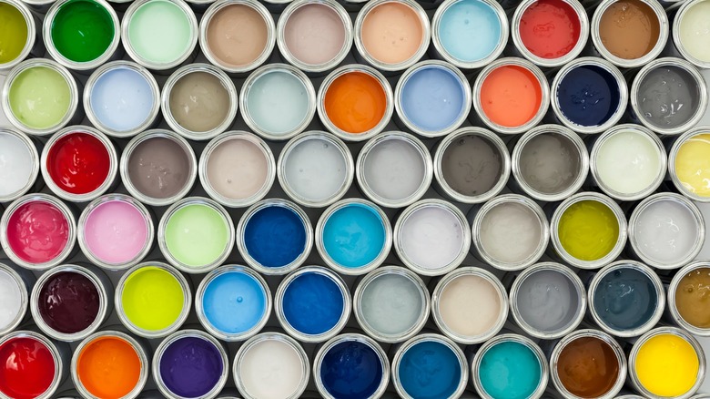
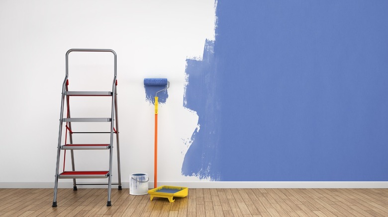
One of the easiest and most affordable avenues for updating a room, or changing its mood, is one we find incredibly challenging — paint! It's difficult to decide; there are too many colors and so much inspiration. Where and how do we begin? According to Better Homes & Gardens, it can take up to 12 hours to paint a medium-sized living room, not including the preparatory steps nor the time invested to reach a color selection; it's not an investment you'll want to throw away lightly so it's important to get it right. On the other hand, it's not a great deal of time or money relative to the reward, or in comparison to other home improvement projects, so it's helpful to not stress so much as to fall prey to perfection paralysis, allowing those woesome walls to languish even longer.
There are some pitfalls to avoid when choosing a color– some of them may sound familiar, being applicable to other areas of DIY and life in general. For example, being impatient or losing sight of the goal. My Domaine spoke with Natalie Ebel, the co-founder of Backdrop, a direct-to-consumer paint purveyor and consultancy. Ebel told the outlet, "The biggest mistake is not trusting yourself and your own sense of style," adding that it's imperative to swatch color before painting. So it's 75% following your gut and 25% following the rules, approximately — it's not a paint formulation after all!
Selecting paint color first
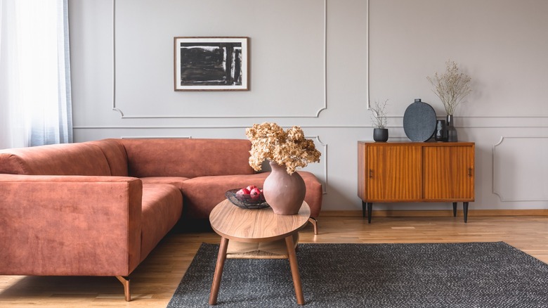
It may seem like a good idea to start a room's color journey by picking the paint first, but this is the wrong way to go about it. As per Bay Cities Construction, you'll risk backing yourself into a corner with fabric and furniture selection. With so many paint options available, it's much easier to begin with the decor and later choose a complementary wall color.
Designers often recommend starting with a favorite piece, or one that sets the tone of the space, and aiming for paint that corresponds to and enhances that, as well as the furniture, wood tones, and other decorative elements; the area rug, drapery, or upholstery fabrics are all excellent items to use as a jumping-off point. If you've just moved in, Real Simple recommends placing some decor pieces in the space before sampling wall colors to get a truer representation of how everything will work together.
Not being clear on the goal
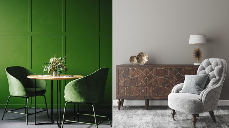
It's good to ask a couple of questions in determining your color goal: What is the function of the room being painted? and What mood would you like to create in the space? Considerations for a bedroom, dining room, or media room might be very different; soothing, light to medium tones work well for a bedroom while a dining room can handle bolder hues. Further, a media room is a perfect place to go dark and atmospheric with paint.
Color can impact our emotional state and, according to Color Psychology, physiological reactions such as blood pressure and appetite — painting the bedroom in a color that makes our pulse race, or the dining room in one that makes us sleepy, may not be the best idea. Additionally, paint hues can foster a feeling: masculine, airy, luxe, vivacious ... or act as souvenir to another place.
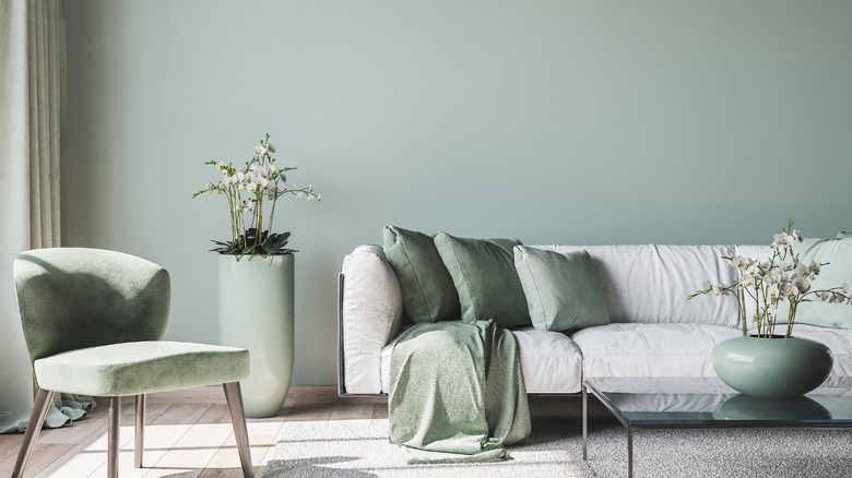
Trying to be too matchy
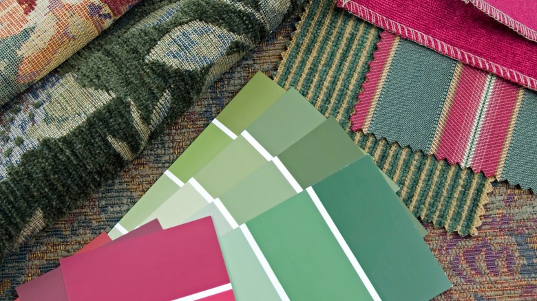
Once the inspiration pieces and palette are decided upon, the wall color can be considered. It's best to take fabric and carpet swatches along to the paint store; if purchasing a new carpet, consider ordering a sample tile. Some companies provide them free of charge or will credit the sample's cost if a rug is purchased.
Pull paint chips from within the color story you've selected, looking for those that complement your decor. It's okay to not match paint color exactly to a shade in your items — in fact, Elle Decor claims it's boring; try a tint lighter, a shade darker, or something with a bit of gray added to create a more neutral tone. Having slight variation reduces the opportunity for clashing and also attributes depth and energy; think of tones in nature — several blues exist in the sky at once and a garden is not only one shade of green.
Choosing blah, bright, or white
White generally makes rooms appear bigger, yet according to Kimberly Grigg Designs, white reflects existing elements, so if you're painting because the space feels blah, white will just make it more so; you'll have to ensure the room has interest by way of texture and fabrics. Despite common perception, dark rooms can feel spacious, too; the perimeters recede, creating expansiveness. Notably, contrast stops the eye, therefore, trim, drapes, and even furniture should be of a similar value.
It's a leap of faith to use bright colors on the walls, so we often opt for neutrals, but this can leave us with bland interiors. Better Homes & Gardens explains that a low-intensity option doesn't necessarily mean beige or gray and suggests using near neutrals — muted shades with an essence of color, making them friendlier to live with than their fully saturated versions. If you love boldness, try brights in small doses; a powder room, accent wall, or the inside of a cabinet.
Ignoring the light quality
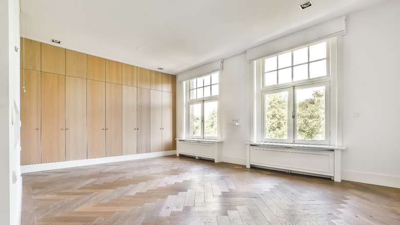
All colors have an inherent undertone of coolness or warmth. Real Simple recommends this tip for whites: place the swatch on a piece of paper to emphasize any yellow or blue. In addition, rooms are oriented to be north, east, south, or west-facing, affecting the quality of light the space receives.
North-facing rooms are notoriously cool, while southern exposure spaces are sunny and warm. Placing a cool blue in a northern room will edge it toward cold, so blue with a touch of yellow (blue-green) will add a little warmth and comfort; and white in a north-facing room can look gray and dingy unless it's on the warmer scale (via Kimberly Grigg Designs). Southern rooms are usually sun-drenched, so covering the walls in warm yellow or orange could result in a space that feels overpowering. In addition, Better Homes & Gardens notes that dark paint color is better suited for rooms with abundant natural light.
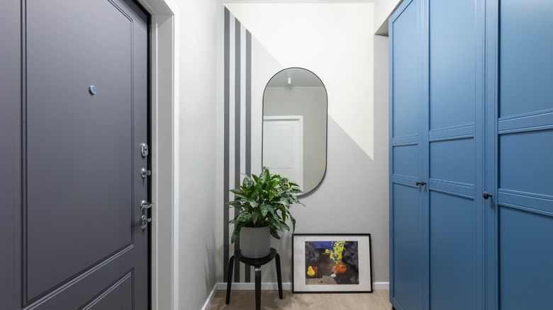
Forgetting the fifth (and sixth) walls
As important as it is to consider the room's decorative elements, per Elle Decor, taking flooring into account is equally vital when choosing paint; predominantly, the concerns are color and undertone, but the material also comes into play. Rustic wood may be more harmonious with soft, organic paint tones, while polished stone might pair well with bold, modern shades. If flooring tips the temperature in one direction, it can be beneficial to counter that with paint, so as not to end up with a space that is overwhelmingly warm or cool.
In design, the ceiling is referred to as the fifth wall, and per Inhabit, we ignore it too often, missing the opportunity to construct a more impactful environment. The outlet suggests kids' rooms and small spaces, like laundry rooms and entries, as the perfect spots to try it out. Who isn't charmed by a pale blue porch ceiling?!
Not swatching
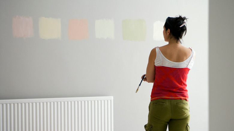
It's impossible to envision what a teeny square of paint will look like covering a large surface. Add to that the effect of the decor in the room, the room's size, and the type of light it receives: per Better Homes & Gardens, sunlight, daylight, and fluorescent and incandescent bulbs influence how a color is perceived. Paint big swaths directly onto walls, ensuring each sample appears on every wall — it's amazing how unalike they look in different locations. If that feels too haphazard, apply paint to a poster board; peel and stick samples are another option if available. Patrick O'Donnell, of luxury paint brand Farrow & Ball, cautions against placing samples too near each other, telling Real Simple that it's distracting and makes it harder to pick.
Once you've landed on your perfect color, purchase it from the company you've swatched — per The Color Concierge, the technology used to color match between brands is only 90% accurate. Also, Better Homes & Gardens recommends boxing, or mixing, separate gallons of the same formulation together in a 5-gallon bucket for color consistency.
Going with the wrong finish
According to Benjamin Moore, paint finishes are categorized by their amount of sheen and gloss. Sheen is the resulting look while gloss is the reflective quality. The most typically available finishes, in order of least reflectivity to highest, are: flat, matte, eggshell, satin, semi-gloss, and gloss. The degree of sheen impacts both the visual effect and functionality of the space.
Flat paint has the lowest sheen and is optimal for hiding flaws; however, stains can be stubborn to remove so it's not suggested for high-traffic areas. Matte has a similar look with just a little shine, lending more wearability. Homes & Gardens recommends flat paint for ceilings and low-traffic areas while noting a matte application is ideal for bedrooms, dining rooms, and living rooms; furthermore, eggshell is a cleanable low-sheen finish suitable for most spaces. Satin and semi-gloss provide greater sheen and greater durability; Benjamin Moore explains that both are an enhancement to architectural features such as trim and interior doors, with semi-gloss affording better washability. Gloss, aka lacquer, possesses the highest shine and durability and creates a stunning luminous surface (that subsequently highlights every imperfection).