The Pastel Color Trend Is Coming Back To Kitchens In 2026 - But This Time With A Twist
Pastel kitchens became popular in the 1950s, and are typically only found today in vintage-style kitchens trying to recreate the past. But if you prefer a more modern look, some designers expect pastels to return in a slightly different form for 2026. Ben Kempton, director for 202 Design, recently explained to Homes and Gardens that he sees pastels making a comeback in the kitchen, though in more muted versions than we have seen previously. "Pastels are returning in a far more tailored and architectural manner than their playful reputation suggests," Kempton says. When used in a sophisticated way, pastels can add a hint of fun to a space without making it feel immature or overdone.
These muddier shades like pistachio green, robin's egg blue, or dusty pink, can add a dreamlike quality to a room while staying away from anything that is too vibrant or likely to become dated. Rather than taking over the entire space, like the brighter pastels of years past, these muted versions are easier to pair with other colors, materials, and patterns for a more seamless kitchen aesthetic overall. But if these colors are the ones to look out for next year, what are the rules to follow when designing a new kitchen using muted pastels for the trendy, yet understated space of your dreams?
How to style muted pastels in the kitchen
One key to decorating with this new generation of pastels is to emphasize their muted nature, making them feel classic and mature. In contrast to the sleek severity of Scandinavian-inspired minimalism, these warmer colors are great for making a space feel more natural and inviting. As such, these pastel shades can be paired with natural materials and handmade items to emphasize a more personal style, rather than a manufactured one. For example, this Roundhill midcentury-modern barstool set features deep brown wooden legs with faux-leather seats in a dusty pink that feels nature-inspired.
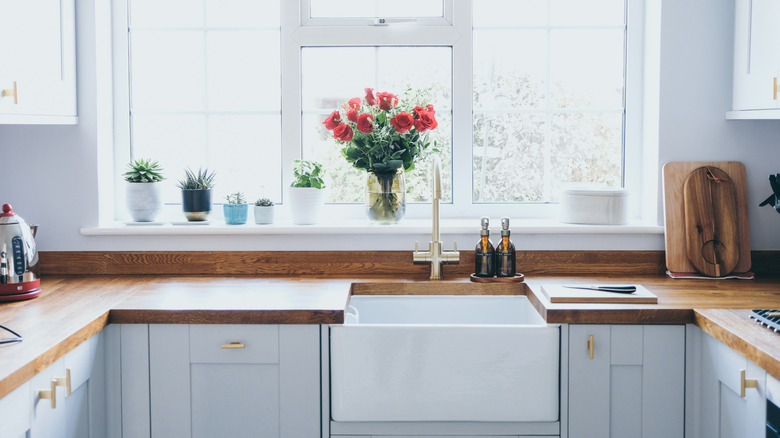
Another charming pastel kitchen idea is to weigh the lighter shades down with darker ones. This is a great way to emphasize the maturity of your new, toned-down pastel and separate it from the lively, childish association of brighter hues. In the kitchen, this can be done in a variety of ways. For example, light pink or peach walls can be balanced out with darker grey cabinets, and a sky blue backsplash can be paired with dark wood countertops to give a feeling of richness and duality.
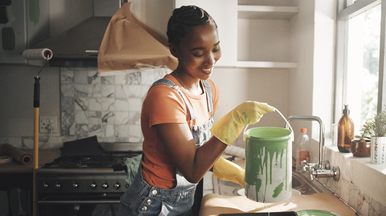
In addition, when considering adding a playful pop of color to your kitchen, it is always a good idea to think about the practicalities. Make sure to consider which areas — such as behind the sink or above the oven — tend to get the dirtiest. You may want to opt for darker colors like gray or tan in those locations and save the lighter pastels for the spots that are more forgiving.