9 Kitchen Countertop Colors You'll Want To Avoid In 2026
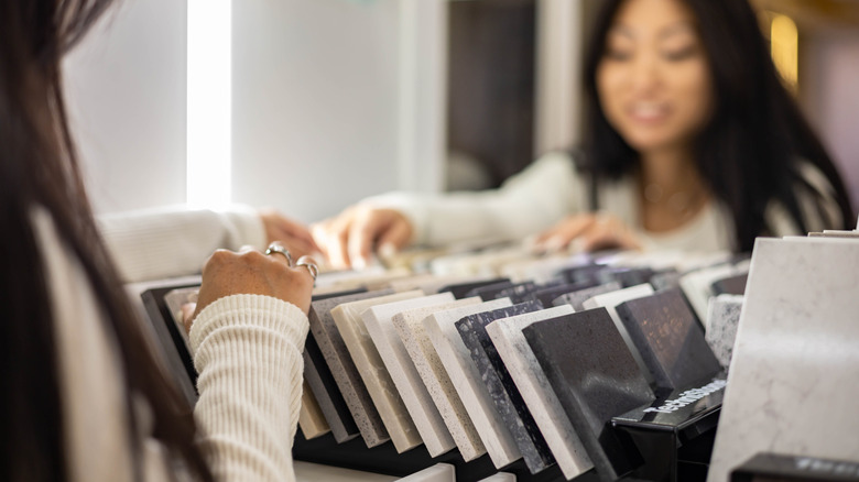
The material you pick for your countertops will have a major impact on the look of your kitchen for years to come, so it's important to choose something high-quality, durable, and that you won't get sick of in a couple of years. Considering the fact that replacing your countertops costs between $43 and $140 per square foot on average, you'll want to choose an option that's less likely to look outdated or overdone as time goes on. There's nothing wrong with going bold or experimental with your kitchen style, but unless you're truly committed to one look, it's a better idea to try out passing trends in ways that are easier to reverse. Choose a timeless countertop color, then have some fun with your cabinet color, countertop decor, and dishware to try out trends with less risk.
If you want to avoid a dated look in 2026, you'll want to pass on two main categories of countertop colors: saturated hues that tend to take over the space, and stark colors that might fall flat. With that being said, however, even the craziest countertops can work in a home if they're styled correctly. Choosing a countertop color that gives your kitchen the right vibe should be a personal process, so if your entire home is doused in red and that's what you like, there's nothing wrong with going with a red countertop to match. If you just want to try out the buzzy, unexpected red theory in a house that's otherwise full of neutrals, however, you'll likely find yourself regretting your decision within a matter of months.
Stark white
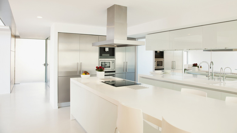
While some people believe that all white kitchens will never go out of style, a stark white kitchen might look out of place in your home. Fully white spaces that lack texture and warmth can feel clinical, sterile, and unwelcoming, and bright white countertops are a major contributor to that look. Rather than opting for a sleek slab with no variation, choose a white or light beige stone with some natural texture. That way, you'll get all the brightening benefits of a light-colored countertop without accidentally making your kitchen look like a hospital.
Brown
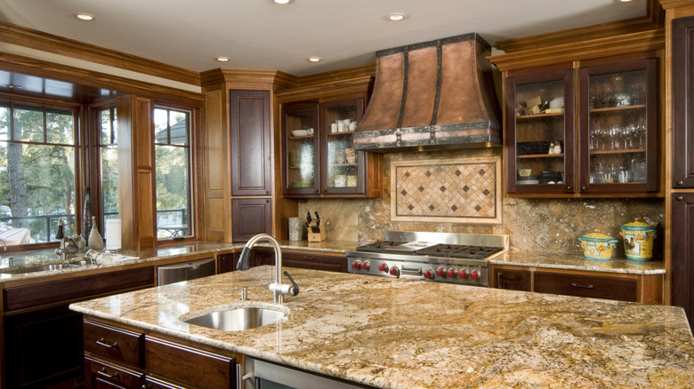
Brown is one of the granite countertop colors you'll be seeing less of in 2026. While tan and brown versions of this material absolutely dominated kitchens in the '90s and early aughts, it's safe to say it was a bit overdone — just about every kitchen reno from the time mimicked the same look. Nowadays, many can't shake the association, so this color instantly reads as outdated, even if it was recently installed. If you're still in love with the look, however, consider pairing it with some cabinetry in a more current color to avoid a time capsule look.
Gray
Gray dominated design as the go-to neutral for decades, but nowadays people are looking for ways to freshen up their cold, millennial-gray kitchens. Just like white, gray tones can read as bland, clinical, and unwelcoming, especially when they sit on the cooler side of the spectrum. There's nothing wrong with wanting a more neutral look, but if you're set on gray counters, consider going for something that toes the line between warm and cool, like greige. This way, you'll be able to easily incorporate accent colors regardless of whether warm or cool tones are trendy at the moment.
Bright red
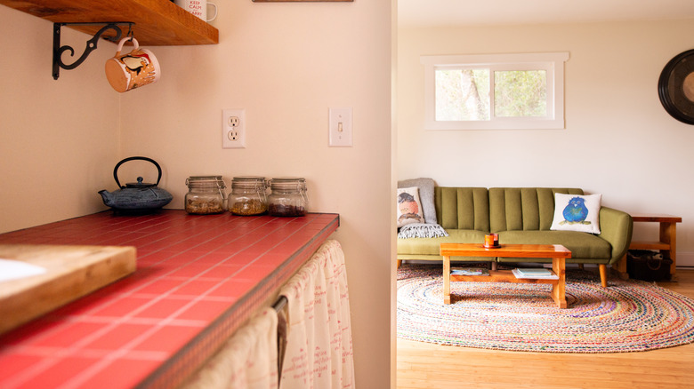
Warm colors are trending right now, so it might be tempting to go all-in with one of the warmest colors out there: bright red. Unless you're building the technicolor space of your dreams, however, we caution against it — recent trends prioritize warmth in a cozy way, not a glowing stop sign way. Red is a very abrasive and bold color, especially when fully saturated, so choosing it for a more permanent feature in your kitchen, like countertops, is risky. Instead, try painting your cabinets the stunning red hue that's on trend for kitchens in 2026: merlot.
Yellow
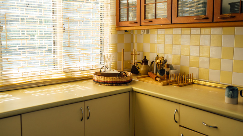
Yellow has always been a controversial color, but even if you adore this sunny shade, it's best to steer clear of it for your countertops. It's seen many iterations over the years, from harvest gold in the '70s to Tuscan mustard in the '90s, but most are too bright to fit into more subdued modern palettes. Even trendy butter yellow is best kept on cabinets or walls — this shade can quickly overwhelm a space, so accents that can be painted over if needed are much safer than permanent investments.
Green
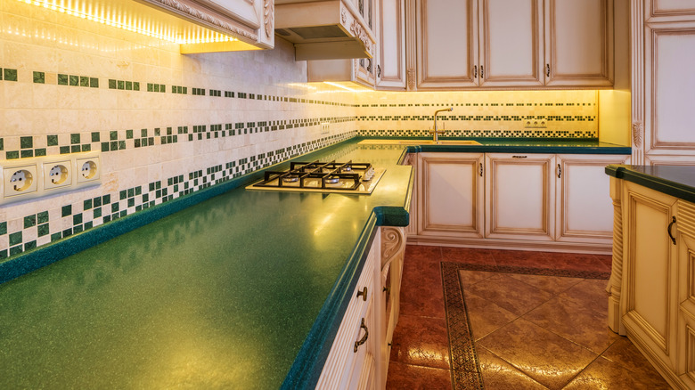
Green is everywhere right now, so it might be shocking that it made the list of countertop shades to avoid. While it can certainly be done well, just about any bold color is safer to avoid unless you have a very specific vision in mind, and that includes green. Despite its natural tone and inherent flexibility, most shades of green still make a very bold statement that can quickly overwhelm a space. Use it to paint your cabinets, or go for a slab with hints of green throughout for a more subtle way to enjoy this color.
Bright blue
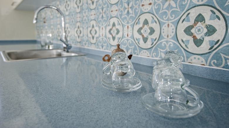
Another color that's a crowd-pleaser but could be overwhelming when used on something as large as a countertop is blue. Bright shades of this color can completely take over a space, drowning out any other design choices you've made, but it is possible to use blue on your counters in a more subtle, timeless way. Rather than going for a cobalt slab, consider a natural stone that leans more neutral but has some subtle blue veining. Navy cabinets would also be gorgeous for a moody look, and they can easily be repainted if they feel too heavy.
Black
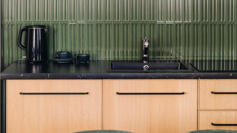
Neutrals are usually a safer choice than bold colors, but, in many cases, black countertops should be avoided. It might be tempting to go for black because it seems easier to keep clean, but the opposite is often true — this color shows streaks, dust, smudges, and debris, which can make it feel impossible to keep up with. While black can still work in a space if you're going for a deep, moody look, it should be used with caution — this dark color won't reflect much light and can make a room feel stuffy if it's not properly styled.
Pink
You heard it here first: Millennial pink is going out of style. While this tone provided an easy pop of color for years, it eventually started feeling overdone, and now, sage green seems to be taking its place as the approachable accent color for decor. Even before its time in the 2010s and 2020s, pinky-toned granites saw a spike in popularity in the early 2000s. If you want a kitchen that feels timeless and sophisticated, however, it's best not to play around with trends and pick your countertops based on what will hold up over time.