Replicate Martha Stewart's Perfect Homes With 14 Paint Colors She Approves Of

One of the biggest decisions you can make when renovating a room is choosing the paint color. More than most features, the color determines how you feel when you spend time in that room. Do you want to feel relaxed, secure, happy, or calm? Color is powerful, and failing to appreciate its emotional impact is one of the biggest mistakes you can make when choosing paint colors for your home. Another is choosing a color that doesn't stand the test of time. Have you seen an apple red kitchen from the late 1990s or early 2000s? Often, the best way to choose a paint color is to get inspiration from someone you trust. And thankfully, one of the most trusted names in home design — Martha Stewart — has released a new line of interior paint.
The paint line Stewart designed features 40 hues inspired by nature. The formula was created by paint company Fine Paints of Europe and can be purchased on Amazon. The colors are available in five different formulations for all your home painting needs, whether you're looking for a semi-gloss for the kitchen or a flat finish for your bedroom. Like the colors in Stewart's own homes, these shades were designed to be timeless and are sure to withstand even the most dramatic design trends. They include warm tones, cool shades, and plenty of neutrals, so you shouldn't have a problem finding the perfect match for your renovation project. With this new line from Stewart as inspiration, here are some tips to replicate almost any of your favorite looks from her designs.
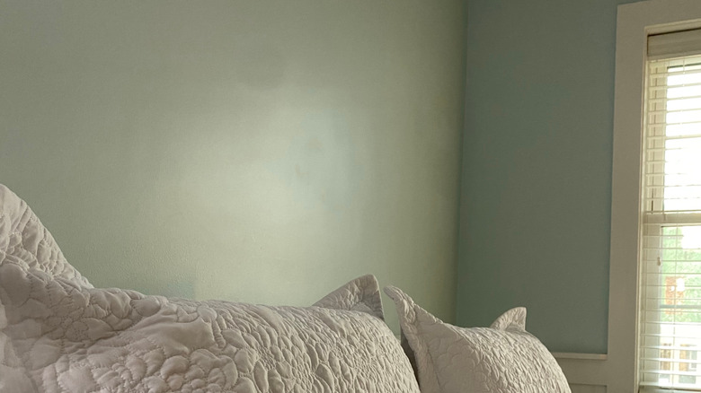
Araucana Blue
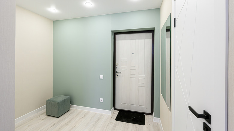
This color was inspired by the eggs from the Araucana chickens that Martha Stewart has on her farm; the hens lay beautiful, blue-tinted eggs. Araucana Blue is a lovely shade if you are looking for a subtle touch of color for your room. This muted blue-green is sure to give your bathroom a calming, spa-like effect, but it would also work well for creating a peaceful environment for your bedroom. For a slightly grayer take on this shade, try Farrow & Ball's Teresa's Green.
Butter Cream
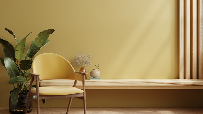
Butter Cream is Martha's take on the popular vintage color everyone is painting their walls this year. This hue was popular in mid-century homes for its warm, inviting feel. Today, it would work well in almost any room. If you're looking for a cozy, inviting paint color that also has that throwback vibe, Butter Cream is a great choice. For a convincing dupe, try Dayroom Yellow by Farrow & Ball.
Goose Down
Goose Down is a rich, earthy brown color with hints of charcoal. If you're looking for a paint to add a cozy vibe to your room, this is the shade for you. Often, some shades of brown can feel too orange or yellowish, but this shade is a cool, muted brown. For a similar shade that goes a touch cooler, try Magnolia's Wooded Acres.
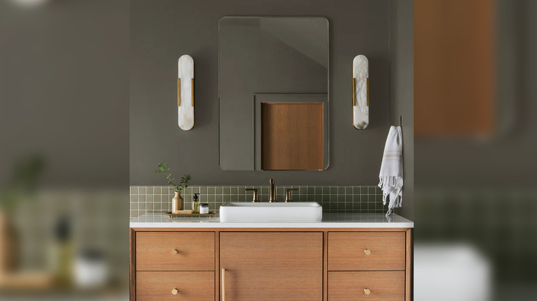
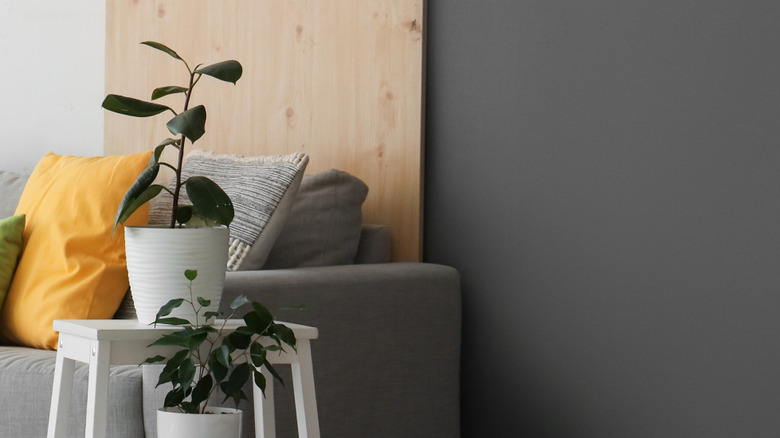
Chinchilla
Chinchilla is a lovely greige-toned paint — a warm gray that works well with creams and warm woods. It's the perfect gray if you're looking to add a cozy, neutral feel to a room without going for a cold charcoal or cloud gray. It would work well for a living room if you don't want to go too dramatic, but instead are looking to create the perfect canvas for richly hued furnishings and decor.
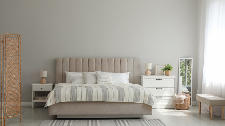
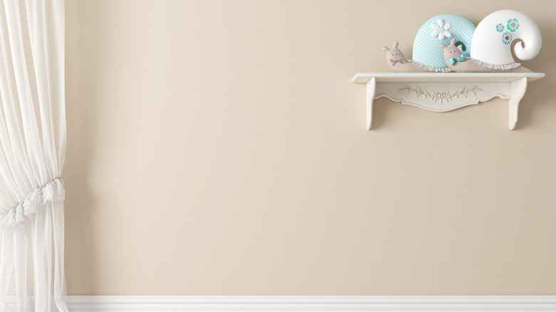
Parchment
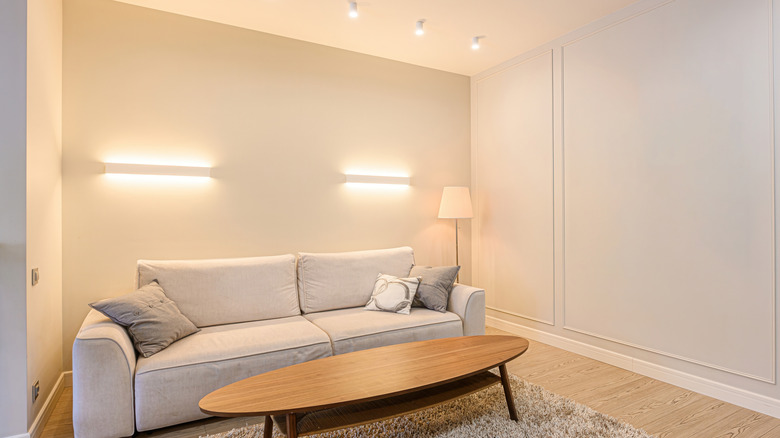
Parchment is the color to choose if you are looking for a creamy white to add some depth to a room. Reminiscent of French vanilla ice cream, it's a neutral white that's slightly cream-hued, but not too yellow. As the name implies, it has the look of aged paper that is timeless with a touch of elegance. It would look great in a kitchen for a clean look that doesn't feel cold or impersonal. For a great dupe, try Cream Froth by Benjamin Moore.
Book Binding Green
Book Binding Green is the choice for those looking for a paint to suit their cozy reading corner, library, or study area. It's a muted sage green with gray tones. It's a great paint color for those who shy away from bright or true greens but want to add an earthy shade to their home. This is the type of color you choose when looking for understated elegance.
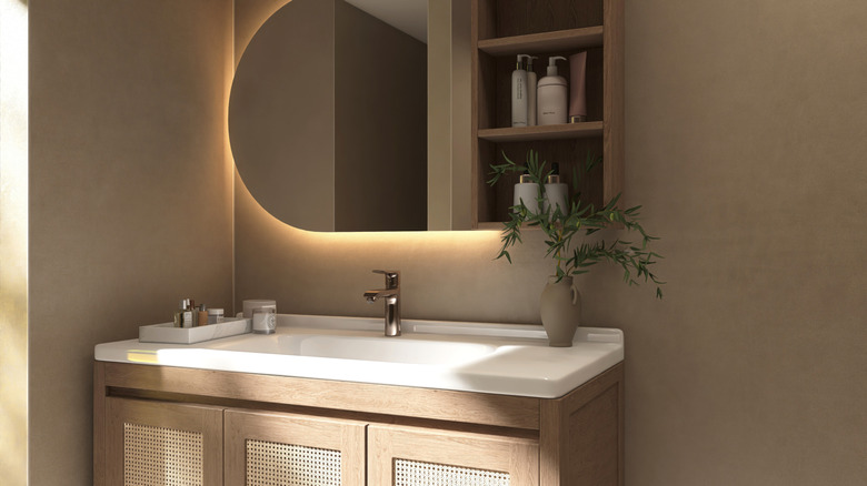
Travertine
Stewart's Travertine paint color is, of course, inspired by the timeless limestone. Not overly yellow, Travertine adds a neutral beige look with subtle sandy undertones. This color is great for any room in the home, creating a clean canvas for natural textures like linen, wood, ceramic, or rattan. If you are looking for a timeless, warm, neutral aesthetic for your home, Travertine is a perfect choice.
Silhouette
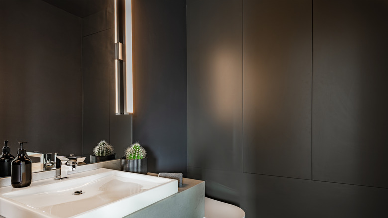
If you are looking for a dark and dramatic color for your walls but you just can't commit to black, Silhouette might be the perfect paint. This dark charcoal color would make a lovely contrast to white linens or metallic accents. In a room with lots of daylight, this paint color reveals its blue-green undertones. In low-light situations, Silhouette is like a cozy blanket wrapping itself around you to create the perfect escape from the busy world. For a moody dupe, try Off-Black by Farrow & Ball.
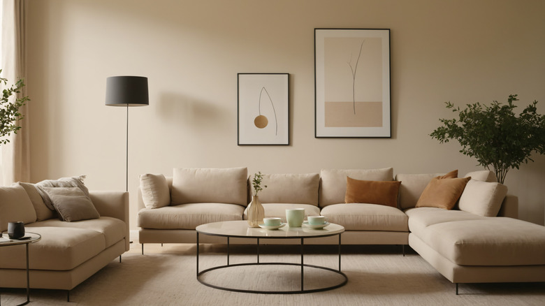
Heavy Cream
Do you love the neutrality of Parchment, but desire something a little warmer and richer? Heavy Cream is a good option. This color is perfectly subdued, yet emanates a comforting, rich warmth. Heavy Cream is a lovely off-white that works with a variety of design styles and creates that comfy, cozy feel that is truly timeless.
Porch Ceiling Blue
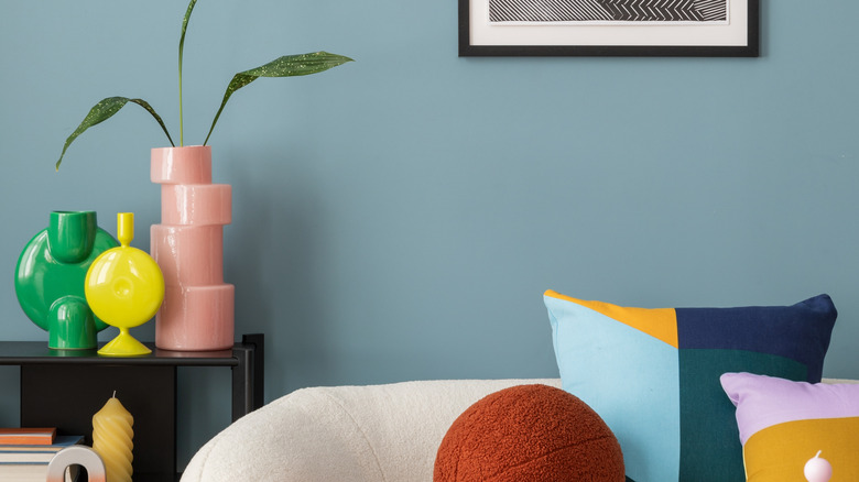
Gray-blue paint shades seem to never go out of style, and Porch Ceiling Blue is a lovely new addition to this color family. With a touch of nostalgia and the feel of a porch on a bright summer's day, Porch Ceiling Blue will add a refreshing airiness to any room. This type of gray blue not only gives an aesthetic of spaciousness, but it also adds a touch of whimsical charm to your home.
Faux Bois
If you are looking to create a cozy, earthy vibe in your home, Faux Bois (French, meaning "fake wood") is the way to go. This paint is a good choice if your home design has a lot of natural materials and textiles like wood, jute, or linen. No matter your interior design style, this color is a great neutral that will add warmth without overshadowing your decor. For a slightly warmer shade, try Ashley Gray by Benjamin Moore.
Batter Bowl Green
Batter Bowl Green is a lovely, muted sage green with a hint of blue. This is the type of paint color you choose when you are looking for a spa-like feel in your bathroom or a calming color for your bedroom. If you want a whisper of green that gives a tranquil feel, Batter Bowl Green is a good choice. For a convincing dupe, try Mint Condition by Sherwin-Williams.
Tarn
This color was named for the deep green-gray waters of small mountain lakes called "tarns." This paint is perfect for those looking for an earthy but contemplative feel to their homes. Tarn is a medium gray with green undertones that can change depending on the lighting — it can work for an accent wall or would make a great color for cabinetry. This color could also be a great choice for a moody bedroom design.
Basketweave Green
Basketweave Green is a great compromise if you want a strong green color that is not too overwhelming. This green shade works well for that cottagecore vibe with its soft, cool undertones that pair well with warm, rustic decor. Basketweave Green is perfect if you like colors that aren't too bold or bright. If you prefer to go a bit more gray, try Green Meets Blue by Behr.