11 Home Decor Trends Our Design Historian Is Happy To Leave Behind In 2026
As we welcome 2026, we're also saying goodbye to a number of design trends that have been "in" for far too long. Sage walls and accents, indoor jungles, pale wood, and stainless everything once felt fresh, trendy, and progressive in all the right ways. We love a touch of sage, both the plant and the color, but, like anything, once it's overused, it becomes stale. And these tired design trends are crowding out more personal, layered design options.
To get a sense of the trends we'll be leaving behind in the coming year, we reached out to our own Sarah Stafford Turner, House Digest's design historian. She looks at trends through the lens of design history and what she sees in current projects, antique markets, and design media. While she's over shades of sage and pale woods, Turner says there are plenty of modern alternatives that still feel warm and livable.
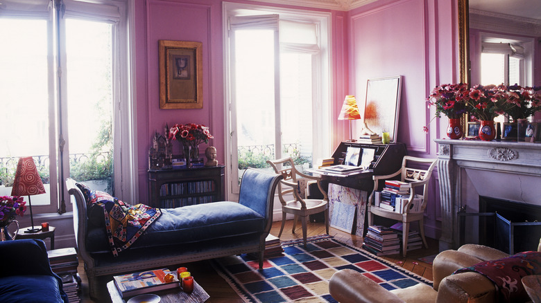
Sage green has become oversaturated

Sage has been so popular in recent years because it's approachable and calming, and it worked great in just about any space. It quickly became the "safe" choice for walls and accessories. Turner explains that "sage green has been one of the hottest interior colors of the last three years. It's versatile for bathrooms, living rooms, and bedrooms alike." So it makes sense that, after such a long run, designers are craving deeper, moodier palettes and more contrast. You may even see jewel tone and pastel combos to really draw the eye.
House Digest's design historian says that "on-trend designers are really shifting towards jewel tones and dark palettes. Think dark, edgy, veined marble, velvet ruby-colored curtains, rich, textured wallpapers in moody shades." She's not wrong. This move toward jewel tones is even being carried through to garden trends for 2026. As is the use of shades of white and cream. "When designers do want to lean into more earthy tones, they're going for cream (there's a reason Pantone named white the color of the year!), whiskey brown, ochre, and greige," says Turner. But it seems that these earthy tones are to be paired with vibrant, richer shades with more character. She continues, "With designers I work with at Antiques magazine, I've seen a lot of jade green (similar to sage, but more saturated and vibrant) in wallpapers, plant pots, throw pillows, and other charming accents."
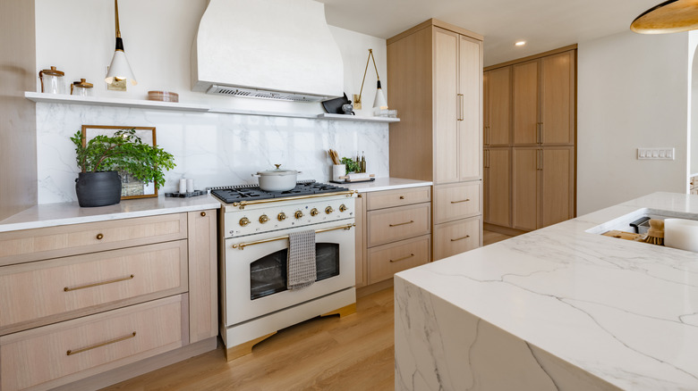
Waterfall islands are starting to feel a bit over the top

A waterfall island is an Insta-worthy kitchen island where the countertop material isn't just on the actual countertop. It "cascades," much like a waterfall, down one or more sides, creating a continuous, flowing look from the top working surface to the floor. They're usually part of luxe-look kitchens that border on show homes, and made of pricey, high-end materials like marble, quartz, or other real or engineered veined stone, so the look is seamless. It also puts the price out of reach of most regular people. They were a real "design flex" in the late 2010s and into the 2020s, as they are undeniably bold statement pieces that tell everyone that the homeowners have big money, used a designer, or have their own real flair for design.
Although waterfall countertops felt very fresh, contemporary, and editorial at first, as they saturated inspo images, this feature has started to wain stale. Besides being a timestamp, waterfall islands are also prone to dings on the exposed corners of the slabs. Additionally, the style, by necessity, limits legroom on the ends. Turner points out, "I think design is trending smaller, not bigger, and waterfall islands are a big statement that takes up a lot of space." This is true. With smaller kitchens quickly becoming the norm, thanks to rising costs, a big waterfall island consumes a massive amount of space and just becomes an obstacle. They can also look really out of place in smaller spaces.
Turner explains, "Design publications are starting to foreground those designers who make the most of very little, keeping a small footprint sustainable, functional, but impactful." The aspirational Pinterest-worthy kitchen is moving away from huge and heavy to clever and efficient, with storage, movement flow, and functionality taking center stage, along with a respect and even enthusiasm for historic details. A great alternative is a traditional wooden or butcher block countertop. They tend to take up less space and money. Plus, of course, you can refinish them. They'll never go out of style, and they age gracefully. Turner agrees, "a simple butcher block island is still a hugely popular choice that's not going away. In fact, I've seen more and more use of reclaimed wood for these butcher block-style islands." She continues, "In contrast, waterfall islands feel a bit over-the-top for the eco-conscious 2026 moment."
Defaulting to mostly black picture frames now looks out of place
Black picture frames, especially identical ones, became the go-to for a "pulled together" look. Big box stores and Pinterest idealism pushed the black frame interior trend heavily, even when the art they were framing didn't really match. But, as we move to more colorful, pattern-rich design trends, thick black frames can feel harsh, tired, and out of place.
Heading into 2026, you'll see more layered and eclectic styles, with natural materials and mixed finishes. Especially in eco-conscious and sustainable designs, where reuse, upcycling, and a rejection of overconsumption take center stage. Turner says, "If you look around, whether it's in an art gallery, a home goods store, or a luxe home, black picture frames are becoming the exception rather than the norm." She continues, "Just like with a lot of other home decor choices, more and more people are opting for natural materials: wood, brass, and silver."
These finishes age better and pick up tones from flooring or hardware. And they feel personal and "collected" over time. Wood and metal frames soften harsh edges and they sit comfortably against patterned wallpapers. Turner explains, "They're more fitting for colorful spaces and versatile for basically any wall covering choice, whereas black is a stark option that leaves you fairly limited if you want to experiment with wallpapers or a popular jewel-toned paint shade."
Footboards on beds are (once again) unfashionable
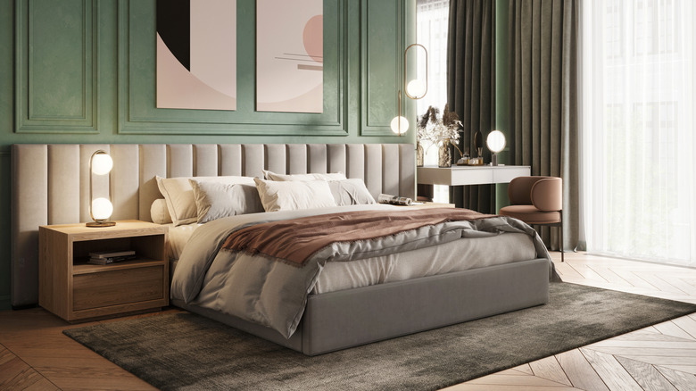
Traditional beds with matching headboards and footboards have cycled in and out of fashion for decades. They were often used as part of more formal bedroom suites. But smaller homes require smaller beds, so those big bedsteads with substantial footboards often don't work well and take up a lot of unnecessary space. They are one of the bedroom trends we'll likely be saying goodbye to in the coming year. Turner tells us, "I'm going to go out on a limb and say that footboards are on their way out. Footboards come and go throughout design history, and it seems like we're moving towards footless beds once again." This follows the broader trend toward lighter silhouettes and less visual clutter. Without a footboard, the eye can travel further across the room, and the lack of a footboard gives you much more freedom in terms of design.
Turner claims that, "With a heavier focus on rich, lush textures, going sans footboard lets you show off your bed coverings, unimpeded." "Headboards," she says, "are still being used to make statement, as are canopies and over-bed curtains ... but footboards are going." If you like a footboard, but you've got a smaller space, consider a short, slimline footboard that's less of a statement piece and more functional.
Stainless steel fixtures shouldn't be the default
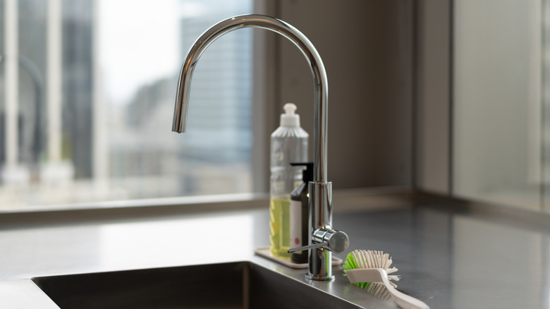
For years, "serious" kitchens flaunted stainless steel everywhere, from appliances to sinks to hardware. Around 2010, neatly matching stainless appliances in every available space, like a real chef's kitchen, became the "dream kitchen," even in a standard suburban home. Others aren't a big fan of the cold look of stainless everything, believing food, especially at home, should be created with warmth and love. But stainless had staying power because it's tough, easy to wipe down, and neutral.
Turner says, "Stainless steel was the hallmark of the circa-2010 kitchen, and it's been on its way out for a while now, in favor of warmer, earthy tones like brass and brighter, more impactful tones like chrome." She boldly proclaims, "I'm calling 2026 the year that stainless steel died." It won't disappear overnight, but it's likely that stainless kitchens and neutral tones will become outdated over time. Our House Digest design historian explains, "This trend will be relegated to the 'dent and damage' section of your local appliance vendor, and you'll see other trends taking front and center: black refrigerators, brushed gold faucets, enamel stoves in jewel-toned shades."
Bulky furniture no longer feels luxe
The McMansion era is coming to an end. Living spaces overfilled with outsized furniture used to be a sign of comfort, wealth, luxury, and status. These pieces were designed for large, open-plan spaces and made "regular" homes that tried to emulate the style look bloated. House Digest's design historian tells us, "While the age of the McMansion went hand-in-hand with enormous sectional sofas, big, comfy armchairs, and chunky statement tables, even ultra-luxury designers are going to lean more heavily into slim, streamlined furnishings in 2026." Slim and streamlined doesn't necessarily mean utilitarian and uncomfortable, though. Design trends will lean into clean lines, lighter silhouettes, smaller footprints, and visible legs, but still with soft cushions and good proportions.
Turner says, "With the cost of living rising, square footage is decreasing, making more compact, understated furnishings increasingly relevant. And, even for those who can afford more space, having empty space to move is becoming more of a status symbol than having your space packed with furniture." So, if you don't want your home to start feeling dated, consider floor space and room for movement when you're next buying furniture.
Color for the sake of color has become crude
Our House Digest expert says, "In recent years, 'pops' of bright color in the home have taken on different forms: Once it was accent walls, then more recently it was color blocking and statement art." Basically, we've tried bright color in every possible way, and the novelty has worn off. The idea of a single bright pop of color morphed into every room needing random 'pops' to avoid looking boring, driven partly by social media photos quickly morphed into color overload, with multiple high-contrast tones in a single space looking chaotic and unintentional, rather than sophisticated.
Turner explains that "interior design is leaning more and more towards unique, intentional statement pieces. Designers are not leaning into color for shock value anymore. Instead, they are choosing textures, finishes, and natural accents (like flowers and greenery) that step in to provide a touch of contrast." As the trends of 2026 begin to emerge, we'll see heavily textured fabrics, interesting woods and stones, and fresh flowers now do the job brightly colored plastic did a few years ago. Turner jokes, "Sadly, that neon yellow accent lamp you bought in 2025 may start to look tacky in 2026." But it's important to remember that you don't have to go totally neutral. Color is good, but it should feel connected to the materials and mood of the room, rather than just being there for the sake of it.
The avoidance of real wood floors in favor of imitation finishes has peaked
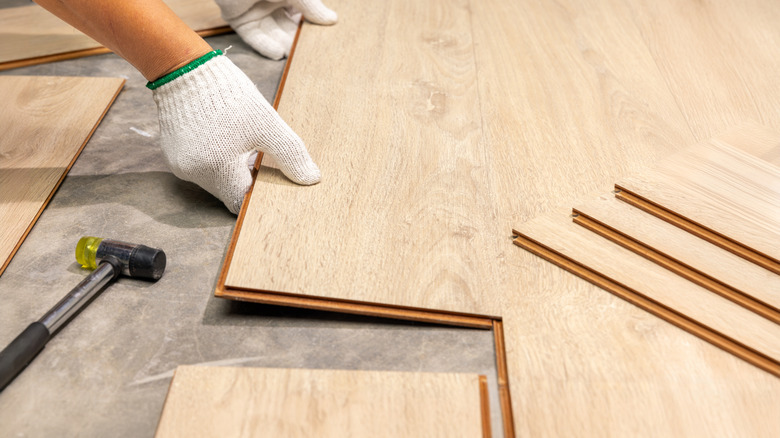
It's true that luxury vinyl plank (LVP) and laminate are practical choices. They're water-resistant or waterproof, easier to install, and often more resilient than real wood flooring. Plus, of course, they're cheaper up front. All of these factors combine to make wood-look flooring popular with landlords and busy families who don't want to deal with the higher maintenance requirements of natural wood flooring. Turner tells us, "As the market overflows with high-quality laminate flooring, 2025 could be considered LVP's peak year. And, there's a good reason. It's waterproof, doesn't have to be sealed, and is easy to install."
But people are starting to want more than soulless printed wood-like patterns repeated across their entire house. Turner agrees, saying, "Yet, homeowners are hankering for something more. Hardwood is sneaking back into the picture with a new outlook on the joys on incorporating natural materials into your home: Embrace the eco-movement, enjoy the patina, and let your floors age along with your house." Instead of fearing scratches and color changes, people are (rightfully) starting to celebrate patina or signs of aging as evidence of real life and quality. Turner says, "Homeowners and designers are becoming less afraid of working with natural wood flooring as buyers are more prepared to pay for homes decorated with materials from nature." A smart option is to be strategic in where you go for natural hardwood over engineered wood or LVP. You could, for example, limit LVP or engineered wood to high-traffic areas and rough zones that are subject to lots of mud and water. There are also a growing number of affordable hardwood flooring options.
The indoor-garden-on-overdrive aesthetic is starting to feel cluttered
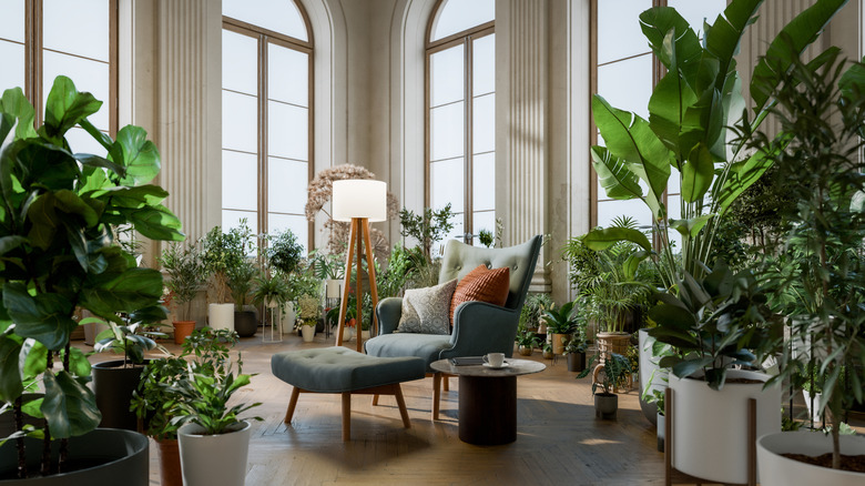
Houseplants can help make a room feel alive. And, during the pandemic, gave people something to care for. But the trend became all-encompassing, and a few strategically-placed houseplants became indoor jungles. A beautiful single aloe gave way to whole walls of pots or hanging vines. And it looks gorgeous on Instagram, but it's also very high-maintenance and somewhat chaotic when you're living amongst it. Turner agrees, saying, "Houseplants will always have a place in our hearts and our homes. But, in recent years the concept of having an indoor garden — a wall of potted succulents, a string of hanging pothos, or a room filled with greenery and grow lamps — has become popular."
She goes on to describe where she sees this trend heading. "As homeowners continue to embrace indoor greenery, they may not continue to push for the cluttered jungle feeling in 2026. An accent houseplant here and there will remain chic, but an overabundance of indoor plants will start to read 'hoarder' rather than green thumb." If you're choosing just a few plants for your space, go for something fairly low-maintenance, like aloe or a lovely jade plant. Or, go bang on-trend with the money tree, which is 1-800-Flowers.com's 2026 Plant of the Year. Keeping your plant collection small and well-considered makes maintenance much easier, letting you keep plants healthier with less effort, and reducing pest problems.
Exposed sound systems are feeling like a faux pas

The old-school look of big speakers, visible amps, and expensive audio equipment proudly on display saw a strange resurgence in the last few years. But visible tech is very dominant and, recently, this visual dominance is falling out of favor. House Digest's design historian says, "It was once the epitome of status for homeowners to show off their Bang & Olufsen speakers, dotted around the media room. But, as quiet luxury demands more market attention, designers are leaning into concealed sound systems." But the trend is moving back to understated quality, so you get great sound without the outsized hardware taking up loads of space.
Turner says, "A sound bar can be hidden in a cabinet (in fact, a whole TV can be tucked away when not in use). Flush in-wall or ceiling speakers make a quiet but powerful statement." And, if you're not quite ready for full-blown built-in audio systems, you can decrease visual dominance by choosing slimline sound bars or small wireless speakers. Or perhaps you can paint your speaker grilles to match walls or other accents. You can also keep cables tidy by running them through hidden channels or cable tidy systems.
Light wood overload is making way for darker, more exciting tones

The Scandi-influenced era of light oak floors, pale wood furniture, whitewashed finishes, and bright, washed-out interiors lasted for years. The pale colors were supposed to bounce light around and make spaces look and feel bigger and airier. These pale palettes were included in furniture, flooring, cabinets, tables, and accents. The problem is that when this is overdone, a room feels flat and samey, because it lacks contrast and texture. Turner says, "For many years, we've been telling ourselves (and designers have been telling us) that light wood reflects light, leading to a brighter and warmer environment. But, design journalists are all over the emerging trend of embracing dark woods."
We're not abandoning light woods altogether, though. But we are using them with more balance. Turner continues, "Whether it's in paneling, door cases, furniture, or flooring, it's becoming okay to get a little moody in your wood choices. This trend reemerged in 2025, but is sure to take off in 2026." She also recommends that you "keep an eye on your favorite TikTok tastemakers — they're sure to embrace rich, dark oak, mahogany, and maple. You can always test the trend with just one or two standout pieces. Maybe a dark wood sideboard or coffee table, rather than shocking your senses by redoing a whole room all at once. Turner says, "As a design historian, I've never been afraid of working historic pieces into my home, and rich, dark woods like rosewood, popular in mid-century Danish furniture, can add a depth and authenticity that simply can't be faked."