Step Aside Beige: The Neutral Paint Trend With More Character
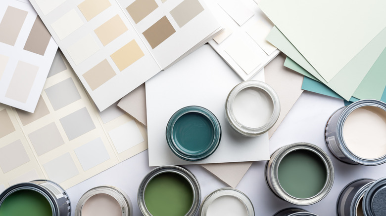
It seems there are two camps of people when it comes to neutrals. There are those who welcome the resurgence of tan and beige in the last couple of years, and those who cringe at the thought of '90s-ish, all-beige interiors. Warm creams, pale browns, tan shades, and beige hues have seen a return to our interior color palettes as folks crave more warmth and neutrality in their homes, creating a stark contrast to the previous years of drab gray. With this influx of toasty hues, some are growing tired of beige and ache for something more multifaceted, like khaki. In fact, khaki has been named Sherwin-Williams' 2026 color of the year, as an ode to comfort, simplicity, and style. Sue Wadden, director of color marketing at Sherwin-Williams, spoke to Homes and Gardens, regarding the brand's color Universal Khaki SW 6150, saying, "Khaki is more than just a neutral—it's a timeless, go-anywhere shade that brings a sense of grounded elegance to any space."
Some experts explain why khaki is preferable over alternative neutrals. For example, designer Mugdha Girish Uma of MGU-Design told The Spruce, "This color is absolutely versatile and is a great substitute for rooms where we want to opt for a different shade than regular off-white." However, not everyone is on board with the khaki paint trend. Some TikTok home influencers also express that the color is a cultural response to help us feel more grounded or connected to nature.
Gentle khaki offers elegance, warmth, and timelessness
Regardless of whether khaki is your preferred neutral, it's fair to say that the color provides a unique take on warmth in home design. Universal Khaki, for example, is described by Sherwin-Williams as an "earthy and timeless, mid-tone tan." While this is one take on khaki, the color can have many undertones, ranging from organic olive green to airy and creamy yellow. Knowing how to use the color khaki in your home can either provide your space with an earthy neutral backdrop or bring you more peace and tranquility. Sherwin-Williams suggests using the tone in common spaces, where neutrality could offer more comfort. However, experts note that considering lighting is important, as khaki can look different depending on lighting. For instance, pale khaki could be a good choice for rooms receiving ample natural light, while deeper green-gray khaki tones could be good in low-light rooms.
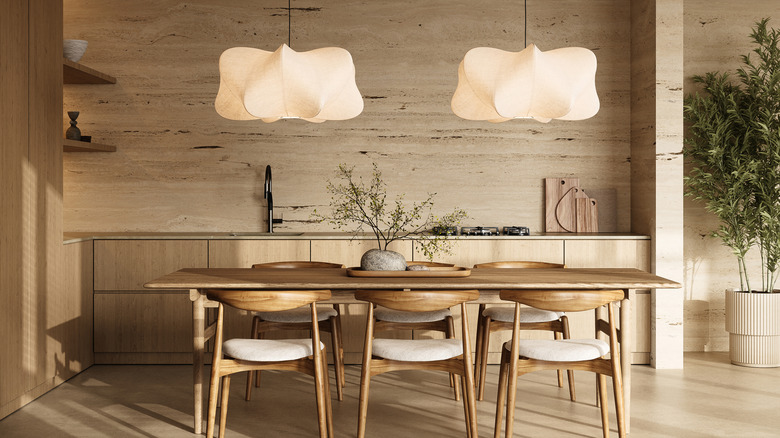
Those seeking a guide to using warm neutral paint colors in each room of your home should seek out the best material and color pairings for khaki. Green-toned khaki hues blend well with wood tones and brown colors. Alternatively, a sandy khaki color might look ultra-organic layered alongside taupe. When choosing materials, organic textures like leather, wood, tweed, and linen look lovely with khaki. And, in the kitchen, some folks recommend pairing khaki hues with Calacatta marble or russet-toned brick accents. Organic silhouettes and sculptural shapes can also enhance the cozy, natural appeal of khaki.