How To Use The Color Khaki In Your Home
A neutral interior design often feels effortless and relaxed, which is why many people gravitate toward this color scheme for their homes. But it's also easy for neutral color palettes to feel monochromatic and boring, especially when you don't know what you are doing. A good neutral color arrangement uses a variety of natural and earthy tones, according to Emily Henderson. These shades can be subtle or bold, but the variations are what make a space look more visually interesting.
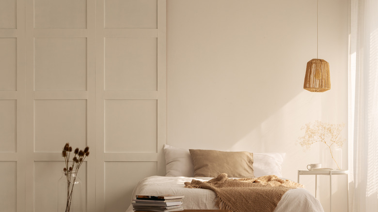
One neutral you should incorporate into your design is khaki. This classic shade is a warm neutral, and that will add some depth to your space. Khaki is an easy color to add and won't require a total renovation to achieve the look. But you should have a well-thought plan for using it in your home to give the room a cohesive look. Here's how to properly use the color khaki for a warm, neutral look.
Choose the right shade
Before you start redesigning your space with khaki, you should know that there isn't one tone through the name that may conjure a specific shade. In its most basic definition, khaki is a shade of brown with yellow undertones, says Art in Context. But this color can also appear closer to tan rather than brown as well as with olive green undertones. All of these shades are considered khaki, so choosing the right tinge for your home comes down to your taste and what style you're hoping to achieve.
All the shades of khaki tend to fall on the warmer side of the color spectrum, but keep the undertones in mind when choosing the color for your space. The undertones in the particular shade you go for will help you better choose a color scheme for the rest of the room. This will decide whether you're pairing the shade of khaki with other neutrals or going for bright colors.
Pair with bold colors
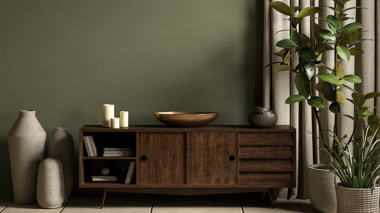
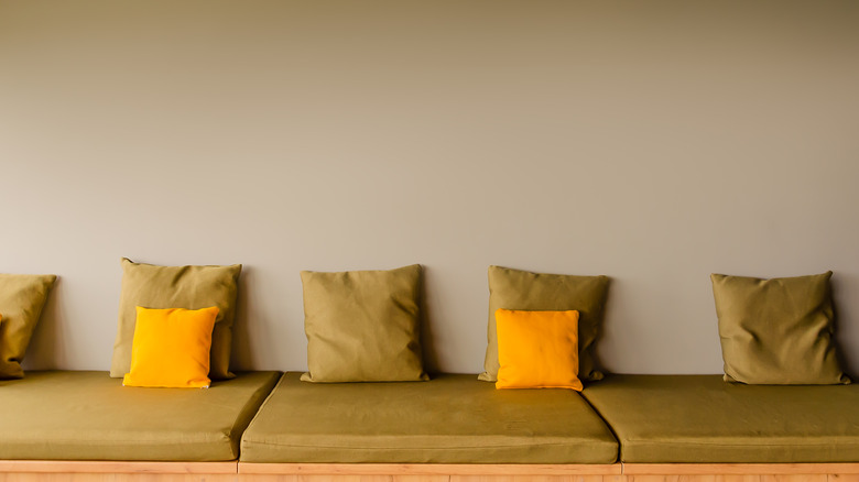
Because khaki is a neutral color, it can pair well with bold hues. So, if you aren't one to design your home in all neutral colors but still love khaki, you're in luck. Khaki pairs well with bold colors like turquoise, violet, and coral. You can mix up the shades and hues of these colors to be as bright and bold or a little more muted as your style can take. More sophisticated and classic combinations with khaki include a classic light blue, green, and deep brown.
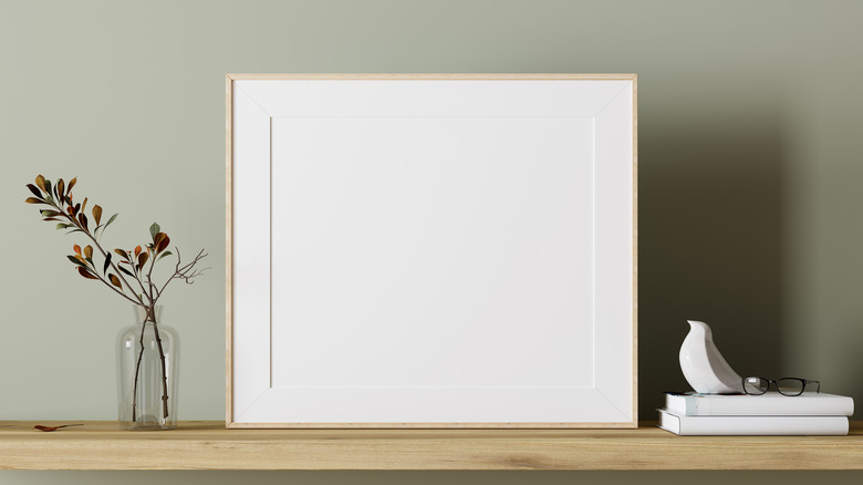
Try khaki walls with bright furniture to allow your décor to pop. Or you can make your furnishing feel warm by choosing a khaki finish. You can also use colorful accents against khaki for small pops of visual interest, says Vergara Homes. For example, go for shelves, picture frames, and lampshades against a khaki backdrop to make these colors stand out, or choose one main accent color that repeats throughout the room.
Combine with earth tones
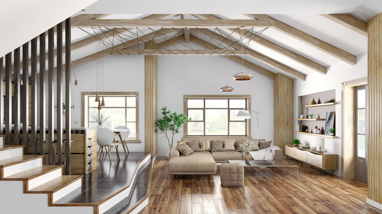
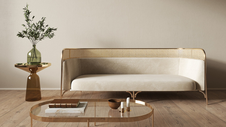
Khaki is a warm earth-toned shade that will pair well with other earth tones to create a cozy space. Using these tones in your décor is a great way to add color without it being too colorful or overwhelming. Earth tones are the perfect combination of colors and neutrals, which include reds, oranges, yellows, greens, and browns. And khaki falls somewhere between the yellow and green spectrum.
The great thing about earth tones and khaki is that you're able to add them throughout the home with ease. Rooms to Go suggest using a striking earthy tone for armchairs and sofas to make the furnishing stand out. Add khaki accents with soft textures like pillows, throw blankets, and curtains to reinforce the natural style that earth tones bring to the space. All shades of khaki will also pair well with wood finishes and furniture like coffee and side tables and shelves.
Go for unexpected accents
You can also incorporate khaki in permanent décor but as an unexpected accent. For example, most people opt to paint wall trims white or keep them the natural wood tone. But if you want something that will stand out, you may want to consider painting the baseboards and the trims around windows in a shade of khaki. If you do that, covering the interior doors in your home with new paint might be an even more excellent idea.
Khaki trim helps warm up the space more than a stark white. According to Sengerson, tan trim can highlight the woodwork in your home. This shade is also flexible, which allows you to change furnishings and color schemes while maintaining a cohesive look. Because khaki is quite uncommon, it can look upscale when customized with the right wall shade and interior styling. You should be sure to create contrast and choose a wall color that will complement the khaki trim but also ensure you allow both to stand out as their own accents.
Make it front and center
But, of course, if you love khaki, you can make it front and center and paint your walls this hue. It can't be overstated how great of a base color khaki is because it provides a neutral covering that pairs well with other tints and warms up a room. But the right shade of khaki can also be an interesting enough choice to stand on its own: The key to the perfect khaki room is choosing the right paint tone, which can be difficult. After all, it's a major decision and will probably become the forefront of your design.
Hey There, Home points out that paint colors can look different when it comes to lighting and other colors in the room, so it's important to keep that in consideration when choosing one. Before settling on a shade, line up a variety of nuances and take note of the undertones. Cool undertones will have hints of blue or green, while warmer khakis will have yellow or red tones.