2026's Official Paint Colors Of The Year (& Tips For Trying Them In Your Space)
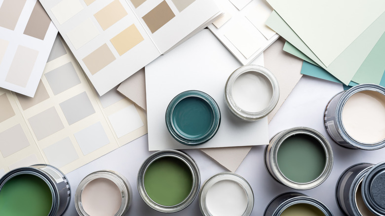
The new year has begun, and a whole host of new color trends have been ushered in with it. If you're searching for paint color inspiration, the biggest brands have announced their picks for 2026. Some shades are surprising, while others have been predicted by top designers. When observing the array of selected shades, one thing is clear: earthy design isn't going anywhere anytime soon.
After a wave of desaturated minimalism, the pendulum swung towards bold, unapologetic color schemes. The design world has finally settled somewhere closer to neutral, without sacrificing the rich depth that maximalism was praised for. This year is putting a moody twist on classic neutrals, staying close to nature without the desaturated look. The hues are natural but refined, reflecting 2026's biggest material and furniture trends. Whether you are looking for a new paint color for your living room, dining space, or bedroom, these 2026 colors of the year are calming, inspiring, and down-to-earth.
Universal Khaki by Sherwin-Williams
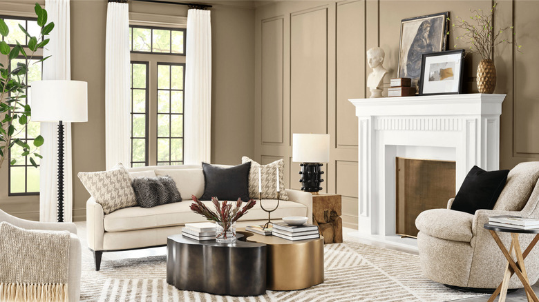
Sherwin-Williams selected Universal Khaki as its Color of 2026. More yellow than green, this variation of khaki is easy to combine with a wide range of shades. Sue Wadden, the company's director of color marketing and trendsight team leader, says in Sherwin-Williams' announcement that "Universal Khaki is the easygoing neutral that makes every room feel put together." It is also described as timeless and an ideal backdrop for pops of color.
Universal Khaki has "universal" in its name for a reason — it goes with almost anything. However, Sherwin-Williams curated a specific selection of shades that complement it perfectly. For the most part, the complementary colors lean warm, including Lemon Chiffon, Henna Shade, and Dark Auburn. There are two cool tones on the sheet: Tarragon and Watery. While some of these shades are bold, they are all rooted in natural hues. Sherwin-Williams' inspiration photos showcase Universal Khaki as an all-over paint color for the dining room, and an upper-cabinet color for the kitchen. This is definitely a kitchen color trend we are eyeing for 2026.
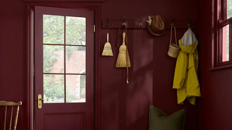
Silhouette by Benjamin Moore
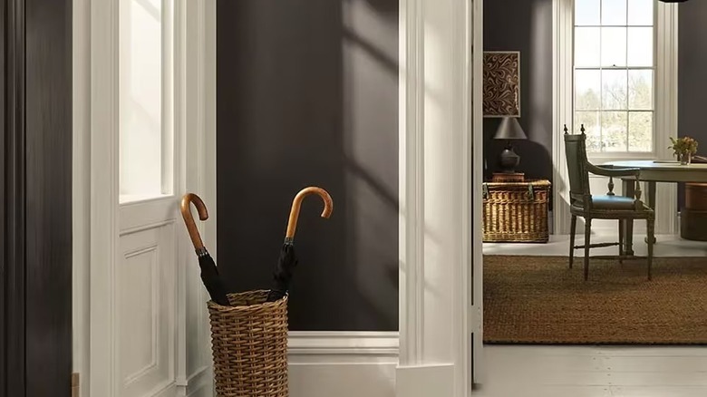
Described as a mix of traditional and poetic, Silhouette by Benjamin Moore is a neutral that still makes a statement. Like many colors on this list, it lies somewhere between a warm and cool tone. Although it appears like a true charcoal at first glance, it has noticeable touches of burnt umber. There has been a lot of debate over whether gray is going out of style, but Silhouette is the perfect example of how you can reinvent a past trend to suit a current space.
If you still have millennial gray elements peppered throughout your interior, Silhouette offers the perfect opportunity to modernize your space. It will blend effortlessly with cool-toned neutrals. Benjamin Moore also recommends mixing Silhouette with calming shades like peachy First Crush, mauve-toned Batik, and blue-gray Raindance. These soft colors will balance the moody appearance of Silhouette while maintaining the refined, muted atmosphere. Try drenching your entryway or guest bathroom in Silhouette for a daring yet delicate approach. Keep in mind that it also creates a beautiful juxtaposition against light wood floors.
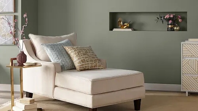
Hidden Gem by Behr
Hidden Gem by Behr isn't blue or green; it's a mature, muted jade. Like other trending colors, it looks saturated without appearing overly dramatic. It's a stunning, balanced shade that Behr describes as having "an air of mystery and sophistication." The endless juxtapositions make Hidden Gem ideal for an array of different interiors. It can lean classic or modern, depending on the surrounding decor.
When selecting the best surrounding shades, Behr recommends soft pastels to boost rather than compete with the muted peacock color. Colors like Mocha Ice and Iced Copper will balance Hidden Gem with their understated, pastel look. You can also create a trendy, monochromatic color palette with similarly cool mid-tones like Dragonfly or Watery. Hidden Gem is tranquil yet confident, making it the perfect choice for bedrooms or bathroom walls with natural elements.
Cloud Dancer by Pantone
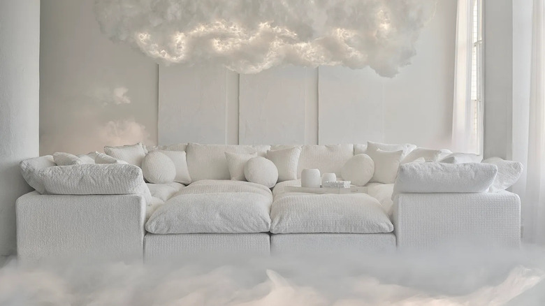
Perhaps the most controversial Color of the Year, Pantone's Cloud Dancer has been dismissed as a "non-color" by critics online. Designers and homeowners look to Pantone as the ultimate paint color authority, and many interior enthusiasts felt like this year's announcement was a letdown. However, Pantone describes their selection as "a symbol of calming influence in a society rediscovering the value of quiet reflection." It is supposed to be the foundation for innovation, giving creatives the ability to design around a light, relaxing base.
Pure white is a home trend you should avoid falling for in 2026 — but Pantone proves that white doesn't have to mean harsh and bright. The correct application of Cloud Dancer is through foggy, muted off-whites. It's important to differentiate this 2026 tone from the builder-grade white of years past. This shade has been refined to the point where it contains visible nuance. Pantone recommends pairing Cloud Dancer with both pastel and shadowy hues. Practically any color will create a beautiful sense of contrast next to this white. Consider shopping for ivory sofas and billowy, off-white textiles. Use this color in any area that is begging for a fresh start.
Iron Gray by James Hardie
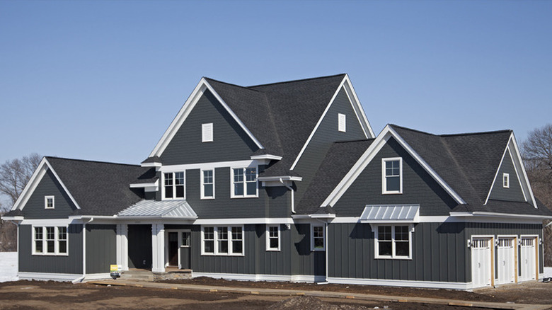
Although it could be compared to Silhouette by Benjamin Moore, Iron Gray by James Hardie leans even cooler and more classic. But even in its cool, dark intensity, Iron Gray is reminiscent of aged metal, tying it back to the earthy trend. James Hardie was inspired by the color of iron doors throughout ancient European cities, once again proving that gray can be classic and timeless with the right shade.
Because James Hardie is an exterior paint brand, this color is intended to be used on the outside of your home. There are several ways you can make the most of this deep, metallic shade. Per the suggestions on James Hardie's website, you can combine Iron Gray with white trim or use it as an accent color in hardware or lighting fixtures. The brand specifically recommends pairing their color of the year with Arctic White for a bold, neutral duo.
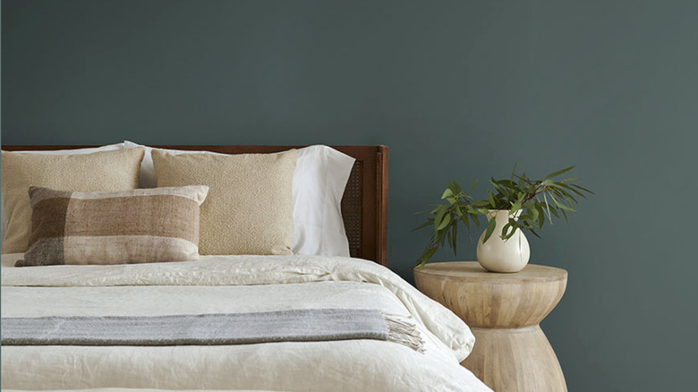
Warm Eucalyptus by Valspar
It doesn't get earthier than Warm Eucalyptus by Valspar. If you liked the idea of Universal Khaki but you're on the hunt for something greener, this is a stunning shade to consider. Although it has cool undertones, the "Warm" in its name describes the way the color makes you feel. Sue Kim, Valspar's director of color marketing, perfectly explains the 2026 mentality in Valspar's Color of the Year announcement: "In the coming year, we will redefine our notion of neutral hues. Going beyond the classified color term, neutral refers to colors that set a grounding and inviting mood with the warmth that calms our senses."
When it comes to coordinating colors, Valspar recommends pairing Warm Eucalyptus with two key hues: Groundbreaking and Degas Blue. The company says that these colors "bridge the natural world from ground to sky" when paired with Warm Eucalyptus. In one of its inspiration images, Valspar featured a bedroom with Warm Eucalyptus walls, a taupe bed frame, and a light blue quilt. This combination of three earth-inspired colors is evidently popular for its timelessness and serenity.
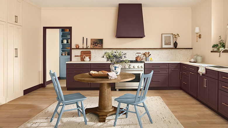
Warm Mahogany by Glidden
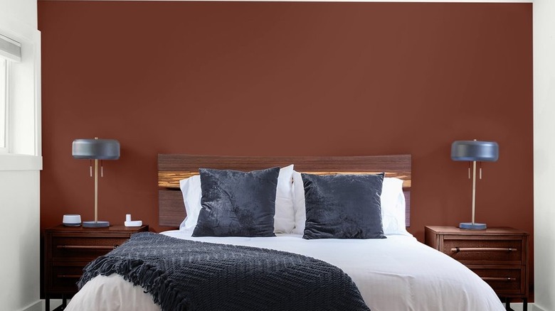
You might remember Pantone's Color of 2025, Mocha Mousse. This pick marked the beginning of a year of medium and deep brown interiors. However, Warm Mahogany by Glidden is proof that brown isn't going anywhere anytime soon. Warm Mahogany has a much redder shift, showcasing the move towards more dramatic variations of neutrals. Although it lies somewhere in between woody brown and clay red, Glidden's Color of the Year announcement labels it as "a rich, grounded red that's bold enough to draw immediate attention and reserved enough to make a timeless statement."
If you already have lots of brown-toned, wooden furniture, don't write off Warm Mahogany just because the shade falls into the same family. When it comes to the right way to embrace the brown furniture trend, reddish brown walls can actually elevate your space. However, keep the finish glossy to avoid a cave-like atmosphere. Glossy mahogany walls can create a rich and classy ambiance, especially when paired with traditional furniture.
Divine Damson by Graham & Brown
Divine Damson by Graham & Brown is a fig-inspired shade of deep purple-red. The brand writes that the shade "shifts gently with the light, revealing hints of mulberry and garnet" and that it's "perfect for adding drama in a subtle, yet liveable way." This color proves that bold, moody tones can also be cozy and welcoming. With its rich, velvety depth, Divine Damson is a versatile choice for both statement walls and intimate interiors. This shade fits perfectly with the bold and glamorous design trends you'll be seeing everywhere in 2026.
Graham & Brown has detailed a specific set of instructions for homeowners interested in applying this shade. The brand explains that the richness of the pigment demands a certain finish, which is why it's only available in ultra-matte and semi-gloss; it will gradually dry down to its true depth. It also suggests pairing the color with its wallpaper of the year, Eternal Weave. This will create a vintage-inspired atmosphere, ideal for more opulent homes. As a complementary paint color, consider the pale yellow-green shade, Wild Rye.
Epernay by C2 Paint
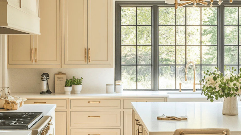
As we move past beige and white, this creamy color is taking over interiors. Epernay by C2 Paint allows you to escape to the French countryside with a champagne glow. Named after the capital of the Champagne region itself, Epernay is a cottage-core dream. Inspired by warm, sunlit stone, this shade lies somewhere in between neutral and pale yellow. If you're starting to stray away from white, but you still want to keep your home bright, this is a radiant alternative.
If you've been hunting for the best kitchen cabinet colors, C2 Paint showcases Epernay in a transitional kitchen with gold hardware and creamy white countertops. It is an ideal color to consider if you want to brighten your space by creating the illusion of increased natural light. C2 Paint suggests Parador, a cooler stone-inspired shade, for areas like window trim and other accents. This combination also pairs beautifully with natural textiles and live greenery.
Melodious Ivory by DutchBoy
If you love the idea of a warm, creamy neutral but Epernay is a bit too saturated for your taste, consider Melodious Ivory, DutchBoy's Color of the Year. The shade works well with both traditional and modern finishes, without overpowering the space. It is also easy to incorporate if you already have a well-defined interior. DutchBoy advises using it in spaces with handmade elements for a nostalgic feel.
Because it is a soft, neutral tone, there are endless ways to use Melodious Ivory in your home. In the kitchen, DutchBoy recommends using maroon-toned Old Chaparral on the cabinets to contrast Melodious Ivory walls. For a cool-toned touch, consider Blue Laguna as an accent shade. Melodious Ivory also works as a beautiful exterior color, pairing well with organic colors like the sage green Cypress Garden. Natural hardwood floors will make Melodious Ivory look ultra-inviting.
Cactus Valley by California Paints
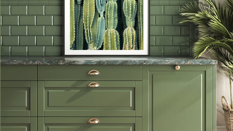
Last but not least, we have Cactus Valley by California Paints. This is one green paint shade that won't scream millennial cringe. On the website, the color is described as "inspired by desert landscapes and garden greenery." The brand also writes that its choice reflects the growing shift towards nature-inspired spaces. Although it is a serene shade, the mid-toned green can also breathe life into your space.
According to California Paints, Cactus Valley is best paired with rich teals and deep mauves. Jewel tones can also help prevent your home from looking too boho. Alternatively, if you unapologetically love the California-inspired, boho look, Cactus Valley will effortlessly complement lots of woods and wicker furniture pieces. The shade will transform depending on its surroundings. Even beyond 2026 trends, this is one of the best green paint colors if you want a vibrant home that still feels calming.