12 Of The Most Stunning Victorian Home Color Combos
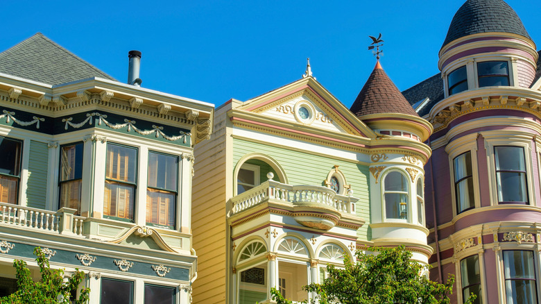
Victorian style houses can be a great source of inspiration for those who love colorful homes. The era, which lasted from 1837 to 1901, saw the use of more color in architecture because synthetic pigments started to be more widely produced. Victorian properties' use of color plus their ornate details lend themselves perfectly to creative palettes. Whether it's an ivory with forest green or a multicolored mix of mauve, pewter, yellow and white, the right combination can bring these buildings to life.
Some architecture from this era, such those in the Italianate style, can look perfectly elegant in a simple two color palette. Others, such as Queen Anne style Victorian homes that have large amounts of specialized trim and ornamentation like balusters, garlands, and brackets, may benefit from a combination of more hues to highlight the numerous details. Some restorers of these architectural wonders may prefer a historically accurate choice of hues, while others may be willing to take a more creative approach. Either way, there are plenty of stunning exterior paint schemes that have serious curb appeal and can make a Victorian structure stand out from the crowd.
Powder blue, butter yellow, and brick red are historically accurate
As a pastel color, powder blue provides historically accurate Victorian charm. When combined with cream or butter-yellow trim and architectural elements like window frames, columns, and dentils, the entire structure seems to glow. Brick red elements in the tower and on the front step risers add additional contrast to make the home's unique details stand out.
Lime and olive green with burnt orange offer playful contrast
Historical Victorian homes can pull off bright exterior paint combinations that you'd rarely see in modern neighborhoods. Yellow or lime green are well complemented by burnt orange trim and a prominent, deeply sloped roof in a shade of olive green. With the building outlined in burnt orange, the green of the siding stands out from the surrounding vegetation while the natural color palette helps it blend organically into the landscaping.
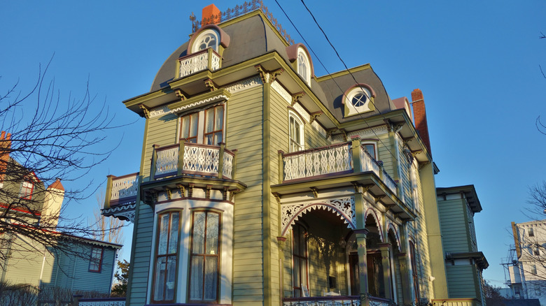
Green with butter yellow and burgundy is unexpectedly refined
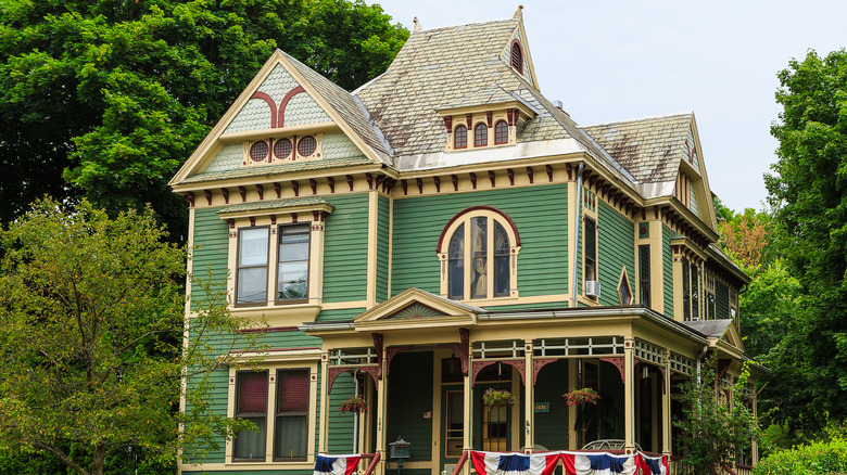
The number of architectural details on Victorian buildings lends themselves to a multicolored combination rather than the typical 3-color home exterior paint palette limited to siding, trim, and door we expect from modern houses. These properties can easily pull off emerald green paint with creamy yellow trim and decorative accents in burgundy, such as brackets and lattice work to an elegant effect. Add a pale green hue to the decorative shingles above the roofline and the look is complete.
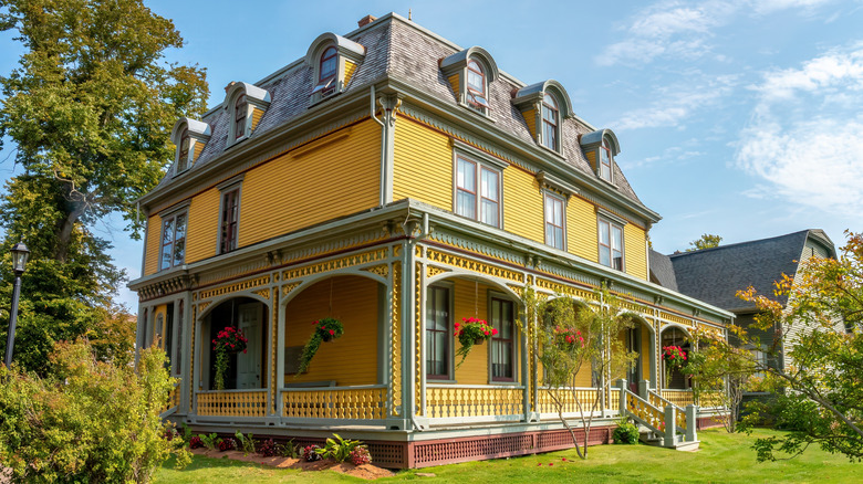
Yellow and terracotta with black offer a bold impact
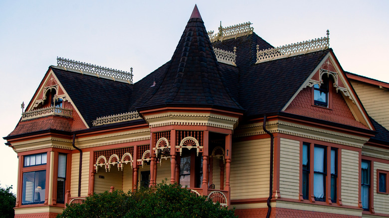
Another inspiring pairing rooted in history for Victorian homes are the earthy colors mustard yellow and terracotta. Mustard creates a warm hue for the siding, while terracotta creates a strong contrast on decorative shingles, trim, and columns. When a black roof features prominently in the building's architecture, matching black accents help to dramatically define gutters, downspouts, and window frames.
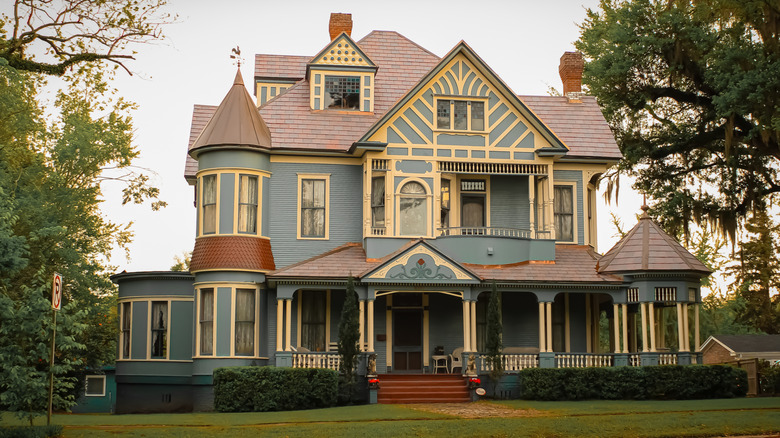
Mauve with pewter, yellow, and white make a whimsical impression
While it's rare that more colors are better when it comes to exterior paint, on a Victorian home a multicolored palette can turn into a visual masterpiece. Pastel hues were popular in the hay day of this historical architecture, and a combination of mauve siding with yellow and baby blue accents turn a house into a multidimensional work of art. Slate gray column bases, baluster rails, and decorative shingles, along with white trim add visual interest to the building.
Ivory with forest green and terracotta highlight traditional details
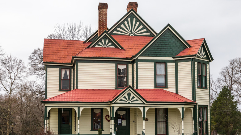
Ivory might look boring on a contemporary suburban home, but as a traditional choice on a Victorian building combined with contrasting trim, this off white hue can make an impact. Forest green makes a beautiful choice for the architectural details, especially when a terracotta roof is thrown into the mix. These hues are particularly effective on one of the most charming elements found on houses of this era — a stylized sunburst.
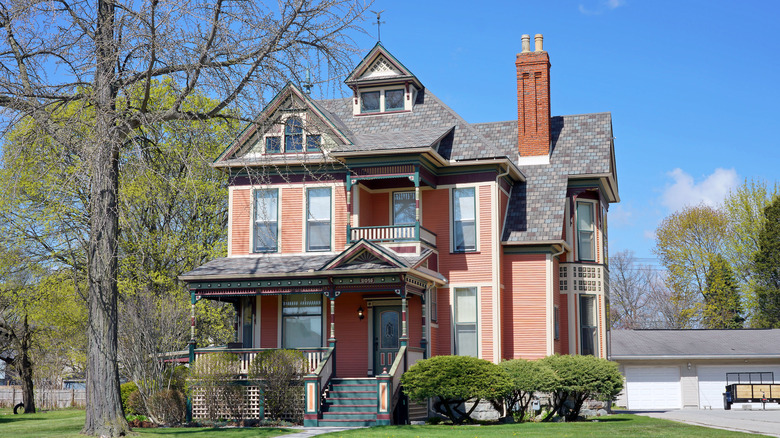
Bubblegum pink with white create a charming palette
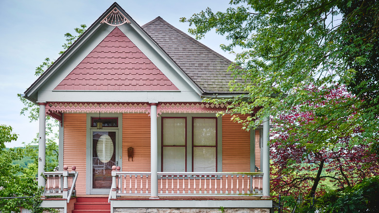
When we think of Victorian architecture we may imagine two or three story buildings with towers. But there are also quaint, one-story houses with the same decorative details from this era. They're known as Folk Victorian homes — and they were more affordable to those who didn't have access to mansions with turrets. Small cottages with decorative shingles and ornate running trim are adorable in bright, bubble gum pink for some serious vintage charm. White trim and columns frame the rosy hue perfectly. A rich crimson adds definition to the window trim.
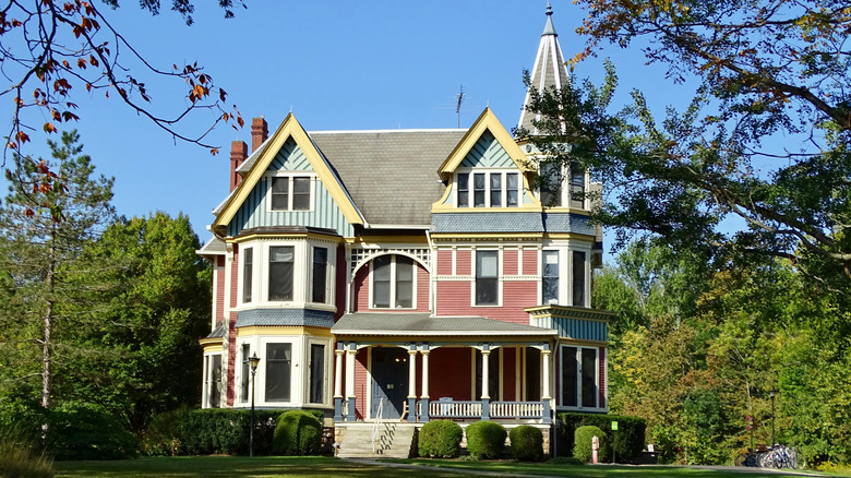
Sunshine yellow with avocado green and mauve will brighten up the block
Sunshine yellow is a cheery hue on a Second Empire style Victorian home. The same paint choice can be used to accentuate the dormer windows that punctuate the mansard roof. While many different hues could be chosen as accent colors, in some cases white makes a lovely choice — especially when a bold shade like mauve provides further interest on latticework and window frames.
Teal and brick red with mustard yellow are a nontraditional delight
While teal may not be among the most common traditional colors for a Victorian home, this is nonetheless an eye-catching selection. Brick red provides a complementary hue for this shade of blue-green, making an excellent choice for lattice work, window frames, and the siding below the roofline. Meanwhile, a third shade added to the combo, mustard yellow, illuminates window frames, trim, and additional architectural details to complete the look.
Ivory with mustard and brown creates understated intrigue
Of course, a historical house doesn't have to be painted in bright jewel tones to stand out on the block. Some Victorian architecture benefits from a more subtle color combination, such as ivory with mustard trim that includes the bracketed eves. The delicate touches of brown help ground the palette. The secret sauce in this combo is a warm-toned ivory, which is an exterior paint that helps the home and garden feel more cohesive.
Salmon, petrol blue, purple, cream, and gray come together harmoniously
When it comes to choosing exterior paint for a historical house, salmon provides a muted alternative to pastel pink. Alongside petrol blue and purple accents on the front step risers and running trim, the effect is unexpectedly harmonious. Cream and gray finish off details like columns and balusters. You might think that this many different hues would be overkill, but actually you can do more justice to the building's architectural elements when selecting outdoor paint colors for a Victorian home with a palette of up to 10 hues.
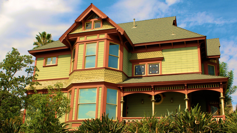
Choose avocado green with brown and cream for a traditional palette
Shades of green are among the exterior house colors that can make a home look more inviting. Avocado green in particular makes a lovely choice for a Victorian era property, particularly when paired with brown accents such as interior window frames and hand rails. Cream looks great on balusters and framing dormer windows. The overall combination mellows the decorative elements of the architecture. And those hoping for historical accuracy will be pleased to know this earthy palette is a traditional choice.