The Bold Dining Room Color George Washington Used In His Mount Vernon Home
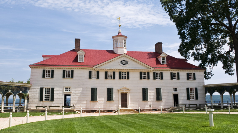
With the 250th anniversary of the founding of our nation happening in 2026, many people are making plans to visit historic sites as a way to celebrate. Some are even planning to see the many lavish homes of former presidents, specifically the founding fathers. And one of the most famous of those homes is, of course, Mount Vernon, George Washington's mansion.
While touring, you might expect to find colonial wood furniture, antique china, and rooms filled with muted colors, right? Surprisingly, no. Some of the most popular paint colors of the time were extremely bright and George Washington's dining room is the perfect example of this colonial trend. If you find yourself touring Mount Vernon this year, you might be surprised to find George Washington's dining room is painted with a striking copper-based pigment called verdigris green.
Contrary to what many of us may think, the founding fathers were into bright colors. Historians are discovering the muted hues we thought were popular for interior design during the late 1700s were actually too faded to tell their true color. Thanks to modern technology and new information, we are now finding out that these paints likely just oxidized and faded in vibrancy over the years. Some of the shades that were all the rage for colonial interior designs were vivid colors like blood red, emerald green, and Prussian blue. Often these paint colors were also extremely expensive. Like today, some of the most popular designs were limited to the wealthy. So, George Washington's verdigris green dining room wasn't just fashionable for the period, it was also a display of his wealth and refined taste.
Why George Washington chose verdigris green, and how to use it in your home
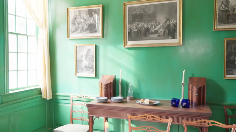
So, why such a vivid green for the dining room in Washington's home? Besides being a popular color for the time period, green was thought to aid in digestion. Washington once wrote, verdigris green was "grateful to the eye" and less likely than other colors to fade. He even had the walls of the dining room "glazed" in an effort to make the color more vibrant. Talk about commitment. It makes you wonder what Martha thought about the room.
Whether you've decided to celebrate the nation's 250th by dedicating some of your decor to 18th century American style trends, or you just love the color verdigris green, there are many ways you can use this bold color in your own dining room without feeling like you're in the Wizard of Oz's chamber.
There are a couple of things to consider when painting with a bold color like verdigris green: how bold do you want to go, how committed are you to the color long-term, and whether it will blend with the rest of your home's design?
If you like this shade of green, but don't necessarily love it, the easiest way to include it in a dining room design is to use it as an accent color. Find a large piece of art with verdigris green as the main color, choose pottery this color for a china cabinet, or add drapery in the shade for a pop of color. If you want to be as bold as Washington, but not too over the top, you could use it as the background color of a gallery wall. Talk about old-world glamour!