The Color Combo You Thought Was A Classic Is Ruining Your Space
Few things are more disappointing than a "fail-safe" design choice falling short of your expectations. You pick a classic color palette recommended by all the experts, only to realize it just doesn't work in your space. Speaking exclusively with House Digest, Sue Kim, director of color marketing at paint brand Valspar, identified one such problematic palette. "A classic color combo that can sometimes ruin a space is red, black and white," Kim said. "While this pairing is bold and memorable, it often creates a stark, high-contrast environment that can feel harsh and overwhelming in residential interiors," she continued.
Red may be a trending paint color, but Kim explained that it can look downright unsettling when paired with white and black. "The intensity of red against a crisp white can dominate a room, making it difficult to relax or feel comfortable while the addition of black elevates the discomfort." According to Kim, this pairing creates a commercialized effect, evoking the vibe of a fast food restaurant. Needless to say, this doesn't fit in well with the cozy goals of residential design.
Red, black, and white kitchens are a good example. "[The] color combination recalls a vintage kitchen or diner where the busy, vibrant atmosphere infuses fun into the gathering space," Kim said. "However, with the current open floor plan prevalent in many homes, the result can make the kitchen uninviting and clash with today's materials and tones in wood and tiles." Thankfully, homeowners who love this color combination can still make it work — all it takes is a good strategy.
How to make red, black, and white work in your home
There are a few sneaky ways to make this color combo work for those who are truly married to it. In an exclusive interview with House Digest, expert Sue Kim said one way to pull it off is to use red as an accent color. "Limit red to small accessories [such as] pillows, artwork, [and] vases against a predominantly white backdrop," she said. Or, pick a focal point for the color combination, such as an accent wall, instead of committing to the full room.
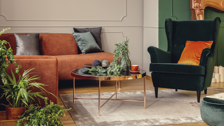
There are many creative ways to incorporate red into your home decor without creating visual chaos. One option is to choose softer shades of red, such as brick or terracotta, to create a more subtle contrast, Kim suggested. Alternatively, homeowners can warm up the space by opting for neutral shades and earthy textures such as wood. "Without careful use, the combo can quickly feel dated or overwhelming," she said.
How to choose the right color combination for your space

When choosing a color scheme for your home, it's important to consider the overall effect, said Sue Kim in an interview with House Digest. "Think about the bigger picture of the space and how colors will enhance or hide features in the room, the feeling you would like the space to convey and how the room will be used," she advised. High-contrast color schemes infuse a room with energy, while pairing similar shades will evoke a more relaxed atmosphere. It's important to choose carefully, as colors play a large role in the overall mood of a space.
"Undertones play a big role in achieving harmony," Kim said. "All colors should share either a warm undertone or a cool undertone to create a cohesive, well-balanced look." If you're unsure, this easy test will help you determine the undertone of your paint color. "Start with a color that strikes the right balance between personal expression and livability in the space," she said. Then, determine the undertone, pick a complementing shade, and voilà, your color palette is established.
Before you bust out the paint roller, testing the colors is absolutely essential. "Natural and artificial light can dramatically affect how colors appear," said Kim. The color palette you see on Pinterest may look completely different in your home, depending on the primary light source in the space.