The '60s Decor Trend That's Making A Comeback (And How To Snag The Look)
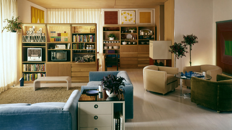
There are a few things to keep in mind when styling a home with mid-century modern decor, including your color palette. We're seeing a return to color palettes reminiscent of '60s earthy tones, albeit in a slightly different way. The 1960s saw an influx of earthy colors, from Harvest Gold to lush green, which spoke to the craving for calm and connection to nature in the postwar years. In an exclusive statement, Sarah Stafford Turner, an architecture and design historian, curator, and editorial board member for the Journal of Design History, told us "Neutral colors like gray, olive, beige, and taupe aligned with the dignified, utilitarian aims of mid-century modernism, though toward the mid-1960s we begin to see colorful accents, like lamps, rugs, and armchairs in teal, orange, and yellow." Today, we're seeing these '60s colors coming back into rotation, although they are less muted and muddy.
"Earthy vibrancy," a term coined by The Brownstone Boys, designers Barry Bordelon and Jordan Slocum, is paving a new path for today's earthy color palettes, as reported by Good Housekeeping. These color palettes are richer, more saturated, and often more grounded than the hues of the '60s. Think deep burgundy over burnt orange, a spiced brown instead of a warm chocolate, or olive green rather than avocado green. While you might choose more playful colors to decorate with for a '60s aesthetic, today's interpretation feels moodier and more vibrant.
How to weave '60s earthy tones into your color palette
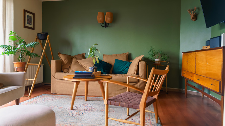
Earthy colors will likely always have a place in home design, acting as a classic staple to implement in nearly any situation. But an entirely earthy color palette isn't always trending, so how do you put this look into practice without going dated? Start by choosing one or two '60s-inspired earthy tones to introduce to your palette. For example, warm ochre or deep clay tones can replace cooler neutrals like sand or pale beige. Or, you might swap tired sage green for a deeper, more evocative color like olive green. You can weave these colors into your palette by making small changes, such as painting kitchen cabinetry or adding accent pillows or furniture. Also, focus on layering natural materials that utilize this earthy color palette, like rich spiced leather accents or vivid wooden heritage pieces. You can also consider bringing earthy tones to your home decor through rich and gorgeous color combos, like pairing a dusty pink terracotta with a rosy and rustic brick.
The key is choosing earthy colors with warm undertones and a richer saturation. You might also consider colors with a darker shade than the lighter hues of the 1960s. Other colors to look for include golden yellow, creamy off-white, or dark oceanic blue. You might express these colors through textiles like rugs or drapery, or consider furnishing your space with warm metallic fixtures and accents. And, while earthy palettes can work for nearly any style, it can be beneficial to take inspiration from Mediterranean, Scandinavian, or modern heritage designs.