15 Colors To Decorate With For A '60s Aesthetic
The '60s were a decade famous for technological and societal advances, so it's no surprise that interior design was also drastically changing. Homes became more colorful and graphic in the '60s with the influence of discotheques and hippie culture. Life was shifting from an emphasis on sticking to traditional ideas and concepts to emphasizing self-expression, and interior design and home décor are where people began to express themselves. Interiors became more vibrant in color and reflected the individuals living in the home.
Retro Planet explained some of the popular trends in interior design and décor during the '60s. The colors used in homes were often based on nature, including shades of greens and blues. These shades were often paired with warm colors, such as yellows, oranges, reds, and pinks. Bright and metallic statement accent pieces were used in homes along with vibrantly colored art. Floral designs and mismatched patterns often accented the bold colors used in homes to create a colorful and inviting space. By using these colors and design elements, you will be able to create a '60s aesthetic in your home.
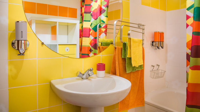
1. Light yellow
'60s aesthetic leaned heavily towards warm colors, often using light yellow as an accent or focal point in a room. Warmer colors were often featured in patterned quilts or pillowcases to bring that pop of color to a space.
2. Mustard yellow
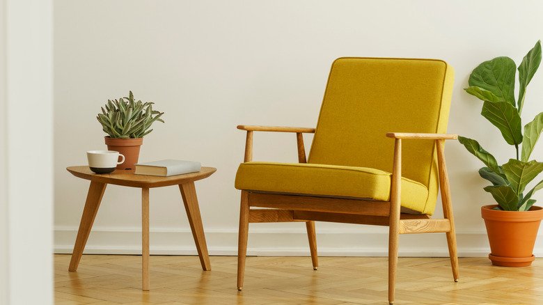
A popular color in the '60s that has been making a comeback in modern design is mustard yellow. This deep yellow color works great with many other colors but is lovely used for a stand-alone furniture piece as well.
3. Fuchsia and pinks
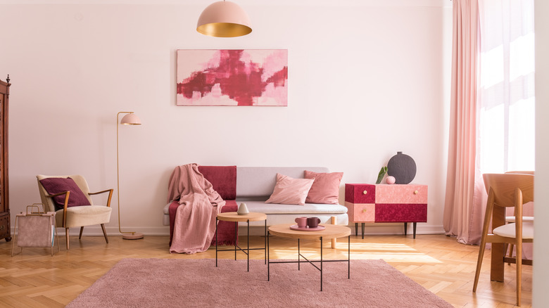
Fuchsia is a common color used to create a '60s aesthetic, often paired with light pink tones. Pinks were seen used in statement pieces and home décor as well as fashion in this decade.
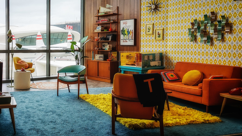
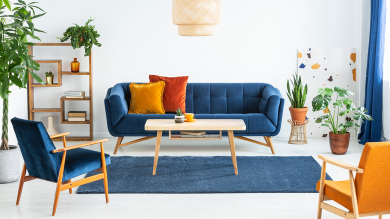
4. Orange tones
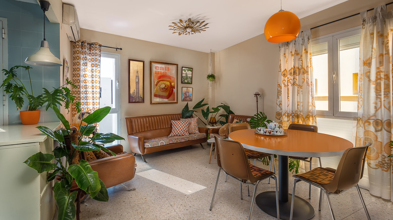
One of the most commonly used colors of '60s design was orange. Whether it was featured in the furniture, lighting, or accent pieces, orange was everywhere in the '60s.
5. Mismatched patterns
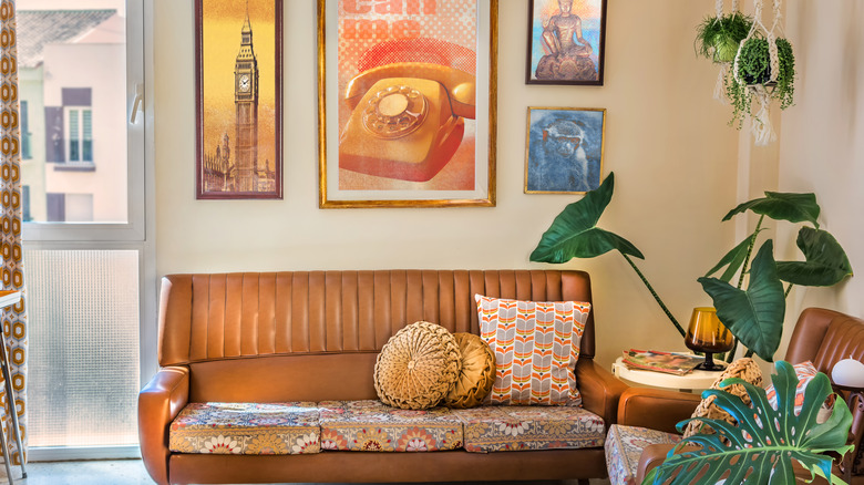
From the influence of hippie culture came the design trend of mismatched patterns. You would often see mismatched patterns in '60s homes, such as floral patterns alongside stripes.
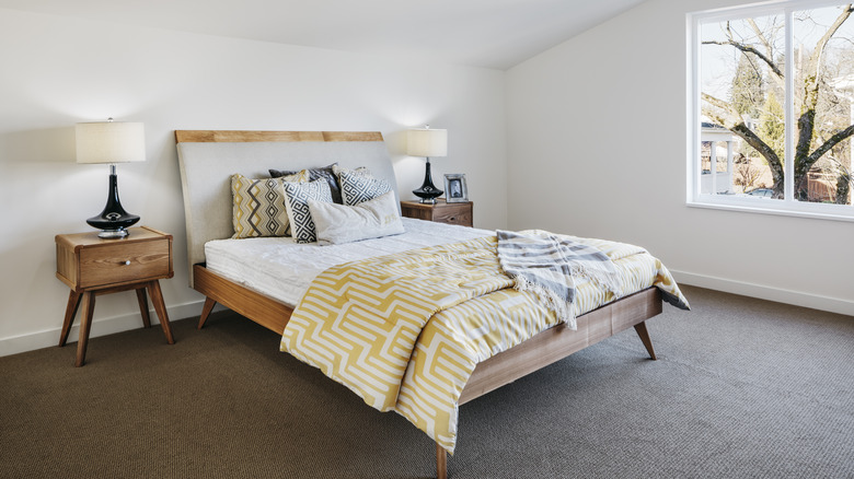
6. Wood tones
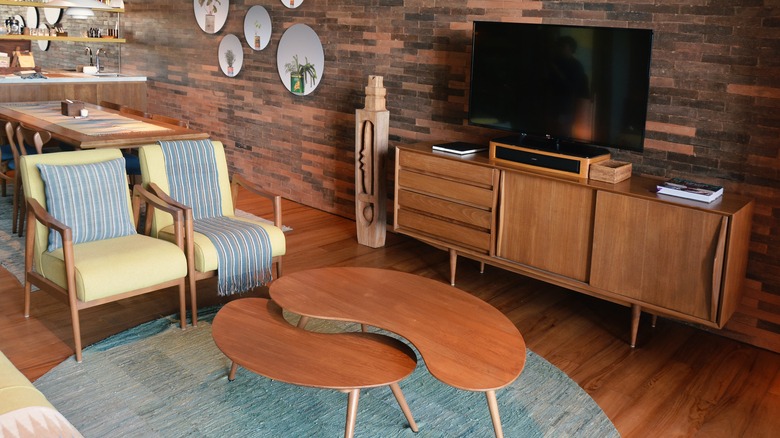
A classic design feature of the '60s aesthetic is wood furniture. Whether the furniture matched wood tones or featured contrasting tones, wood was a crucial element of home design in the '60s.
7. Neon colors
With a societal shift to focus more on self-expression, it's no surprise that bright and neon colors rose in popularity in the '60s. Common neon colors that were seen in homes were yellow, orange, and green.
8. Bright red
Sticking with the trend of warm colors, red was often featured in '60s homes. Red furniture and décor paired wonderfully with the other popular warm colors such as yellows and oranges.
9. Avocado green
Avocado green décor pieces were often seen in '60s décor. This color paired well with the other popular colors of the time, including yellow, orange, and blues.
10. Light green
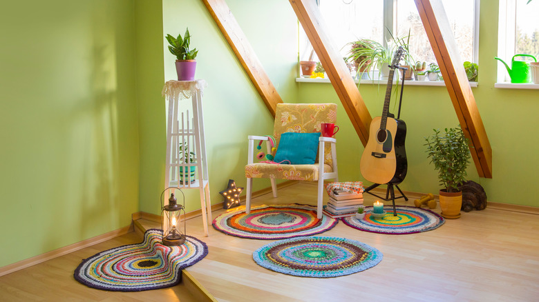
Light green was another popular shade of green in the '60s. This tone was often seen in kitchens and used to paint walls, especially in an interior design inspired by hippie culture.
11. Primary colors
The '60s introduced a trend of pairing together primary colors, red, yellow, and blue. These colors work well together in design because they are complementary to each other.
12. Blueberry
Blueberry was a color often seen used for furniture and décor in the '60s. This color was used to complement the popular warm colors of the decade.
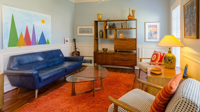
13. Dark blues and greens
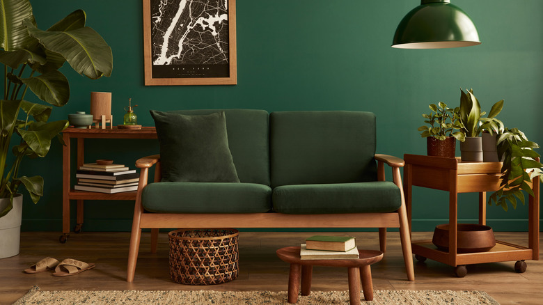
Continuing with the trend of blue colors, deep blues and greens were also popular in the '60s. These deep tones were often paired with wood to create a moody and sophisticated feeling in a room.
14. Black and white
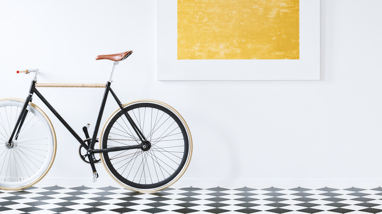
Contrasting colors were often seen in '60s design, especially blacks with lighter colors such as whites or neutrals. This design concept is often seen in checkerboard flooring, which is still popular today.
15. Metallic tones
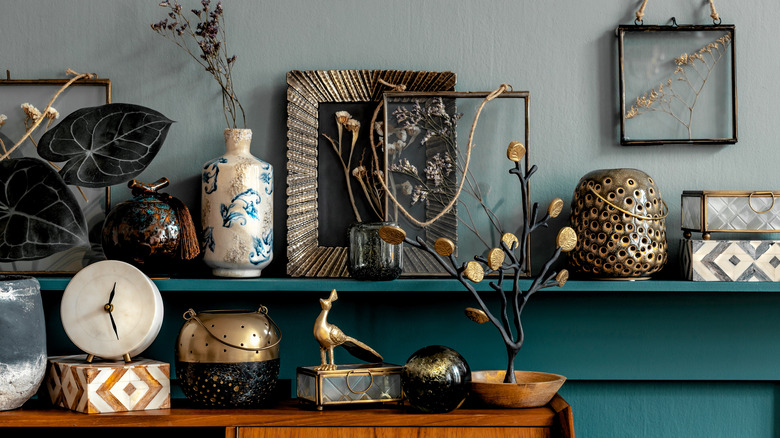
With the rise of discotheques in the '60s, metallic home décor was often utilized to bring a sense of playfulness to a home's design. Metallic décor, especially tones such as copper and gold, was often placed around the house to create that classic '60s aesthetic and some interest in the design.