Boomers Can't Stand This Modern Paint Trend

It's not surprising that a generation raised on the pastels of the 1950s and psychedelic pinks, purples, and oranges of the 1960s would have strong feelings about interior paint colors. In an exclusive interview with House Digest, designer Cara Woodhouse shared her observations about paint color preferences of the baby boomer generation, born between 1946 and 1964, noting that "one paint trend many boomers tend to dislike is the heavy use of very dark charcoal or black interiors throughout an entire home." Woodhouse, founder of Cara Woodhouse Interiors, found that "while dramatic monochromatic spaces have become extremely popular in modern design, many boomers feel these environments can feel heavy, moody, or overly intense for everyday living."
Apparently unaware that dark paint colors may fetch a higher selling price, "boomer clients often prefer warmer neutrals, soft whites, muted taupes, and colors that make a space feel airy and calm," Woodhouse said. "They usually gravitate toward tones that feel uplifting and timeless, rather than highly atmospheric." A peek at paint colors every boomer has in their home affirms Woodhouse's assessment, with beiges, browns, grays, along with a few nods to colors that evoke those psychedelic times. So there's low chances of boomers color-drenching with black in their homes.
How to implement dark color in home design
As to whether dark colors or neutrals and soft colors are more likely to stand the test of time, Cara Woodhouse exclusively told House Digest, "I think timeless paint choices are less about specific colors and more about emotional longevity." Several boomer-preferred colors are considered classics, and Woodhouse acknowledged that "a beautifully balanced warm neutral will almost always age better than something overly aggressive or trend focused." If you're in the neutral camp — boomer or not — you'll want to take a look at the best neutral paint colors for a relaxing home.
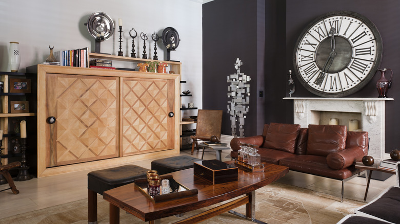
Still, Woodhouse sticks up for the moodier tones, explaining that "darker paint can absolutely work beautifully when used intentionally." You can even have the best of both worlds, incorporating both boomer-hated dark paints and their preferred softer colors. "Instead of saturating an entire home in dark tones, I often recommend using dramatic colors in smaller moments like a library, powder room, media room, or accent wall," Woodhouse said.
Another option, she said is "pairing darker colors with warm woods, layered lighting, and tactile materials." Such a juxtaposition of lights and darks "helps create depth without making the space feel overwhelming," Woodhouse explained. With such expert ways to implement dark paint colors in your home, you can embrace the deep shades without turning it into a cave.