Iconic Paint Colors That Are Classics For A Reason
Painting a room a fun new color can really freshen up the look for not a lot of money. However, when it comes time to actually choosing your paint color, it can be quite an intimidating task. There are countless paint chips to be found at the hardware store, not to mention hours spent scrolling through Pinterest to find the absolute perfect shade. In addition, each specific color will look different in every room based on the amount of natural light it gets, making the process downright overwhelming.
Every year, you'll find articles online providing list after list of the hottest paint colors of the year. Sometimes, however, you may want to opt for a classic look rather than a trendy one. If you don't expect to repaint for a few years, it's better to choose something that has some proven staying power.
The following colors have been popular for years — or even decades — and are favorites of designers and avid home decorators alike. These tried and true colors can be used in really any room of your home, and they look just as great outdoors as they do indoors. Read on to learn about some of the most iconic paint colors of all time and the reasons why their popularity has endured for so long.
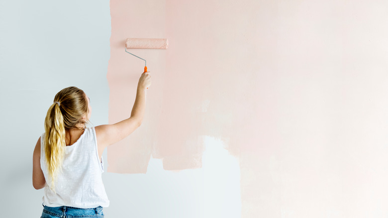
Simply White (Benjamin Moore)
A look doesn't get any more classic than crisp white paint. And white is white, right? Well, Benjamin Moore has a number of iconic white shades in their collection, including Cloud White, White Dove, Chantilly Lace, and White Heron. In 2016, however, Benjamin Moore named Simply White their Color of the Year in the interest of "highlighting white as a timeless and versatile design statement." The color's official write-up describes it best: "Fresh as the first snowfall, this clean, crisp, multi-purpose white is a perennial favorite for trim, ceilings, and walls."
Benjamin Moore's Creative Director, Ellen O'Neill, went into detail in 2015 about why the brand chose such a simple color, saying, "White is not just a design trend, it is a design essential. The popularity of white, the necessity of white, the mystique of white is quantifiable in our industry." White is always timeless.
Simply White is a great choice for nearly any interior or exterior project because of its subtle warmth and its ability to provide a clean, neutral backdrop to any room. Painting any area this shade of white is also a spectacular way to really brighten up a space and create a more open feel.
Hague Blue (Farrow & Ball)
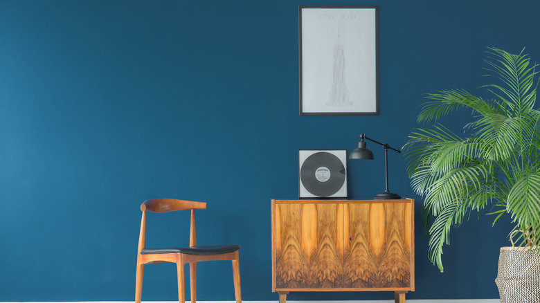
Historically, many of the colors that have been popular consist of light neutral shades like whites, grays, beiges, and ecrus. This one, however, stands out from the pack. Hague Blue by Farrow & Ball is a rich blue-green color that adds intrigue and complexity to any space. In a survey from the UK, this color came out as the top pick for kitchens, living rooms, and bedrooms (via House Beautiful).
Farrow & Ball explains the origin of the name, saying, "This strong blue takes its name from the fantastically colored woodwork much used by the Dutch," going on to say that, "The green undertones of this timeless, deep and dramatic blue means it sits as happily outside as it does in small dark rooms."
Farrow & Ball's color curator Joa Studholme told House Beautiful that "Hague Blue oozes period grandeur and creates a dramatic, glamorous feel." It's a great choice for cozy spaces like dens, bedrooms, and basements.
It can definitely be scary to choose a dark paint color for a room if you are not used to choosing bold looks, but it really is a spectacular way to create a dramatic and striking "wow" look!
Revere Pewter (Benjamin Moore)
While cooler gray paints may be going out of style, neutral and warm grays like Benjamin Moore's Revere Pewter will always be a great choice to use for your project. According to Benjamin Moore, Revere Pewter is "a light grey with warm undertones, this classic shade creates a unifying look that calms and restores. A great transitional color, it's perfect for an open floor plan." In many ways, it's the perfect color, being not too light, not too dark, not too cool, and not too warm. How's that for sounding just right?
Nivara Xaykao from Benjamin Moore explained to Southern Living, "It is one of our most popular colors because it has just the right mix of gray and beige, and you can take the color into any direction." Choose this shade for pretty much any room in the house, whether it gets lots of natural light or is inherently dark. Revere Pewter looks just as great outside as it does inside, making an excellent choice for exterior trim and siding.
Tricorn Black (Sherwin-Williams)
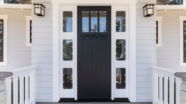
Black paint may seem intimidating to use on anything since it's such a bold color, but it's a risk that's absolutely worth the payoff. Stephanie Pierce from MasterBrand Cabinets told USA Today in a 2016 article, "If you're going to go with a lot of black you need at least that same amount of brightness in the space, whether in wall space or window space or bright white ceilings or light floors."
Tricorn Black by Sherwin-Williams is possibly the most iconic black paint of all time. It's a popular choice for front doors, home exteriors, and moody interior living spaces. One of the reasons it's so popular is that it's very neutral, with neither a warm or cool undertone. Studio McGee named Tricorn Black as one of their favorite black paints, calling it, "The perfect saturated black" and adding that it "looks incredible in a high gloss finish. We often use this for a statement-making front door or cabinets."
Sea Salt (Sherwin-Williams)
If you want to bring a coastal feeling to your home, look no further than Sea Salt by Sherwin-Williams. While some colors add drama to a space, others are perfect at creating a peaceful oasis in which you can relax. One of the reasons why Sea Salt has historically been so popular is its naturally soothing effect. It's light, airy, and evokes nature due to its pale blue-green hue, bringing to mind gentle waves and the feel of the ocean. As a matter of fact, the shade has seen a surge of popularity during the COVID-19 pandemic.
Sue Wadden, Sherwin-Williams's director of color marketing explained to the Wall Street Journal, "When we're stressed, our minds subconsciously seek blue tones to subdue our feelings." Wadden guessed that Sea Salt was popular during the pandemic because "[It] isn't too bold or vibrant," and, "People have gravitated toward softer, nature-inspired hues [to] feel grounded in a time filled with unknowns."
Painting a room Sea Salt will be sure to make the space look and feel fresh, open, and incredibly bright.