15 Colors To Decorate With For A Retro '50s Aesthetic
From poodle skirts and pastels to sock hops and rock and roll, the 1950s marked a very specific cultural era in the U.S. Music, television, poetry, and film were all producing culturally specific and game-changing content. Fashion changed from functional and conservative during war-time poverty to accessible and playful.
Without the weight of the second World War looming over the country anymore, interior design also shifted into a more playful, experimental style, as opposed to the more reserved and practical designs of the previous few decades. According to Big Chill, some of those changes involved more futuristic furniture silhouettes, lamination, clean lines, bright-colored linoleum floors, fabrics with bold patterns (stripes, polka dots, stars, boomerangs), and, most notably, the increasing popularity of televisions in the home, which dramatically and permanently changed furniture layouts.
As for colors, pastels became very popular, most often featured in swanky new kitchen appliances, cabinets, and other furniture. Neutral, beige Scandinavian colors also became popular. And lastly, everyone can recall images of sleek, black, white, and red diners designed in the modern style. For those looking to incorporate a bit of 50's nostalgia or retro flair into their own home, keep reading for inspiration on how to add these fun and funky colors.
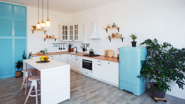
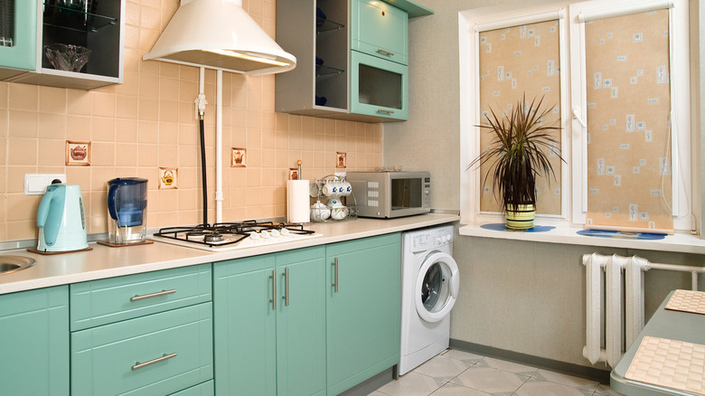
1. Turquoise and red
Pastel cabinet faces were very popular in the 1950s. Add some retro flair to your kitchen by painting your cabinets a lovely turquoise. Contrast this with pops of bright cherry red for a totally vintage look.
2. Primary colors
1950s décor also heavily featured bold, contrasting colors. Consider incorporating the primary colors — red, blue, and yellow — into your color pallet in bold hues, mixed in with vintage furniture and décor finds and funky, retro patterns.
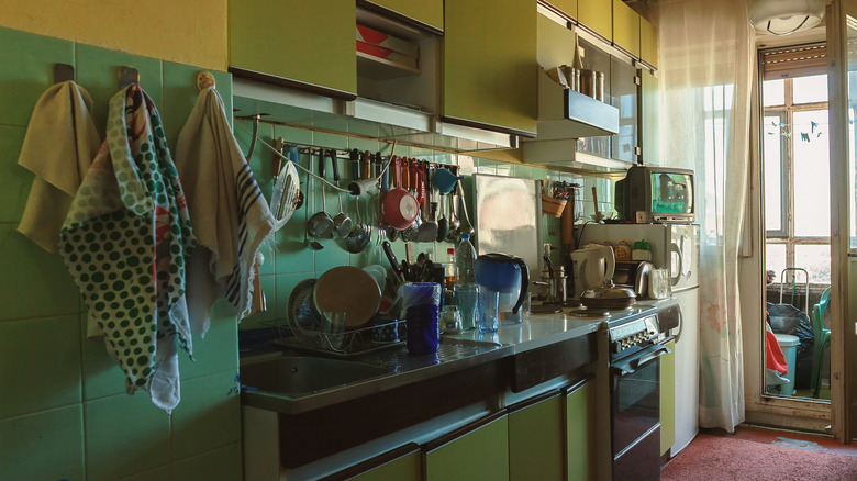
3. Green and yellow
For a more authentic, less flashy approach to 1950s decor, opt for some earthier retro colors, such as mustard yellow and olive green. These two colors can be updated with touches of gold and cream or adhere more to a historical sensibility with light, warm-toned woods.
4. Monochromatic black and white
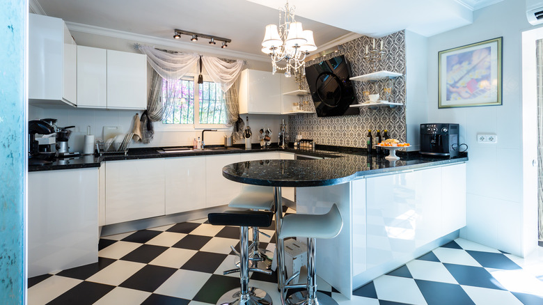
Checkered linoleum floors are one of the design staples of the 1950s. For a modern look with a slight retro influence, add black and white checkered floors to a sleek, modern black and white room, such as the kitchen or bathroom.
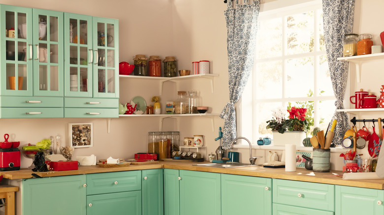
5. Pastel pink and Tiffany blue
Lean heavily into the pastel trend of the decade by combining a pastel pink with a Tiffany blue. Keep it retro with vintage furniture, or modernize it with sleeker, more up-to-date pieces.
6. Classic retro diner red
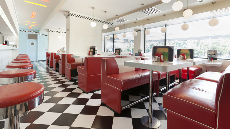
For a cheeky, fully 1950s look, pair checkered floors and black and white furniture with cherry red seats, taking after the popular retro diners of the decade.
7. Cool beiges
For a calmer, more sophisticated take on the decade's design approach, opt for Scandinavian-inspired beiges and creams. To make it a bit more obviously retro, look for a warm-toned wood, mid-century statement piece of furniture.
8. Sage and lime green
Bold colors and color mixing were a hallmark of the 1950s. For a total throwback, mix a warmer green, like sage or olive, with a brighter hue, like lime or apple.
9. Dark gray and yellow
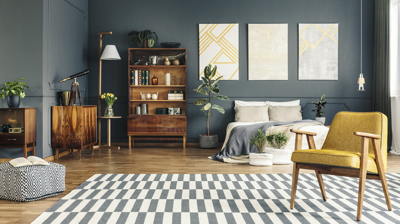
Bringing it back down again for a modern but retro-inspired color pallet, pair a 50s inspired mustard yellow with a modern blue-toned dark gray. Add in some mid-century furniture to make the retro inspiration more obvious.
10. Retro blue

A bright, punchy shade of retro blue will transform any room with just simple accents, making your 50s inspiration crystal clear.
11. Yellow toned wood
While plastic furniture was a staple of the 1950s, so were very warm, almost yellow-toned woods. To bring in some obvious retro inspiration, opt for those mid-century tones. Mix with retro-inspired colors, like yellow, green, and blue, for the full effect.
12. Pastel pink and yellow
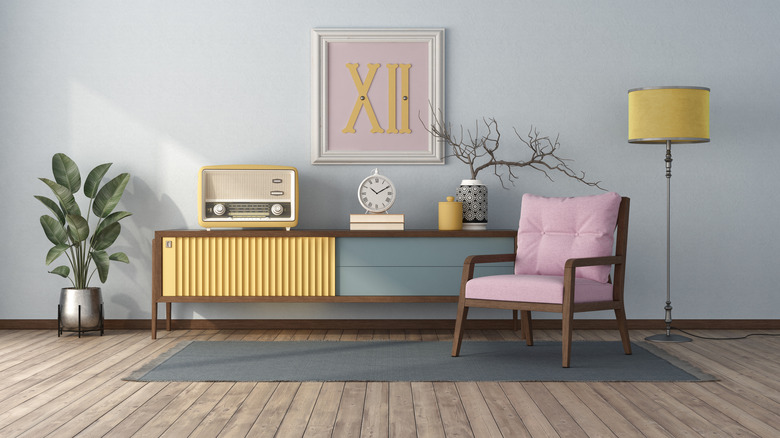
Pastels in any shade will bring a retro flair to a room. However, they should still be flattering. Pastel pink and yellow, for example, go excellently together and definitely have a 50s influence.
13. Peach and pastel turquoise
Peach is a very retro color and offers a softer, lighter warm tone in place of loud oranges and yellows that go well with cool tones. Pair with a pastel turquoise for the 50s color pallet of your dreams.
14. Matcha green
As for greens, a light matcha or tea green will be light enough for a 50s pallet and is versatile enough to go with modern décor as well.
15. Bright teal
Teal is another loud and bold color that will instantly produce a retro sensibility. Pair with orange-toned woods and vintage clutter, and your room will instantly feel like a time machine back to the 50s.