10 Ways To Use Very Peri, Pantone's Color Of 2022, In Your Home
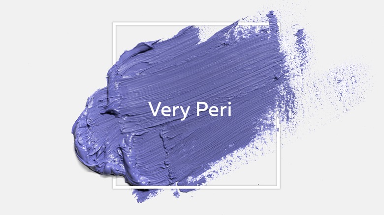
Very Peri is the Color of 2022, designated by Pantone's Color Institute experts. Based on trends and current events tracked throughout the world, they forecast color preferences and aim to choose a shade that both summarizes and satiates the cultural zeitgeist. This is then represented in multiple consumer goods categories, including make-up, textiles, home décor, fashion, and even the technology sector.
Very Peri is a fun and pithy name for this particular tone of periwinkle — a blend of blue and purple. It's vibrant, fresh, and a little extra. A juicy jolt should help steer us away from anything like languishing — our general 'meh' state of mental health these last two years, as identified and explained by The New York Times. Blue is officially everyone's favorite of the rainbow and is associated with loyalty and confidence; purple is perceived as calming and spiritual, assuming it's not too bright. So it's no mystery that this cheery (but not annoyingly so) shade was selected for 2022, a year in which we are working on self-care as a priority and seek assurance against uncertainty. Very Peri may not be the color we wanted, but it could be one we need. Here are 10 ways to use it in and around your home.
1. Upholstery
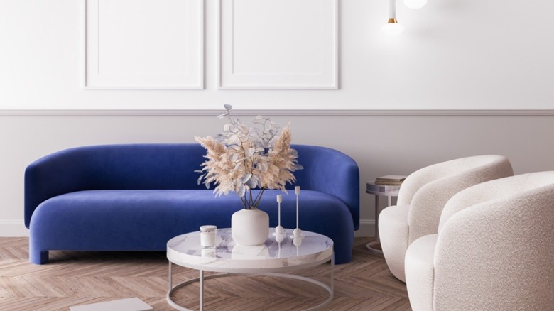
Colorful upholstery is almost incomparable in its ability to create a mood and luxe coziness in a space. Neutrals are generally the choice for long-term furniture pieces because of their adaptability and ease of mixing, but safe is not the only way to play. As shown here, this Very Peri sofa almost hums with vitality.
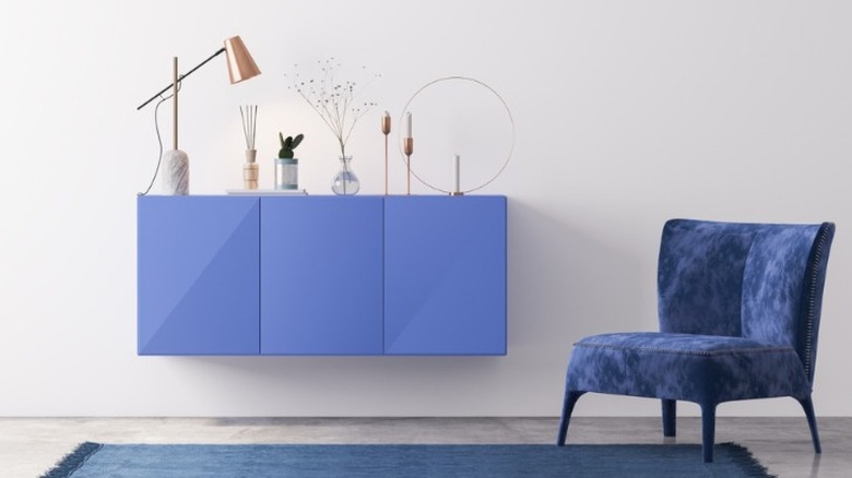
2. Cabinets
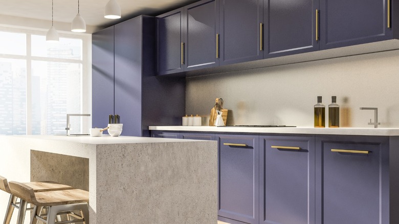
Complemented by a palette of natural stone and wood, a deep periwinkle makes this kitchen more than just another builder's special. The clean and classic styling conveys timelessness rather than a trend. Colors found together in nature, like the clam or oyster shell combination here, soothe and harmonize indoors too.
3. Dishes
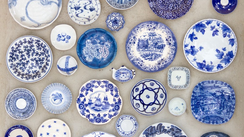
Traditional blue and white porcelain contain plenty of tones within it that often skew toward cobalt and periwinkle. Use it to bring a sense of history and classicism to a matching wall color or the interior of a painted cabinet. Flowers are gorgeous with transferware table settings; we suggest shades of salmon, orange, yellow, pink, or even more blue!
4. Wall and trim paint
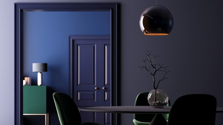
White trim has been de rigueur in design for a long time, and not surprisingly, as it creates cohesion throughout a home. Yet colorful trim makes for jewel-box rooms that feel uncommon and individual, especially when paired with saturated shades on the walls. This one visually ties the greyed lilac and navy walls to each other.
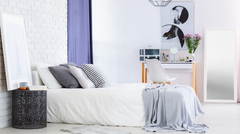
5. Bed linens
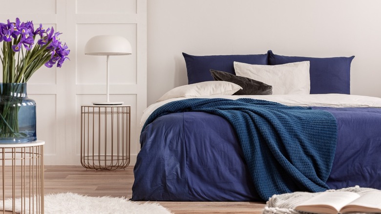
The bed is the largest piece of furniture in the bedroom; therefore, how it's dressed impacts the space tremendously. For example, white sheets always seem crisp and highlight colored bedding. Try mixing different shades of periwinkle rather than having everything matchy-matchy — it will result in a rich, layered effect.
6. Flowers
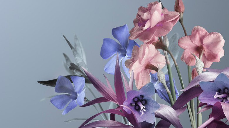
Whether indoors or out, cut or potted, flowers are an instantaneous and splendid way to add color to any space. There are many purple and blue flowers — and every shade in between — for a container garden near the front door or a vase on the coffee table. Iris, hydrangea, and hyacinth are just a few that come to mind.
7. Bathroom linens
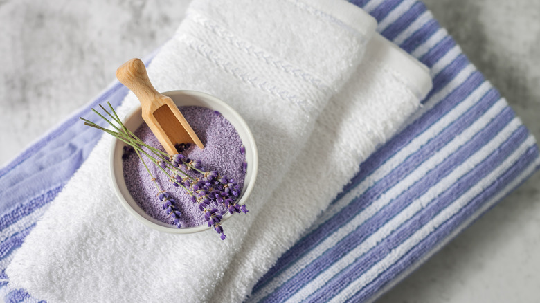
With a nautical vibe, the color periwinkle fits seamlessly into bathroom décor. We've established how beautifully it works with beige, ivory, white, and grey tones — most bathroom fixtures and flooring palettes. It's a fresh and pretty complement to natural wood vanities and hardwood floors as well.
8. Painted furniture
Natural wood grain is handsome, but sometimes the stain is too dark or orange to integrate with today's styles. If your piece isn't an antique and has seen better days, try giving it a lift with a coat of paint. Very Peri could be traditional or modern — it all depends on the application.
9. Curtains
Drapery is a fantastic (and practical) way to contribute color to a living space — from near ceiling to floor, great swaths of it. If you can't find the shade you're looking for, comparatively inexpensive white curtains can be dyed in the washing machine. Periwinkle is perfectly comforting and restful in a bedroom.
10. Exterior paint
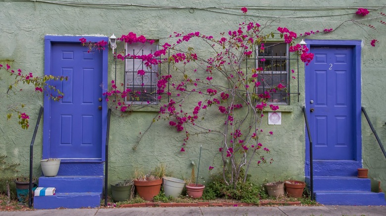
Homes in the U.S. are a bit staid in their exterior color choices; one needs only do some armchair traveling to find inspiration worldwide. For example, shades of blue and periwinkle are celebrated in Greece and France on doors, shutters, and window frames. They promise a joyful return, climbing with flowers and punctuated by wreaths and awnings.