The 20 Best White Paint Shades For Opening Up Your Home
The color white can seem like a simple shade to implement when designing your home, but there are a few things to be aware of. For example, the white shade you choose should match the undertones of your space, according to Real Simple. If your kitchen cabinets have a warm undertone — which is a bit yellow — it won't go well with a cool shade of white as it can appear a bit blue. You'll want to keep the undertones coherent throughout the space for a harmonious design.
Luckily, there are plenty of white paint colors to choose from. Many shades of white can look great in your residence, and it's a great option to brighten up any room to make it feel bigger, according to Verywell Mind. However, if certain factors of design are absent, your room could end up looking dull and boring. So, we'll take a look at how different shades of white work with other distinct designs.
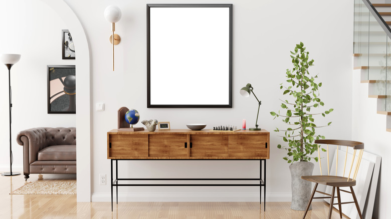
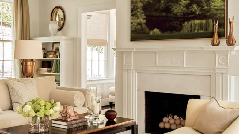
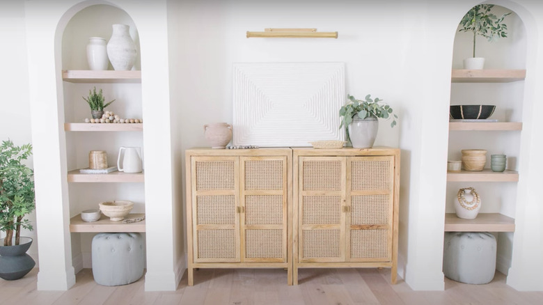
Bright white
The bright white complements the other colors in the space, such as different shades of gray, green, and brown. This creates a balanced design as everything is a cool color. The plant pot may be yellow, but they're light and small enough to not impact the overall design.
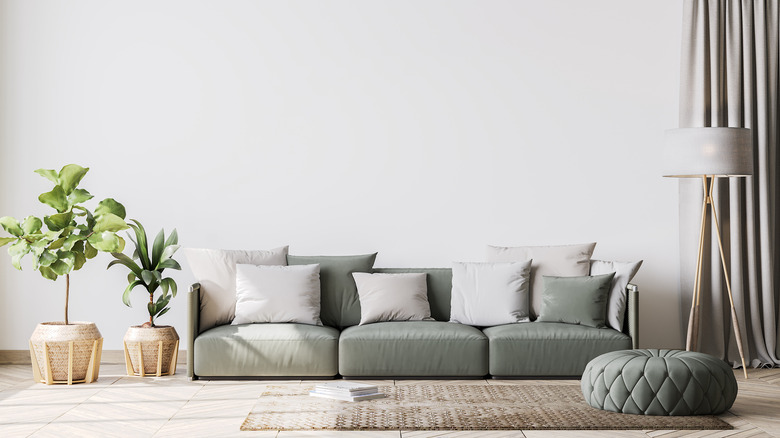
Semi-bright white
This semi-bright white is bright enough to contrast against the white sofa but is also slightly warm to complement the gray rug and the brown furniture. This harmonious and bright design makes the space feel more open, even with several pieces of furniture present.
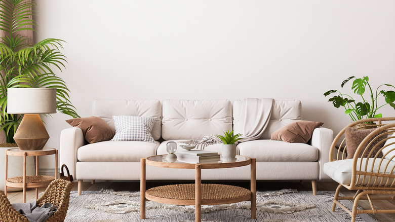
Neutral-toned white
This paint color is white, with tones of gray and brown. It's a neutral color that sits in the background, as the sofa, plant, table, and rug stand out against it. If you have more white decor present in a space, this greige white paint color will still be able to tie the design of your room all together.
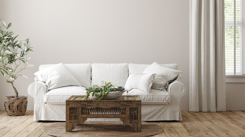
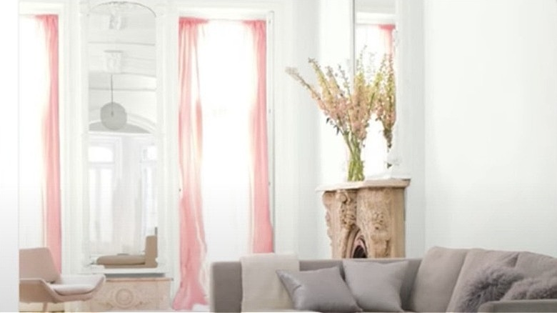
Pink-toned white
This is a warm white that gives off a slightly pink color as it's surrounded with pink and gold decor. It goes well in this space as the colors present are all warm, from the floor to the wood furniture, the gold polka dots on the wall, and the pink canopy. Although there are a few pieces of furniture that are bright white, it doesn't overload the room with different tones, but instead brightens up certain corners.
Alabaster white
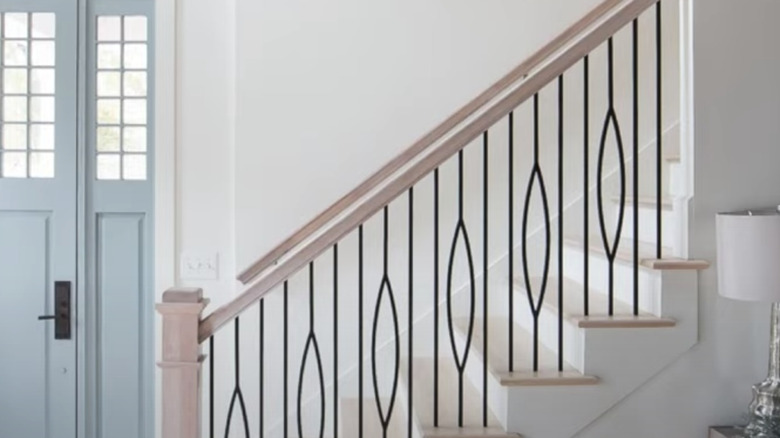
This paint color is known as alabaster white, which is definitely soft on the eyes. It's perfectly combined with the soft brown colors on the steps and handrail, because of its slightly yellow tinge.
Deep cream white
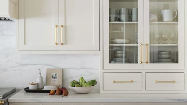
The deep creamy white color of these cabinets pair well with the golden handles as they have similar tones. The white countertop is a nice contrast to ensure the whole kitchen doesn't appear too yellow.
Cloud white
Cloud white paint is a great way to invoke a bright color without it being too stale. It's soft yet fresh, and is a great background for slightly darker whites.
Aged white
This is a warm-toned color that is typically used for older designs and can pair well with the Victorian-era style, as well as many other traditional designs.
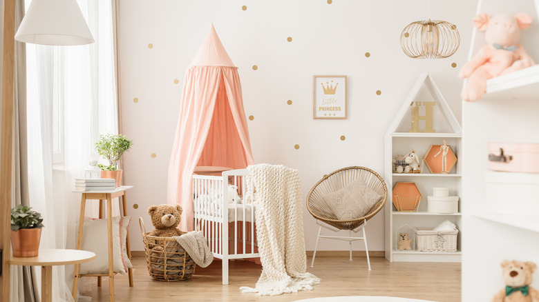
White with gray undertone
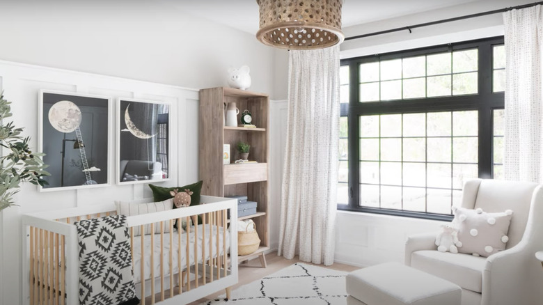
If you want to create a bright room for your child, but not too bright, look for a bright white with a gray undertone. This is a helpful way to ensure other features can remain bright in the space, while also contrasting against the gray tone of the wall.
Non-traditional white
This shade of white may be darker and creamier than what you'd expect, but it's an excellent shade for a neutral-colored home. Here, there is minimal natural light, which slighting dims out the white of the color. But in rooms with more natural light present, the sunlight is able to bounce off the paint color, making it appear more white — which in turn makes the room feel bigger.
White with a hint of brown
This shade of white is light and airy, creating a comfortable environment.The warm undertone has hints of brown, creating a space that feels open, that is also not too white in order to balance out the other decor.
Bright off-white
This shade of bright off-white is fairly useful as it gives off the appearance of a very bright white shade, but it also has a warm undertone to ensure the shade isn't too stark when compared with various neutral colors.
Almost brown
This bedroom is painted with a shade of white with deep and warm undertones. In bright rooms, it tends to look more white. However, in dark rooms, the color looks as though it's a light brown. This can be great for those who want a softer color during the night, instead of a stimulating bright white.
Rich and warm white
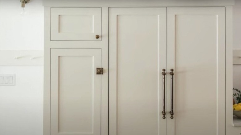
This is a rich and deep warm white that has hints of yellow and brown. This is why it pairs nicely with the dark bronze hardware. This shade of white will pair well with light warm whites, as well as deeper colors of white.
Bright white with hints of gray and blue
This shade of white has cool undertones, so the paint can sometimes look gray or blue depending on the decor around it as well as the amount of natural light. If painted in a room with warm artificial light, it could end up looking a bit yellow.
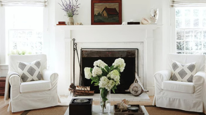
Pure white
This room is a perfect example of what a pure white paint color would look like. It's a strong color that brings out the pink, gray, and other colors and makes them seem more saturated. This color paired with the natural light is the ultimate way to make your space feel larger, especially if you add a few mirrors.
Almost gray
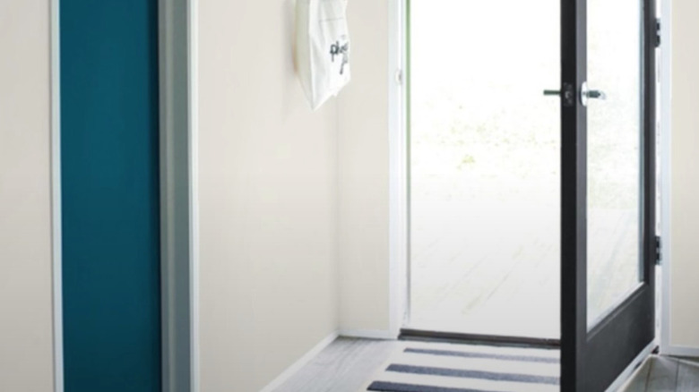
This shade of white is almost gray; however, it also has a warm and creamy undertone. Because of this combination of tones, this paint pairs well with cool and warm-toned designs. Such as these black and blue doors, and the cool gray floor.
Blue white
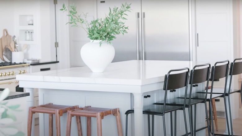
Here, the blue-white paint is seen on the lower part of the island. In this current lighting, it seems like a light blue, but can sometimes appear more gray, white, or even green.
Subtle warm white
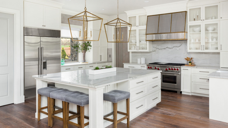
This kitchen gives off the illusion of being bright white, especially with the gray veining in the marble and the gray cushions on the stool. However, the warm tones in the gold accents are what subtly softens and warms up the color. This is a great way to get that bright white kitchen design, while also making it more welcoming.
White with yellow undertone
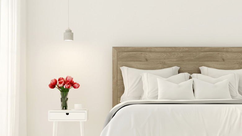
This bright white has hints of yellow to create a warm appearance that complements the wood headboard, which also has hints of yellow. This color scheme can make your room look more cheerful without bringing in a bunch of bright colors.