20 Colors That Perfectly Complement Teal Decor
Teal is an enchanting color with a sense of whimsy and fluidity. Not blue or green, but somewhere between those grounding, soothing shades. Regarding classification, it's not a primary or even secondary color — primaries are red, yellow, and blue — the colors all others stem from. Secondary colors are a mix of any of those two: orange, green, and purple (via Color Matters). Teal exists as a tertiary, a blend imprecisely called blue-green, and even paint purveyors cannot decide exactly one way for it to be. Then again, that is their prerogative and our pleasure. Teal Ocean by Benjamin Moore is dramatic and deep; Teal Zeal from Glidden Paint is a milky, jewel-like shade akin to turquoise; and Sherwin Williams offers clean and energizing Maxi Teal, among swoon-worthy options.
According to Mojomox, the use of the term in naming a particular hue was first recorded in 1917 after the teal duck, with a vibrant blue-green stripe along its head. The outlet notes that the color is an equal mix of blue and green, describing it as relaxing, sophisticated, and reminiscent of clear water, sky, and lush green landscapes. Thus, it's often employed in marketing for travel and lifestyle industries and recently in the creative and technology sectors. At home, teal provides tranquility and vibrancy both. Add white for cheery aqua or black to deepen it to smoky emerald. Pair it with pastels, neutrals, brights, and white and black. Dial it to wherever you want it to take you — the one you choose is the real teal.
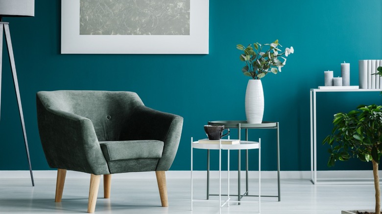
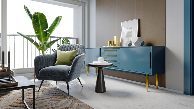
1. Greige
Greige is a combination of gray and beige — another of those inexact shades — and its neutrality makes it an excellent backdrop for colorful teal. With more depth than white, greige provides teal with an interesting yet non-competitive partner. Abundant natural light and energetic artwork lend the restrained space cheerful sophistication.
2. Mustard yellow
Teal, being part green, has yellow in its foundation; therefore, yellow is a perfect complement. Lemon would be brighter, and ochre, though beautiful, would be muddier. This shade cuts the mustard. It's vivid and fresh yet leans a little moody. Above, the saturated color is offset with plenty of crisp white and some grounding black.
3. Walnut brown
Teal is highlighted against neutrals like beige and brown. The palette above is reminiscent of sand and water, creating a relaxing and serene vacation vibe. However, the dose of color and the juxtaposition of cool teal with this warm walnut brown ensures the space also has vitality.
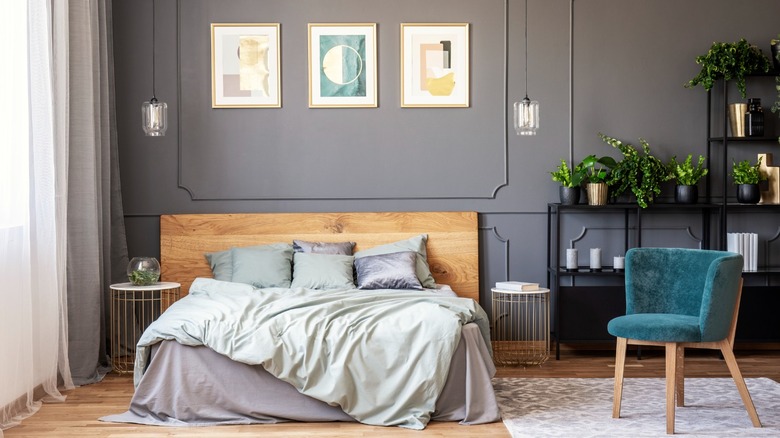
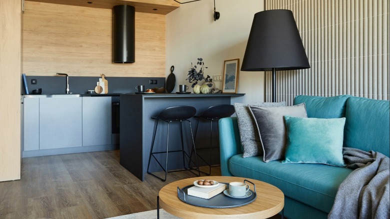
4. Charcoal
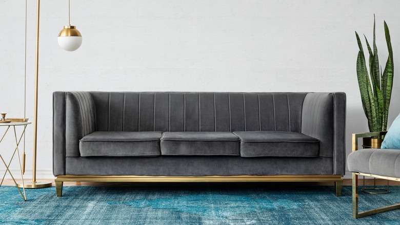
Teal and deep, rich neutrals create a moody scheme. Charcoal offers the chicness of black, perhaps more so with its subtlety, without being as dark. Furthermore, it can be hard to discern details in black furniture and decor; for example, the channeled back of the sofa above would be more difficult to appreciate.
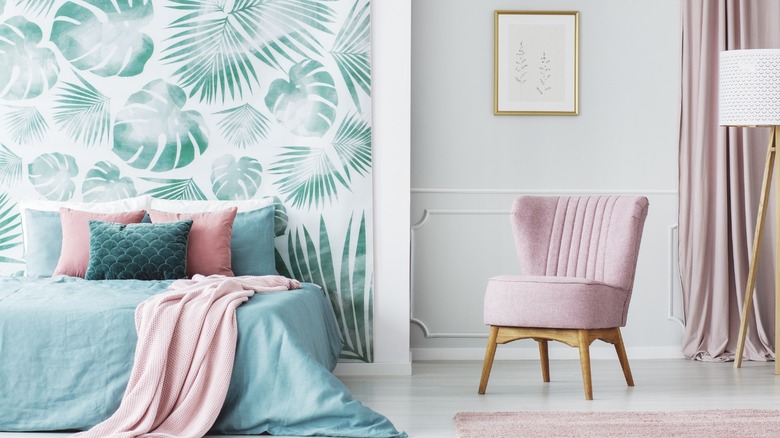
5. Salmon
Salmon is a tint of orange-red, and teal is blue-green. On the color wheel, those are opposites (complementary colors), making each seem vibrant and more robust; the surest way to a bold palette is to employ complementaries. Because pink includes white, and the teal here is slightly dulled, the combination is radiant rather than garish.
6. Hot pink
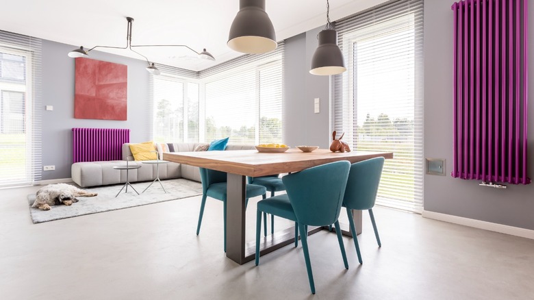
A pairing of hot pink and teal is an 80s throwback to drama and glamour — and a nod to the Memphis school of design and the unabashed use of lucid color popular at the time. A contemporary interpretation adds neutrals and organic elements to the brights to ensure the design has sophistication.
7. Aqua
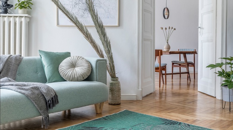
Aqua is teal with the addition of white; hence the colors are very harmonious and soothing when used together. Once again, there is an analogy made to the sea and all of its luminous and glittering shades. Introducing other versions of blue and green creates a layered yet calm palette — emerald foliage looks particularly lush.
8. Eucalyptus green
A variation on the concept above, this example combines teal with another shade of blue-green; gentle eucalyptus is an exciting counterpoint to its vibrancy. Where the prior photo might remind us of the sun-kissed, shallow sea, this one recalls depths and shadows. It's a similar but moodier take. Plenty of light neutrals help to balance the use of strong color.
9. Black
It is said in decorating that every room should have some black. It imparts sophistication and graphic edge — and it goes with any color or style, from rustic and farmhouse to traditional or modern. Imagine a Spanish wrought-iron staircase, a farmhouse cast-iron wood stove, or the contemporary lighting pendant and bar stools above. Color sings against its darkness and solemnity.
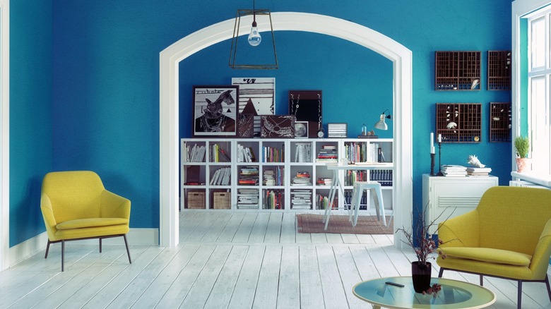
10. Chartreuse
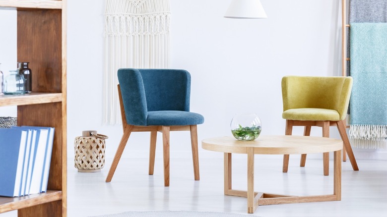
The combination of chartreuse and teal is similar in story to mustard and teal. However, acid green has more pop and bite. An association with emerging flora makes it feel fresh. Additionally, it conveys alchemy (the eponymous French liqueur and glowing bioluminescence) or caution (fire engines and safety gear). Use it for an unapologetic color punch.
11. Navy blue
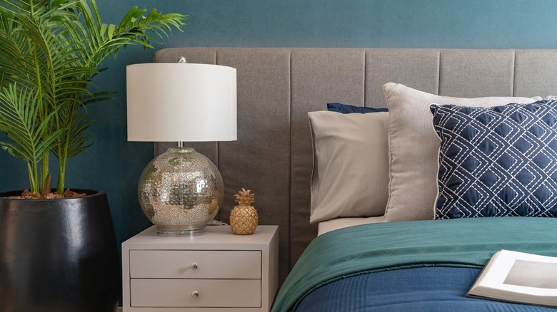
Teal is sprung from the cool depths of blue; therefore, navy and teal have a beautiful synergy. In the above example, their richness is countered softly with neutral ecru and a twinkling mercury glass lamp. A matte paint treatment or seagrass wallpaper will appear to float on endlessly.
12. Taupe
Like gray, taupe is a great neutral background for teal accents; but taupe is less cool and will impart warmth to a modern interior. Further, it blends well with various wood tones and warm metallics, such as brass, gold, copper, and bronze. In the example above, teal molding is a surprising detail for the colorful console to relate to.
13. Olive green
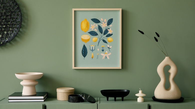
Olive green and teal build an unconventional yet soulful narrative, one that is grounded in nature and the landscape. Here, a combination with light wood has a sun-washed and subtle effect. The result feels timeless — is it a grouping of ancient artifacts or a postmodern vignette?
14. Mushroom
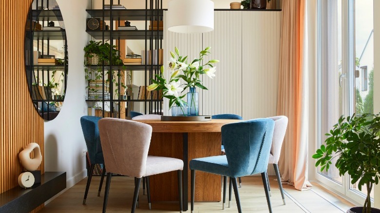
Mushroom is a wonderful gray that can include undertones of various colors, including yellow, purple, and pink. Pit teal against its neutral base. Above, the dining room seating is artfully split among cool teal and mushroom velvet. Blue glass vases and champagne drapes subtly repeat the color scheme while black accents tie the space together.
15. Champagne
Teal's jewel tones covey glamour, along with ruby red, amethyst purple, and the pale green of peridot. They seem even more luxurious when paired with shimmering metallics and lustrous neutrals. In the above example, teal velvet, a champagne area rug, and gold lamps stop us in our tracks — the prettiest traffic cones we've ever seen.
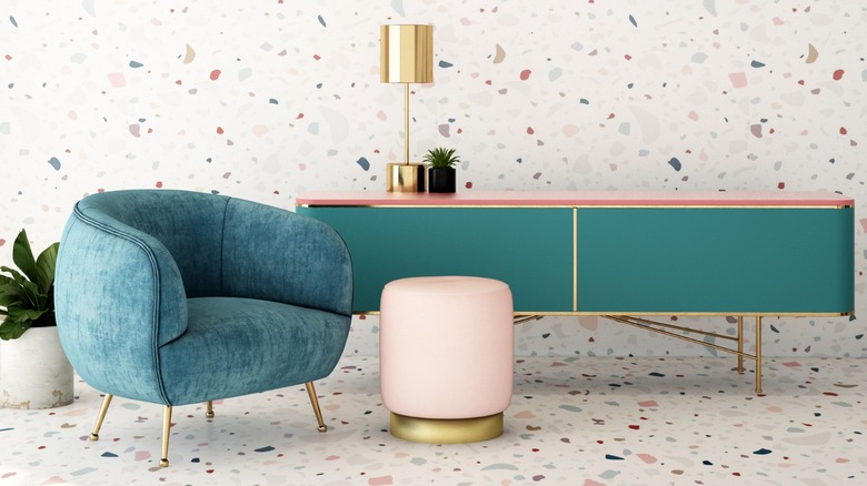
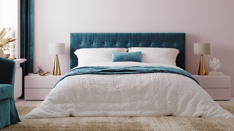
16. Shell pink
Shell pink and teal is another retro color mix, this time with a midcentury influence; we might think of a 1950s vacation resort or a cheery diner. There is innocence and optimism in this color scheme that can be tempered with texture, bold patterns, and modern shapes.
17. Cobalt Blue
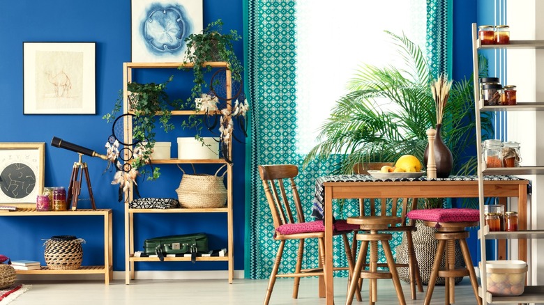
Like yellow and green, blue and green are analogous colors (those that appear next to one another on the color wheel). These shades are generally harmonious and calming when used together. Even when vibrant, as above, there is an easiness in their combination.
18. Pearl gray
Pearl gray and teal glow together. Both in-between shades that make the other more gorgeous, they can be played up with sumptuous fabrics and a touch of metal. Picture the room above lit softly in the evening. The deco-inspired space defies placement — is it in Hollywood or a Paris arrondissement?
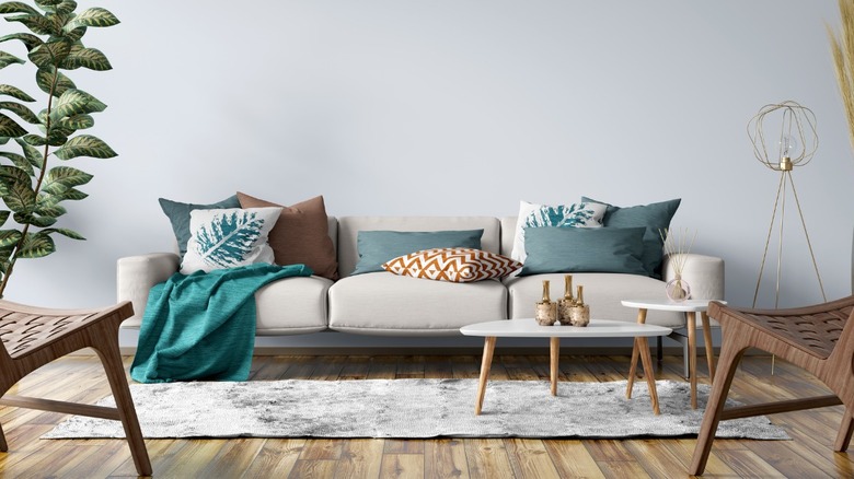
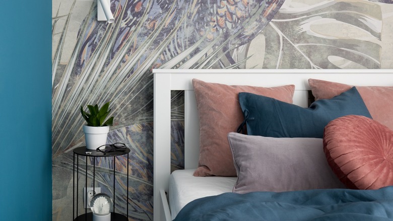
19. Garnet
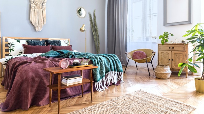
Rich garnet enhances the gem-like qualities of teal. Together, they create a warm southwestern mood (with saddle leather), a free-spirited bohemian vibe (with rattan and sisal), as above, or an opulent traditional formality (with dark wood); it all depends on the fabrics and styles of the decor. Whatever they may be, your space will be colorful and cozy.
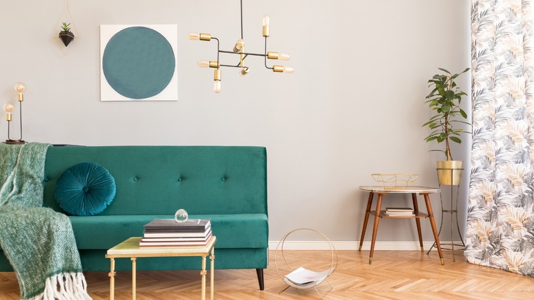
20. White
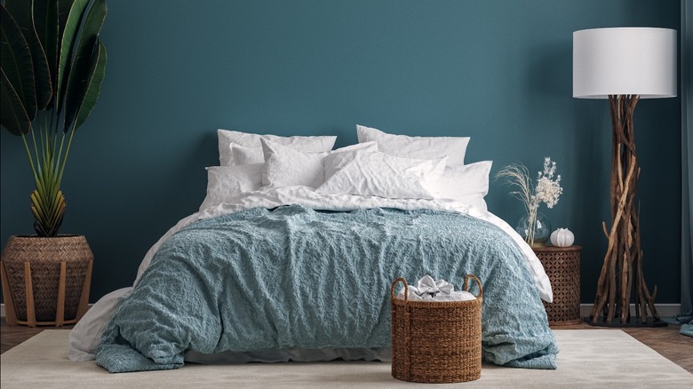
White allows all colors to seem as they are, bearing no influence on how they are perceived; clear and radiant teal is ever more so itself. Warm, medium wood grounds the ethereal combination.