15 Vibrant Shades Of Coral Paint That You'll Want To Use In Your Home
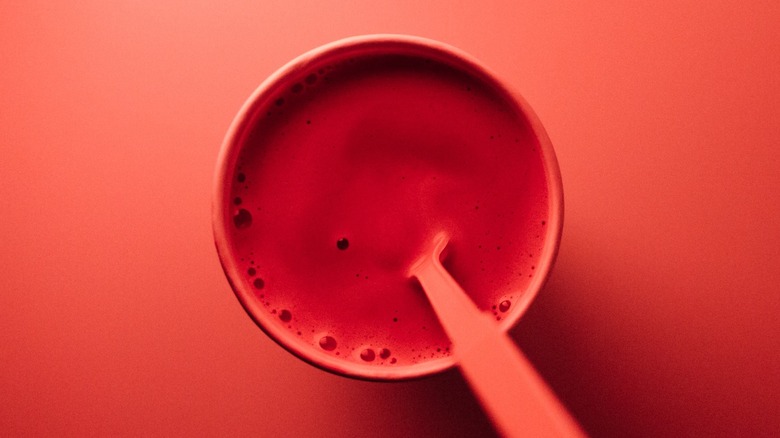
Some believe that coral is too bold to use as a wall paint color. However, this vibrant shade isn't as overwhelming as other electric or neon options. While it can be eye-catching, coral is typically warm and inviting. Color Meanings says this color is associated with optimism and happiness. Different shades can have mostly pink, orange, or red undertones.
Because this color is named after the reef, it has strong connotations with tropical locations and the ocean. To bring out its vacation vibes, you can try pairing it with blue. According to Canva, mixing coral with navy blue and neutrals will create a versatile color palette from which you can pull.
Warm colors, meanwhile, will bring out coral's warmth, like yellow, pink, or orange. These colors will also create an interesting layered look of similar shades. Another unique pairing could be teal and coral. Both these bold, vibrant colors will remind the viewer of nature with no chance of boring them. As for coral, check out 15 of its shades below, with ideas of how you can use each in your home.
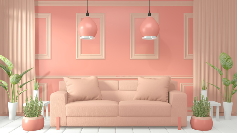
1. Pink coral
Choosing a coral shade with mostly pink undertones will bring out its playfulness. Pairing it with white will make the color appear more bold.
2. Orange coral
On the other hand, a coral color with more orange undertones will create a more peaceful and warm atmosphere.
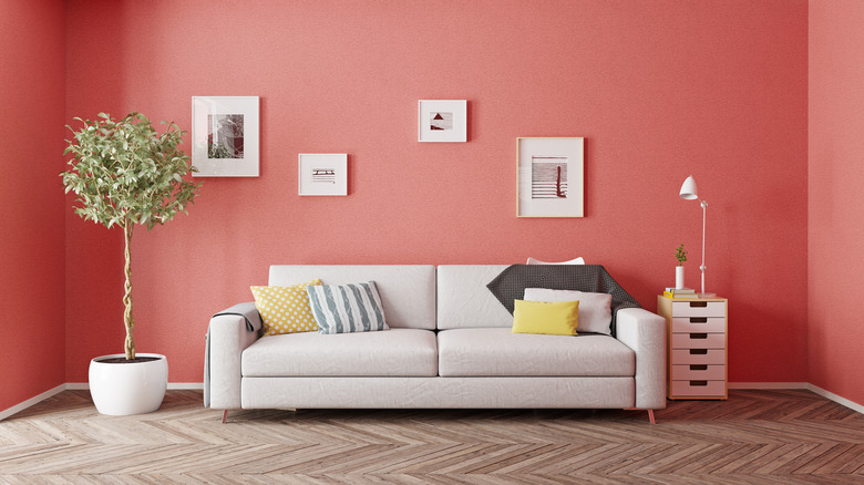
3. Red coral
Coral with mostly red undertones is extra vibrant and stands out. Using a red coral will emphasize the bold color in your space.
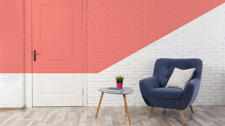
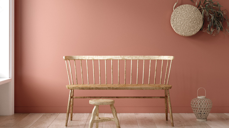
4. Coastal color
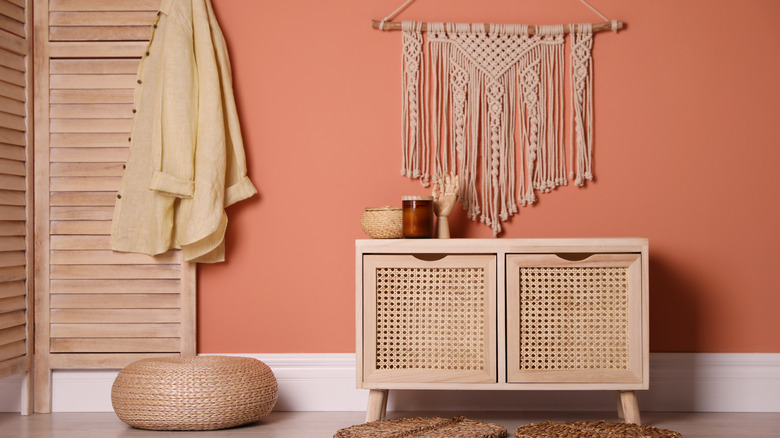
Coastal corals have pink and orange undertones. To bring out the coastal vibes in this color, pair it with blue shades or natural wood furniture.
5. Hibiscus shade
The hibiscus flower mixes many warm shades in its petals, including coral. Choosing a mostly pink coral will remind the viewer of this beautiful flower.
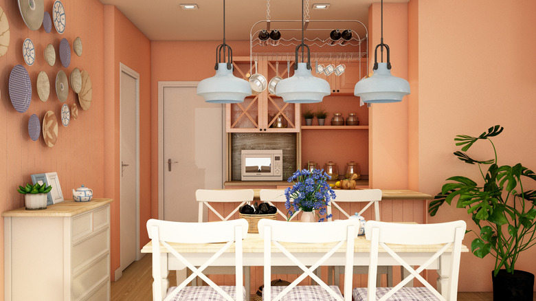
6. Mixed undertones
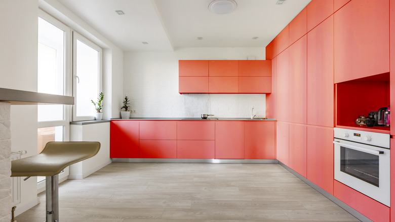
This kitchen has coral cabinets that display pink, orange, and red undertones. They're vibrant and very interesting.
7. Playful hue
Bring out the playfulness of coral by choosing a mostly pink hue and mixing it with other colorful accents.
8. Muted shade
For a less bold but still beautiful shade, choose a muted coral. This will still give a slightly vibrant appearance but won't be so eye-catchingly bold.
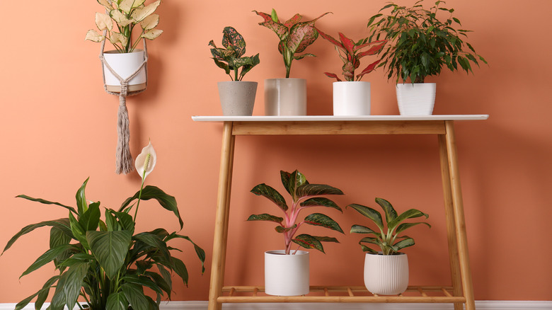
9. Peachy tint
Lean into orange to create a peachy coral space. Pairing with baby blue and white accents can make this shade look gorgeous.
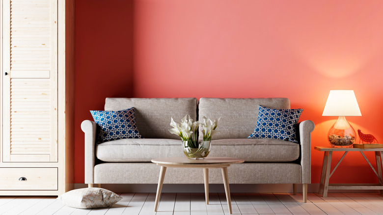
10. Calming color
For a calming shade, choose a medium deep coral shade. This hue has pink and slightly orange undertones.
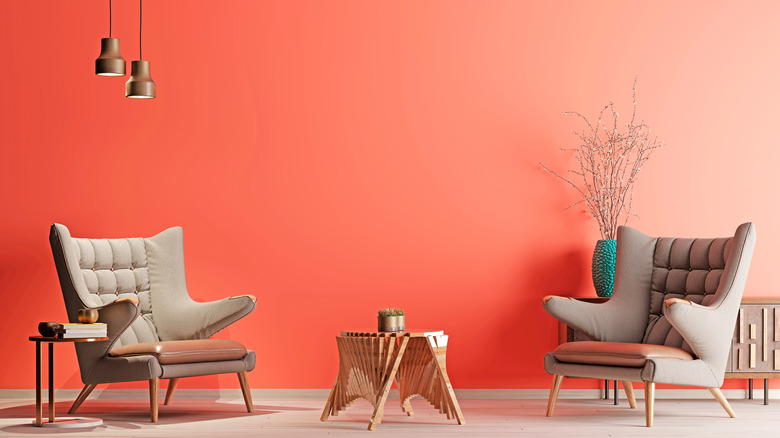
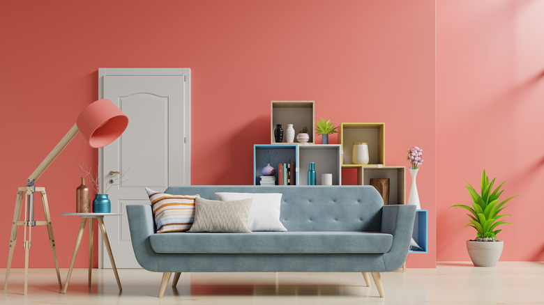
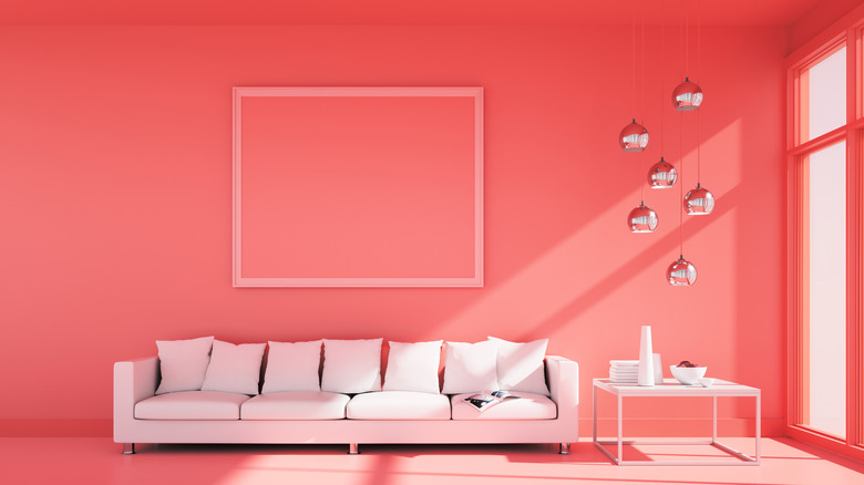
11. Energy-inducing hue
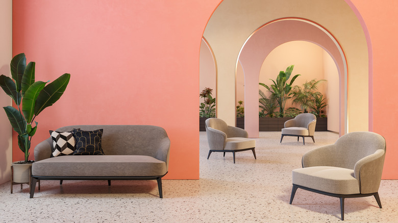
A more bold and vibrant shade of coral will produce energy in a space, but it shouldn't feel overwhelming.
12. Lighter choice
A lighter coral that's close in tone to a light pink can look chic in a space, especially when paired with neutral colors.
13. Flamingo flare
A red coral will remind the viewer of bright flamingos. This color would give a tropical flare to any space.
14. Strawberry pink
A slightly less vibrant and more pink coral shade will give a room a delicious and fun strawberry appearance.
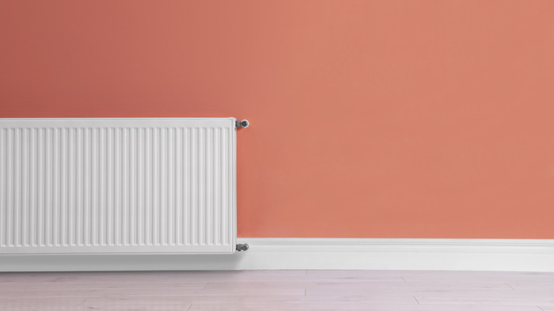
15. Statement shade
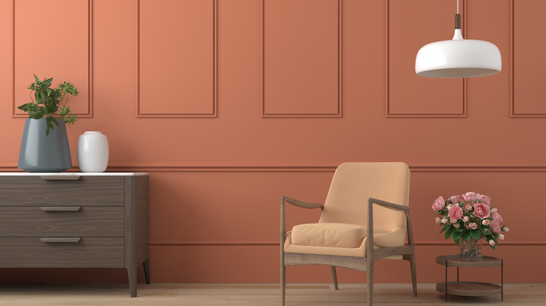
A dark orange coral shade could be ideal for a bold accent color. This shade isn't extremely vibrant but gives a more sophisticated feel.