Interior Design Rules Designers Want You To Know
According to The Interior Design Association (IIDA), interior design is the art of planning and executing how people interact in an environment. While the goals vary from increasing sustainability and function to updating safety while fostering an aesthetic, interior designers address human and environmental needs in their creative projects. As interior designer Jonathan Adler told Mansion Global, "Design is a reflection of the world we live in, and the world we live in is completely chaotic. There are no rules for anything in life, and the same applies to design. It's bad because you have so many choices; it's challenging. But on the good side, you don't have to worry about anything going out of style."
Design may not be among your interests, but addressing the interior design of a space can increase expression, maximize your space, and help increase the feeling of calm (via Kern & Co). There are many different tricks interior designers use to enhance a space, such as playing with color to alter mood and focus points or utilizing flow to increase a room's function (via Marianne's Consignment Confessions). You can arrange items in different shapes to promote visual interest or even play with lighting to create a peaceful atmosphere. Here are a few interior designer trade secrets to help you enhance your home.
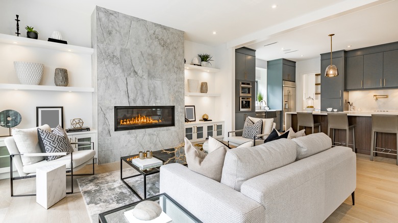
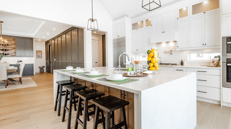
Blend textures
One of the biggest trade secrets in interior design is to layer textures. According to LuxDeco, adding texture to a room is about blending different visuals throughout a space, from rough to smooth. For example, pairing a rustic natural wood dining table with smooth velvet chair cushions will make a room look more appealing. You can also add texture through your lighting choices. A bright bulb will make a room feel more alert and clean, while an ambient Edison light will increase the softness and coziness.
Add texture through decor by layering items on your bookshelf. Place shiny metallic ornaments in a jar or a contemporary glass lamp on top of a stack of vintage books. You can also contrast a polished fireplace with a handmade rug. Contrasting fabrics and textures can increase the appearance of balance in a space and add more depth. If you want to mix fabric patterns and work in texture, start with your largest piece and work around it (via Hadley Court). For example, if your focal point is a large patterned rug, instead of trying to match everything in the room to the rug, complement the rug's color palette with smaller items. You can decorate with fine designs like polka dots on a vase or pillowcase.
Layer lighting
Layering lighting in a room is one of the best interior design secrets to increasing a room's appearance and functionality. According to interior designer D. Signers on YouTube, you should consider a few things when adding lighting to your home. The first is color temperature, which is measured in kelvins and describes the color from a light source. For example, 3000k is considered warm light, and it evokes the feeling of intimacy and calm. On the other hand, 6000k is cool light that provides an alert feeling. For a bedroom or intimate space, it's best to use a warmer light, while workspaces, kitchen, and bathroom areas should use natural or neutral light because it's clean and inviting. Consider the angle of your light source, which is how the light emits from a fixture. Spotlights commonly showcase something in direct, harsh lighting, while light at an angle distributes soft light throughout a space.
When layering in light, consider the three different types (via Pooky). Ambient lighting is the general light in a room, most commonly seen in wall-mounted fixtures or floor lamps. This light is the one you rely on every day. There is also accent lighting, which sets a mood or accents part of the room. Sometimes accent lighting is placed next to bookshelves or as an overhead above valuable paintings to showcase them beautifully. It can also be a carefully positioned wall sconce or chandelier that draws attention to specific details in a room. Last is task lighting, which is lighting for completing a task. For example, you can use overhead lighting in a kitchen or a lamp on a bedside table for reading.
Follow the rule of three
According to designer Talie Jane Interiors, one of the most important and basic rules in interior design is the rule of three. The rule of three states that items arranged in odd numbers appeal more to the human eye because they offer a mental challenge and are more engaging for the brain. Items in even groups often look staged, while odd numbers look more natural.
You can apply the rule of three in your home by accessorizing accent pieces like vases, books, or plants or through your furniture placement. When you're accessorizing, group three similar-looking objects together based on color or shape or place three completely different objects next to each other to create an intriguing vignette. The rule of three is also used for furniture placement when choosing items of a similar color, size, or shape. For example, you can group a couch and two chairs in similar styles or create a seating area with an odd number of chairs.
Use the 60/30/10 color rule
According to interior designer Sara Lynn Brennan Interiors, the best way to create the perfect color palette in your home is by following the 60/30/10 rule. The rule says a dominant color should make up 60 percent of a space, a secondary color should be about 30 percent, and an accent shade makes up 10 percent. In practice, the 60 percent color is often the background shade for the room. Next, the 30 percent color will create interest and support the dominant room color. Finally, 10 percent of the color defines the character of a room. It can be bold or subtle, depending on the look you want to create.
As a general rule, 60 percent of your color should come from walls, accent pieces, rugs, your couch, or statement furnishings. You can incorporate the 30 percent color through window treatments, chairs, or smaller items. The 10 percent color can come from throw cushions or fabric on a piece of furniture, small accessories, or artwork.
Referencing the color wheel is a great way to select your color scheme. You can make your space look monochromatic with one primary color and varying shades. This look works well for Scandinavian or zen-inspired rooms with neutral paint colors. You can also focus on complementary colors by using two colors on the opposite side of each other on the color wheel. Or you can opt for an analogous color scheme using three colors next to each other on the color wheel and selecting your dominant color from the middle shade.
Follow the 60/30/10 rule for furniture
Want to clean up your vases or candle collection? You can arrange your furniture and accessories in a room by following the triangle rule or creating a visual triangle. According to the School of Decorating on YouTube, a visual triangle addresses decor arrangements that look cluttered. Arrange three items to connect them together and prevent clutter. When arranging pieces into a triangle shape, it's important to avoid items that are too similar in height because they can look boxy. Keep groupings small and avoid including too many items at different heights.
You can also make visual triangles by stacking items on top of one another, like books under a decorative item or layering pieces on a bookshelf so that each shelf is a point of the triangle (via Kylie M Interiors). You can also layer items to create visual depth using the triangle philosophy. Place the tallest item at the back, the second largest slightly off center, and the final piece in front of both. Voilà!
Plan out your gallery wall
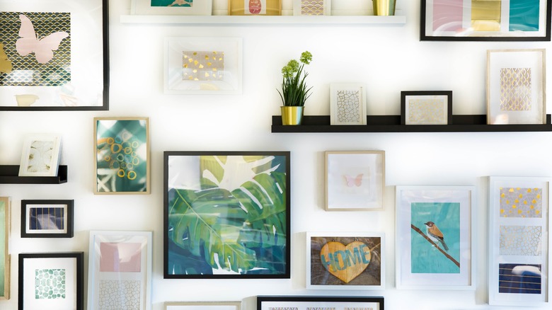
Gallery walls are all the rage in home decor, but they can be a hassle to install. Interior designer Nick Lewis on YouTube suggests that homeowners consider the entire wall as a whole project rather than focus on each individual picture or art piece. Lay out the wall with paper or painter's tape prior to drilling holes for each frame. Take your unique wall into consideration when planning a gallery. If the wall is long or odd-shaped, focus your pieces accordingly. For example, tall walls can showcase texture and details without feeling too crowded, as long as the pieces are scaled to the room. By contrast, having smaller frames close together can make even the tallest wall appear short and cramped.
Playing with the shape and texture of your frames is also a great way to make an impact with your gallery wall. When planning the wall, leave blank space around the pieces, so the layout doesn't feel too cramped or random. It's also important to avoid hanging gallery pieces too high, especially if they're placed over a couch. A good general rule is to hang things five to eight inches under a ceiling when placing anything above a couch or sideboard. Also, aim to hang pieces two or three inches apart from each other for consistent spacing (via Framebridge).
Make the room look luxurious with statement art
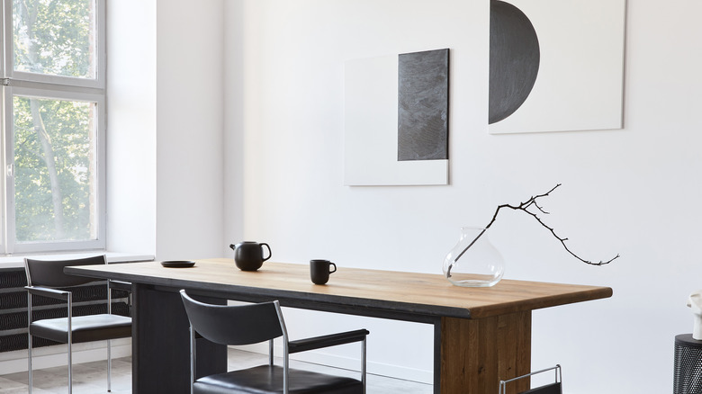
One of the easiest design tricks in the books is to scale your art to make a room look more luxurious. According to artist Kim Knoll, bigger is better when it comes to hanging artwork in your home. Small art can make a space look empty, and an otherwise well-decorated room may look incomplete. Measure the area and plan it out with tape prior to hanging so you get a sense of how the wall will look. While you can hang three pieces of furniture side by side and follow the rule of three, you can also choose to have one statement piece. This style will offer less distraction and make a room more minimalistic.
As a general rule of thumb, when hanging a piece over a sofa, art should be ½ to ⅔ the size of the furniture piece (via Ballard Designs on YouTube). You can also decide what size your art should be by measuring your wall and multiplying the numbers by 0.6 and 0.75. This tip will give you a range of art sizes appropriate for your unique space (via Kate Kerdi Interiors on YouTube).
Mix aesthetics with the 80/20 or 70/30 rule
To successfully mix design aesthetics, follow the 80/20 rule, which some designers prefer calling the 70/30 rule. Both follow the idea that most of your design should be one style, while the remaining percent leans toward another style. For example, the majority of a room could be decorated in a rustic decor style, with some bohemian details mixed in. According to Stone Gable, the breakup can even be 70/20/10 if you're trying to mix three different design styles together.
When mixing design styles, it's best to keep your furniture versatile enough to pair with virtually any decor style. This tip keeps the room looking timeless and prevents you from having to purchase a new couch every time you want to change things up. To successfully follow the 80/20 ratio, use the same color palette throughout a space. Doing this will ensure you can stray from your main style without making things look messy or thrown together.
The 80/20 rule is also a great way to figure out how much to spend on each piece (via Ariel Magidson on YouTube). 80 percent of your budget should go to the dominant items that'll get much more use, like a couch or kitchen table. 20 percent of your budget can go to small details that make up the remaining design style, like curtains, lighting, and side tables.
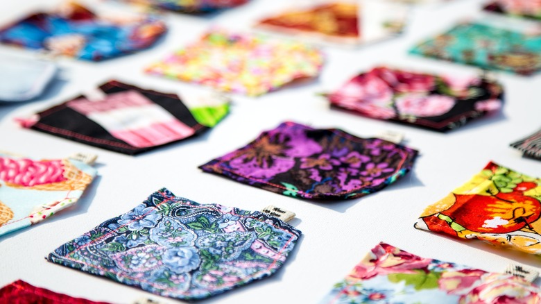
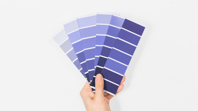
Reference samples before starting any project
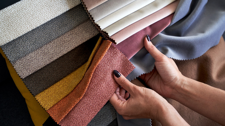
Before starting any design project, interior designer Marilynn Taylor suggests picking up fan decks from your local paint or hardware store. Fan decks, sometimes called color decks, are a book of color, fabric, or stain options, commonly delivered in a fan deck binding. You'll typically see fan decks with paint or stain samples for consumers from the leading paint brands.
Additionally, your local paint store expert should be able to walk you through a brand-specific deck. Typically color and fan decks are sourced by interior designers and contractors, but homeowners and aspiring designers can also get their hands on samples from most major brands. You can contact consumer brands directly and ask for a color deck or sample book to be shipped to you. Some companies have online forms where they provide complimentary swatches or a section on their website where you can purchase swatches, color decks, and sample books.
Create a mood board
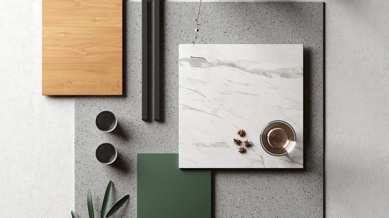
Once you have your color decks and fabric samples, you can create a mood board. According to Janine Stone & Co., a mood board is used in interior design to help keep the room's vision aligned, collaborate with the client, and gauge the feeling a room will invoke. A mood board will typically feature samples of furniture and upholstery fabrics, wood, tile, metal, stone, and wall coverings for use in the room.
Mood boards help a space look cohesive and organize ideas, making them perfect for non-interior design professionals. These tools can help start the creative process and act as a guide rather than a strict outline. Using one is a great way to help visualize your space and what you want the finished product to look like. You can create a mood board using fabric and other physical samples or create one online. Mood boards can be a mix of anything that inspires you, including photos you like, items you have or want to purchase, colors, wood grains, and keywords (via D. Signers on YouTube). You can create digital mood boards on services like Canva or specialized interior design platforms like Spoak. You can also create a Pinterest mood board and use the plug in and suggested product feature to curate a shop-friendly mood board (via Larissa Swayze on YouTube). The best part is that there is no risk with creating a mood board. You can easily explore different trends and styles without any commitment. Let your creativity run wild because the sky's the limit!
Try a color reader or paint app
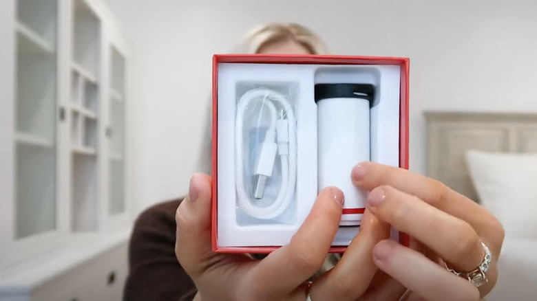
One of the newer tricks in interior design is using a color reader to help you color match your items. With a color reader, you can fill a room with your favorite shade of pink or capture the same ocean blue hue from your living room sofa. Color readers connect to your phone via Bluetooth. Whatever object you place your color reader device on, it will read the color and collect the closest paint color from an app, per Mimi Estelle on YouTube. While many popular paint brands have their own color reader designed for their collections, readers like Datacolor collect information about a variety of popular brands like Ace Hardware, Behr, and Benjamin Moore.
Color readers can help you determine which colors pair best with the color you scan. You can also save and curate palettes from the app for ease of use. If you don't want to purchase a color reader, you can download AI-based apps from major paint brands, like the Benjamin Moore Color Portfolio app. The app allows you to use their specific reader if you have it or to upload your own photos and match hues to any color in their fan deck collection. Additionally, the app has a video visualizer. You can walk through your space and see paint colors displayed on walls in real-time. This technology makes injecting color into your home a breeze.