12 Versatile Shades Of Aqua Paint That You'll Want In Your Home
Dreamy, youthful, carefree emotions are all represented by the wonderful aqua color palette. This bright and invigorating tint reminds people of everything from calm, aquamarine ocean scapes to the vibrancy of life. Sitting somewhere between teal and turquoise, aqua can represent clarity and have a serene effect on those who immerse themselves in this captivating shade.
According to Home Decoratory, this particular shade comes from the combination of yellow and a large amount of blue, or green and a lighter shade of blue mixed together. The results are similar, with an eye-catching color that fills the beholder with happiness and a sense of calm.
When it comes to adding this paint color to your home decor palette, there are a variety of options and hues to actually choose from. One size fits all does not apply to aqua, and the variations all have a dazzling yet different effect. You can choose to pick a shade that expresses a more vibrant mood, or find options that lean toward a muted atmosphere. With such a versatile palette, it's surprising this color can send people shying away from using it within their homes.
There are numerous colors that complement and contrast well with aqua, including light pink, pale gold, white, light gray, and even navy blue. Depending on your theme or design intentions, you can accent your aqua walls with varying color schemes that pop or subdue the overall outcome. Either way, this option shouldn't be feared but embraced and used as a muse for anyone wanting to bring an invigorating vibe into their home.
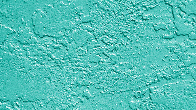
1. Bright and bubbly
Opting for a bright and bubbly aqua color is a way to incorporate all the vibrant charm into a room or space. This shade is great for a specific feature or accent wall, but can also be used to cover an entire room or textured wall that is ideal as a focal point.
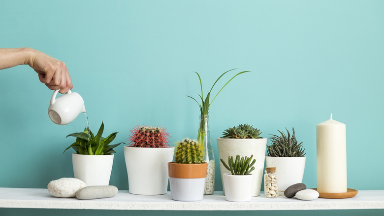
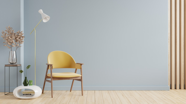
2. Simple and subdued
Not all aquas have to be as loud. In fact, there are a variety of hues and shades that are more muted but still exude a colorful edge. This light aqua is perfect for a high-traffic area that features bold furniture or simplistic decor, adding to the depth of the space without becoming a distraction.
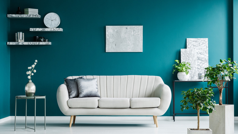
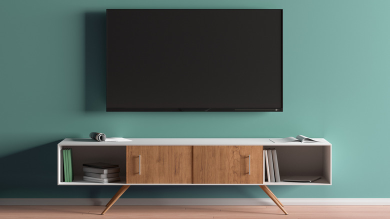
3. Deep aqua
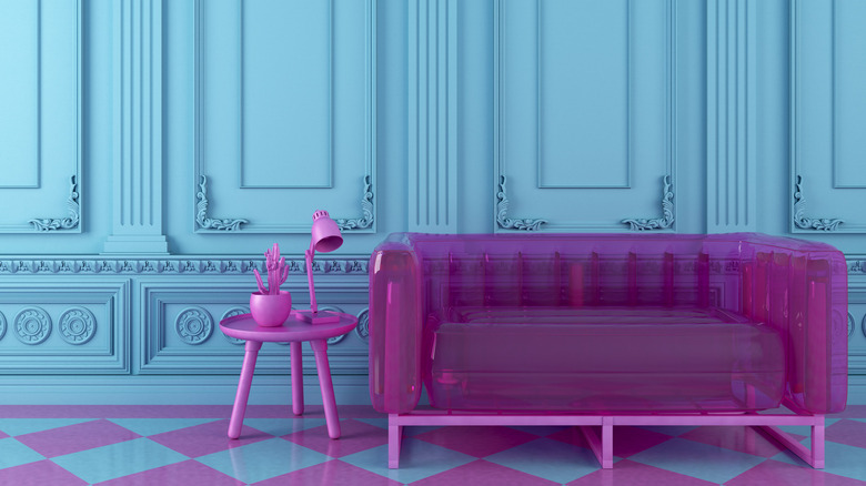
Aqua can match with a multitude of colors and accents, and if you're craving an eye-popping interior, why not go big and bold? A deep aqua wall or room can contrast well with magenta, pinks, or reds and create a truly unique design theme.
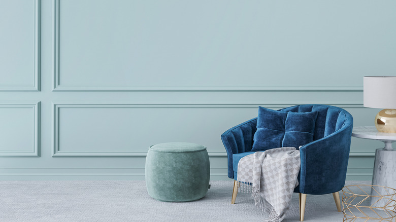
4. Dreamy simplicity
Whether your furniture is loud or subdued, a darker shade of aqua can add a classic twist to any room. Using it to contrast with white or cream furniture will make the walls pop, while varying shades of blue and teal will help mute the bold color without completely drowning it out.
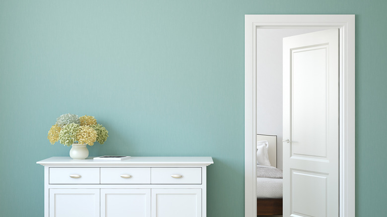
5. Farmhouse escape
For a truly chic spin on the aqua palette, opt for a lighter tone to pair with wood or textured walls. Not only does this show off the vibrant and youthful effect of the color, but it brings a farmhouse feel that adds an escapism theme to any area.
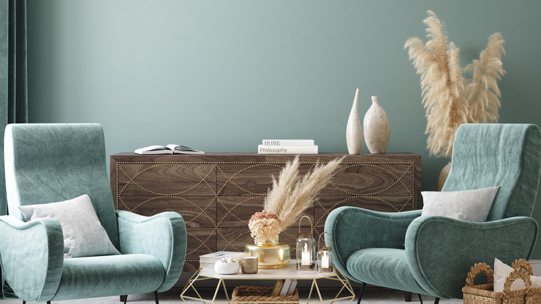
6. Lavish designs
Just like with water, aqua can be dark or light and everything in between. Deeper, thicker aquas are ideal for dramatic themes and decor, creating a rich and lavish environment. Whether you love entertaining or enjoying the feel of a calm, controlled space, this serene but bold color will tick all the boxes.
7. Light and airy
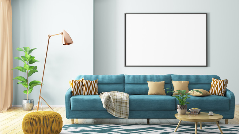
Nothing can compare to a light, airy space that feels open and inviting at the same time. Using a pale shade of aqua will bring a welcome vibe into any room, while still allowing for a range of colors and tones to decorate with.
8. Classic comfort
Some shades of aqua can be both bold and basic, offering a simple charm that extends to multiple rooms. This shade encompasses the bright qualities aqua is usually associated with, but has a slightly darker quality that makes it more approachable for high-traffic areas.
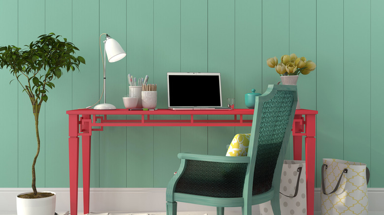
9. Naturally inclined
As you lean toward the greener side of the aqua palette, you'll find it is quite easy to incorporate a more natural feel into your home. The earthy tones of this shade allow for a simplistic interior that still feels adventurous and serene at the same time. This color is ideal for bedrooms or bathrooms, too.
10. Modern twist
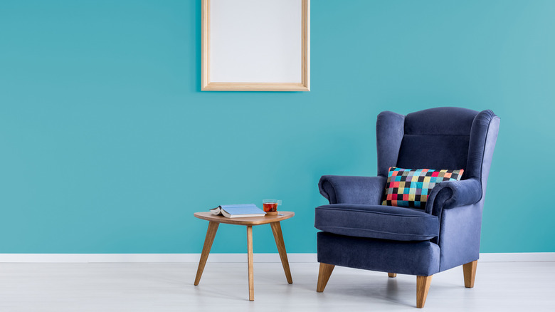
For a more modern take on aqua, choose one that leans toward a blue tinge or hue, more than green or yellow. While these shades still give you the illusion of a vibrant wall, the blue undertones are easier to pair with different colors and accents that other aqua options might not match.
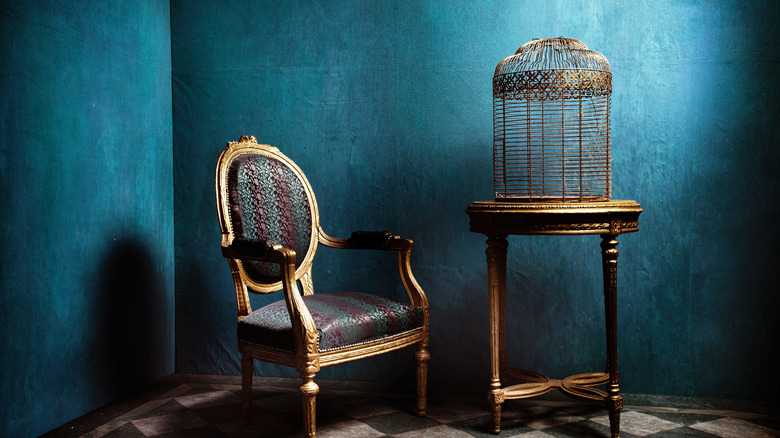
11. Stormy seas
Gray undertones can be perfect for incorporating aqua into a smaller space or tying in other aqua-hued accents. Instead of looking lifeless, this shade pulls out the highlights in similarly colored furniture or decor, contrasting nicely to create a serene atmosphere. This tone is also great for natural wood furniture.
12. Pale hiatus
It might be hard to believe, but aqua has such a wide range that it can actually appear similar to a grayish lilac color. This pale version is useful for those rooms that can still benefit from a little color, but doesn't need a shade that will overwhelm the space. Yellows and golds complement this particular version of aqua without making it seem too pale.