15 Rustic Paint Shades That You'll Want To Put Up In Your Home
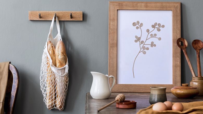
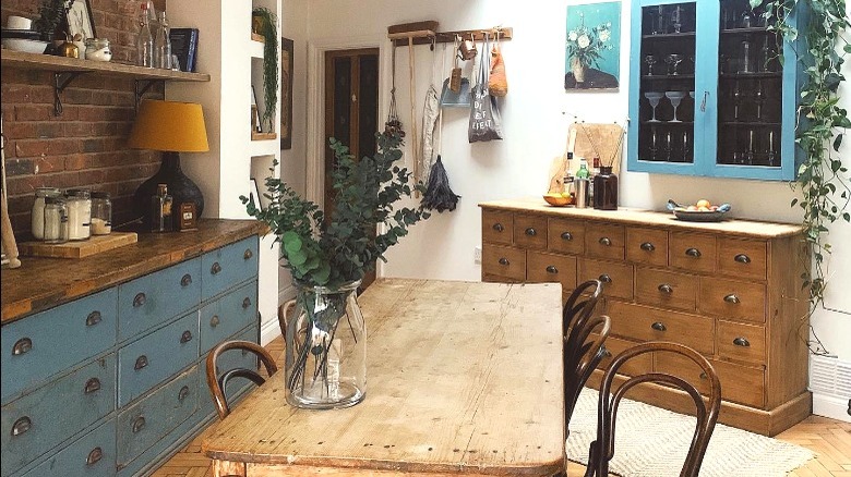
Rustic decor is a loose category that can be featured in many aesthetics. Farmhouse, cottagecore, and French country are all rustic aesthetics, characterized by mixing the old with the new, coziness, and a touch of old-world elegance. These styles tend to buck the starkness of contemporary design without the frilliness of neo-traditionalism. Plus, as many people look to reduce their environmental footprint, rustic decor is great as it encourages upcycling, thrifting furniture pieces, and breathing new life into second-hand purchases. That's just one of the benefits, says Green Ideal; it's also great for the budget.
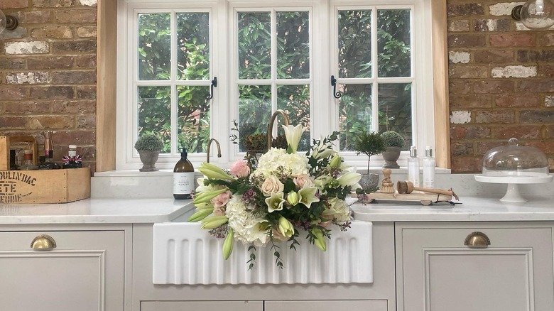
One of the best ways to incorporate rustic vibes into a room is to opt for a new paint color on the walls or give a piece of furniture a makeover. From burnt oranges to muted greens and pale neutrals, rustic shades come in a wide variety. Check out this guide for 15 beautiful rustic paint shades you'll want in your home.
1. Benjamin Moore Driftwood 2107-40
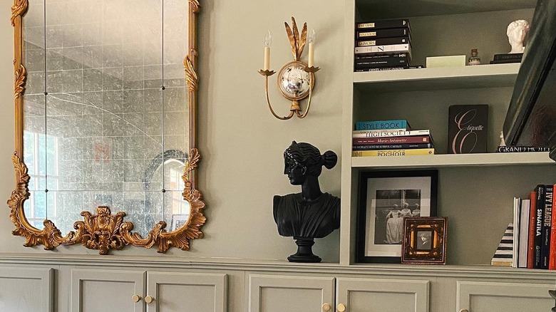
Driftwood by Benjamin Moore is a warm taupe, sometimes reading as a pale tan or brown-hued grey. It's a soothing, cozy, medium neutral that can pair well with any earth tones and pale pinks, like Benjamin Moore Soft Satin 2164-60. Great for cabinets, bookshelves, and wall-to-wall color.
2. Farrow & Ball Stone Blue No. 86
Farrow and Ball's Stone Blue No. 86 has the delicate edge of French country thanks to its cool grey undertones. If you have a piece of wooden furniture that is worse for the wear, this refined shade of blue will elevate it — great for cabinetry, dressers, and banquette benches.
3. Sherwin-Williams Felted Wool SW 9171
Felted Wool by Sherwin-Williams has the warmth and appeal of a pair of cashmere gloves. This timeless taupe is a gorgeous greige with slightly warm brown tones. Great for wall-to-wall coverage or for adding depth to a bookshelf.
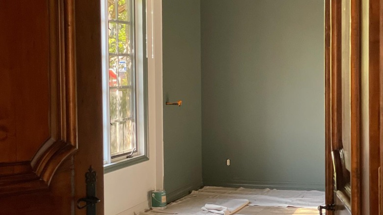
4. Benjamin Moore October Mist 1495
Benjamin Moore's 2022 Color of the Year is the soft sage green October Mist. It reads as a neutral but with an elegant, verdant touch. For old-world charm, consider painting this shade on the walls and ceiling — it pairs beautifully with brass and bronze, as well as Benjamin Moore's Venetian Portico AF-185.
5. Behr Unplugged T18-11
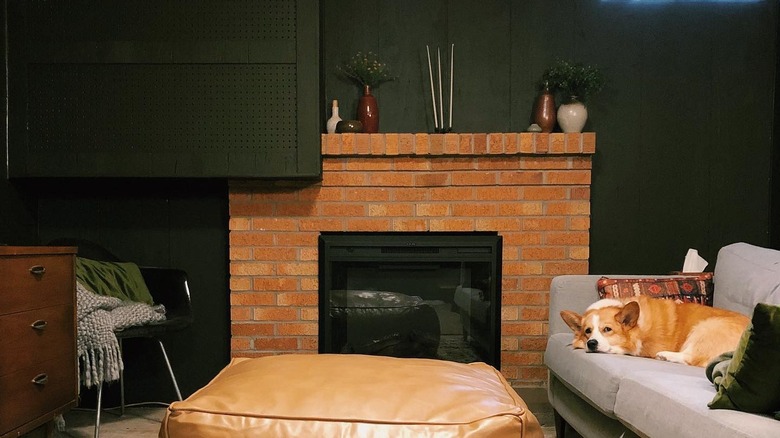
For those looking for a more dramatic edge, opt for Behr's Unplugged, a deep, heavily pigmented pine green. It looks great with red brick, earth tones, and burnt oranges. Ideal for trim or as an accent wall.
6. Sherwin-Williams Cavern Clay SW 7701
Sherwin-Williams' 2019 Color of the Year Cavern Clay is timeless. This spicy cayenne shade is a nice, earthy take on burnt red-orange. Stunning on an accent wall, door, or all-over powder room color. For a dose of drama, pair with a deep black or a creamy white to keep things more neutral.
7. Benjamin Moore Pashmina AF-100
For those who can't decide between a cool or warm tone neutral, Pashmina by Benjamin Moore may be the perfect rustic shade. It can read as beige, tan, or warm grey depending on the lighting and how you pair it with other colors.
8. Sherwin-Williams Alabaster SW 7008
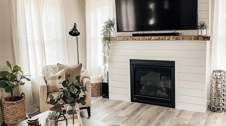
Leaning into rustic tones doesn't mean abandoning the classic look of white and black modern farmhouse design. Sherwin-Williams is a gorgeous eggshell white that looks good with anything — crisper shades of white, deep sage green, and natural wood tones.
9. Behr Cracked Pepper PPU18-01
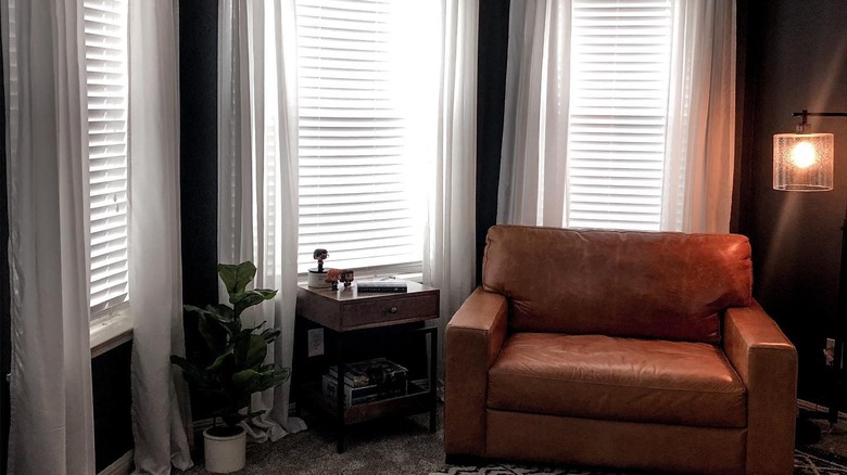
Previously shunned as too dark and dreary, black walls have been getting some much-deserved love in interior design. Behr's Cracked Pepper is a stunning, deep grey that can work as a main wall color or give a piece of wooden furniture like an end table or nightstand a whole new vibe.
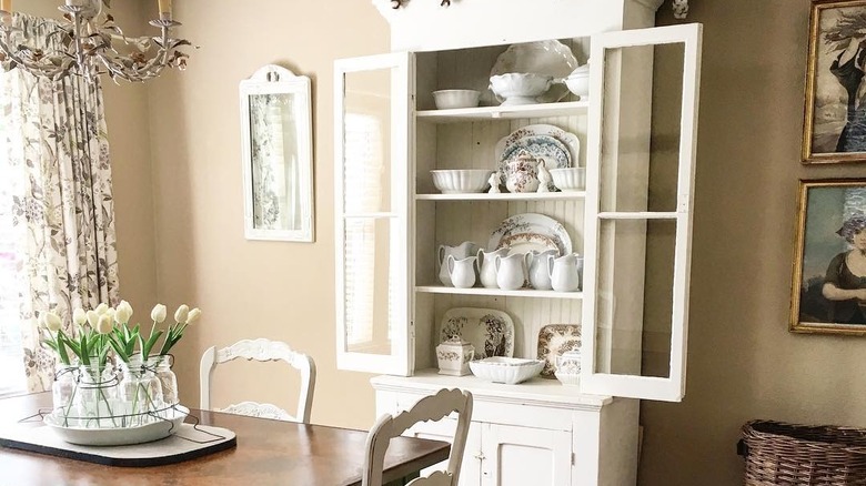
10. Benjamin Moore Creamy White OC-7
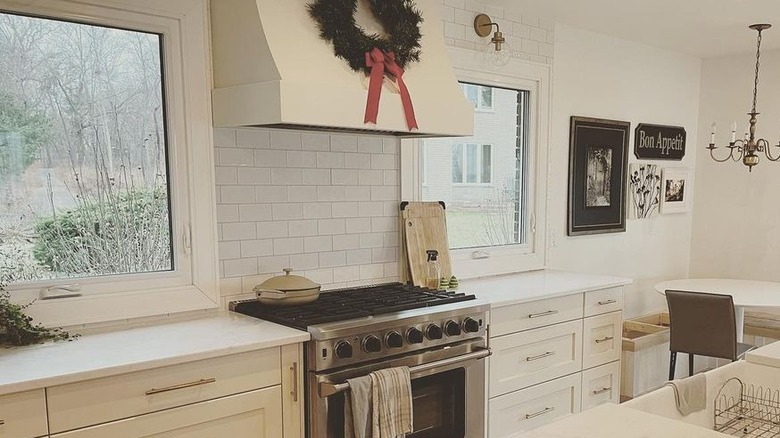
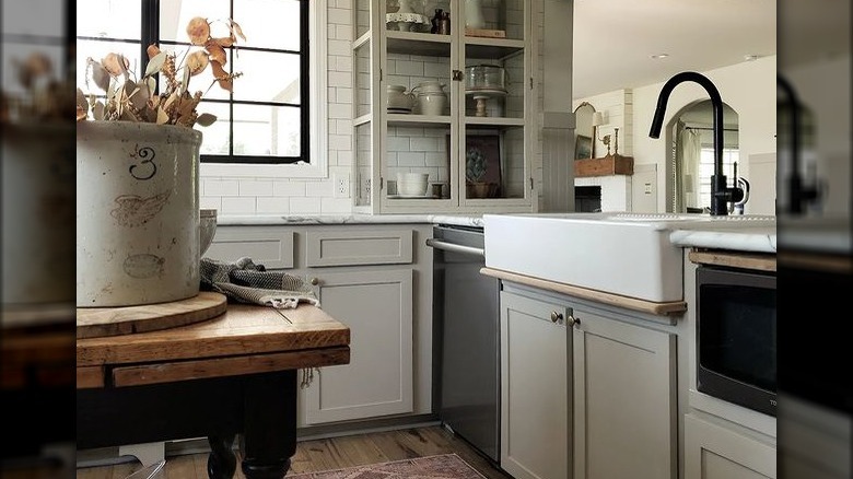
Much warmer than a true white, Benjamin Moore's Creamy White has a rustic softness that makes it ideal in a French country home. Just as suitable for your cabinets as it is for your walls and everything in between.
11. Behr Rusty Gate M200-7
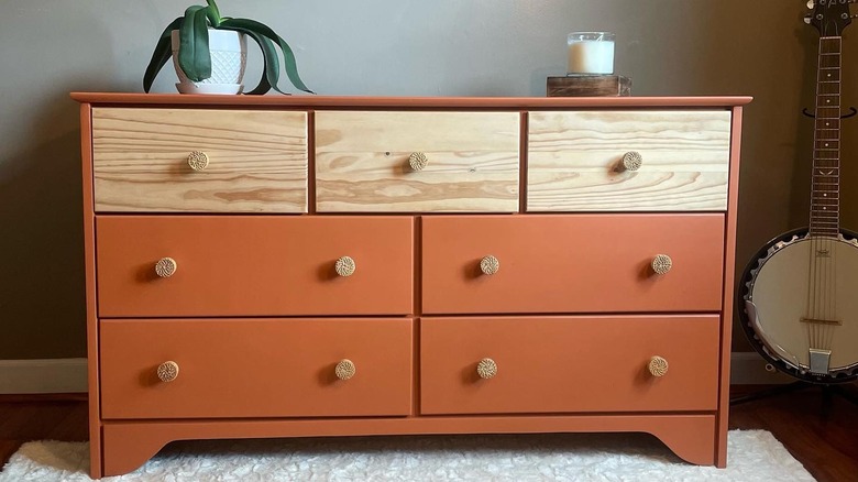
Rusty Gate by Behr is a gorgeous shade of warm, burnt orange, sometimes known as terra cotta. It works as an earthy neutral but still has the vibrancy and charm of a punchy, spicy orange. Rusty Gate would look beautiful on refurbished wood furniture or a statement wall. Pair with pale gold accents.
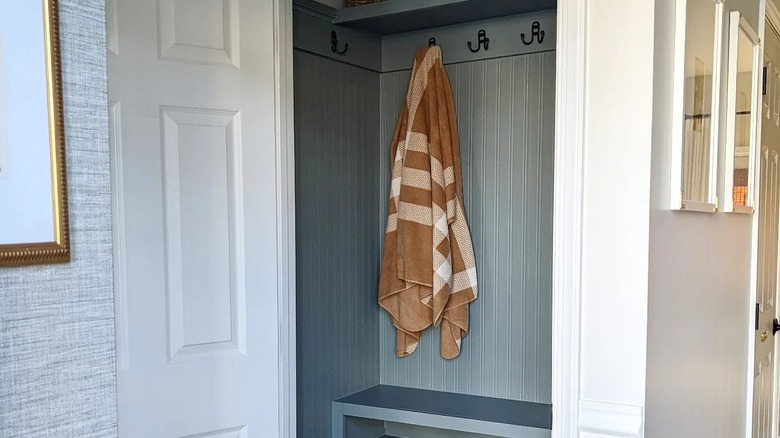
12. Benjamin Moore Rainy Afternoon 1575
Sage green is enormously popular due to its soft naturalist vibe, but for someone wanting a slightly moodier shade, Benjamin Moore's Rainy Afternoon grey-leaning green is the perfect pic. This is an ideal floor-to-ceiling color that will have you wanting to curl up with a cup of tea.
13. Sherwin-Williams Latte SW 6108
Sherwin-Williams Latte perfectly captures the gorgeous, comforting shade of coffee gently stirred with a splash of milk. This warm neutral is part of the orange color family but reads as a delicate beige. Stunning in any room and works with many aesthetics.
14. Sherwin-Williams Portsmouth SW 9644
Sherwin-Williams' Portsmouth is a stunning shade of cape cod blue with slightly grey undertones. Burnt oranges, camel brown, and white make this rainy blue pop delightfully. Perfectly suited to cabinets, wall-to-wall coverage, and on furniture.
15. Benjamin Moore Rosepine 461
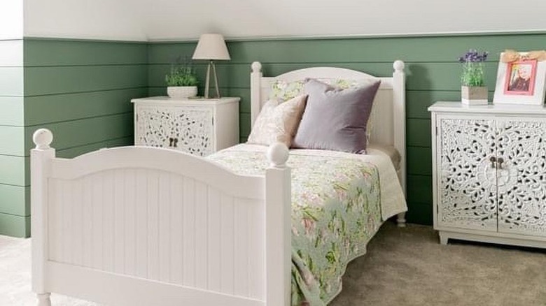
If your tastes lean more into pastels for a cottagecore/shabby chic rustic aesthetic, consider Benjamin Moore's Rosepine. It's a springy but muted sage green that pairs nicely with blush pinks and white. Consider Benjamin Moore's Chantilly Lace OC-65 on the trim and Early Sunrise 2084-60 on an accent piece.