David Bromstad's Advice For Pairing Paint Colors With Dark Woodwork

In a world full of gorgeous colors from every hue and shade in the rainbow, it can almost be overwhelming when it comes to deciding on which one ... or 12, to use in a room, especially when you break down how certain colors can work either with or against each other. The last thing you want to do is make a mistake choosing a paint color that will clash with a room. This could not only look displeasing to the eye but also put a damper on the vibe of the whole area. Understanding that colors such as orange and soft reds can add a sense of warmth to a room, whereas blues and violets can induce calm and neutrality will help you in designing your room, according to HGTV.
If you live in a home with dark wood trim, flooring, exposed beams, or doors, it could be a bit tricky to match the ideal shade of paint that will be able to highlight these accents while not taking away from the overall aesthetic. Luckily, HGTV's resident color expert and host of the show "Color Splash," David Bromstad, has some good advice when it comes to matching the right paint in a room that features dark woodwork.
Contrasting paint can be ideal for dark woodwork
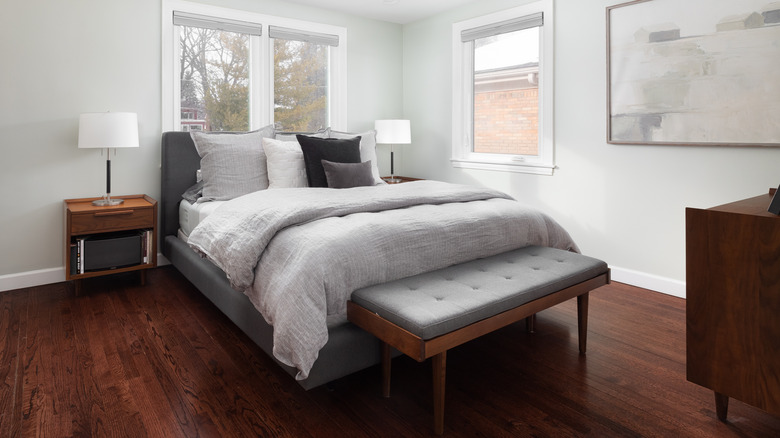
Dark woodwork like floors, beams, and furniture, as well as deep-colored wood accents such as trim, wainscotting, and window frames, can be a unique addition to any room. Dark wood has the ability to bring out rich notes of sophistication and can aid in balancing a very well-lit room. However, if not contrasted properly with the right shade of wall paint, the area can quickly look shady and foreboding (via From the Forrest). So which colors work for a room with such serious features?
Color connoisseur David Bromstad answered just this question in a Q&A with HGTV Magazine (via HGTV). "Dark woodwork can be incredible, but only if the wall color majorly contrasts with it; otherwise it'll look like a haunted house," he says, advising that if you have this type of wood in a room, it is best to go with a shade of white. Additionally, he recommends going with a pale color such as a blueish gray or a soft green to help the space feel brighter. These elements will help add some levity to the heavier, darker characteristics of the room and bring forth a wonderful feeling of balance.