David Bromstad Is Begging You To Avoid This Popular Color Mistake

Choosing the right colors for your home might seem simple, but even a small difference in tint can have a massive impact on the entire design. When finding your color palette, it's best to take a thoughtful approach, and consider some advice from the professionals, like David Bromstad. Bromstad has years of experience in interior design and even multiple HGTV shows under his belt, including his series "Color Splash," which focused on showing homeowners how to take a practical yet enthusiastic approach to color design in the home. Although he's known for his innovative use of color, there are still some choices he can't get on board with. When speaking with HGTV, Bromstad shared his take on the biggest color mistake people often make — keeping the color palette too "matchy-matchy" due to fear of experimenting with different shades.
Although it's important to consider how impactful our color choices can be on the overall design, it doesn't mean that you should always play it safe. Home design is a creative art, and some of the best results come from experimenting with choices that can offer a sense of character in your space. There are plenty of reasons to take Bromstad's advice and avoid overly matching color schemes, and they're worth considering before you start your design process. Mixing in different splashes of color won't always prevent you from creating a cohesive color palette for your home — with a thoughtful approach, a more expansive use of color can be your design's biggest asset.
Overly coordinated color schemes fall flat
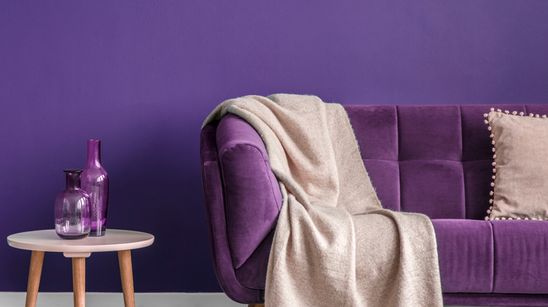
When discussing his take on the biggest color mistake homeowners make, David Bromstad expressed that "they just don't know what they're doing because of their fear. So they often go too matchy-matchy. They'll have red walls and then think they need a red comforter. That's definitely a look, but not necessarily a good one" (via HGTV). He's not the only professional to share this view, as many designers note that overly matched color schemes tend to lack personality and contrast, which are key elements to a successful design. When everything from decor to furniture to paint colors shares the same hue, it creates a one-dimensional, monotonous look that can quickly become outdated.
Bromstad has shared that his college studies in color theory taught him just how much impact color choices can have, and now he never commits to one singular shade in his designs. Color theory in interior design is used to define a space both aesthetically and visually, using various color combinations that visually shift proportions, evoke certain moods, and create interest through contrasting elements. There are so many color combinations that will transform your home's interior, so limiting your palette to only one hue can prevent your design from truly standing out. An abundance of matching elements will never guarantee a successful design. The best spaces feel cohesive but also layered and dimensional, which can only be achieved when you open up your color palette to more than one specific shade.
Expand your color palette for a lively design
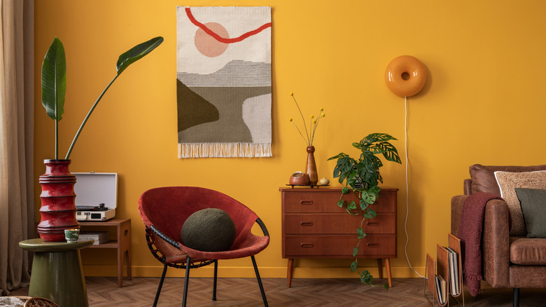
David Bromstad acknowledges that many people fall into the mistake of matchy-matchy schemes simply because they're too afraid to experiment with color. For those who can relate to this fear, he encourages starting small by choosing neutral colors for your large furniture pieces, and slowly experimenting with more exciting colors through decorative accessories or paint choices. Bromstad says that sticking to shades that are similar in tone helps maintain a cohesive look, with one of his favorite combinations being soft greens with beige undertones paired with muted, dark browns to add interest that remains neutral. You can also liven up a neutral color scheme by mixing in elements of texture, dramatic metal accents, and neutral shades that complement each other.
Maybe you're not afraid of vibrant colors, but you're not sure how to incorporate them without risking a design that doesn't match. In this case, designers recommend starting with a base point for your color palette, like a vibrant rug or piece of artwork, and using it to guide your color choices. Once you have your base color, layer in decor with complementary shades for a bolder look, or some with subtle variations in tone to keep the space more relaxed. If you're looking for ways to add a dramatic splash of color into an otherwise neutral design, aim for a large, colorful piece of furniture that contrasts the neutrals, either in intensity or tone.