David Bromstad Has A Word Of Advice If You Paint All Your Walls The Same Color

Choosing the right paint color for your home can be a little daunting. You want to make sure that you match the perfect shade to complement the décor and the feel of your room; in some circumstances that could mean picking one coat of paint for an accent wall, with other contrasting shades on the adjacent walls to frame the selection. Also, if you have multiple people living in your residence, chances are that each person will have their own taste in the color palette. Keeping in mind the tones for your kitchen, bathroom, and dining room, this painting project could potentially cover every hue of the rainbow.
However, if you have absolutely fallen in love with a particular color, can it possibly become the one shade that you feature throughout your whole home? Well, there are many experts that would tell you that's not the best idea. According to Wiese Painting, you shouldn't paint the whole interior of your home in one tone. Instead, they suggest that if you like a certain base then you should use variations of that pigment in different rooms to create a progression of that same color. This will help to make each space flow seamlessly from one to the next without the color taking the main stage. But if you want to throw caution to the wind and stick with that electric blue tone for your whole home, then HGTV's color expert David Bromstad has some advice for you.
How to balance your tone of choice
If you have made the decision to paint the interior of your home one color, then there are some things to consider. The host of "Color Splash," David Bromstad advises that if you plan on choosing a bold base tone for your home you should make sure it's a color you will not grow tired of. There would be nothing worse than taking the time to paint and then finding out it grates on your nerves a few months down the road.
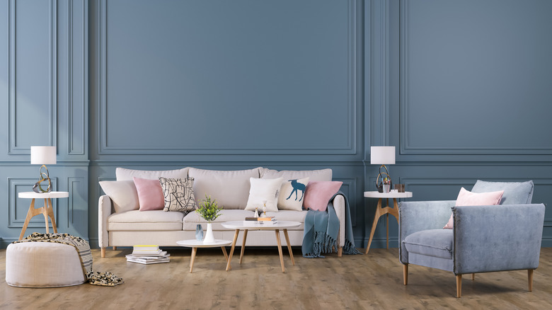
Bromstad also revealed a secret about how to carefully balance this painting choice so it doesn't become over-stimulating. "Just keep your furniture neutral — think natural woods with crisp white or rich cream upholstery," he told HGTV. "That will help the blue feel like a backdrop rather than competition for your eye."
Although this will aid in mellowing out the room a touch, the bright color may still be a focal point. To aid this dilemma Bromstad has another solution. "My other trick is to use even more saturated colors as accents," he continued. "Fuchsia pillows, tangerine bowls, and a neon yellow vase or two will make an otherwise potentially crazy shade seem toned down in comparison." Incorporating these tips into your own home might be just the thing to create continuity around the room and treat the eye to more than a one-note wall.