5 Paint Colors That May Overwhelm You In Your Own Home
Paint color is one of the most personal decisions we make when it comes to designing a home. It can communicate emotion, history, mood, and a sense of belonging in our personal space. While some stick to palettes they are familiar with, house flippers and seasoned buyers will demonstrate that paint color can be used in a variety of ways to convey all sorts of things about the place you live in.
This is not to say that strong colors cannot be utilized, but they need to be used thoughtfully and not excessively in order for a home to feel balanced and not overstimulating. From the walls (often suggested to not be the first decision) to the floor, color is at the heart of every design choice we make (as noted by MyMove). So, let's discuss five paint colors that may be overwhelming or stressing you out in your own home.
Red
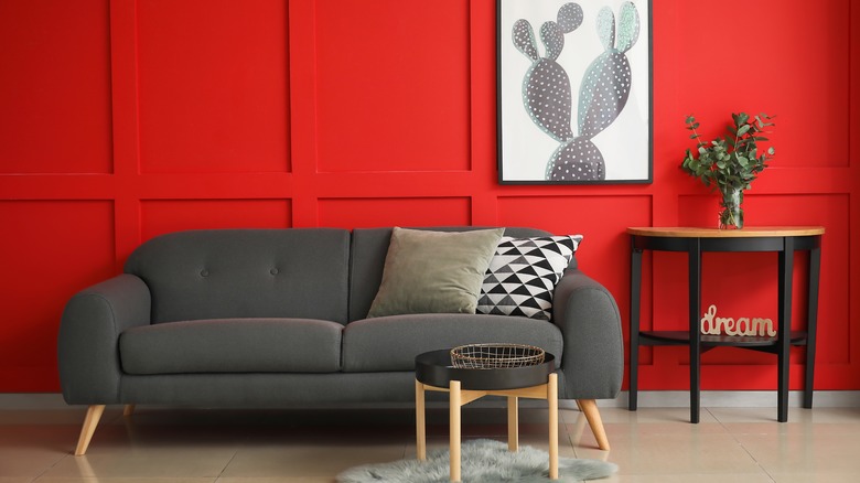
This one isn't surprising — because of what is called color psychology, the color red is generally associated with creating a state of alertness and invigoration (as noted by Reviewed). This might explain why cinema walls are often this color to not let you get too sleepy before the movie. Or why red is the color often associated with Valentine's Day and might make for a romantic dining room. But you definitely want to be careful with this color.
It is subconsciously cemented in our brains to associate red with fear and danger. Red stop lights, red fire trucks, red lifeguard stands — this color carries real weight in a home. It can cause a rise in blood pressure, body heat, and even sensory overload (according to Symbolism And Metaphor). A deeper magenta or soft diluted red pattern is one thing, but a red wall can be overwhelming. A red couch can be too loud and assault the senses. Even red art can be distracting. In its purest form. Red is best reserved for home theaters, dramatic dining rooms, and modern homes that warrant a strong aesthetic.
Bright yellow
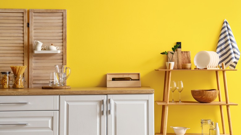
Bright yellow can be downright headache-inducing. While pops of it can be fun on pillows, wallpaper, or country chic decor, this is not a color that typically works well on walls or painted in big spaces (like cupboards). When used in excess, it can overtake a room and overstimulate the homeowner with distressing effects.
In fact, there is real scientific evidence to support such claims. One study found that romantic partners are most susceptible to engaging in conflict in yellow kitchens (according to Young House Love). Another piece of research suggested that babies were more likely to show fuss in yellow rooms. Furthermore, yellow's relatively limited marketability indicates that it could affect your home's future resale value. One study found that, in general, yellow kitchens are less preferred. As a result, the seller could be leaving close to $2000 on the table for the resale of their home, should they choose to keep a bright yellow color (according to PPD Painting).
Purple
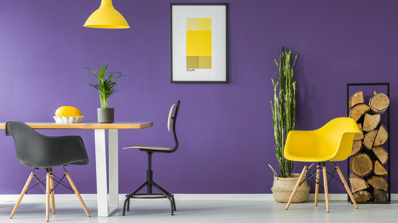
Because it has such a relationship to red (the combo of red and blue), purple does not relax a homeowner. It actually does the opposite. Purple has been proven to elevate the heart and up neural activity (according to Color Meanings). The appeal of purple is increasingly limited — it is one of the main colors that younger buyers associate with a dated or unattractive property.
Additionally, there is also science backing up the negative effects of the color purple within a home. Research with short-term residences showed that purple walls did not lead to good sleep. In fact, it was the color most likely to induce a bad dream. In particular, Pyaar asserts that a dark purple is very much to the emotional detriment of a homeowner — a deeper hue can elicit feelings such as depression, annoyance, and irritation. It is also a color that is difficult to pair with and generally limits the design possibilities of a space.
Brown
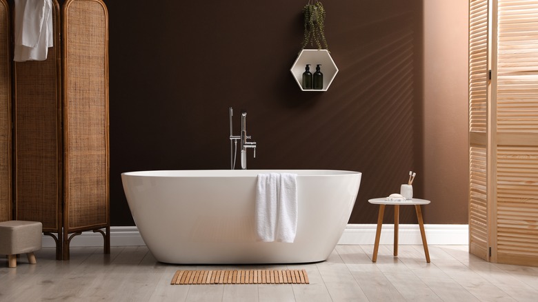
Plain brown is one of the worst colors you can paint your home, period. While there are deep, rich hues and lighter tones that can complement certain rooms, this is generally a difficult color to pull off. Emotionally, brown brings sentiments of a cramped, dirty, and unappealing space. While it may work well for keeping kids' handprints and muddy splatters from dogs from showing up on the walls, it simply looks messy from the start.
House Painting Tutorials notes that because brown has a strong effect on a room, similar to black, the color works best in confined spaces, bathrooms, or rooms with limited wall space — this severely limits the usability of this color to small bathrooms and perhaps closets. Furthermore, brown paint also requires a very specific configuration of lightly colored furniture, light fixtures, and finishes in order to work. Again, this is very limiting and not ideal for a room aesthetic.
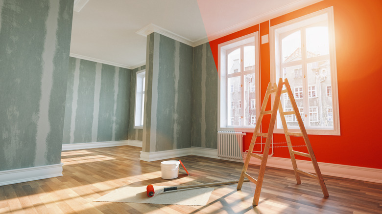
Orange
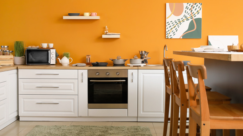
Orange you glad — just kidding. But, seriously, orange is chaotic and typically way too much for most main rooms. It is definitely a color that depends on the setting. In a tropical condo, the right shade might work with softer decor. But there are so many home styles and aesthetics where this color does not work at all. It is also a color that does not create a sense of ease or relaxation.
While its cousins rust and umber might be useful for a small space such as a yoga studio for some zen vibes or a moody bathroom, traditional orange is quite distracting. Color Meanings points out that orange is a combination of red and yellow, both of which are colors used for increasing energy and appetite. This is not a color that promotes relaxation or tranquility; thus, it fits best in bonus or themed rooms.