David Bromstad Recommends These Colors For Your Beach House

"Design Star" winner-turned resident HGTV host David Bromstad has made a name for himself on the network since his debut on the pilot season of the hit reality competition. His love of using bold hues in design spaces and even more colorful personality has made him an HGTV fan favorite. That's also earned him tenured notoriety with hosting gigs on other hit shows like "Beach Flip," "Color Splash," and "My Lottery Dream Home," as well as making an appearance on season two of "Rock the Block."
Bromstad knows that a splash of paint in just the right hue can help elevate any space, and encourages people to think outside of the box when it comes to incorporating color into their own spaces by not being afraid to play with unexpected tones. Because many who gravitate towards certain design styles tend to box themselves in to a specific set of "rules" with regard to a color story, Bromstad urges them to reimagine their desired aesthetic to make it feel more creative and less cookie cutter by throwing their learned dictates about color out the window.
Coastal-inspired spaces in particular often run the risk of coming across as gimmicky or beach-themed, making the style notoriously difficult to pull off from a design perspective. Fortunately, Bromstad is here to help, and he shares his tips on how to choose the palette that will leave your beach house feeling elegant and sophisticated.
Consider the location of your beach house
In an interview with HGTV, David Bromstad shared that it's important to consider the geographic location of your beach house in order to determine the palette that will work best. "A more tropical setting may have colors that are a bit bolder and more vibrant because tropical areas have gorgeous flowers and plants that grow naturally in that environment," he explained. "It really depends upon your own personal taste and also where you are geographically."
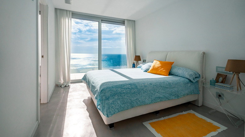
Additionally, Bromstad said that he loves certain tones in beach house settings to play up both the coastal feel and elevate the space. "For me, when I close my eyes, I see many colors that represent the beach," he continued. "Soft blues to striking turquoise, muted oranges and reds for accents throughout; I adore whites and creams for that gorgeous soft luxurious beach feel." Those fresh, bright, neutral hues leave the space feeling clean and elegant while also providing a good jumping-off point if you want to work in some of the bolder tones
Add pops of color with accessories
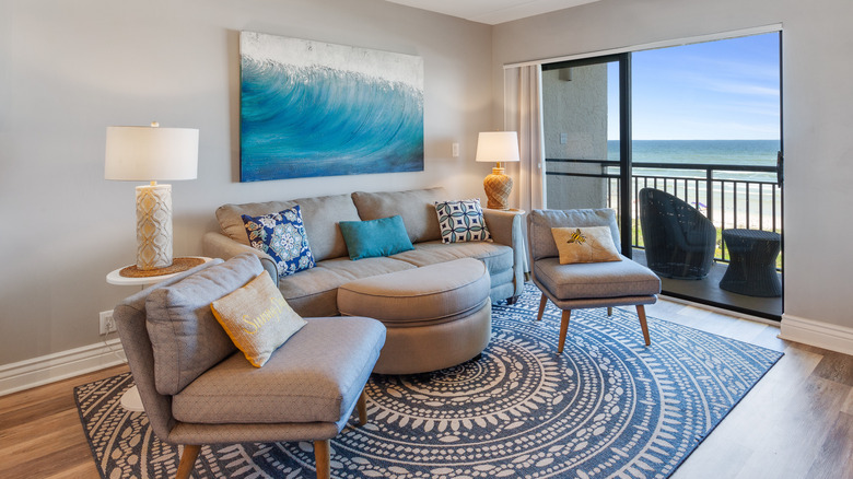
Because David Bromstad is known for his creative way of thinking when it comes to design, he's also a fan of unorthodox color choices for beach houses. "I wouldn't avoid any color if it's done in the right way," he revealed to HGTV. "I have even seen black in a beach theme and it was gorgeous, but it was done tastefully. Any color can work honestly."
If you aren't as bold as Bromstad and want your beach house to simply have a more light and airy feel, there are still creative ways you can incorporate subtle pops of less neutral shades into your space. "You can achieve the look of the beach without painting your walls in color by adding color with throw pillows, throws, lighting and art through bedding and bath," he continued. "Choosing the appropriate home colors, material, textiles and art can create a beach look without doing the theme."