The Best Color Palette For A Coastal Home Decor Style
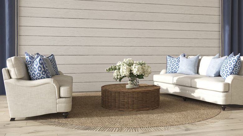
Every well-designed home begins with a color palette. As The Turquoise Home explains, carrying a color scheme throughout multiple rooms creates cohesion while still allowing for a dynamic look. Additionally, sticking to a set of shades will help you confidently choose décor pieces that you know will work in your space, no matter the tone or texture. Moreover, a palette will keep your design minimalistic because you'll have to limit yourself to a set number of hues. In turn, this will make your home feel more peaceful and calming, as your limited tones will work together nicely.
If you love the beach or you live near it, perhaps you desire to create a coastal color palette. Below, you'll first find some essential tips for creating any color palette. But then, you'll discover some of the best coastal color combinations, whether you want a subtle nautical flare or to dive head-first into a beachy theme.
Start with the basics
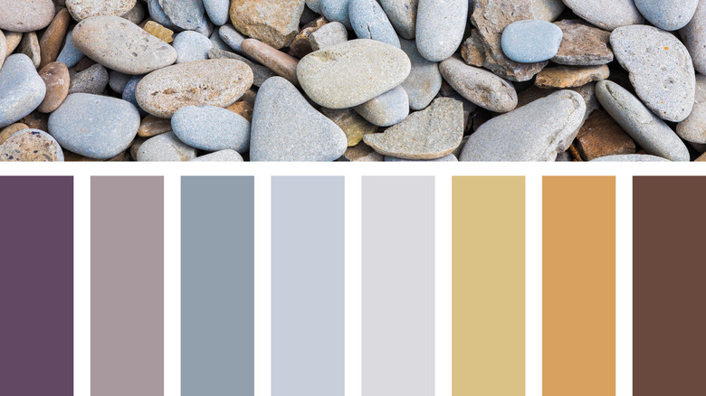
The first step to creating a color palette is choosing a mood. If you want your home to feel exciting, you may choose complementary colors, or those opposite one another on the color wheel, per The Turquoise Home. For a coastal setup, this would probably mean pairing blues and oranges. If you want a more subtle space, perhaps you'd enjoy an analogous palette, with colors that sit next to each other on the color wheel. This would mean blues and greens. Or, for the most simplistic but still interesting design, you could choose a monochromatic look that uses many shades of blue or neutrals.
Hey There, Home says that color palettes should include three to five shades. So your first hue will be white (either cool or warm-toned) and be used on your trim and doors. Next, you'll choose a neutral that you can use for most of the walls. The third would be a more saturated tone, while the fourth should be a shade that matches; and finally, add an accent color that will be used to enhance your other shades.
Another way to think about using a color palette is with the 60-30-10 rule, per Home Bunch. This rule says that you will use your main color 60% of the time, your secondary color 30% of the time, and your accent color 10% of the time. This can help you create a balanced appearance that doesn't have shades competing for the main color tone.
The best coastal shades
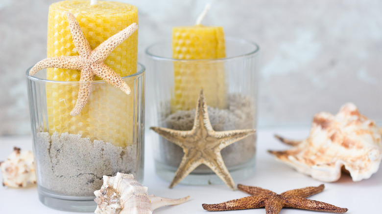
Home Bunch says to take inspiration from nature to curate your color palette — visit the beach and see which hues you enjoy the most, especially those other than blue or tan. As Completely Coastal points out, shades of orange, purple, and pink could emerge from seashells, or warm tones of red, yellow, orange and pink from a sunset could inspire you. Seafoam or shards of sea glass could lead you to teals and greens.
The best palette would utilize a white shade, a neutral (typically tan), a pop of blue or green, and some extra accent tones. For example, those who want to lean into a deep ocean theme may enjoy a cool white with a gray-blue shade and a dark blue pop of color. In addition, you could use light tans and bright blues for accents and secondary colors. On the other hand, those who love seashells or the sunrise could choose a warm white with a light tan and a pop of teal. Then, they could add pink, orange, yellow, or green tones.
If you're looking for some popular beachy shades by Benjamin Moore, try out Muslin, a light tan, or Ocean Air, a light blue, for your neutral, and Honeywheat, a bold yellow, or San Francisco Bay, a medium blue, for your bold pop of color. In addition, Sherwin Williams has some beautiful blues, including Aleutian, Sporty Blue, and Blissful Blue, and stunning greens, including Sea Salt, Coastal Plain, and Recycled Glass.