An Interior Designer Tells Us The Biggest Color Palette Mistakes Homeowners Make
Even if you prefer a neutral, minimalist aesthetic over the bold hues of a maximalist style, the overall color palette you want in your space is a key factor to decide on before you start decorating. However, as MyMove explains, this seemingly simple decision can often be really difficult. After all, there are so many possible shades to choose from, and endless combinations you could incorporate.
Deciding on a color palette for your home is critical for many reasons. According to Hey There Home, having an overall color palette will give your space a cohesion that won't exist if you approach every room individually. Just think of how you use your home — you're constantly moving from room to room, so you want some commonalities between the various spaces. Additionally, from a practical perspective, having an overarching color palette in mind for your home will be a huge benefit when it comes to decorating. You won't need to consider every option for paint colors or decorative accessories — instead, you'll have certain parameters in mind to help you narrow things down.
The challenge of deciding on your home's color palette means advice from the experts can be so helpful, as it's easy to get it wrong. In an exclusive interview with House Digest, Leah Atkins, interior designer at Leah Atkins Design, highlights some of the biggest color palette mistakes that homeowners make, so you know to avoid them as you choose your home's perfect color palette.
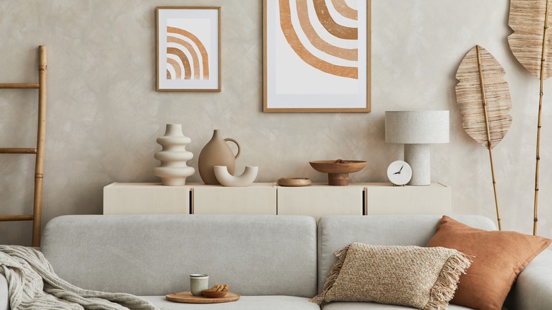
Using the same color for every room in the house
You want your space to feel cohesive. Perhaps the easiest way to achieve that is to pick a neutral hue — such as a cool gray or warm cream — and splash it on every wall. Simple, right? Well, according to Atkins, this easy out is actually a mistake and won't achieve the look you want.
"Keep the house interesting by using a different paint or even a wallpaper in the dining room and bedrooms," she advises. "This will help the home to feel cozier and more personalized as well as give each room its own personality."
Note that she's not advocating you paint each wall in common areas a radically different shade so that you're meandering from one end of the color wheel to the other simply walking down your hallway. If you found a neutral hue that you want to be the primary color throughout your home, that's perfectly fine. Simply avoid using it for every single room.
Atkins suggests branching out in the spaces that are set apart from those common areas, such as your dining room or bedrooms. This way, you can maintain a sense of cohesion in your home's color palette while still adding pops of visual interest. As a bonus, it's far easier to switch out the paint or wallpaper in one room than to repaint your entire house, simply because you decided that the greige hue you used everywhere is a little lackluster.
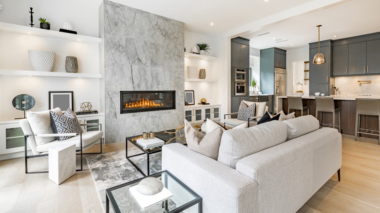
Avoiding white walls because they're boring
White walls have earned the reputation of being sterile, and you might even find yourself avoiding white at all costs. However, Atkins recommends you don't immediately discount this entire hue simply because you fear it'll make your home feel boring. It can actually be a fantastic choice if you want to highlight certain elements in a space.
"White walls allow your artwork and other pieces to pop while also allowing the space to feel more open and modern," she explains. "White is almost always my go-to color for the main living spaces in a home, especially if it's an open concept."
Just think of it as your home's walls providing a backdrop for all the other pieces in your space, from artwork to furniture to your favorite accessories and textiles. Even with a seemingly neutral hue like gray or beige, depending on the undertones and whether it's a cool or warm shade, it could potentially clash with some items in the space. White works with absolutely everything, and will really allow the other elements in your room to stand out.
And, if you have the misconception that white should be reserved for ultra-sleek, modern spaces, know that's absolutely not the case. "White also works beautifully with any design style," Atkins clarifies. Yes, it works in modern spaces, but it also serves as a great pairing for antique pieces with intricate details you want to showcase, mid-century modern furniture, and more.
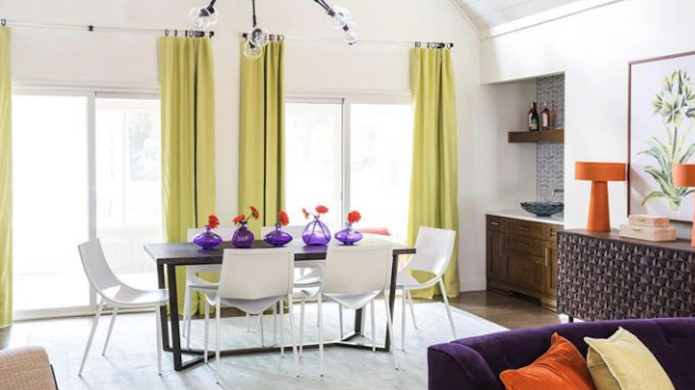
Adding too many bright colors
If you're the type of person who loves to be surrounded by vibrant shades throughout your home, you definitely should find a way to incorporate all kinds of hues — after all, your home should express who you are. However, as Atkins warns, it can be quite difficult to master a color palette that includes a ton of vibrant hues.
"When you're working with a lot of bright colors, it really takes an expert's eye to make it work well and not feel overwhelming. It is very easy for a lot of colors to look like a kid's room," she explains.
However, that's not to say you should resign yourself to a home filled with neutral colors if that's not what you love, simply because you're afraid you don't have the design skill to figure it out. "When done correctly, it can be very sophisticated," she admits of spaces filled with saturated, bright hues. Instead, take her tip and think outside the box as to what exactly constitutes a color. "This means playing with patterns so you avoid having only solid colors," she adds.
As per her recommendation, you may wish to stick to one or two bold hues on your walls. Then, mix up the color palette of different rooms by incorporating furniture or accessories with patterns and prints that bring in some of those common colors while also adding in splashes of other hues you want to be included.
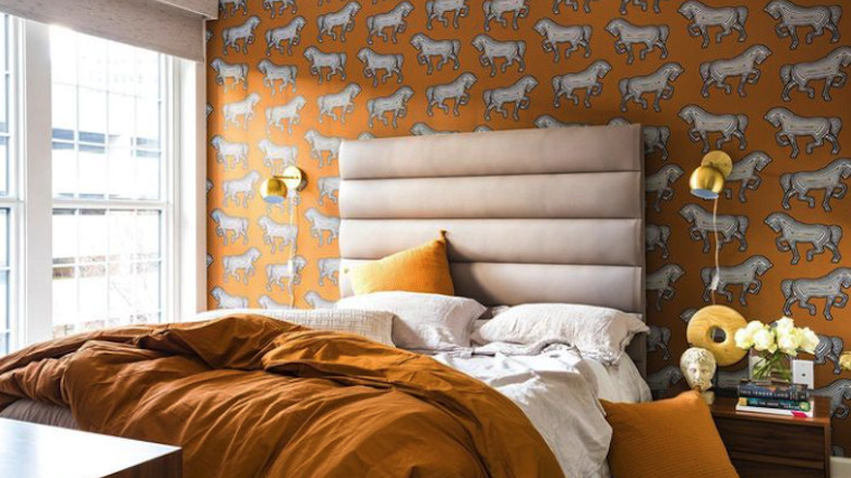
Trying to incorporate color into an otherwise neutral room
When you know your home's color palette, you know the general combination of shades you're working with throughout your space. However, just because a particular hue is part of your home's color palette, it doesn't mean it can work seamlessly in any room, as Atkins outlines. She warns that it doesn't always work to add a burst of color in a room that is otherwise entirely neutral, even if that color is found elsewhere in your home.
"This can often feel forced and it's sometimes best just to stick with the serene neutrals," she recommends. "A neutral room is more often than not meant to be just that — neutral. When you throw in a random green throw pillow or red accessory, it can cheapen the space." That's certainly not the effect you want.
So, when you're bringing in colorful pieces, whether it's something like an accent chair or a piece of art, assess the overall palette of the room you're looking to put it in, rather than the palette of your entire home. If, as Atkins suggests, you have a bold textile or accessory in mind for a room that's otherwise entirely neutral, it may be a better fit in a room that already has a few pops of color.
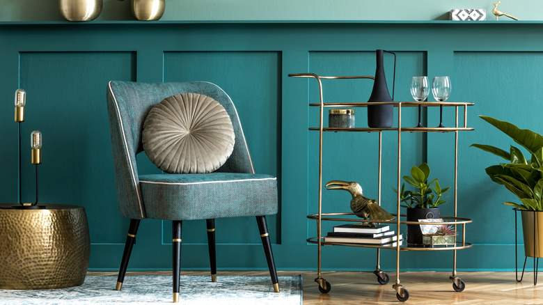
Being afraid of mixing metal finishes
While the metal finishes in your space may not be the first thing that catch your eye when you walk into a room, particularly if you've incorporated several bold colors, they definitely make an impact. All metals, from sleek stainless steel to glam gold to retro brass to modern matte black, have a particular aesthetic. While their finish adds a bit of texture and shine to a space, metals function essentially as additional colors in your space's color palette. So, treat them as such. You probably shouldn't include every single metal in the same room, but you definitely don't need to restrict yourself to just one, as Atkins outlines.
"Feel free to mix gold, silver, and black! I promise it won't hurt a thing. So many people think that once you choose gold, everything has to be gold. Sometimes, mixing finishes can even make a space feel more high-end," she explains.
If you have particular elements in your home that you're not planning to change, such as all the drawer pulls in your kitchen, or certain light fixtures, it's useful to keep these in mind when you're deciding on the color palette in that space. It doesn't mean you can't bring in some accessories or furniture with touches of a different metal — you just want to keep all the colors and metals in a room in mind to ensure they work well together.