The Best Color Palette For A Minimalist Home Decor Style
Minimalistic home décor is defined as simple and clean. Every piece you introduce has a purpose, meaning this design aesthetic has helped homeowners to maintain a clutter-free space. Since minimal décor is a must, interest needs to be created with other design elements, such as color. According to Stone Gable, choosing the right color palette is crucial in creating a harmonious and balanced design. Sticking to a specific color palette throughout your home can also help create a seamless design from room to room.
Instead of choosing random décor pieces and hoping they'll complement each other, we believe it's easier to choose items that match a specific color theme. When you know exactly which hues you're looking for, shopping for rugs, vases, artwork, or anything else becomes much easier. Below, we'll reveal the best color palettes for a minimalist décor aesthetic, and how you can incorporate them into your home.
Pastels are your best friend
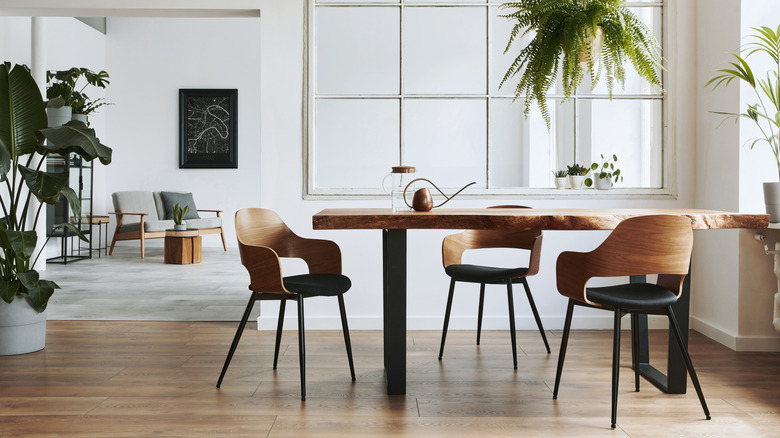
In order to maintain the simplicity of a minimalist aesthetic, the colors you choose should not distract from the quiet and calm space you're trying to create. According to Space Joy, the color palette of a minimalist home includes different shades of white, creams, and pastel colors. Typically, it's common for the walls to be painted completely white, while the other colors can be found within various accent pieces.
A pastel pink or blue makes a great choice for minimalists who want a touch of color in their home, notes Casa One. In fact, blue specifically is able to complement shades of white, gray, and cream. You can create a cohesive, minimalist design by sticking to white paint for the walls and adding pastel blue side chairs or sofas. Similarly, pastel pink is best suited to complement gray or ivory walls, and is able to bring out a subtle yet beautiful contrast against your other muted décor.
Warm and inviting
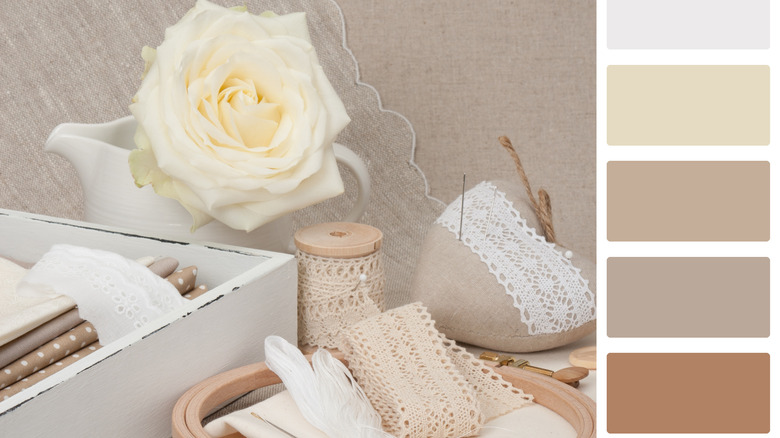
Sometimes the minimalist aesthetic can appear to be cold, but the right color palette will warm it up and make the space feel more inviting and cozy. According to Island Premium Paints, a color palette they call Cafe Passion creates the friendly ambiance you desire. This palette contains a deep rusty color, ivory, a light gray, and a soft beige. It's advised to use this scheme in a dining room or an office.
To make this work in a dining room, we suggest keeping the walls bright with the ivory color, then choosing a complimentary dining table in a soft beige. For contrast around the table and near the walls, look for chairs painted with the deep rusty color, or consider refinishing the ones you already have in that hue. To tie everything together, we believe it's best to use the light gray as an accent color. For example, it would work well for the drapery, a table runner, or a piece of art hung on the wall.