20 Paint Colors That Will Go With A Pine Wood Trim
Want to make your pine wood trim shine? Light yet durable, pine is a softwood that is easy to manage and install while it pairs with an array of paint colors. Generally seen with a white to yellowish tint, it appears fresh and woodsy when utilized as trim within a home space. Places you might showcase your pine are on window trim, door frames, molding, baseboards, a fireplace façade, and/or mantel, including banisters and railings, among other places. The four main types of white pine are eastern, western (or silver), sugar, and limber, with sugar being the top choice for common domestic construction (via Cameroon Timber Export Sarl). Often showcasing distinctive knots within its design, the bright, natural shade of this fabric may also be available in a brownish-red or yellow (southern pine) hue.
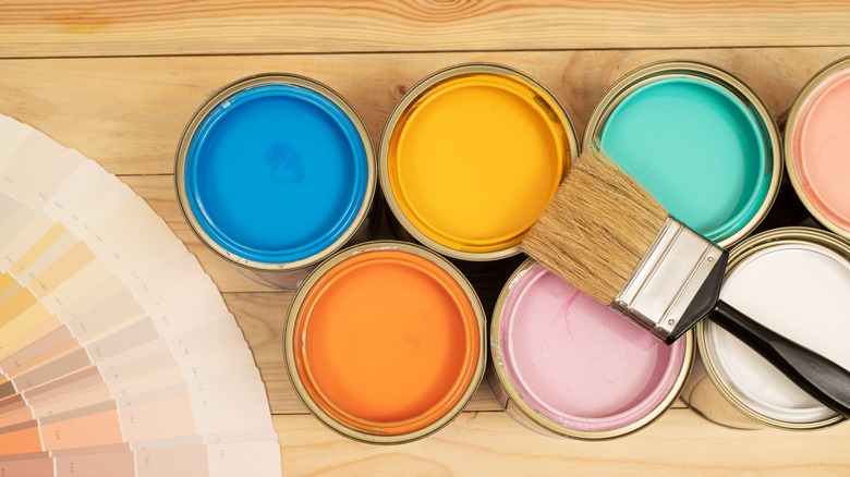
So, what types of colors complement a pine wood trim? As the natural material contains traces of convivial orange and yellow colors, you might balance it with cool, serene shades like blues and greens. Additionally, other vibrant shades may go well with your trim, depending on the tone of the pine, like red and purple, including a few neutral tones with white and gray. Whether the wood appears white, yellow, or red, several paint colors are to consider within the spectrum, from light to dark. Keep reading to learn how to take your pine trim to the next level.
1. Elegant white
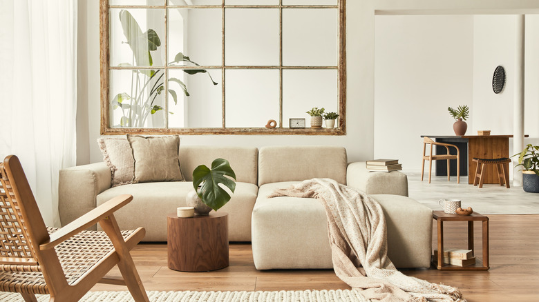
Like a clean slate, white walls are classic and fresh, as they go with various types of interior designs. This image features an elegant yet rustic living space with a pine-like partitioned window frame as the focal point, while neutral-colored furniture and décor complement the room's chic, casual aura.
2. Cloudy gray
An opaque gray looks modern and chic against a wood trim, especially a rich golden pine color, as seen pictured above. With the wood doors and windows as the focal point, this inviting entryway also features white trim to contrast the gray and the wood tone with complementing sconces and a light bluish shade within the columns.
3. Neutral taupe
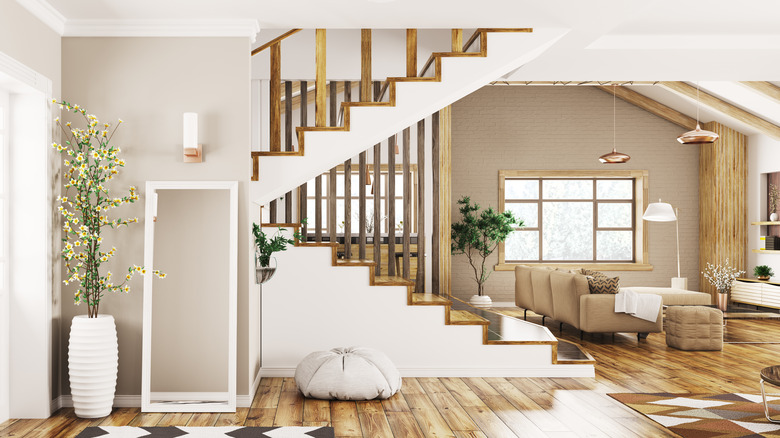
Recognized as gray with a hint of brown, taupe is an earthy and natural neutral that may go light to dark, as it complements several pastel colors like pink, yellow, and blue, including other neutral shades. Here pictured is a taupe-colored living area with pine wooden stairwell steps and railing, contrasting naturally against the white and taupe elements.
4. Opulent gray
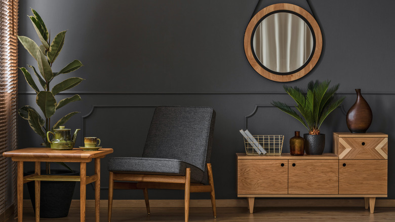
Rich and refined, this dark gray shade has a hint of purple that casts a decadently sophisticated tone. The light pine wood elements from the circular mirror, mid-century modern cabinet, chair legs, and table all stand out significantly against the distinguished wall. The additional dark brown décor and green plant life complement the space.
5. Divine cream
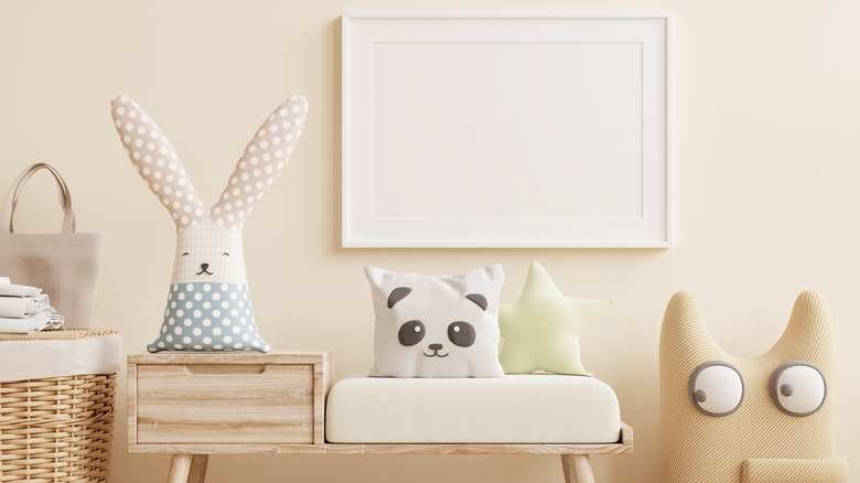
Super light and neutral, this cream-colored wall emanates a relaxed vibe in a nursery room. The white pine is present on the drawer bench with other pastel colors, such as blue, pink, and yellow, which slightly contrast the room along with the white picture frame, brown and beige décor, and wicker basket.
6. Airy yellow
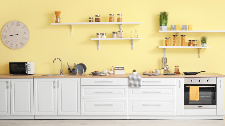
A light yellow color will complement a white pine trim, whether it's on a railing, window trim, or countertop. This kitchen gives an example of these colors composing a bright and airy aura with the creamy yellow wall and light wood countertop and floors, including the contrasting white cabinetry and shelves.
7. Misty green
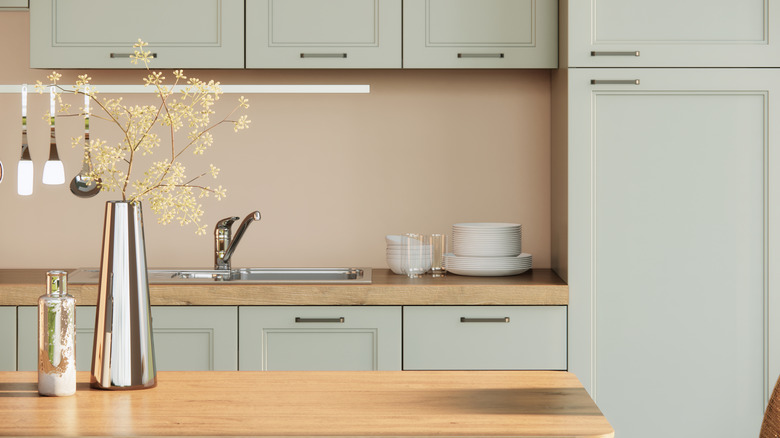
Reminiscent of sea mist or pale plant life, this image features a faint green color amidst the kitchen cabinets for a subdued contrast. A delicate hue, the muted green softens the pine wood countertops present on the island and back counter, while an earthy, pinkish beige complements the simple, serene atmosphere.
8. Sprite green
Balance the outdoor elements with browns and tans against a faint, fairylike green. This cabin features captivating window trim in a yellow-to-red pine wood hue, including similar pieces on the mantel, staircase, and ceiling. The massive gray stone fireplace, wood table, floors, and leather furniture enhance the wood framing and features within the vast living space.
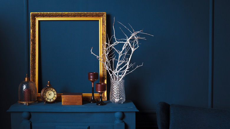
9. Olive green
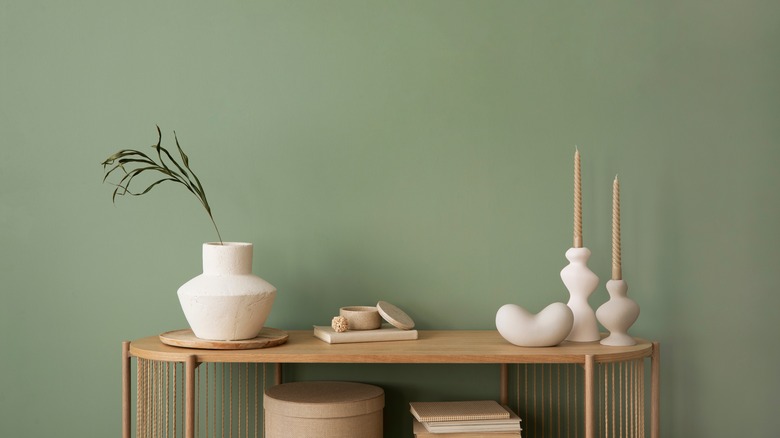
As many neutral green colors might work with your pine trim, this picture gives an example of a gentle olive green wall juxtaposing a pine wood credenza table. A placid scene, the white vase, and candlesticks contrast the color combinations for a minimal, clean vibe.
10. Forest green
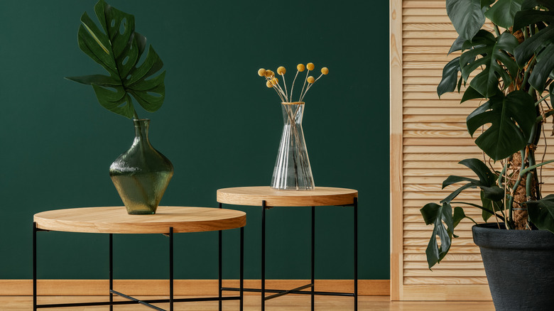
Your pine wood trim will look highly distinguished against a luxurious forest green shade for a serene, boho air. This image showcases the rich, dark shade on the wall, as the light pine divider and accent tables are the stars. Other green, yellow, and black elements give compliments to the space through the plants and hardware.
11. Blue horizon
Like sand and sky, color combinations are often represented through the natural elements. This image features a lovely blue horizon as soft and bright as the sky, with a white pine wood piece to accompany it. You might choose this airy duo for a bedroom or bathroom while including white, black, brown, or beige in the mix.
12. Stormy blue
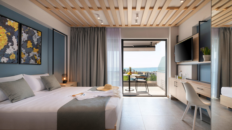
Here pictured is a hotel/condo bedroom with beach vibes all around. From the wood planks on the ceiling to the desk cabinet drawers, light pine is present throughout the room for fresh, coastal air. A thunderous, grayish-blue color is featured on the bed wall and the back of the desk area for a dim yet mysterious beach setting.
13. Dramatic teal
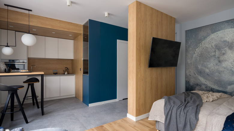
A cross between green and blue, teal gives depth and drama with the ability to keep things tranquil. Like an ocean wave, this apartment features a rich, teal accent wall that contrasts well against the light pine kitchen backsplash, walls, floors, and bedroom partition wall. White, black, and gray elements are also present to balance the room.
14. Berry blue
Like blue and tan or blue and gold, a deep blue can make your pine wood trim pop. This picture features three tones of blue amidst the wall, dresser, and chair, which appear from an enticing blueberry to more navy, making the brown and white pieces stand out, especially the light yellow pine-colored picture frame.
15. Boho brown
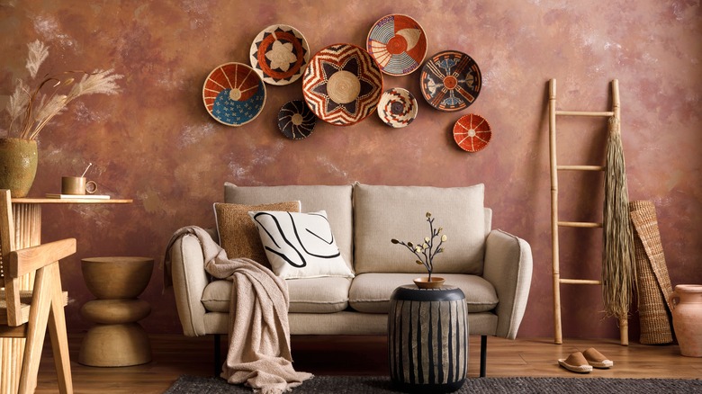
Keeping things earthy and bohemian, this brown wall has depth and character through its textured application. The neutrality of the hue blends nicely with some light pine-colored pieces, including the pale-toned décor and furniture, to emphasize the vivid decorative bowls displayed on the wall.
16. Dark chocolate
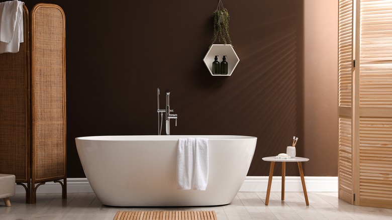
Brown isn't typically a color you might see in a bathroom, but it can work depending on the vibe intended. Here pictured is a bold, dramatic shade as rich as chocolate pudding splashed upon the wall with lighter pine-colored wood elements to contrast through the shades, floor mat, and table legs, including the white bathtub.
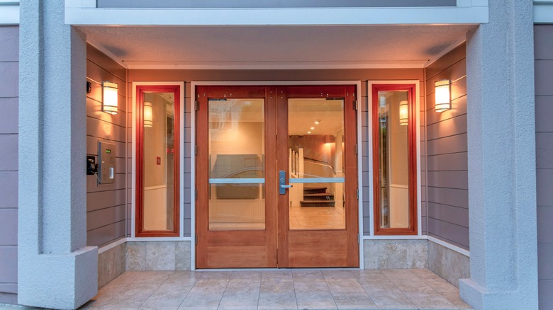
17. Rustic red
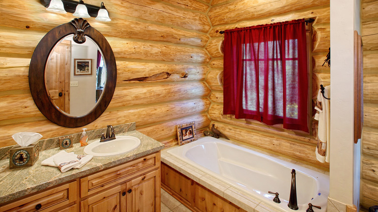
Full of passion and romance, a certain shade of red may be a vibrant paint color to mingle with your pine wood trim. Here pictured is a log cabin bathroom with a robust red present within the window curtain, which sets a fiery, yet tender mood amidst the rustic golden pine hue of the log structure.
18. Shell pink
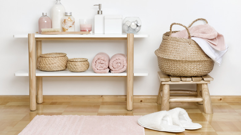
Various shades of pink may work with light white pine, darker yellow, or a red hue for a warm, energetic look. The image above features a delicate shell-like pink with white pine wood elements for a simple feminine feel amidst the spa items of towels, lotions, and baskets. The white wall also contrasts well with the corresponding colors.
19. Posh purple
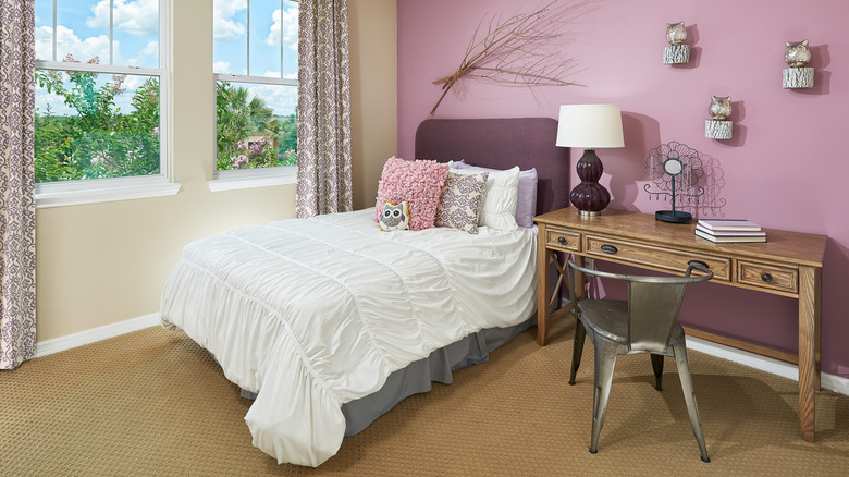
For some regal elegance, purple and pine wood trim create an ambiance of loyalty, magnificence, and passion. Here pictured is a pale violet wall color mixed with a darker shade within the bed's headboard while balanced with white, black, gray, and a notable pine-toned wood table. Like lavender and soil, a tan wood is grounding against purple's flirtiness.
20. Black and tan
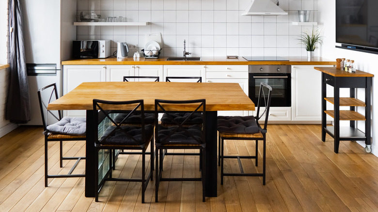
Whether it's a beer cocktail or an old warehouse, the combination of black and tan is the perfect balance of dark and light. This kitchen features a minimal, industrial farmhouse design with the pine wood table top against the black elements; the lighter your trim, the more it will appear distinguished alongside the black.