Think Twice Before Painting Your Kitchen These Trendy Colors
From cooking to dining to entertaining, we spend a lot of time in our kitchens — which is why the color you choose to paint the room is so important, and you shouldn't rely solely on trendy colors.
Science suggests that color is impactful enough to influence our moods and emotions. According to Mountain Vista Psychology, exposure to certain hues can evoke positive and negative thoughts and feelings. The right paint colors can amplify positive feelings of calm, focus, creativity, and energy. In contrast, the wrong paint colors can leave you and your guests feeling particularly somber, distracted, overwhelmed, or anxious.
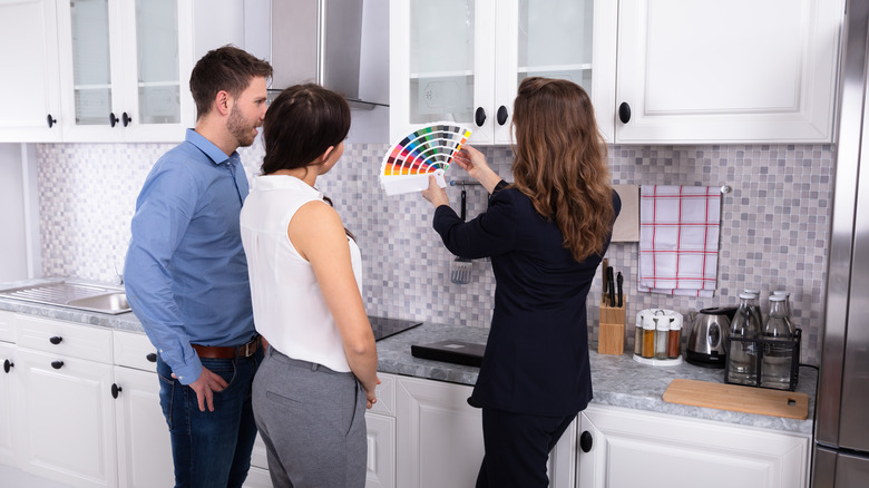
Not only is it important to know which colors to avoid for the benefit of your own psyche and energy levels, but to help your room reach its full potential. While specific paint colors work great in some areas of the home, they might not be ideal in others. Because your kitchen suits the defined purposes of cooking, dining, and entertaining, opting for trendy paint colors can easily take away from that by creating a vibe that is far more overwhelming than it is warm and welcoming. Knowing which paint shades to avoid in the kitchen can help you express yourself through color in a way that doesn't detract from your kitchen's true purpose.
Stark white
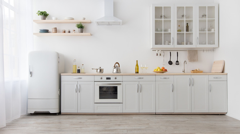
While stark, all-white kitchens were once one of the biggest design trends, experts say that is becoming a thing of the past. And while there's no denying that an all-white room in any capacity looks striking and beautiful, the reality is that cabinets and walls that have been painted a bright white are nearly impossible to keep clean. Splatters and messy mishaps that inevitably happen with cooking and baking will be much more difficult to conceal with a color that shows everything – and homes with pets and children are even more susceptible to stains and messes in the kitchen.
Because of this, kitchens that have been painted white require a lot more maintenance than their more colorful counterparts — and not just when it comes to cleaning. According to Dwell, white cabinets can show their age more quickly, as the color makes scratches, wear, tear, and delamination a lot more visible.
Not to mention, a stark white kitchen simply isn't all that visually interesting and can make this popular entertainment area feel sterile and uninviting. This is why more and more interior designers are transitioning away from the trend. If you want to use white paint in your kitchen, Dwell suggests adding a splash of color or texture with contrasting countertops or backsplashes or choosing a darker shade for your upper or lower cabinets.
Bright red
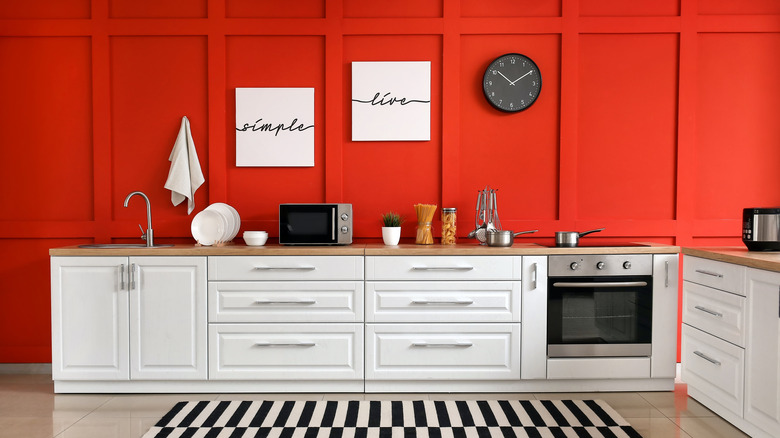
While the bold use of red has become increasingly popular in design in recent years, it doesn't work everywhere — especially in the kitchen. "Something to be careful about would be painting large areas of your kitchen red," Valspar's senior brand manager Tobie Lewis said via Homes and Gardens. "The kitchen is a space where you should unwind and relax while cooking, eating, or hosting your friends. For many, the color red is powerful and too distracting for this specific room."
Arch Ziner also notes that red increases appetite, which is why many fast-food restaurants incorporate the bold hue in their marketing. So, not only is red a particularly distracting and overwhelming color to use in your kitchen, but it can also prevent you from being fully satisfied with your meal and can make you (and your guests) all the more susceptible to unwanted overeating.
If you find yourself craving warm, rosy hues in the kitchen, opt for something a little more subtle, like blush, as softer tones on the wall will liven up the space without overwhelming your dinner guests. "A warm and playful color, pink is a versatile shade to use in the kitchen," said Jane Everett, Design Director at Naked Kitchens via Real Homes. "It can be toned down and balanced out with muted timber accents, paired with black or grey for an industrial feel or placed with contrasting, vibrant shades for a lively and dynamic design."
Dark green
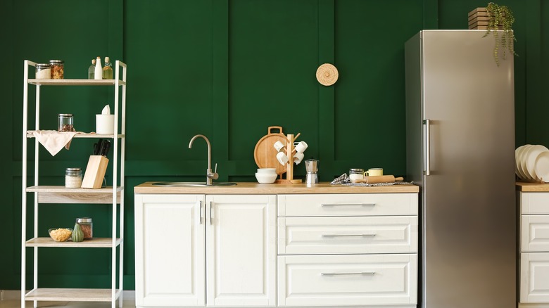
Four major paint brands — Behr, PPG Paints, Benjamin Moore, and Glidden — all declared some shade of green as their 2022 color of the year (per Well and Good). As on-trend as green may be in design, experts say you will want to avoid using darker shades of the color in your kitchen. Painting your kitchen dark green can cast unwanted shadows and make it difficult to see what's happening while eating and cooking, particularly in kitchens without a lot of natural light.
Manhattan-based realtor Parisa M. Afkhami warns via Homes and Gardens that painting your kitchen darker shades of colors like green can actually negatively impact your home's value. If you are planning on selling your house down the road and don't want to go through the hassle of repainting your kitchen before putting it on the market, consider a lighter, more mellow shade of green.
According to environmental psychologist Dr. Sally Augustin via Well and Good, being surrounded by the color green has a lot of benefits for our psyche due to our intrinsic connection to the color in nature. It can decrease stress and promote feelings of optimism and calm, making earthier, natural shades of green an excellent choice for the kitchen — as long as you don't go too dark.
Bright yellow
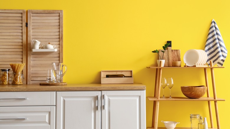
While yellow is often thought of in positive regard as a cheerful color, experts say it's best to avoid particularly bright shades of the hue in the kitchen. Amy Youngblood, owner of Amy Youngblood Interiors, shared via Homes and Gardens that bright yellow is the one paint color she avoids when designing a kitchen, saying that it demands too much attention and takes away from the rest of the room. Instead of having a mellow, cheerful effect on your space like a lighter, more subdued shade of yellow would have, an ultra-bright shade is far too distracting.
"The challenge with bright yellow is that it can increase stress levels, especially if we are juggling lots of aspects of preparing a meal or have people in the space that you find annoying," said Psychologist and Wellbeing Consultant Lee Chambers via Homes and Gardens. "'It is also the color that fatigues our eyes more than any other and can lead to feeling unsettled, frustrated, and fatigued if you spend significant time in the presence of vivid shades of yellow."
Because your kitchen has a lot going on, the space can already feel hectic, particularly during the holidays. Skipping the bright yellow paint and opting for a very subtle shade of yellow or off-white with yellow undertones will warm up the room without adding any unnecessary chaos.
Dark brown
While natural, earthy tones like brown have been having a moment in design recently, choosing a paint shade that is too deep can really put a damper on the overall vibe of your kitchen — particularly if you have dark-colored cabinets. "If you want to keep your kitchen color scheme neutral, choosing shades of dark brown can leave the space feeling unwelcoming and uninviting, the last thing you want for a room that should be the soul of the home," said Tobie Lewis of Valspar via Living Etc. He adds that it's best to avoid going monochromatic with neutrals in the kitchen, as dark brown walls as the backdrop for dark cabinets can make the space feel flat and depressing.
While the color does not have to be avoided in the kitchen altogether, instead of incorporating it through wall paint, consider introducing the color with dark, natural cabinetry. This can make the space feel ultra luxe and modern in contrast with light-colored walls.
If you gravitate toward the look and feel of a totally neutral kitchen, Jenna Kate at Home suggests opting for a lighter shade of paint, such as white, soft gray, or light beige. These colors work particularly well in contrast with dark cabinetry.