Home Town's Ben And Erin Napier Have A Trick To Personalize A Boring House

When designing a home, Erin and Ben Napier of HGTV's "Home Town" always attempt to make the space as personalized to the owners as possible. One way they do this is by asking the family to fill out a survey containing prompts such as, "Tell me about your favorite childhood memory" and "Tell us about each person who will be living in this house. What do you love to do? What are you each passionate about?" This helps the Napiers curate an aesthetic that will be cherished by the homeowners. In the caption of an Instagram post about the survey, Erin shares, "A house should not be decorated, but collected, and it should not be about my style — I only take their story and assemble it in a visual way" (via Instagram).
Besides adding personal elements to the interior, there's another way the Napiers make a home feel more customized: By embracing unique exterior elements. Instead of making every home look like a cookie-cutter model of the previous one, the Napiers try to use features that would make even the most boring exterior more interesting.
Embrace bold colors
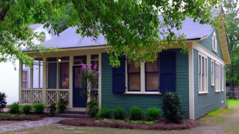
When redesigning a recently renovated home, Erin and Ben Napier soon discover that all the character from the 1955 property has been stripped away. Erin says, "When a house gets flipped, it's like they go out of their way to disguise any tiny variation that would make it have character of any kind." One of the worst elements is the exterior paint color, which is a bland gray that doesn't give the home the cheerful look the homeowners deserve. Erin calls it "boring in every possible way." To remedy the situation, she chooses light yellow paint for most of the exterior, changes the brick to a gold tone, and adds a bit of contrast with a blue front door. The result? In Erin's words, this home now "reads as pure sunshine" and "feels like it has some personality," per Realtor.com.
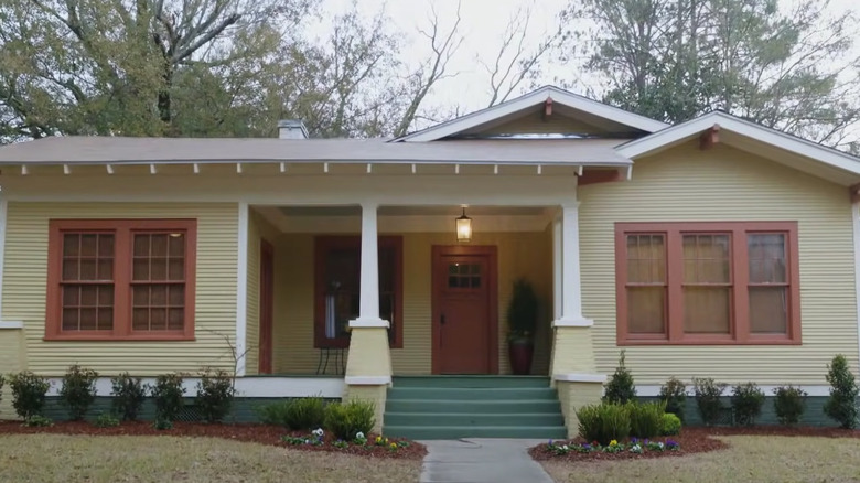
Bold exterior colors are a common choice for the Napiers. When renovating another home, they also choose light blue and yellow shades but add coral and aqua shades as well. Erin says, "These colors, in color psychology, are playful and cheerful," per HGTV, which is just what every home needs.
How Erin chooses the right colors
As Erin shared on Laurel Mercantile, her favorite paint colors have a bit of "dinge" in them. Because she often renovates older homes and wants to preserve the history of the buildings, she stays away from shades that appear too modern. She says, "The key to choosing colors that feel part of their surroundings, that feel aged and part of their environment ... is ... dinge."
What is "dinge," you're most certainly asking. To explain, Erin says, "Choose whatever color you like that has a bit of yellow in it to make the color feel integrated and truly part of its environment instead of too-new, too bright, not quite right, and out of place." To let you in on two of Erin's favorite green paint shades that have the perfect amount of dinge, she would recommend Benjamin Moore's Celery Salt, a light and warm shade, as well as Sherwin-Williams Woodland Lichen, a medium tone with a tinge of yellow.