The Timeless Paint Color Nate Berkus And Jeremiah Brent Predict Will Always Be Trendy

Interior designers Nate Berkus and Jeremiah Brent have a reputation for elevating any space with the right design elements. Interestingly, the celebrity couple don't always see eye to eye on style preferences. Berkus leans more on traditional design, as proven by his recommended timeless decor for any room. Brent, on the other hand, prefers modern aesthetics. His recommended bathroom design is always on trend. Despite their differences, they always end up with a cohesive outcome, thanks to a common ground. For instance, one style preference that's common between the two is their love for neutrals.
"What I love about neutrals is that they provide the perfect backdrop to then make the room what you want it to be," Berkus told Homes & Gardens. He prefers understated hues that let furnishings, textures, and personal touches do the heavy lifting. Instead of bold accent walls, he favors subtle color play in niches or shelving. Brent shares the sentiment, even joking (via Domino) that neutrals are their "love language." But among the neutral colors they've used in their projects, one easily stands out as their go-to choice as they feel it's always trendy.
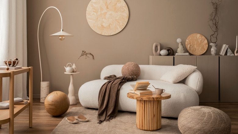
"Beige is so timeless... It can be paired with almost anything and will always look handsome," Berkus told Homes & Gardens. Brent echoed the idea and even described warm beige as "the perfect canvas for any design aesthetic." This soft, adaptable color almost always fits seamlessly into their combined approach, as it offers a sense of sophistication and comfort without overwhelming a space.
How the celebrity couple used beige in their own space
Nate Berkus and Jeremiah Brent's love for beige is evident in their own home. The "Nate & Jeremiah by Design" stars designed their Fifth Avenue apartment by bringing together their disparate styles and using beige as the common ground. The color and its different shades play a key role throughout their home, particularly in the living areas, where it acts as a calming foundation for the couple's curated furnishings, artwork, and decor. Brent, who values function over trend when choosing home decor, and his husband of over a decade, Berkus, did not settle on any beige, though.
After a grueling selection process, they chose an earth-toned beige with a hint of gray. "If I had to describe it as a feeling, it'd be like a hot stone massage," Brent told Domino, prompting Berkus to add that the brown hue gives the shade a slightly "historic" and rich feel while the warm undertones gave it depth and complexity. Throughout their apartment, beige is paired with contrasting black accents and layered with rich textures — linen, wood, marble — to give each space dimension. In bedrooms, where color is more pronounced due to intricate wallpapers, beige still acts as a grounding hue. The effect is a home that feels serene but not sterile, warm but not heavy. As a result, beige becomes more than just paint on the walls; it's the thread that ties everything together in the home the couple shares with their two children.
Why beige never goes out of style
While trends come and go, beige has somewhat remained a constant in the world of interior design. In fact, beige has once again been named the top color trend in both fashion and home design for 2025. Nate Berkus and Jeremiah Brent's prediction about beige being always trendy was right all along. But what makes this neutral color relevant in all seasons? The answer is its versatility. Many neutral paint colors can make a home relaxing indeed, but beige is likely among the few to complement nearly any design style, from rustic farmhouse to sleek contemporary and boho chic to minimalist modern, aside from white and gray. Even in spaces with varying lighting, beige can easily adapt and enhance the overall atmosphere due to its versatility.
Another reason why beige has this timeless appeal is it can smoothly interact with other colors and shades instead of grabbing attention for itself. Whether it's paired with cool blues and greens or warmer hues like rust, ochre, or terracotta, beige balances the palette and adds a sense of harmony. In effect, it can warm up modern interiors without overpowering other design elements. At the same time, it can make traditional rooms feel more open, light, and inviting. This may also explain why beige is such a year-round workhorse, capable of performing well no matter what seasonal decor it gets paired with. Given all these, it's clear that beige does not necessarily follow the trends, but it never goes out of style.