HGTV's Hilary Farr Explains How To Choose The Right Paint And Fabrics To Create A Truly 'Unique Space

Hilary Farr may be well known for her quirky personality on the HGTV show "Love It or List It" and her endless ability to help stressed homeowners renovate their homes. She's also noted for her ability to create beautiful spaces that are both trendy and upscale, even on limited budgets.
One core concern for many people updating their interior design is blending the best materials to create an impressive, beautiful look. For example, choosing paint and fabrics that support each other in achieving an aesthetic goal is important. Farr's recent move to work with Covington Fabric & Design to create the "Love it Collection" is an excellent way to understand this challenging interior design topic. How do you meld woven textures and bright, eclectic patterns with the paint on the wall to create a visually stunning and cohesive space? She recently offered insight into creating a unique space doing just that, even with a mixture of styles.
Take full advantage of neutrals
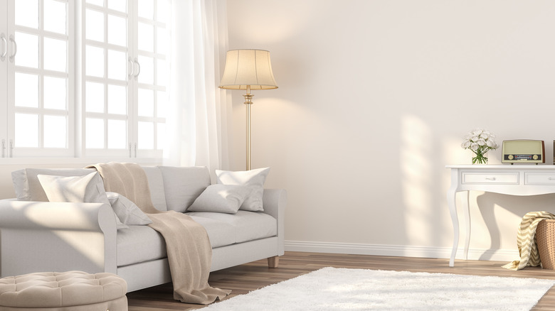
One of the most important tips Farr offers in a recent Homes & Gardens interview is to utilize the benefits neutral paint colors bring to the space. "I tend to use a neutral on the walls if I'm designing an entire house from scratch — because that's how I like to live," she notes. She also says, "I like to have a very neutral wall, and then I always paint the ceiling the same color as the walls. I think everyone should. That's a really important part of making a room look great."
Neutral paint colors create a nice base from which you can then build out. Use fabric as a way to enhance the design of a room. "Paint is a quick and easy way to create a mood and character, and when it's paired with the perfect fabric, you are truly creating a unique space (which is something I love to do)." With a neutral tone on the wall, even a brightly patterned loveseat will feel like it fits in. You could also incorporate more eye-catching decorative items in the space without creating any visual obstacles due to poor color matching with the walls.
What if you want a bold color on the walls?
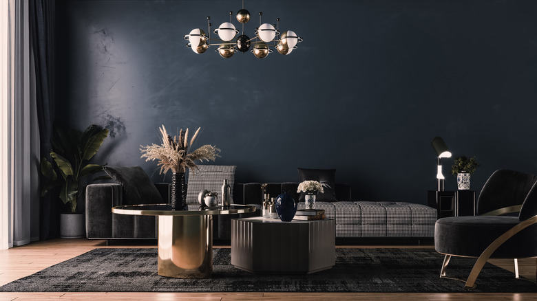
Not everyone is happy with a pale gray or beige wall, though. That's understandable, and Farr says there are ways to make brighter, bold paint colors on the wall work well with the items you place in the room. You just have to be creative. She says, "Firstly, you can contrast the paint with fabric to create drama and impact. Or secondly, you can choose a dramatic paint color that makes a big statement -– then pull an element from that to your fabric. The two things speak to each other –- as opposed to a strong contrast where they look beautiful together –- but are essentially two different elements that have met in the same room."
Finding items that work well together rather than fight off each other helps to create a more welcoming, visually beautiful space rather than having two contrasting designs or colors in the room. For example, if you plan to use a bold blue on the walls, pick some fabrics for that space that incorporate the same hue, at least in part, such as in the detailing, to help tie the items together. Ultimately, interior design rules are made to be broken when it comes to creating a space that speaks to you, your personality, and the functional needs of your family.