The Sherwin Williams 2023 Paint Color Of The Year Is The Perfect Balance Between Neutral And Bright
We may receive a commission on purchases made from links.
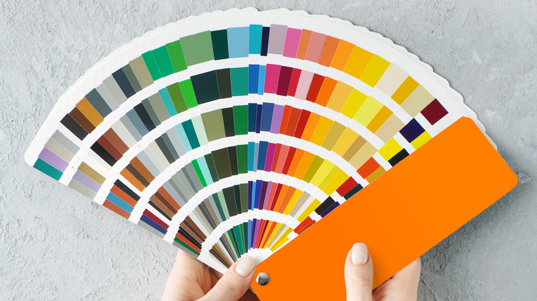
Tone-on-tone décor has had its moment. While minimalism is a style that's here to stay, the latest developments for interiors include warmer colors and softer surfaces. Also gaining popularity is a newer mix of shapes that includes rounded and organic forms. Still clean and clutter-free, minimalism is losing its boxy, almost industrial look in favor of more inviting spaces. Designers are taking advantage of the research and development conducted by paint companies by bringing in new colors such as softer whites, lighter grays, and earth tones in greens and browns, but also in yellows and reds.
While we've mentioned this trend toward warm colors before, what's really exciting are the innovative neutrals that bring color into a space, yet blend perfectly with other neutrals. Instead of sticking with gray-on-gray or white-on-white, open up your living space by adding something more unexpected, such as Sherwin Williams' Color of the Year for 2023, Redend Point.
Unusual and slightly mysterious
This color is a blend of dusty rose and beige. It's a calm yet intriguing tone that takes on different shades depending on the colors around it. Redend Point is a medium shade that may look darker in a room with low lighting. Place it next to bright white, though, and it takes on a rosy tone. Next to dark browns, it appears to be light tan with reddish undertones. Sue Wadden, director of color marketing at Sherwin Williams states, "[Redend Point]... is a heartening hue that invites compassion and connection into any space. The color is a natural choice for those looking for a warm and joyful neutral."
To help you decide on the mix for your home, Sherwin Williams has developed an entire palette to accompany their color of the year. Since it's a neutral, Redend Point pairs well with lighter tones such as white or gray. But it also goes with deeper tones, from dark green to nearly black. Consider other natural earth tones, especially colors from a burnished, wind-swept desert landscape.
Your colors, your choices
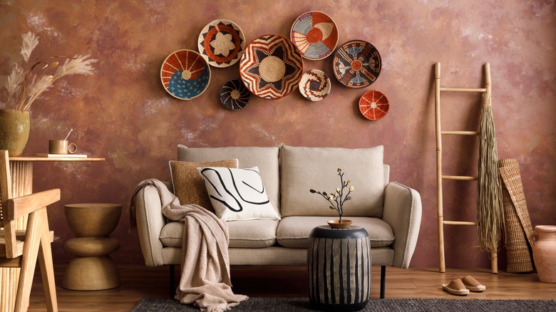
You can also introduce colors that are opposite on the color wheel. In this case, directly across from this warm and welcoming muted red/beige is a light, dusty blue; think faded denim jeans. Combining dark brown, vanilla ecru, Redend Point, and faded blue would make any space warm and welcoming, not to mention visually stunning, whether it was a great room, family room, or den. Metallic copper accents would make that room even more spectacular.
If you're unsure about such a forward-facing color, there are ways to try out paint trends without putting spot samples on your walls. Start with small, defined surfaces. Start with accents. Apply Redend Point as paint, of course, but feel free to add it to a room through artwork and accent items like pillows, vases, or area rugs instead of covering a wall with it. Additionally, Sherwin Williams has partnered with Etsy to provide a wide variety of household items in the hue, which takes the guesswork out of your highlights and offers effortless style for your favorite rooms.