These Are The Best Bathroom Vanity Colors
If you're embarking on a bathroom remodel or are just looking for a fresh look, painting your vanity is a great way to achieve that. You can give the space a makeover largely by changing up the vibe of the room with a brand-new pop of color. Before you begin the process, however, it's important to take a few things into consideration. First, it's important to understand the material you're working with so you know the steps to take and the appropriate primer to use. The most common materials are wood, metal, or laminate. It's advised to choose an appropriate primer for the material of your cabinets and have it tinted to match the color of paint you plan to use.
Taking this preliminary step will ensure the best coverage when you coat your vanity in the stunning new color you've chosen. You'll be glad you took that extra step later, as the old color won't show through and affect the new one. The other important thing to keep in mind is the type of paint you choose. Because the bathroom is a room in the house with a lot of moisture, you'll need to choose a paint sheen with a higher gloss. Gloss and satin sheens resist moisture while matte, flat, and eggshell sheens absorb it. Additionally, look for higher-quality paint with mildew-resistant properties. Your bathroom will look and feel like a totally different space by changing the color of your vanity. With that in mind, here are some of the best bathroom vanity colors to consider.
Mega Greige: the new favorite neutral
One of the biggest trending colors of 2023 is greige. If you're looking for the ideal neutral but like to be a little different, try a shade called Mega Greige. People everywhere seem to love the new combination, which can be described as a warm beige mixed with gray undertones. Sherwin-Williams developed the color Mega Greige #7031, which is on the darker end of the greige spectrum. It is a wonderful alternative to boring beige or oh-so-common off-white neutrals. If you love the idea of using a unique shade that's not too bold and opens up a completely fresh palette of colors to match with, find a shade of greige you love. For a lighter shade of greige, try Edgecomb Gray by Benjamin Moore, another extremely popular choice.
If you're going with lighter colors, greige matches nicely with a soft cream or bright white in bathrooms. If you're looking for something bolder and more dramatic, try black or dark gray. Of course, the best part of any neutral is that it goes with absolutely anything, so the sky's the limit! Olive green or teal both make great combinations with greige in the bathroom if you want to try something a little more daring. Whatever else you may be doing in the bathroom, a greige vanity is a terrific choice you won't regret.
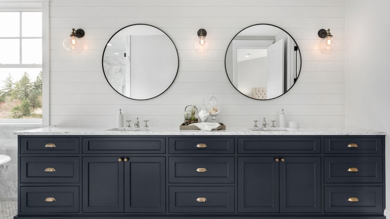
Hale Navy Blue: this might be for you
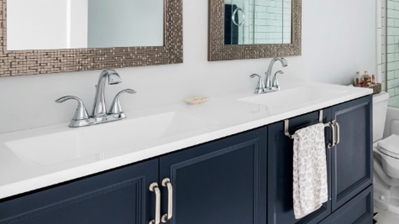
Another popular color for the bathroom vanity is navy blue. One of the hottest shades is Hale Navy #HC-154 by Benjamin Moore. It's a dark shade of blue that's just the other side of midnight but not quite black. Timeless and classy, this color will provide the perfect contrast for a lighter shade of your choosing in the bathroom. If that's too dark for your taste, try Naval #6244 by Sherwin-Williams. Naval is still a deep blue, but will never be confused with black. Either of these makes a terrific navy blue hue for your bathroom vanity.
Navy blue pairs perfectly with classic white, or a lovely warm cream color. The results are a sophisticated and stunning look you'll fall in love with. You can easily find a great wallpaper to coordinate with the navy blue color if you've been toying with the idea of wallpaper in the bathroom. Another idea would be to use a lighter shade of blue to accent the darker shade and bring an element of tranquility to the space. Blue represents peace and calmness, and makes a lovely choice for the bathroom vanity.
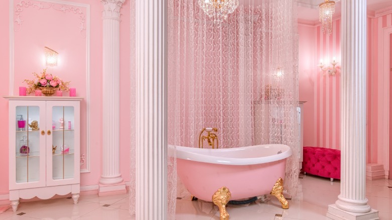
Vibrant pinks: the latest trend
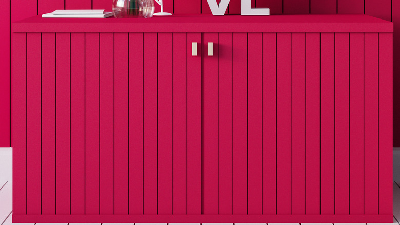
Are you looking for a dazzling, vibrant new color to give your bathroom a big splash? The Pantone color of the year, Viva Magenta, is all the rage, and yes, even for your bathroom vanity! Benjamin Moore's color of the year, Raspberry Blush, is another great option if you love vibrant pinks. Of course, you don't have to use it in its brightest shade; if you want to go bold without going overboard you could try a lighter shade on the color wheel. The tone is a raspberry pink with a tinge of orange, and is said to give an energetic vibe. It is definitely a fun and vivacious statement color to choose for your bathroom vanity, and presents an opportunity for many other exciting decorating possibilities. This fearless shade isn't for everyone however, so if you like the idea of a blush but want something more on the pale end of the spectrum, try Misty Blush #2097-60 by Benjamin Moore.
When using an intrepid color for your vanity, it's important to keep in mind you should use the same shade for other things in the room. According to interior designer Martine Claessens, if you're looking for a terrific color to pair with Raspberry Blush try Wenge #AF-180 by Benjamin Moore. Wenge is a rich bronze color that pairs beautifully with the raspberry hue. Another recommended color is Starry Night Blue #2067-20 if you're looking for a vintage 70s vibe. Experimenting with these delightful shades in the bathroom can be both exciting and challenging, and choosing the color of the year is a great way to start!
Sea Salt: reminiscent of the sea
Sherwin-Williams Sea Salt #SW-6204 is a lovely soft blue-green sea breeze of a color that makes a lovely shade for the bathroom vanity. Similarly, you might check out a shade from Benjamin Moore called Palladian Blue #HC-144. For a beach-style atmosphere, either of these would make a confident choice for the vanity. Blue-green represents tranquility and refreshment, and what better feelings for the bathroom? This color is calming and peaceful and more than a little reminiscent of the coast.
Sea Salt or Palladian Blue will work perfectly with warm shades of greige to look like the sand on the beach with the color of the sea. The shades also look great with white or even coral pink. A shade that matches Palladian Blue well is called First Light #2102-70. For Sea Salt, try Benjamin Moore's Pink Blossom #2081-40. For those of you who love softer shades like these, you won't make any design mistakes by choosing one of these colors for your bathroom vanity.
Gray Cashmere: warm as a sweater
Gray Cashmere #2138-60 by Benjamin Moore is a terrific neutral color and is extremely popular for a bathroom vanity. It's got just the right softness and warmth to make the ideal neutral for this space. If you want to go a little darker, try Benjamin Moore's Graystone #1475. Another terrific option that brings to mind a cloudy sky is a Sherwin-Williams shade called Mindful Gray #SW-7106. Using the color gray is sophisticated and chic in design and represents balance and neutrality. There are some people who find it too industrial and it can be oppressive by itself, so be sure to bring an uplifting shade into the space to accompany it.
For example, gray is perfectly suited for a coral pink or blush shade, as well as other pastels. Sherwin-Williams has a light shade of pink called Angelic #SW-6602 that's perfect for bathrooms. Another slightly darker hue is called Mellow Coral #SW-6324, particularly suited to Sea Salt. To go deeper still on the color wheel, try Pink Starburst #2004-40 by Benjamin Moore. Of course, if you aren't too keen on brighter colors in the bathroom, gray can be paired with white or cream shades for a more subtle approach. You can also go with a blue hue, just keep in mind the general rule of thumb of going two shades darker or lighter when using it with gray.
Tarrytown Green: for a beautiful scene
A rich shade of pine called Tarrytown Green #HC-134 by Benjamin Moore is a wonderful bathroom vanity color to try. This shade brings to mind the forest and complements a natural and down-to-earth design. The color symbolizes growth, health, renewal, and abundance. If you prefer a lighter shade of green try something like their Silver Sage #506. For a little twist, check out Pistachio #561. Last but not least, Clare makes a color called Avocado Toast that's definitely worth a look. In fact, this exact shade was even featured in 2019 in The New York Times for its popularity among Millennial homeowners. Whichever hue is for you, green makes a fantastic choice for your bathroom vanity.
Tarrytown Green pairs well with cream colors like Soft Chamois #OC-13 by Benjamin Moore. Sherwin-Williams makes a shade called Alabaster #SW-7008 that also looks divine. You can also revert to the section on shades of greige which pair equally well with greens. Something else designers suggest is using black and white tile with a deep green vanity. Additionally, keep in mind green looks especially good with wood accents and gold hardware. By choosing green for your vanity you can create an island oasis or whatever impactful look you're after, right in the privacy of your own bathroom.
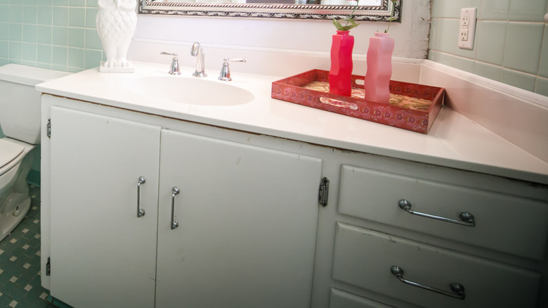
White Dove: the standby we love
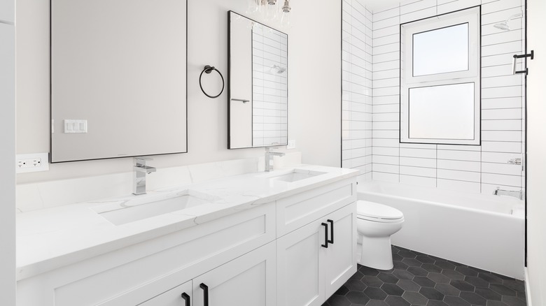
White Dove #OC-17 by Benjamin Moore is one of the best classic shades of warm white for your bathroom vanity and a timeless standby. Shades of white are probably the most commonly used for a fresh, clean look with your bathroom vanity. Another shade of brilliant white to try is by Clare, called Snow Day. This cooler shade of white is as pure as snow, hence the name. Chantilly Lace #OC-65 by Benjamin Moore is another standout. And of course, the best part of white is it goes with anything. The color white represents purity, cleanliness, and simplicity. It can prevent a cluttered or chaotic look in design and makes a solid pick for the bathroom vanity.
White makes the perfect contrast and backdrop for whatever other color or colors you want to accent, so essentially you have a blank canvas. One idea for a good color with white is Teal Ocean #2049-30 by Benjamin Moore, a deep and vibrant hue that looks especially dazzling against a stark white background. Another terrific pairing could be with Benjamin Moore's Eggplant #1379 for a slightly eclectic vibe. One could say these suggestions are a bit temerarious, but with a few strategic pops of whatever accent color you like best, your bathroom can look like it was designed by a pro.
Misty Blush: pretty in pinks
Misty Blush #2097-60 by Benjamin Moore is a lovely neutral-ish color with a hint of pink that's perfect for bathroom vanities. This shade is a feminine and soft neutral that will make you smile. Another enchanting blush like this is Sherwin-Williams Intimate White #SW-6322. If these hues are right up your alley you might also consider a shade of mauve, such as Mauve Mist #1264 by Benjamin Moore. This is a sort of smoky or dusty pink with violet undertones that looks stunning on a bathroom vanity. Blush-tinted hues in general are currently trending. The color pink symbolizes harmony and inner peace and brings a touch of romance to your space.
This color pairs well with off-white or other pastel shades like Valspar's Mint Gala #6001-7B. Another idea is Benjamin Moore's Lake Placid #827, a pale sky blue. For a nice off-white pairing, try something like Maritime White #963 from Benjamin Moore. If you're going for a bit of romantic charm, try any of these bathroom vanity colors to help you achieve this. Soft shades offer a serene tranquility that's right at home in the bathroom.
Evergreen Fog: an intriguing hue
An interesting shade of gray and deep green, Evergreen Fog #SW-9130 by Sherwin-Williams is a top choice for the vanity. This color is a cool shade of green and holds up true in all sorts of light. That means you don't have to worry about it looking yellow unless you pair it with something in that shade. It was also Sherwin-Williams' color of the year for 2022. Another hue similar to this but slightly warmer is Willow Tree #SW-7741 with blue-gray undertones. Clary Sage #SW-6178 is another top choice. If you want to go a little more saturated with green try Artichoke #SW-6179 which makes a nice rich shade for the bathroom vanity.
For pairing with Evergreen Fog try a warmer shade of white like Shoji White #SW-7042. You can also try a shade of gold like Bakelite Gold #SW-6368 or even an intriguing shade of brown called Über Umber #SW-9107. These shades will help give your bathroom an earthy organic vibe. Wood is also a striking way to accentuate the look. You won't regret choosing Evergreen Fog for your bathroom vanity for a natural and down-to-earth feel.
Blissful Blue: may be ideal for you
Blissful Blue #SW-6527 by Sherwin-Williams is a wonderful shade for the bathroom vanity and will remind you of a clear blue-violet sky. Other paint brands like Valspar have the same name paint (Blissful Blue #4005-3C) but it is a different shade. While both brands are lovely, the SW shade is lighter and the Valspar has a gray undertone to it. SW's Blissful Blue is a playful but serene shade that feels almost whimsical. If you want to go a bit deeper, try Scanda #SW-6529. These hues have a dusty feel with an ever-so-slightly gray and violet influence. Another interesting color is Bunglehouse Blue #SW-0048, a much more saturated blue that makes a striking impression.
Blissful Blue is idyllic with Cedar Brown by Glidden or with wood accents for a natural complement to your space. It also goes well with a shade of white such as Pure White #SW-7005 by Sherwin-Williams. Or if you want to try something a little more unconventional, try a shade of orange-pink called Coral Reef #SW-6606. Using any of these combinations helps achieve a coastal vibe and a timeless look. Choosing the just-right color for your bathroom vanity should be fun and unapologetic, so perhaps this is the time to try something completely different!