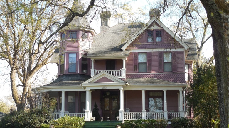
The Most Toxic Home Decor Colors In History
The quest for vivid color has caused some deadly situations in history, including the unintended use of poisonous pigments in paints used by artists and dyes used for home decor. The pigment ingredients that caused toxic reactions were usually minerals or metals, including lead, cadmium, and mercury, and they've caused poisoning through the ages. Some of the most well-known examples include Scheele's Green, Lead White, Vermilion, and Naples Yellow. In modern times, colors including cobalt blue and mauve have somewhat toxic histories as well.
Color has a rich and thrilling history, and the human fascination with color has led to some amazing discoveries and innovations. Even as some people take the color in their surroundings for granted, our desire for color is apparent in the lively fashion and home furnishing industries. Billions of dollars are spent in the quest for color that will make a powerful statement, and maybe become the next cultural trend.
These colors have all earned themselves reputations as some of the most toxic pigments in history. However, that doesn't mean that these shades are obsolete as home decor options, as there are now modern non-toxic formulations that allow you to enjoy these unique hues while keeping your space safe.
Scheele's Green: a toxic color trend
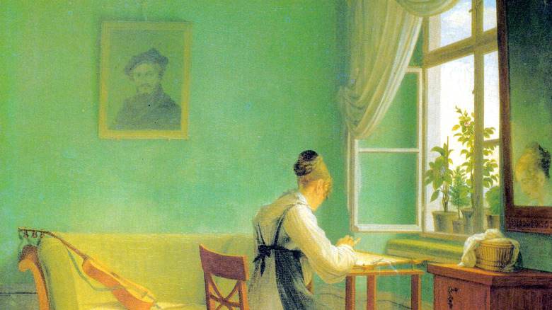
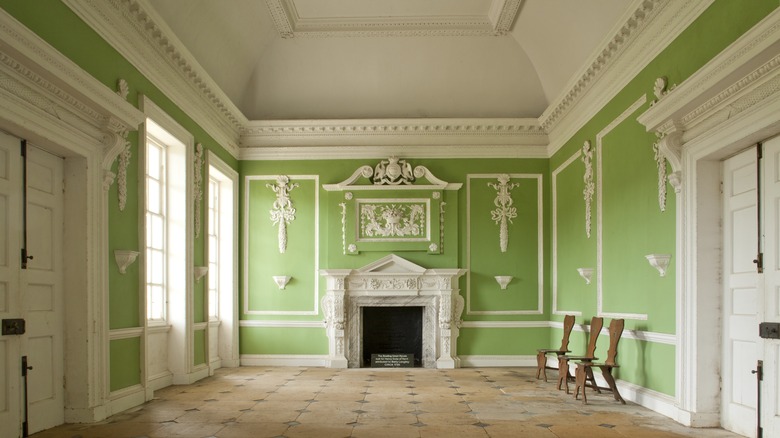
Probably the most famous example of a toxic color that was widely used for home decor is Scheele's Green, a pigment invented in the early 19th century by a Swiss chemist. Its vivid, cheerful hue was so appealing that it was used to dye everything from fabric and soap to candy. It quickly became a desirable color for home furnishings and decorations, including upholstery, drapery, wallpaper, and rugs.
It was only discovered later that the pigment's use of arsenic caused many people to become deathly ill. This could happen when moisture could cause a toxic mold to form (on wallpaper dyed with the green dye, for example) that caused a chemical reaction releasing arsenic gas. This may be why the color green is considered unlucky to paint rooms with.
The appeal of Scheele's Green lay primarily in its bright, rich quality — it was a luminous green that hadn't been seen before. Today, bright green is popular in home decor and fits a variety of color schemes. It's a bold color choice for everything from biophilic design to vibrant, eclectically-styled spaces. To get this look in your own home, try shades like Benjamin Moore's Fresh Lime or Paradise Green to coat an accent wall or brighten an entire space.
Cobalt blue's toxic history
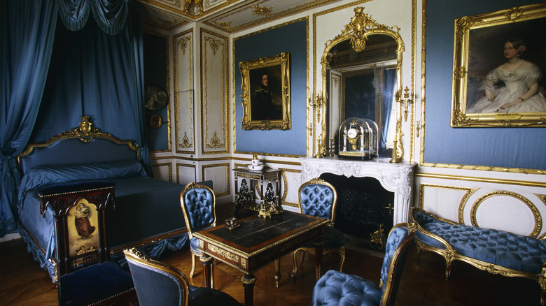
Pigments have been made from crushed gemstones, metals, minerals, and various natural substances. One toxic pigment ingredient is cobalt, used to make blue pigments. The name is from a German word for "goblin" and comes from the belief that evil spirits replaced silver in mines with false silver. Cobalt is found near manganese and silver deposits and is a byproduct of nickel refining. The pigment was invented in the 19th century by French chemist Louis Jacques Thénard.
As a pigment, cobalt blue was less expensive than ultramarine blue, so it became very popular in the art world. Cobalt blue was famously used by painters like Vincent Van Gogh, Pierre-Auguste Renoir, and Maxfield Parrish, whose luminous skies inspired a paint hue named "Parrish Blue." Cobalt pigments are still in use, but the paints carry warning labels. Cobalt is poisonous to ingest, and exposure can cause allergic reactions or respiratory problems. Professional artists using cobalt pigments practice safety precautions, using protective gloves and good ventilation in their workspaces.
Bright, deep blue is said to be a calming color, as are most blues, reminiscent of the sky and ocean. Cobalt blue is a great choice for accent walls, cabinets, and furnishings. Playing beautifully off gold, this color is fantastic in spaces with traditional or formal vibes. It also complements other vivid hues like magenta or chartreuse to create fun, lively spaces. To add this iconic color to your space, you can use intense shades of paint like Behr's Dark Cobalt Blue.
Vermilion, a fiery red-orange made with mercury
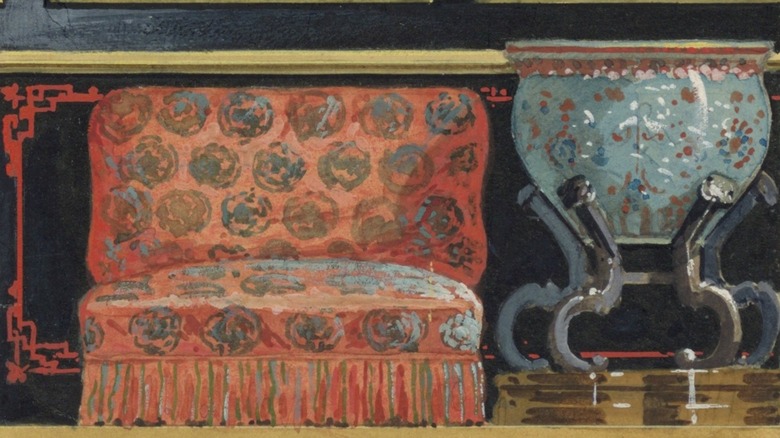
Vermilion is a deep, bright red with a touch of orange. The pigment, made by heating mercury and sulfur, or from powdered cinnabar (a mineral containing mercury), was very sought after in parts of Europe and Asia through the 18th century, commanding high prices for its beauty and rarity. Some sources trace the earliest use of vermilion pigment to 8000 B.C. in China. Its Chinese origins have led to the color also being called "China red." It was very popular in Chinese culture, being used to create lacquers for painting furniture and inks for printing and calligraphy.
By the 11th century, methods for producing vermilion pigments synthetically were perfected, and artists clamored for them. But by the 19th century, European-made vermilion was considered an inferior product due to its being adulterated with other ingredients, as cinnabar was still comparatively rare. Chinese vermilion was still considered the most desirable red pigment, but the presence of mercury made vermilion an ultimately dangerous pigment to use.
Because of the eventual disappearance of vermilion pigment from widespread use, antiques made or decorated using authentic vermilion pigments are very valuable. Imitation red Chinese lacquer pieces became quite popular in the home decor market in the 1960s. Today, deep reds (like maroon, burgundy, cranberry) and oranges (like rust and persimmon), as well as the unbeatable red-orange of vermilion, can anchor many creative, striking color palettes for home interiors. Try Farrow and Ball's Blazer or Charlotte's Locks to create this warm look in your modern-day home.
Perkin's Mauve and the dawn of industrial color
Why is mauve so hard to pin down? A muted purple, warmer than lavender, with a decidedly "dusty" vibe. This unique color, found in meadow flowers and clouds at sunrise, was also the first synthetic dye. In 1856, a teenage chemist (William Henry Perkin) tried to develop a synthetic form of quinine to treat malaria. His failed efforts yielded a vivid purple substance that came to be known as mauveine or Perkin's mauve. Prior to his discovery, purple dyes came from sea mollusks and plants.
Perkin marketed his invention and mauve became a cultural sensation; even Queen Victoria wore a mauve silk gown for a Royal Exhibition in 1862. A millionaire by age 21, Perkin the entrepreneur retired at 36 to do research in organic chemistry. His work revolutionized medicine, aiding Nobel Prize-winning research on tuberculosis and chemotherapy.
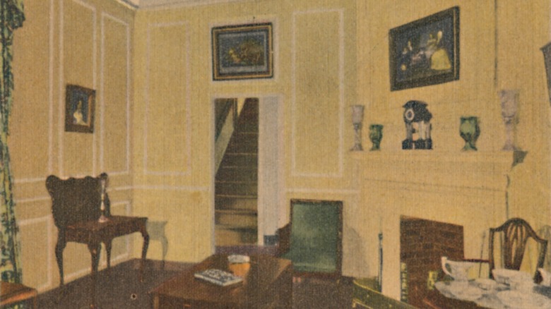
Dyes made from natural materials can be unstable, with inconsistent hues. Using natural materials for dying often requires using mordants made from metal salts, and is often ironically more environmentally toxic than using synthetic dyes. Perkin's work lessened the need for precious natural materials for dying. Mauve's introduction caused a seismic shift in the industrial use of color for fashion and home decor. Today, cool, neutral mauve is a fabulous choice for accessories such as drapes, upholstery, and linens. Vogue magazine even calls mauve one of the most unexpectedly popular colors of 2023 for home decor.
Naples Yellow and capturing the sun
The origins of Naples Yellow are somewhat shadowy. It dates from as early as 1500 B.C. in ancient Egypt, where this bright pigment made from lead antimoniate was used for coloring glass. It's believed that the name, first recorded in 1693, is related to volcanic mineral deposits found around Mount Vesuvius near Naples, Italy, that were used to make the pigment. It was used in ceramic glazes for centuries before its use in painting was noted in the mid-1600s.
Painters in Europe loved the luminescent qualities of Naples Yellow, and it was produced in a subtle range of hues known as jaune d'antimoine by French painters such as Renoir, Delacroix, and Édouard Manet. Manet favored a pale, lemony version of Naples Yellow in his paintings, including 1862's "Music in the Tuileries," which marked a significant milestone in the history of pigment. The yellows in the painting include a traditional formula of Naples Yellow, hand-mixed by the artist, and a new "hue" similar to this color that was pre-mixed and sold for professional use. This led to more artists using less toxic pigments free of lead.
Ready-made paints revolutionized the world of painting, lessening human exposure to the toxic lead in the original Naples Yellow. Now available in safe pigment formulas free of lead, this color is now recognized as a versatile, warm shade of pale yellow (as seen in Valspar's Lemon Butter). Using yellow to brighten your home adds energy as well as cheerful character.
Lead White: historically famous and deadly
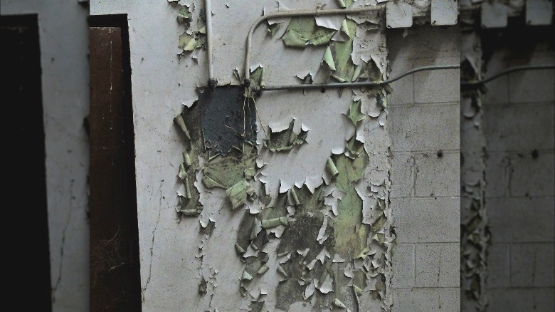
Lead White is perhaps the most widely used and yet the least known of history's famously toxic pigments. Ground lead was used to make a bright white pigment in ancient Greece nearly 3000 years ago. The use of lead in paint continued until the 20th century when it was banned in the 1970s because of its toxic ingredients.
Lead white as a pigment was considered useful by painters because it imparted a desirable brightness that was long-lasting on the canvas. The famous Dutch painter Vermeer was known to be a devotee and used it in his paintings to enhance the chiaroscuro (light and dark contrast) effect of his compositions. The brightness of Lead White is said to be without parallel even to this day, decades after the use of lead paint has been discontinued.
Today, paint manufacturers are working to produce paint hues that are similar to that white, bright pigment once so valued by artists. Oddly enough, white paint has the widest range of color variation of all the colors! Choosing a shade of white can be quite complicated. Some white paints comparable to the brightness of Lead White include Behr's Ultra-Pure White and Benjamin Moore's Chantilly Lace.