What Color Palettes To Use If You're Featuring Red
Red is a very bold and strong color and, when featured in a room, has a tendency to dominate the color scheme. When strategically paired with other colors, though, both the positive and negative decorative and psychological properties of red can be enhanced or reduced. According to Very Well Mind, red has the negative attributes of being dominant, aggressive, and represents danger. However, it also has the qualities of passion, romance, desire, excitement, and power.
While it's a common interior design suggestion to hold off on featuring red in a room due to its energizing, possibly agitating, qualities, that's not entirely true. Different hues, depths, and tones of red create different atmospheres. A deeper, richer red paired with a luxurious purple, for example, will create a very intimate atmosphere. A sleek black and white room with a punchy, vibrant red will create an invigorating environment. It largely comes down to what colors are paired with the shade.
Decadent red and blue
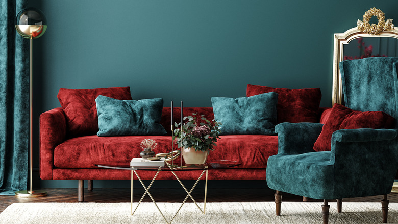
Red has a tendency to be very luxurious and rich. Lean into this quality by opting for a deeper, more luxe shade. Pair with an equally decadent blue or teal for a truly royal feeling.
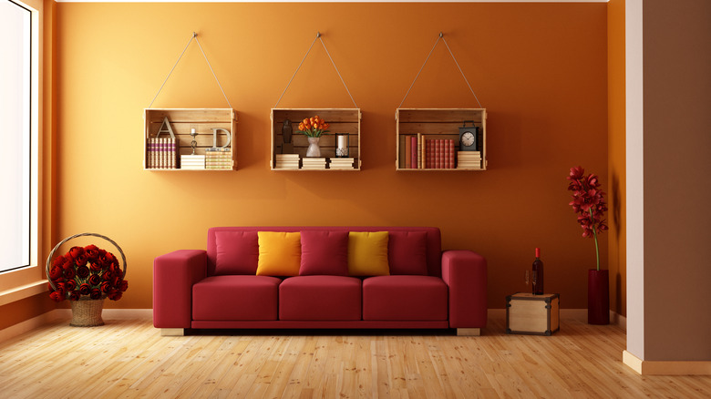
Autumnal reds and oranges
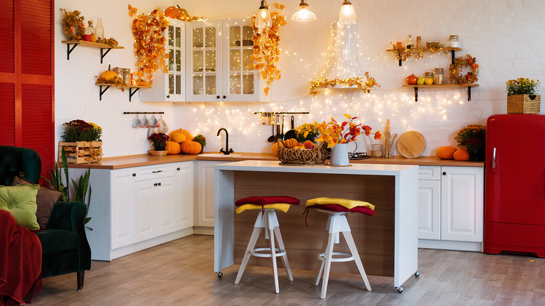
Red is one of the major colors overtaking fall landscapes. Replicate this in your own home by pairing your red feature pieces with multiple shades of orange and yellow decorations.
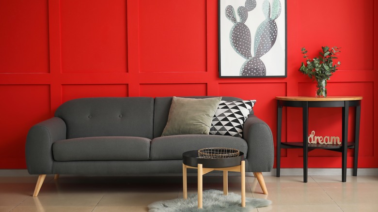
Modern red, white, and black
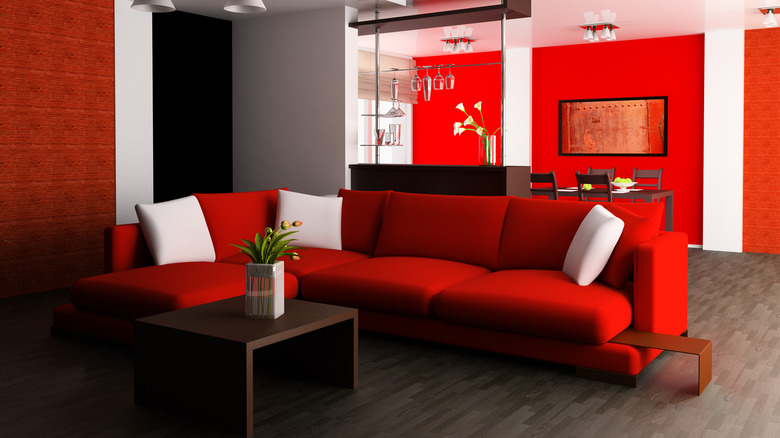
Flatter, more punchy red tones pair excellently with a black and white modern color palette, as it helps break up the monotony while bringing life to the aesthetic while remaining sleek and clean.
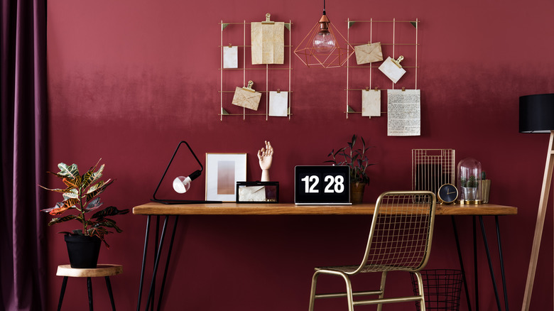
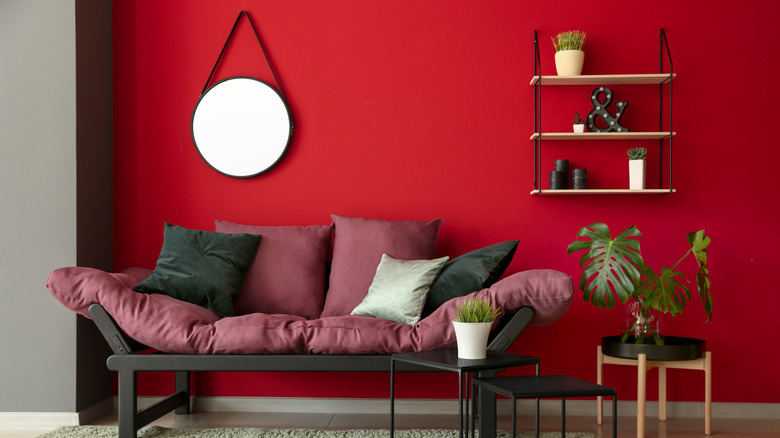
Soft red, purple, and pink
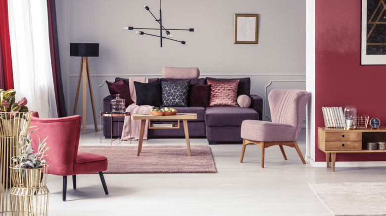
If you're more interested in a softer design approach, look for a more toned-down, dusty shade of red. Mix with dusty pink and soft plum colors for a sophisticated but quieter look.
Red and warm tones
Red is an undeniably warm-toned color. Lean into this aspect of the color and heavily incorporate multiple warm shades — darker reds, oranges, terracotta, rust, mustard yellow, plum, etc. Don't ignore wood tones; make sure wood furniture is warm as well.
Mix dark warm and cool tones
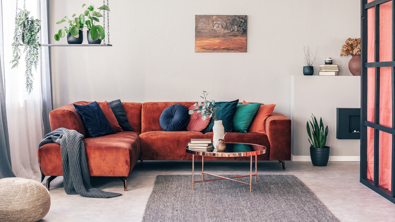
On the other hand, to keep the warmth of red from overwhelming a room, mix in various cool shades — navy, teal, gray, etc. To keep things from clashing, opt for darker, heavier shades.
Retro inspired red and orange
Switch up a classic red and orange color pallet by choosing richer, more 70's inspired shades. Lean into the retro vibes with other decor pieces, or modernize the color pallet by opting for more modern furniture silhouettes.
Bachelor red and black
Red can have a tendency to trend more feminine, but that doesn't have to be the case. Darker, richer reds paired with black furniture and more industrial decor can create a really swanky bachelor pad atmosphere.
Rich red and sapphire
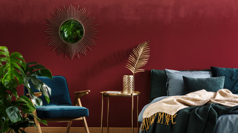
To create an intimate, cozy room dripping in luxury and drama, pair a really deep red with a rich sapphire color.
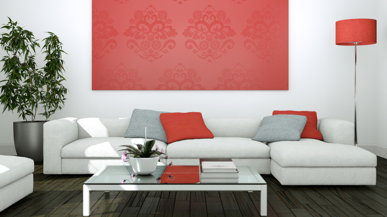
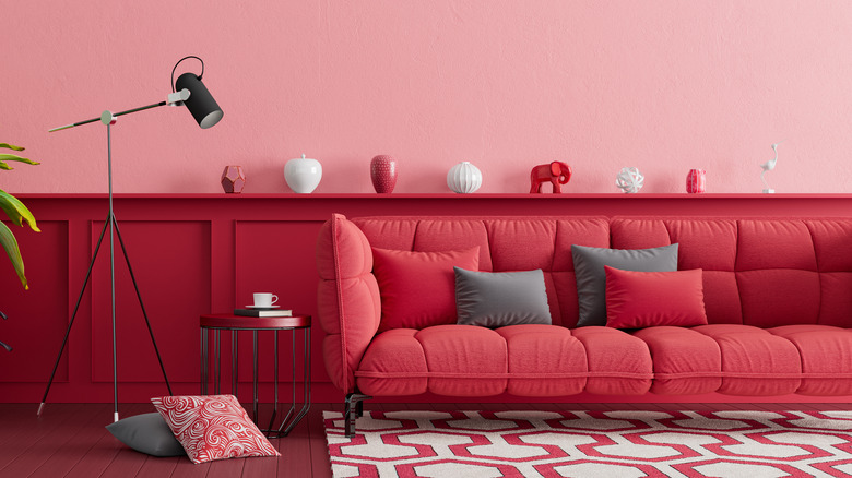
Lively red and gray
Since red is such a domineering color, a great color to pair it with is shades of gray. The contrast of cool and warm will create lots of texture and visual difference in your room.
Red and gold
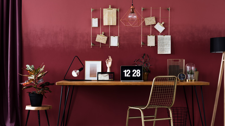
Bring out the warmth of red by incorporating lots of gold. Against a darker red, the gold will really pop out and add a bit of sparkle.
Modern bright white and red
For a brighter approach to modern design, combine shades of red and white. The red will stand out starkly against the red, so use sparingly.
Earthy reds and terracotta
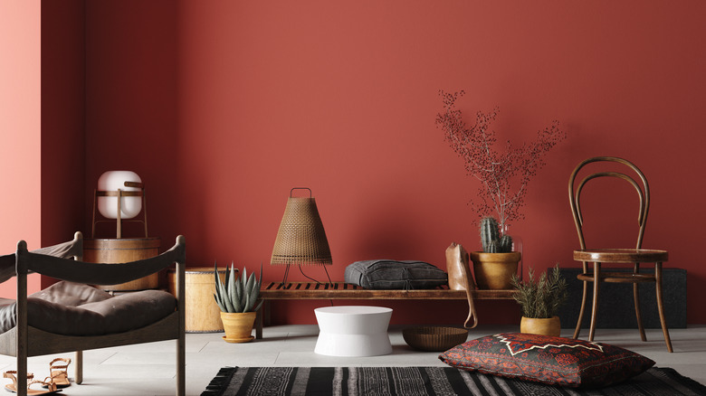
Often when discussing an earthy color pallet, people think of browns and greens. Red and terracotta, however, also offer an earthy effect. Pair these shades with brown wood for a rooted feel.
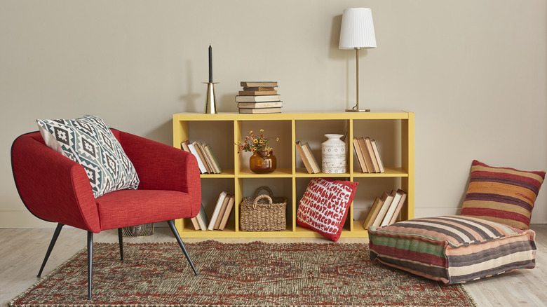
Red and pink
Red and pink are a great, classic color combination. Pink is actually just a light shade of red, meaning there's plenty of room to play with shade mix and matching.