The Most Popular Home Decor Trends From The Decade You Were Born
When talking about trends, the first thought that many people have is fashion and beauty. This, of course, is for good reason — how we present ourselves changes significantly from year to year — but there's also something more subtle happening in the background: our home décor style. It's common to shop online for new clothing or try out a different makeup look frequently throughout the year, but you can expect a humble coffee table or sofa to last more than a decade. Because of this, changes to our homes typically happen much more slowly. So slowly, sometimes, that it's hard to recognize until you look back at the trends of the past and compare them to your own experience.
While the idea of trends might seem a bit silly at first glance, they can act as a fantastic snapshot into the events, widespread attitudes, and technological advancements of that specific time through the lens of the everyday population. The average person doesn't often end up in the history books, but they do act as a consumer and have influence in the market. Because of this, one of the best ways to take a trip down memory lane is through exploring the home décor trends that have come and gone in your lifetime. Who knows — that dose of nostalgia might be strong enough to inspire you to incorporate some retro décor pieces into your space.
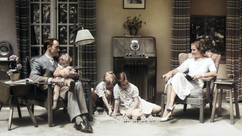
1930s: Bold wallpaper
Compared to the opulence and post-war revelry of the 1920s, the 1930s was a much more subdued decade, and for good reason. In 1929, the stock market crashed, leaving investors — and the world economy, as a result — in the lurch. Budgets that once allowed for the purchase of luxury goods and unnecessary décor pieces no longer had as much wiggle room, but that doesn't mean that interiors needed to be boring. Instead of relying on large and expensive pieces of art to add interest to their spaces, many people opted for more complex wallpaper designs to help fill the gaps.
1930s: Curved accents
While not everyone bought into the sleek Art Deco style that emerged in the 1920s, and even fewer had access to these ultra-designer pieces, it opened the door for many innovative designs that we now consider modern. In the 1930s, there was a slight move away from Art Deco and towards a movement known as Streamline Moderne. Trademarks of this style include rounded edges that feel aerodynamic, nautical themes, and long horizontal lines. While this aesthetic might be more recognizable in architecture, it still significantly impacted some of the designer décor and furniture pieces of the 1930s.
1940s: Contrasting color schemes
The 1940s was a decade almost entirely shaped by war, so a lot of the focus on less essential things like décor was put on hold in favor of more patriotic pursuits like growing your own victory garden or filling roles left vacant by troops. Once World War II ended in 1945, however, there was a massive reemergence in focus on the home and family. Similar to the 1920s, this post-war era was a time of celebration and recovery, so it wasn't uncommon to see bold color palettes, especially ones that played with contrasting colors, adorning rooms in the home.
1940s: Wood furniture revival
Wood furniture never truly went out of style, but it saw a massive resurgence in popularity in the 1940s thanks to the fact that many other materials of the day were being rationed as a part of the war effort. Wood pieces, from simplistic and straightforward to bold and ornate, were trending for just about every room in the home. In many cases, furniture pieces would also be purchased in sets made from the same material and stained the same color, ensuring that the bed frame, vanity, dressers, and nightstands, for example, would perfectly match one another and create an overall cohesive look.
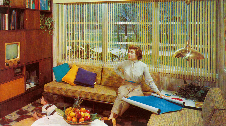
1950s: Sleek, modern lines
The 1950s was an era where many people had a newfound sense of optimism surrounding the future, and the design trends of the day reflected that. While modern aesthetics had been floating around for decades, they finally took hold and started appealing to a widespread audience in the 1950s. One of the most popular design aesthetics out there emerged from this era: mid-century modern. These pieces were characterized by sleek lines, rich colors, and an overall lack of frivolous and ornate detailing. Because of this overall minimalist vibe, it's not uncommon to see mid-century design styles still being produced today.
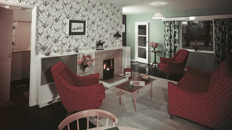
1950s: Colorful built-ins
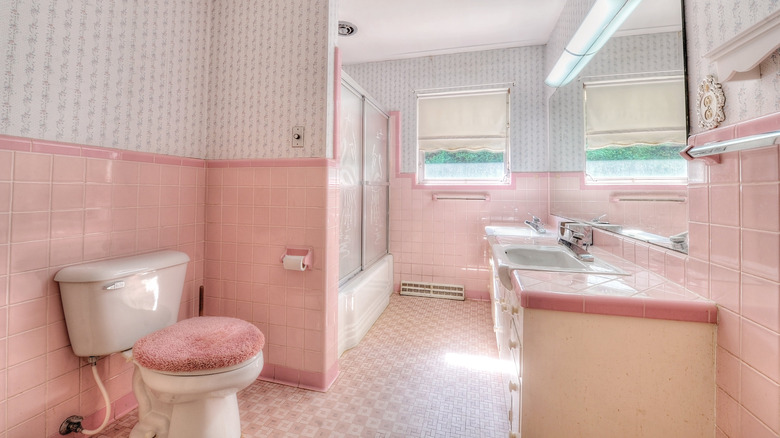
Maximalism and bold pops of color might be on the rise in current aesthetics, but contemporary designs have nothing on the 1950s. Rather than sticking to simple neutrals and accessorizing with accent pieces here and there, decorators in the 1950s were all about incorporating color into every facet of the room, even in more permanent pieces. In homes of the era, it wasn't uncommon to find bright pink bathtubs, teal refrigerators, and buttery yellow sinks, though many of these items have been replaced or painted over as time has gone on and such bold choices were no longer trendy or marketable.
1960s: Bright, warm colors
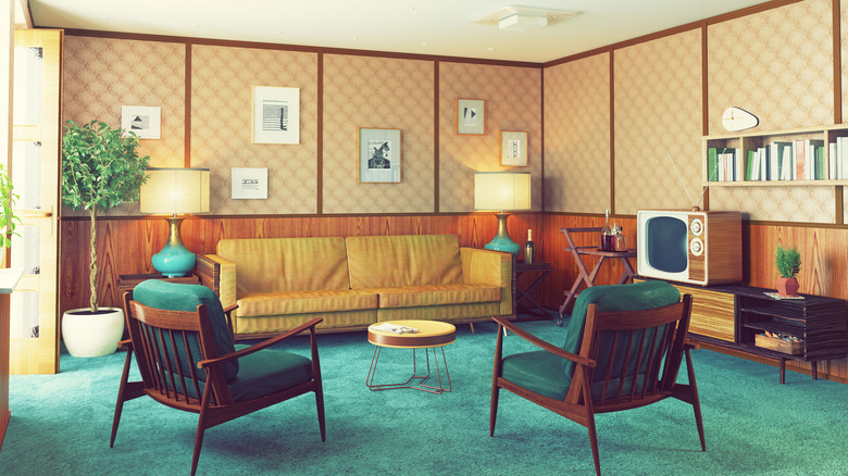
One of the most instantly recognizable facets of 1960s design is the color palette. After bright and pastel shades dominated the 1950s, warmer-toned and slightly earthier colors started to take hold in the 1960s. Colors like teals, orange, yellow, red, green, and warm wood tones were popular choices for furniture and home décor at the time, all combining to create a cohesive and distinctly cozy color palette. This overall feeling of warmth continued through the 1970s, but designers of the 1960s were certainly bolder with the saturation than their more subdued and bohemian counterparts down the line.
1960s: Space age lighting
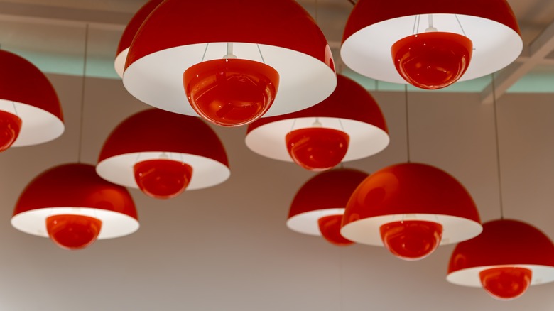
During the 1960s, America was knee-deep in the space race, eventually landing a man on the moon in 1969. As a result, designs of the era had a distinctly futuristic flair (retro-futuristic to those of us now in the future), especially when it comes to customizable accents like lighting. Traditional lamp and chandelier designs were often swapped out for pieces that had inventive, sleek, and creative silhouettes, and still-iconic designs like the lava lamp and mushroom lamp were popularized during this period. A lot of the time, these pieces were created using plastic thanks to the fact that they were cheaper to make, but glass and metal designs were still common.
1970s: Shag rugs
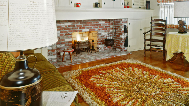
Shag carpeting is quite a controversial design choice nowadays, thanks to the fact that the high pile is notoriously difficult to clean, but homeowners in the 1970s seemed willing to accept this additional effort in exchange for such a cozy and comforting surface. Shag rugs offered a more subdued choice for those with wood flooring, but wall-to-wall designs were also popular. Despite developing quite a negative reputation in the following decades, modern iterations of these plush rug styles are still available and often sought after today, especially for fans of '70s interior home design.
1970s: Rattan furniture
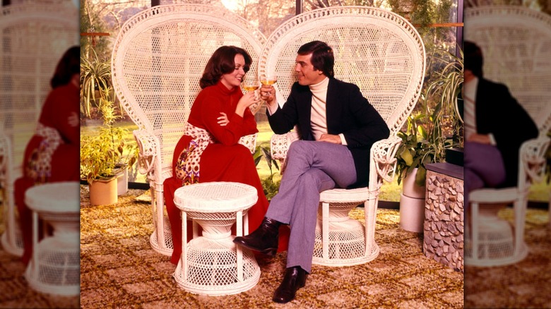
Rattan furniture might be primarily associated with outdoor pieces nowadays, but, in the 1970s, it was everywhere, both inside and outside the home. This distinctive woven style of furniture's revival in popularity during the decade was a natural response to the increased appreciation of earthier and more bohemian design choices. Entire furniture pieces, like woven chairs and tables, were popular, but it was also common to see items that mixed the texture and structure of rattan with an additional layer of upholstery or cushioning to make everything a bit cozier.
1980s: Mauve and pink
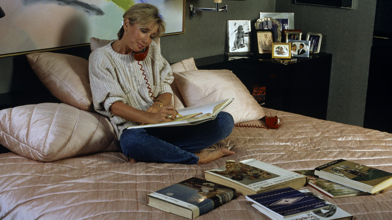
The 1980s, as a decade, were all about excess. Puffy shoulder pads, heavy makeup, and big hair dominated the fashion and beauty world, and bold colors, prints, and textures took over the home décor space. Possibly the most popular color during this era, however, was mauve, a distinctive dusty, pale pink purple that washed over everything from bedding to carpets. This color gave rooms a distinctly feminine flair and was often paired with other colors in the same muted pastel family, like pale blue, mint green, and light yellow.
1980s: Heavy drapery
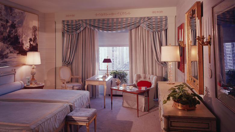
Following the same theme of excess, in many spaces in the 1980s the more fabric and texture you could fit into a room, the better. Nowadays, curtains tend to skew more minimalistic and are often seen as a functional inclusion to help improve sleep and increase privacy rather than a decorative choice, but the '80s weren't afraid to make a statement. Heavy fabrics boasting an array of different colors, patterns, and textures were often layered over and around windows, so it wasn't uncommon to see lush drapery and multi-layered curtains as a way to bring some texture and color to a space.
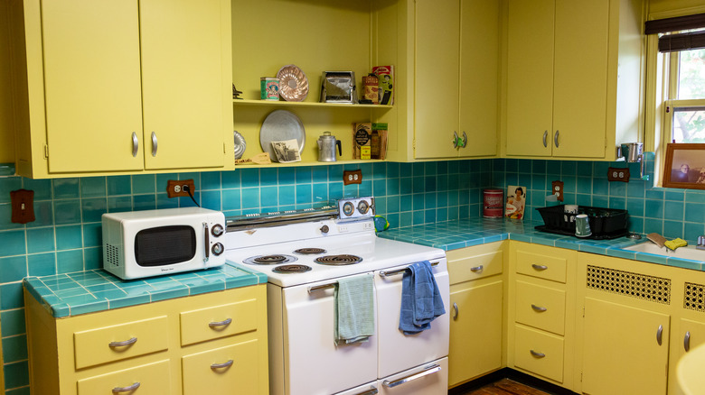
1990s: Pale-toned wood
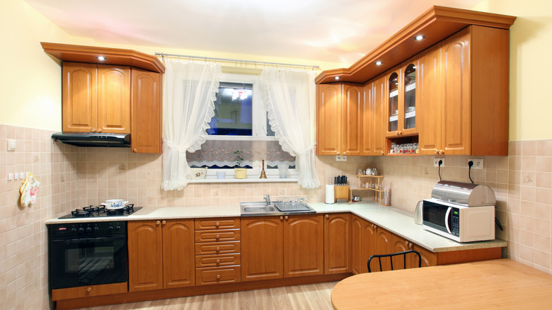
If you were building a home in the '90s, it's likely that you opted for a lighter colored wood, like pine, over some of the darker options that were available. Pale wood popped up just about everywhere, from cabinetry to flooring, and is one of the easiest ways to determine when a home was built at a glance. Nowadays, pale woods like pine are often read as cheap when compared to other, deeper options, but they can add a major dose of texture to a space when used sparingly and incorporated into the correct color scheme.
1990s: Brass fixtures
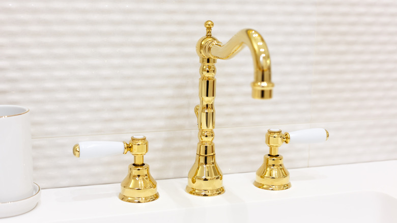
During the 1990s, brass fixtures were having a major moment. Pretty much anywhere you found metal around the home, you'd find this distinctive warm-toned finish. Handles on cabinets, faucets on sinks, and even the metal that helps to create a seal on the shower door was likely brass. After the '90s, the popularity of brass seemed to fade in favor of more cool-toned finishes like chrome and stainless steel. If you're craving a bit more warmth and sheen in your bathroom setup, however, you can still find brass fixtures at the hardware store — you just might have to dig through a sea of silver tones, first.
2000s: Tuscan kitchens
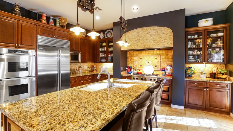
In the early 2000s, upper-middle-class kitchens took on a distinctly European flair. The Tuscan kitchen trend was characterized by hearty wood accents, warm-toned granite countertops, textured tiling, pops of bright red, the occasional hand-painted mural, and, of course, decorative bottles filled with oil and some sort of preserved vegetable. It's unclear why the trend of mimicking Italian design (in a distinctly American way) took off so heavily, but these ornate kitchens of the 2000s offer a stark contrast to the more minimalistic, pared-down, and ultra-bright look that's more popular in homes today.
2000s: Heavy wood furniture
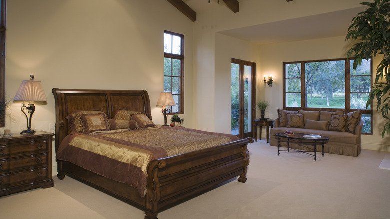
Heavy wood furniture pieces saw a massive spike in popularity in the early 2000s. Whether you were a fan of chunky and ornate bed frames or dining tables with ultra-stocky legs, it was likely that you had at least one room in the house with a more dramatic and moody look to it. Most of the time, these furniture pieces were paired with similarly thick fabrics in prints like damask and jacquard, all wrapped up in a warm and rich color scheme that heavily favored deep browns and reds.
2010s: Shabby chic
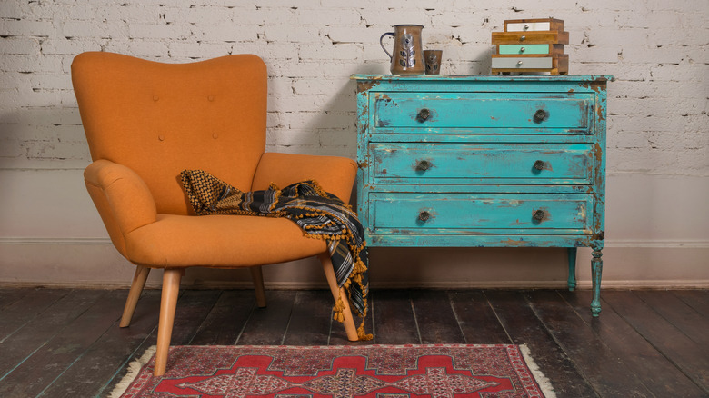
During the 2010s, it was hard to walk into a boutique or furniture store without happening upon a piece with intentionally chipped or distressed paint. The shabby chic movement is all about embracing imperfections, repurposing vintage items, and cultivating an overall aesthetic that is a little rough around the edges, and it was incredibly popular with secondhand shoppers and DIYers for years. Now, however, it's beginning to fall to the wayside in favor of a slightly more polished, though still eclectic, home décor style. Now, it's more common to attempt to restore vintage pieces rather than simply give them a coat of chalk paint.
2010s: Gray
Because home décor trends don't fluctuate as quickly as clothing trends, it's no surprise that some of what was trendy in the 2010s is still fairly popular today. One trend that's beginning to fall out of favor, however, is gray as a primary neutral. In the 2010s, most of the neutrals were cool-toned whites, grays, and blacks, and they were often contrasted with pops of bold yellow or teal to bring in some freshness. Now, however, it seems like the pendulum is swinging back toward warm tones as the go-to, and browns, beiges, and warm whites are starting to take over.