Take A Look Inside Chip And Joanna Gaines' Massive Hotel Renovation

We may receive a commission on purchases made from links.
What do you do when you've renovated hundreds of houses, plus an actual castle? Transform a hotel, of course. At least, that's the case for Chip and Joanna Gaines. This personable power couple has been putting their hometown of Waco, Texas, on the map ever since HGTV scouted them in 2011. Since then, they've renoed and restored countless homes in front of our eyes, built out the Magnolia empire, and turned Waco into a tourist destination. If that's not enough, Joanna Gaines is thought to have single-handedly inspired America's modern farmhouse fever.
After their castle renovation, you would have thought this pair had reached a reno peak, but grass definitely doesn't grow under the Gaines' feet. No sooner had "The Castle" episodes drawn to a close, and they started their biggest project ever. As the name suggests, Hotel 1928 was constructed during the Roaring Twenties, a period when the country's cup was bubbling over with optimism, opulence, and innovation. Built in the style of a Moorish Revival lodge, it was originally owned by the Karem Shriners.
After purchasing the property, the "Fixer Upper" hosts considered using it as their headquarters. But once they decided to turn it into a hotel, Joanna Gaines told USA Today, "Our minds were spinning with ideas around how incredible it would be to restore this landmark property in Waco back into a place that welcomes people in again." And boy, did they do just that. Seemingly overnight, the Gaineses renovated and designed over 50,000 square feet of space into a beautifully updated experience that transports visitors back in time to a glamorous period of history.
The luxurious lobby
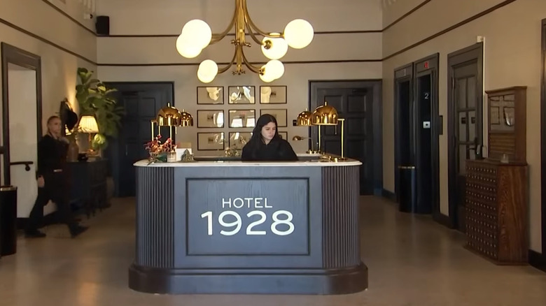
From the moment you walk into Hotel 1928, you're greeted by old-world elegance. White walls highlight the original Moorish architectural elements, including the recessed arcade, vaulted ceiling with original beams, historic ceiling mural, and restored terrazzo floors. Reception "counter" might be too flimsy of a word to describe the burnished, U-shaped concierge desk that dominates the lobby. Gold globe pendant lights and desk lamps add that feeling of '20s glam, while a small seating area nestles under a gallery wall of vintage photos. Black-and-white historical pictures of early Waco are a running theme in the hotel, drawing visitors deeper into the history of both the building and the town.
It might sound crazy to draw decorating inspiration from a hotel lobby, but this is one foyer where you can absolutely find design details to steal for your own space. Firstly, the color palette is perfect. Black and white is always a win, and adding dark brown and wood tones lends a classic, mildly moody touch. Warm metals are the perfect compliment, especially if you're looking to channel a period like the '20s. The grayscale photo wall is another element that's easy to mimic and can work well with most color palettes. If you want to showcase some of the history of your area, see if you can dig up old photos of your house or neighborhood. Alternatively, look for family pictures taken before color came to cameras, or edit your own images into black-and-white or sepia for a monochromatic effect.
The cozy café
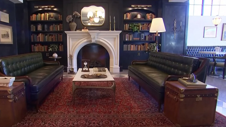
If you're longing for a caffeinated pick-me-up after check-in, you won't have to look far. The Café at Hotel 1928 is one of three restaurants, all of which are open to both guests and the public. While you might originally go for the coffee, you'll definitely stay for the design. Joanna Gaines is known for her farmhouse-inspired spaces and typically champions timeless, pale paint tones. But for this project, she has taken a far moodier route, opting for stormy black walls, starting in the entrance area and extending into the café. The focal point of the café is definitely the ornate white fireplace surround, which pops dramatically against the dark walls and built-in bookcases. Two vintage leather trunks act as side tables, while a red Persian rug anchors the space and breaks up the black-and-white expanse of checkerboard tile.
This space is a perfect example of how you can achieve a moody interior without washing everything in dark tones. The white brick to the right helps to break up the dark walls, built-ins, and upholstery. It makes the leather benches pop and picks up the white of the checkerboard tile, the marble tabletops, and the fireplace. Speaking of the fireplace, here's another design element that's definitely worth drawing inspiration from. Not every house has a fireplace, and if you're lucky enough to be blessed with a hearth, why not hype it up by painting it a different color to your walls? And black walls aren't mandatory for this to work. If you have white walls, simply paint your fireplace surround in a contrasting color, such as dark brown, black, slate gray, or a deep terracotta.
The moody library
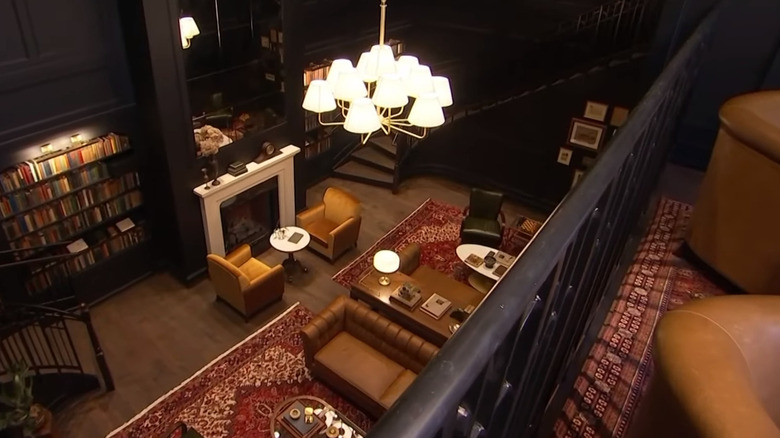
Chip and Joana Gaines created some serious magic when they decided to convert what was once the building's coal cellar into a library area for guests and visitors. From the landing, two broad staircases descend into a luxurious two-story library brimming with historic books. They stocked the shelves from another of Chip's inspired buys, Booked Up. Owned by Larry McMurtry, Chip Gaines bought the bookstore with the express purpose of preserving its massive inventory. Close to 8,000 of these vintage books (fittingly, from the '20s and '30s) line the library walls. The beautiful bound spines take center stage against dark, drama-laden walls. The rugs, chairs, and soft furnishings echo the muted reds, greens, and brown tones of the books. Persian rugs visually warm up the space, anchoring a curated collection of leather-covered recliners, chesterfield sofas, checkered wingbacks, and inviting club chairs. Nostalgic, period-appropriate details dot the space, including Larry McMurtry's typewriter, an antique brass abacus, and much more.
If you're looking to create a vintage-inspired feel in your space, take a leaf out of the Hotel 1928 library and focus on the small things. One of the ways you can channel the past –- even if you don't have a two-story room to convert into a full-on library –- is to build a book collection. And the easiest way to make your book display fit in with the rest of your décor is to go the Gaines route and use it as part of your color palette. By pulling shades from your bookshelves, you can make the space feel curated and cohesive. Vintage books tend to come in similar color palettes, making them easy to coordinate with rugs, art, and upholstery.
The rooftop restaurant that gives you a full view of Waco
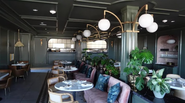
Hotel 1928's rooftop restaurant, Bertie's, will transport you to the '20s faster than you can say, "Waiter, please." This charming eatery serves some serious design flare. During an interview with Architectural Digest, Joanna Gaines said, "The team and I wanted to have a little more fun here, and we kind of had this character in mind: our crazy aunt." Well, Joana's crazy aunt definitely has taste, an eye for color, and a perfect hand with pattern. Outside, the color scheme is soft, with scalloped-edge umbrellas and checker tiles. Inside, guests are greeted by dusty pink sofas in the seating area, marble tables, and leather tub chairs against a backdrop of muted teal-green walls. The petal-shaped pendant lights in this space are a beautifully updated take on Art Deco design. Banquette seating against the back wall makes for a dynamic focal point with floral upholstery that's echoed in the scatter cushions throughout the restaurant.
Once again, the color pairings are on point. Pink and green always play well together and can look both soft and sophisticated if you opt for muted shades. If you're thinking of channeling this color palette in your home, going green on your walls is a great idea. Paint is a cheap way to upgrade an area and is relatively easy to change if you tire of the color. Are you wary of investing in a pink sofa? If so, incorporate blush tones through smaller accent pieces. If you're re-upholstering a piece in a patterned fabric, see if you can get a few scatter cushion covers made as well to repeat the print.
The Brassiere restaurant
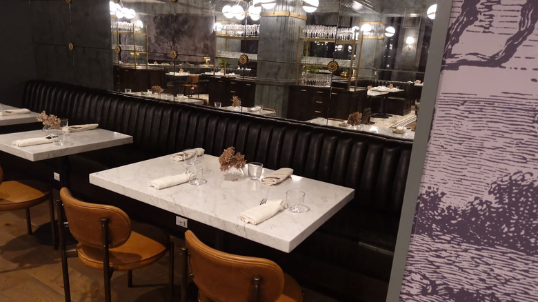
From a design perspective, The Brasserie is like a more serious sister to the rooftop restaurant. Less bright than Bertie's, the main restaurant features a paired-back color palette with black accents, dark wood, caramel-colored leather, light sage, and forest green. The focal feature has to be the monochromatic, vintage-esque landscape wallpaper that wraps the restaurant. The floors are an arresting mixture of hardwood and vintage black and white penny tiles. The walls are lined with more sumptuous banquette seating. Freestanding, stone-topped tables dot the floor, and the rest of the seating is a mixture of upholstered armchairs and side chairs in a combination of both brass and chrome metals.
If you love the aesthetic Chip and Joanna Gaines created in The Brasserie, recreating the vibe in your own home might be more achievable than you think. To start, vintage-style landscape wallpaper designs are pretty popular right now, and you can find similar motifs on places like Etsy. The Gaines went hard on the bench seating in this "fixer-upper," but for good reason. Banquettes are space-saving, offer oodles of seating, and can even double up as storage. If you have a nook in your home you want to transform into a dedicated eating area, built-in bench seating can work wonderfully. Too many loose seats in a small space can be awkward, and lots of chair legs can look visually chaotic.
The sumptuous suites
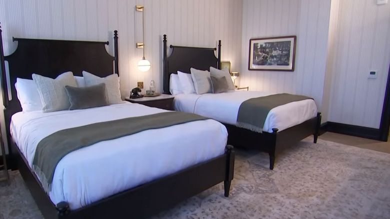
There are 33 rooms in total, and no two are identically decorated. Part of this is because Joanna furnished the hotel with a blend of new and pre-loved vintage or antique pieces. The Gaineses also had to consult with the Texas Historical Commission to get the go-ahead on what types of materials they could use that would be in keeping with the building's past. This guided some of the design decisions. For instance, in the bedroom, Joanna originally considered concrete floors, but the committee decreed that certain rooms had to be carpeted. Although they're all slightly different, the rooms have a similar color palette to the rest of the hotel, with lots of sage green, browns, caramel tones, and a touch of gray, all against a running backdrop of black and white. These color pairings look both grown-up, cozy, subtly glamorous, and old-world. To make it really feel like you're living your best 1920s life, the rooms sport charming details like vintage-style radios and rotary-dial phones.
If you want to recreate Hotel 1928's vibe, one of the best tips to take away is Joanna's ability to blend old and new furniture. The way she combines well-loved, historic pieces with out-of-the-box items of a similar style is impressive. The result is an updated take on traditional design. Pairing smaller vintage items with new furniture can still give off a classic feel. Painting traditional-style pieces can also lend a fresh look. For instance, the Chippendale-style beds and headboards in Hotel 1928 are painted black, which creates a subtle contemporary look and stops the rooms from feeling like stage sets.
The beautiful bathrooms
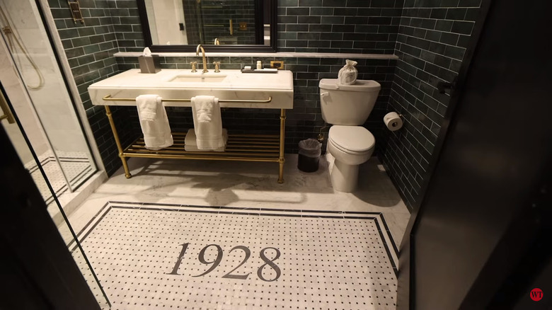
The bathrooms in Hotel 1928 are so beautiful, they deserve a standalone mention. The first thing you see in all of the en-suites is "1928," arranged in black-and-white mosaic floor tiles. The result is a tile rug effect that's echoed in the shower. On the walls, Joanna opted for forest green subway tiles, which enlivens the monochromatic flooring even further. Generous marble-look washstands add a sense of luxury, and gold-toned towel rails and faucets bring in that undercurrent of glam, popping to perfection against the green tiles.
Are you itching to recreate a similar color scheme in your own lavatory? Unless you've got plans (and cash) to demo and reno, redesigning a bathroom can be tricky. But there are some relatively cheap, and in some cases, renter-friendly, changes you can make. For instance, instead of incorporating dark green through tiles, consider paint or wallpaper in deep teal tones. If you have chrome hardware, you can swap this out for gold or brass without having to undertake major renovations. If you're renting, you can always take the fittings with you; just be sure to store the originals along with their screws. And if you just can't get your mind off how good the Gaines' mosaic floor design looks, you can even achieve a similar aesthetic for under a hundred bucks with a mosaic vinyl mat.
The majestic ballroom
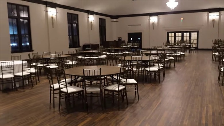
If you want to two-step back to the roaring '20s, Hotel 1928's 5,800-square-foot ballroom is the place to do it. This magnificent room feels grand and ultra-authentic. In this area, particularly, the Gaineses focused on restoring rather than changing. During an interview with KCENTV before the project started, Joanna said, "We want to preserve a lot of the historic elements of the building. There's just some beautiful trim work, windows, things that are just killer — the ballroom. You can just walk in and see it and imagine what it was." Fortunately, they were able to keep a lot of the original finishes, including the floors, which is very poetic considering that people danced on them almost a hundred years ago. Paired with the large paned windows, recessed ceiling, molding, and stunning chandeliers, the space gives off decided "Great Gatsby" vibes.
One of the most striking takeaways from this historic ballroom is how great architecture doesn't need complicated decorating. Joanna kept the color palette super simple, sticking to mostly black and white. She could have tried a bold paint color, gone for plusher furnishings –- but instead, she let the beautiful bones of the space speak. If you have an old home with great architecture, taking a paired-back approach like this can help to emphasize its special, original elements, like molding, fireplace surrounds, transom windows, or niches.