Tips For Selecting Coordinating But Not Matching Picture Frames
We may receive a commission on purchases made from links.
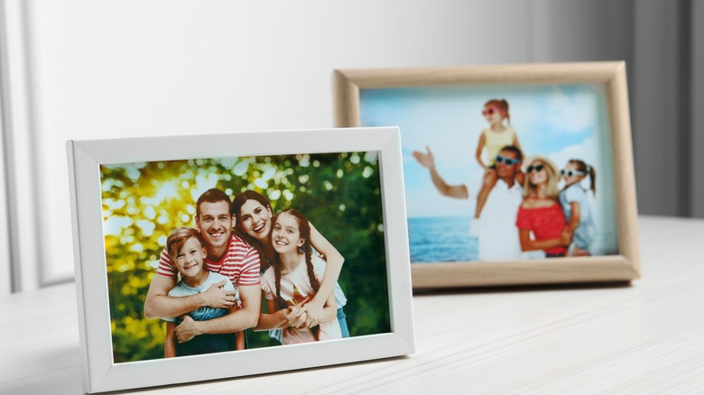
An attractive set of photo frames can be a perfect way to get your photos out of albums and electronic files and into your space. They can be a great way to add personality to a home. Display too many, however, and many design experts feel that they can visually clutter a room if done sloppily. Designer Amal Kapen not only recommends you be selective in your photos and rotate them regularly, but she also recommends thoughtfully curating and coordinating the frames you put them in for a more cohesive and intentional look. While they need to be complementary, too many single matching frames can look boring and severe. The trick is mixing and matching frames for a perfect balance using color, materials, and finish.
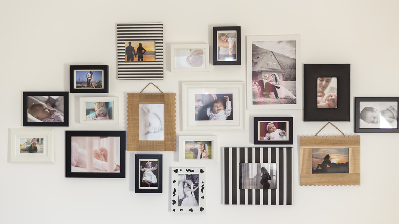
By grouping frames together, be they freestanding on a mantle or shelf, or hanging on a wall, you can create a gallery wall or dynamic shelf of memories that shows off images to their best advantage. The key is to let the frames and photos form a cohesive whole to prevent them from cluttering or overwhelming the room.
Coordinating frames by material or color
When it comes to using coordinating frames, many designers suggest mixing and matching woods to gain additional warmth and texture rather than sticking to one kind. Darker and lighter stained words can work together nicely. You can also coordinate frames in a single material, but a variety of shapes and orientations, like all gold or silver frames in circles, ovals, or other shapes. Combine simple and more ornate pieces in a similar finish, creating a glam or formal traditional look.
For something more casual, try painted wood frames in a couple of different shades you want to tie into other interior elements, such as black and white or pops of a bolder color that coordinates with the photos. Black and white photos can look stunningly simple with a surround of basic black or pop-in frames or clear lucite ones, which often look best in more modern rooms. For additional interest alternate colors or types in a line or layer them with overlap for an assemblage feel.
Other ways to create cohesive photo displays
While you can just use coordinated frames to create a photo gallery wall, feel free to mix photos among other art and decor items, which can add interest and texture to a blank wall, particularly if they are unified by frame type of material. Try mixing art prints, vintage ephemera, oil paintings, sketches, and personal photographs together in similar or coordinated frames. You can also mix in 3-D elements like wall planters and sculptural pieces that add more dimension than a complete flat display of art or photos.
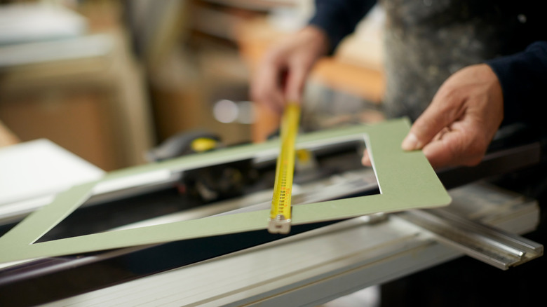
If you're looking for a budget-friendly approach to creating the perfect art or photo arrangement, thrift stores are a great place to pick up frames in a variety of finishes and materials that working together can create a stunning gallery wall. You can also purchase bulk packs from Amazon or inexpensive wood Dollar Tree frames and use spray or chalk paint to customize them. If you are stuck with a mix of frames and aren't looking to modify or replace them, you can also coordinate by matting the images in a standard color or way.