The Soft Paint Tone You Should Consider For Your Victorian-Inspired Door
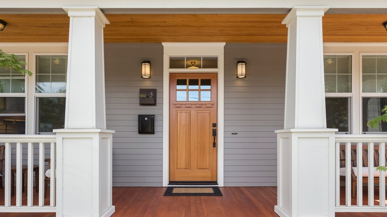
A front door is one of the most important features of a home's exterior. It's an important detail to help boost your home's curb appeal. Because of that, many people have painted their front doors. Shades of blues, greens, and reds are the popular colors among the neutral whites and blacks. However, if you want to stand out from the crowd, there is one color currently gaining popularity that isn't used quite as often. Light pink is unexpected for a home's exterior door, and that's exactly why it makes the perfect shade. The shade, specifically, is Milk Thistle from the London Door Company. This soft shade of pink adds a subtle pop of color to a traditional Victorian-inspired front door.
Pink is often a color that elicits strong reactions, both positive and negative. What most people worry about is having a shade of pink that's too bright or eye-catching. However, this trend is suggesting a softer shade that is a little more low-key. It's also a bit closer to a tinted beige, so it's not an overwhelmingly intense shade that would cause most people to pause. The neutral element allows you to easily pair this kind of pink with other exterior features, yet it's still different enough to stand out from the crowd of colored front doors.
Designing around a pink door
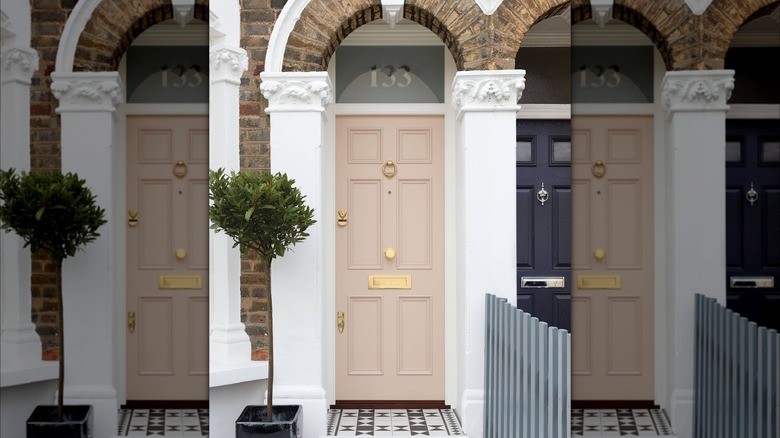
A pop of color can often go a long way when it comes to your home's exterior, and finding the right shade is the ideal place to start. A rise in dusty, neutral pinks as front door colors is on the horizon when it comes to front door trends. Shades like Pink Drab from Farrow & Ball and Pinky Beige from Sherwin-Williams have a slightly darker tone that leans more into the neutral beige undertones, while Farrow & Ball's Calamine is best for a lighter color scheme and is a little more of a true-pink. Georgetown Pink Beige from Benjamin Moore has a peach undertone that makes it a little warmer.
Though pink may seem like a challenging color to design around, it can be quite easy, especially with a pink that has more neutral tones in it. Use pink in combination with a crisp white for a light and airy aesthetic. Consider white-painted brick or white siding so the door stands out as a feature. Or pair it with black for a color scheme that looks more sleek and modern. Be cautious with tans and beiges, as these colors can look too similar, creating no distinction between features.
Pairing pink with brighter colors is also an option. Try a teal blue or a vibrant red, both of which will play off each other while allowing the pink to be a feature. If it's too much to fully paint brick or siding with these bright colors, incorporate them as accents instead, on trim, shutters, or window flower boxes.