Must-Try Color Trends We Saw At TIHS 2024
We may receive a commission on purchases made from links.
While the world of housewares might seem simple at first glance, it's actually an expansive industry that encapsulates just about everything it means to transform a simple space into a functional, comfortable, and unique home. This market is involved in almost every part of our day-to-day lives, from how we launder the clothes we wear to the appliances we use to prepare our meals, and the International Housewares Association seeks to connect professionals and consumers from these wide-reaching concentrations under one roof at The Inspired Home Show (TIHS) 2024, held March 17-19 in Chicago, Ill.
House Digest spoke with Tannese Williams, Product Marketing + Development for Pantone Fashion Home + Interiors at TIHS — she helps manufacturers figure out the color palettes for their products. She shared with us the importance of color in the home. "Home is where you go to be who you are," she explained. "Color gives you an emotion. Color makes you feel a certain way. For your house, you get to choose the colors that help you connect to who you really are."
Trend One: Monochrome
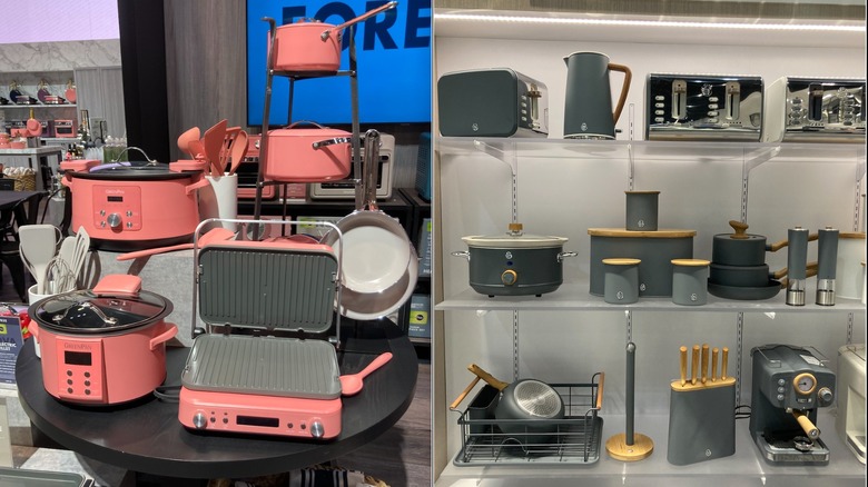
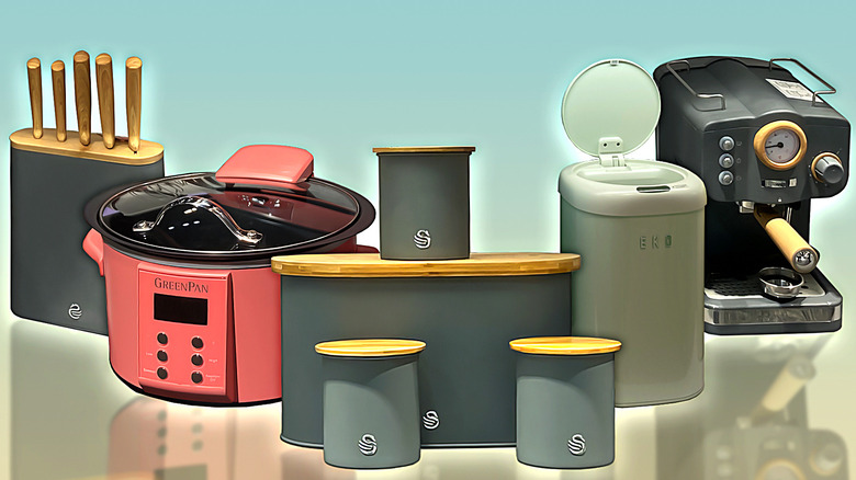
If you're a fan of consistency in your interior decorating, you're in luck. At this year's TIHS, several different brands were exhibiting collections of items in the exact same hue, meaning you could easily coordinate your entire kitchen or bathroom if you're willing to stick to the same line. Instead of showing a toaster in blue, green, red, yellow, brands were showing a blue toaster — and matching blue dish drainer, spatulas, pots and pans, paper towel holder, and so on.
This level of coordination is nothing new when it comes to neutral colors and materials like black, white, and stainless steel, but complete collections in one bold shade have been historically few and far between. While it's unlikely that most consumers will be willing to swap their entire collection of kitchen essentials in one go, this trend could inspire a new generation of collectors or first-time buyers to pursue a cohesive set rather than a mishmash of items from various brands, especially if they're just beginning to dip their toes into more vibrant waters. If you'd like to incorporate more color into your home but don't want to figure out which hue goes with which, trust in the monochromatic trend. Pick one shade you absolutely love, and go for it.
Williams said it's a great color trend for those who feel like they have a lot going on in their world, and want to simplify by having just one color. "There's a sense of security, a feeling of 'I know what's going on,' when you step into a room and see just one color. There's not so many things happening at once."
Monochrome collections to watch
While the monochrome trend is one of the easiest to spot while perusing TIHS, there were several brands that were especially attention-grabbing. KitchenAid, which has a long history of playing with color, showcased a collection of kitchenware in Mineral Water that fits in perfectly with the other bright colorways they offer. If you're looking for an even more unique option, the brand also creates a limited-run collection for their chosen color of the year. Items you can find this beautiful color in include a stand mixer, knife block, mixing bowls, various utensils, dish-drying racks, scrub-brush holders, and more. If you've got a white kitchen, the brighter color will definitely pop.
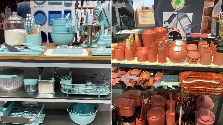
Moving away from kitchenwares, European brand Spirella decided to explore the monochrome look, displaying a collection of matching terracotta soap dispensers, toilet brushes, and rugs, among other things, that would allow consumers to create a colorful bathroom without worrying about clashing shades. Fans of organization will also be pleased to know that there's an eye-catching collection of matching blue storage baskets, too, courtesy of Design Ideas.
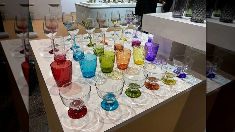
Trend Two: Rainbow
On the opposite end of the spectrum from the monochrome theme, we have the emerging trend of sets in a full rainbow of color. Several brands offered multiple colors in one set or individual items that could be mixed and matched. Sticking with the monochrome aesthetic is still certainly an option with many of these brands, but there is also a general encouragement to play around with different combinations, an idea that will likely prove popular as more and more people begin to explore maximalist décor as opposed to the more pared-down and simplistic styles that minimalism offers. Williams shared, "You've got to have fun in color." It's also about options. The color pro explains, "If you have a dinner party, maybe you'll give your vivacious friend the yellow plate, and the teal plate to your calm friend."
With that being said, these sets are far from falling into true eclecticism. Despite the items' differences in color, their shapes, styles, and overall aesthetic remain consistent, meaning that, despite how many different shades you include in your unique mix, the pieces will still feel cohesive. Hopping aboard the rainbow train might seem a bit intimidating to consumers, especially after years of having so few options for color, but this consistency could make the transition feel a lot more comfortable.
Rainbow collections to watch
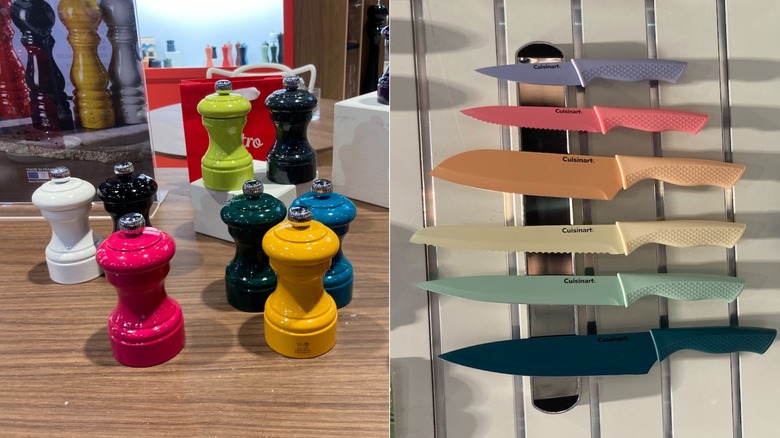
Brands that offer multiple colors in their most popular products are far from few and far between, but the unique kind of consistency and encouragement to mix and match that specially-designed rainbow collections encourage is much more rare. With that being said, however, there were still quite a few displays at TIHS that fit the bill. Cuisinart showed off multiple different offerings of its colored knife sets, both in muted shades and a more vibrant colorway, Peugeot displayed a full spectrum of color in its Paris u'Select Pepper Mills, and Gibson Home had some fun with its vibrant stoneware-style dining sets.
Additionally, Lav went for a slightly more pared-down approach to the rainbow trend with its drinkware that combines both clear and colored glass, and Terragave showcased some of their biodegradable, agave-based plant pots in bright shades that included a lime green, golden yellow, and carrot orange. Even Viking, a brand known almost exclusively for its ultra-shiny steel cookware, displayed some colorful kettles, helping to cement the impression that this new wave of color is much more than just a coincidence among brands.
Trend Three: Earth tones
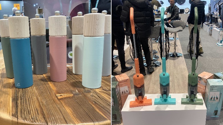
Earth tones are the hottest color trend when it comes to neutral shades, says Tannese Williams, and you may be surprised by what hues are part of the trend. "Nature is not boring at all," says the Pantone color pro. "It's not just beiges, grays, and tans. We're bringing in greens, peaches, blues." She said the color palette, which can be both muted or vibrant in tone, is a way to connect with the outside world. "You can feel attached to nature and feel a little more grounded."
Peugeot's Boreal salt and pepper mill collection showcases the full range of earth-tone colors. The mills combine the look of wood with softer tones of green, blue, gray, and pink found in nature.
Black + Decker is offering their Powerseries Lite 3in1 Stick Vacuum in three colors that represent the more vivid side of the earth-tone color trend. The pop of orange, teal, or forest green will look great in your closet or in the corner of your living room.