9 Of HGTV's Keith Bynum & Evan Thomas' Best Design Ideas, According To The Fans

If you're searching for unique design ideas that won't break the bank, Keith Bynum and Evan Thomas are the kings of bold budget renovations. "Bargain Block" on HGTV showcases their historic upgrades of dilapidated homes in the Detroit area. This dynamic duo is known for turning forgotten houses into designer residences at an accessible price point. All HGTV shows are fun to watch for viewers who are passionate about design, but shows like "Bargain Block" take it a step further by giving new life to abandoned homes and neighborhoods. These are undoubtedly some of our favorite renovations to watch.
Fans are loving this relatively new addition to the HGTV roster. The authenticity of Keith and Evan, plus their admirable cause, have made this one of the most beloved shows on the network. We've pinpointed their top renovations by weighing the enthusiastic HGTV YouTube comments. The viewers have spoken, and their top picks will give you major design envy. Steal inspiration from Keith and Evan's most beloved rebuilds.
9. A funky Wild West-inspired transformation
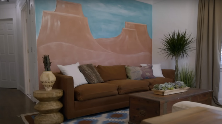
In Season 2, Episode 6, Evan wasn't originally on board with Keith's plan to transform this Detroit bungalow into a Wild West-inspired retreat. However, the end result wowed both house hunters and viewers alike. While many fans were absolutely obsessed with the rustic twist, others were skeptical. The bold, Southwestern mural commissioned by Keith was the major piece that divided some fans. YouTube viewer @karenacton3854 commented, "I personally like the finished product, unfortunately I'd be painting the mural.....not my style." However, user @opalmoon2256 was won over: "Was kinda of worried with theme...but it's cool n love the cow/bull horns over the door. Great job!"
The benefit of committing to such a bold theme is to maintain cohesion throughout the entire space. On the downside, it can be more limiting when it comes to resale. Finding buyers who admire a bold aesthetic can be tricky. However, Keith and Evan are proof that daring choices often pay off. If you want to recreate the Wild West theme, add Southwestern-inspired throw pillows like these from Wayfair. You can also add potted succulents throughout your space.
8. A bare-bones home goes all-black glam
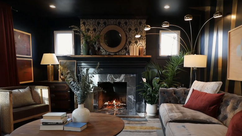
Painting (almost) the entire interior black is a bold design choice, to say the least. However, Keith and Evan never shy away from a well-executed theme. In Season 2, Episode 8, the home had already been taken down to the beams, offering the duo more flexibility to focus on the cosmetic design. They chose to use black as the base color throughout the interior, with glamorous gold accents. Although it was certainly daring, most fans loved the final result. YouTube user @michellapereira2328 commented: "Very sophisticated design idea. The shiny gold striped effect and the gold design over the fireplace make it feel expensive." @twistoffate4791 agreed, "I adore what you guys did here, and agree with the gentleman who described it as "part art deco, part Harlem Renaissance." However, they didn't win over everyone. @caroled5734 chimed in, "I love what you guys do, but I couldn't handle it all black living room and kitchen."
If you want to paint a room in your home black, but you're nervous about committing to such a dark shade, consider a dark grey like 2124-10 Wrought Iron, by Benjamin Moore. Once it's all over your walls, it will look like a soft, smooth black. The only downside to a black interior is that it can be tricky to paint over, so make sure to swatch your shades before making your final selection. For a glamorous touch, follow Keith and Evan's lead and display velvet, tufted furniture, like this piece from Wayfair.
7. An abandoned house is transformed into a zen-inspired space
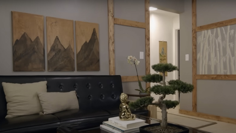
The house in Season 2, Episode 3, had rotted walls and a carpenter ant infestation, resulting a much more involved renovation than Keith and Evan were prepared for. Beyond the heavily involved structural overhaul, Keith and Evan decided to keep the design for the home relatively simple. Although they are used to renovating pretty battered homes, Keith described the original home as, "One of the worst homes we've ever done." The decision to keep things sleek, simple, and zen-inspired was an overall hit with the fans. @susanr5546 commented, "This small home went from a complete mess to a petite zen treasure due to Keith's and Evan's hard work and vision." However, some fans thought it was a bit too humble. @victorialine5984 added, "This is one of the duo's more restrained renovations."
Keith chose to paint a bamboo-inspired mini-mural which tied the ambiance together. While it looked beautiful, we've already learned that not everyone is a fan of murals. You can get a similar look with a panoramic painting like this from Vancico. This will create the same feel without the risk of having to repaint. Wooden details are also essential if you want to copy the meditative, zen decor in this home. Add another nature-inspired piece of wall decor with this driftwood and eucalyptus wall hanging from Etsy.
6. A 1920s restoration with classic Detroit details
In Season 3, Episode 3, the 1920s home might have appeared like a tear-down to some, but Keith Bynum & Evan Thomas immediately noticed the good bones and solid construction. Their vision was to infuse as many classic Detroit-inspired details as possible, paying homage to the home's roots. Fans were particularly obsessed with the kitchen renovation, which included a unique tile floor. "It's a nice little play off of classic Detroit-style mosaics," Evan explained. Keith continued, "It's very elegant and lots of wood and black, which is very Biedermeier, very Detroit, which I love." YouTube viewer @DanKohan commented: "I love how you kept the cool old stuff and that kitchen tile is awesome. The black and white theme all over is super classy. Great job!" @NomadChristian said, "Love the tile floor in the kitchen." However, some fans had criticism for some of the kitchen details. @robinbirdj743 commented, "Am I the only one who wishes they had soaked the cabinet hardware and saved the old wood cabinets?"
The only challenge with designing a home that blends both traditional and trendy elements is striking the right balance. The goal is to make both eras blend together through cohesive features like a color palette comprised of neutral tones. If you want to create a similar space, you can purchase almost identical tiles from Floorzz Premium Flooring. For a more affordable, renter-friendly alternative, go for peel and stick vinyl tiles from Target. Copy the herringbone countertops with these from Lowe's.
5. A groovy 1970s-inspired disco house
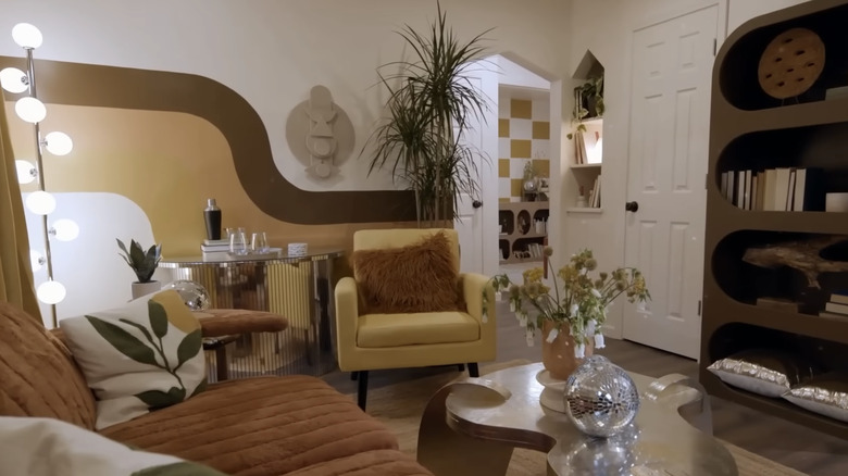
Using the 1970s as home decor inspiration is a daring endeavor. While this groovy decade might not appeal to everyone, Keith and Evan created a unique and playful design plan in Season 3, Episode 2. They dubbed this home the "Disco House," and when these two adhere to a theme, they go all out! Keith described the plan: "I'm going to make this house a whole vibe. Think 1970s browns and gold, lots of textures like shag and velour. Maybe a well-placed disco ball. Gotta keep it classy of course!" This home was a fan favorite, even for those who didn't groove with the theme. @MsLinda165 commented, "I don't even like the 70's and I love this house." @M.Cambell said: "Having lived through the 70s I have to say that I have no nostalgia for it. That said, they did an amazing job on that little house, and it'll make someone very happy."
The 70s is a controversial decade in the world of design, but nobody can deny its consistent impact on modern fashion and interior trends. Mustard yellow and brown tones were essential in tying together the 70s-inspired theme. Get your own 70s-style armchair at Target for a groovy accent piece. You can also capture the retro look by adding these Wayfair chairs to your dining space or kitchen. For the finishing touch, create an almost identical backsplash with these groovy tiles from Floor and Decor. Overall, this episode is proof that you can take inspiration from any decade and still make your space look classy.
4. A crumbling $1,000 home gets a second chance
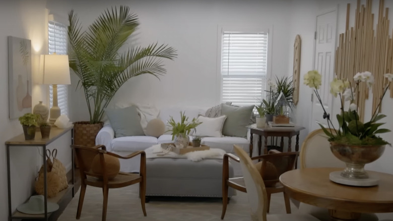
While all of Keith and Evan's projects involve breathing new life into dilapidated homes, this home, Season 2, Episode 1, really showed their ability to revitalize struggling neighborhoods. The water damage in the home was extensive, and the renovation involved ripping out essentially all the walls and flooring down to the studs. Because so much of the home was unsalvageable, they chose to reconfigure the entire space by creating an open floor plan and turning the existing kitchen into a bedroom. Fans loved this renovation because it exemplified Keith and Evan's mission of offering affordable, livable homes for everyday families. The top comment was posted by @gddrew, stating, "I really like how these guys are revitalizing a neighborhood, while giving people the opportunity to have a nice, AFFORDABLE home." @ThreeRunHomer agreed: "Remarkable. They're improving the neighborhood and creating really nice low-priced homes."
The decor of the home was light, bright, and Hamptons-inspired. While this aesthetic could feel out of place in Detroit, Keith and Evan added enough traditional details to balance the beachy theme. Copy the easy, breezy look with these woven bar stools from grandinroad. Add plenty of palm-style plants throughout your space, and focus on soft, warm lighting. While it might be tempting to paint your interior a clean, white shade, go with a creamier tone like SW 7013 Ivory Lace.
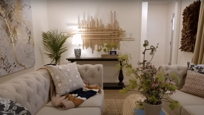
3. An unexpected, minimalist twist on a classic home
The home in Season 2, Episode 4, wasn't quite as derelict as some of their usual projects, which is why Keith decided to challenge himself with a more refined aesthetic. Minimalism isn't typically Keith's go-to when it comes to selecting a design theme for an old home. He opted to paint the walls beige instead of white, exclaiming, "I can't deal with that much subtlety!" However, the finished product was a hit with the fans. @byronjackson8452 commented, "Omg that house is amazing. Love the minimalist style." @Tiadaghton37 agreed, "Best remodel they have done! Loved it!"
Although the home was inspired by minimalism, Keith made sure it felt welcoming by incorporating warm neutral tones and natural textures. Pops of greenery break up the space while flecks of gold add a subtle touch of glamor. You can get a similar look with this modern, modular sofa from Living Spaces. The cowhide rug, like this artificial version from Rugs USA, looks beautiful on top of a woven area rug for added visual interest. This episode is proof that there are ways to make a space look dynamic without using lots of color.
2. A warm, welcoming remodel with a stunning fireplace
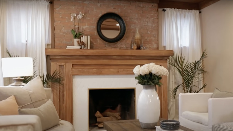
In Season 2, Episode 2, Keith and Evan turned a rotting house with major structural issues into a warm, Cape Code-inspired home. While they couldn't save the original fireplace in its entirety, they created a custom mantel and frame to serve as the centerpiece of the living room. All of the historic-inspired details were stunning, but more than a few fans are obsessed with the fireplace. @sreeladasgupta8795 said: "Absolutely love this house. The fireplace is magnificent." @maureenforsman3272 added: "Love, love the fireplace. Spectacular! The exposed brick is a great feature."
Mixing wood tones has been trending recently, but Keith and Evan decided to stain all the major wood pieces the same shade. This is a great way to create cohesion, and you can avoid monotony by adding other dynamic elements. In addition to the custom woodwork, Keith and Evan dared to play with the contrast between dark and light. While the living space was light and bright with gauzy curtains and light woods, the dining room took a moodier turn. They chose to paint the walls in the same shade as the exterior, a deep navy tone. Capture the look in your own home with Westcott Navy by Benjamin Moore.
1. A dilapidated home gets a cabin-inspired makeover
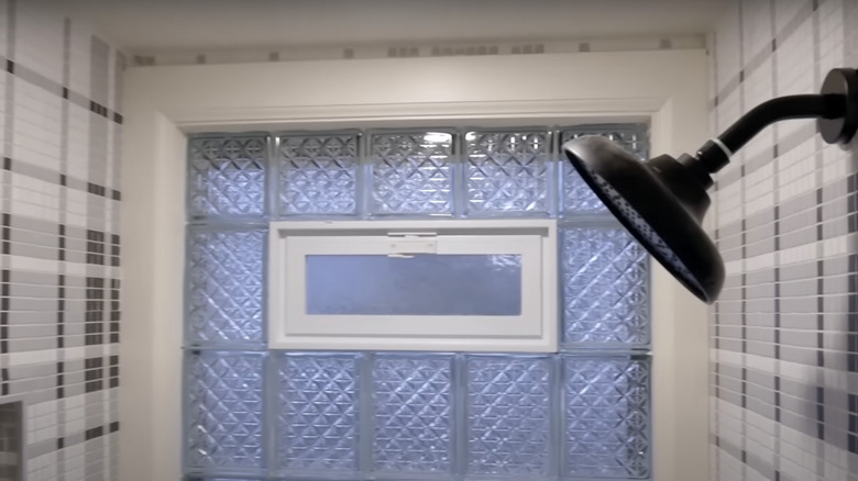
To call the home in Season 3, Episode 1, a fixer-upper would be an understatement. Not only was it completely decrepit, but the existing rooms were pretty tiny. Although they were working with a relatively compact space, Keith and Evan decided to add a proper second bathroom to add resale value. Real estate agent Shea Hicks Whitfield explains: "The one existing bath that's here is so tiny and so gross, even once it's cleaned up and sparkly and pretty, I am concerned about the size of the bathroom. So, to add a second full bath would be amazing." Fans agreed that this was the right choice for the use of space. @user-ig5wm8ms5g commented: "The fact that the house only had one FULL bathroom and they put a second FULL bath in was amazing!....And one bathroom was all plaid ??? That was too cool!!!!" @sadie513 also shared, "First time I've seen them add a bathroom and it was well needed."
Stealing space from another room to create a bathroom can be a risk, but the resale value will likely increase. Keith and Evan had some problems connecting the plumbing between the new bathroom and the kitchen below, but their renovation is proof that nothing is impossible if you consider creative solutions. If you choose to convert an unused space into a bathroom, make sure to consult an architect to determine the amount of structural renovation and plumbing overhaul.