The Color Pairings That Make Summer's Favorite Green Feel Timeless
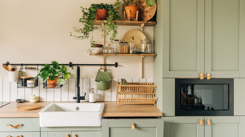
Playing with trends while ensuring your interior stays timeless can be tricky, but green is a great place to start. Pistachio green is a particularly trendy tone that can be used throughout your entire home. This color is soft and gentle but can still pack a punch. It's slightly greener than sage but lighter than grass green. There are several places in your home to use trendy neutral green paint colors like pistachio, but the real challenge is finding the best colors to pair it with. We've highlighted the best timeless color pairings to ensure your pistachio-tinted interior won't go out of style.
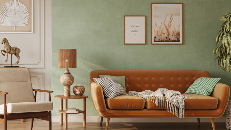
Blue and green have always been paired together to create soothing spaces, and there's a reason for the longevity of this serene color combo — pistachio green pairs particularly well with pale blue. Baby blue and soft green can help you create a colorful interior that won't feel overboard. You can also opt for a blue-grey if you want your space to lean modern. Another timeless combination is pistachio green with ivory or warm white. You should never underestimate the power of a crisp, light, neutral shade with a pop of green. If you want to make a major design statement, try the trendy yet timeless technique of color drenching and go for a mix of pistachio and dark green. If you're worried about the monochrome trend going out of style, pair pistachio with a warm shade that is contrasting yet still natural — like terra-cotta orange.
The best light shades to pair with pistachio
If pastel blue is calling your name, there are several ways to flawlessly blend this timeless tone with pistachio green. The first step is to select the right shade of light blue to complement your pistachio decor. For a subtle approach, Woodlawn Blue by Benjamin Moore can help you curate a traditional color palette. This shade will allow the pistachio to shine. If you want a shade that will balance the pistachio directly, try Sapphire Ice. This is described as a "straightforward powder blue." (via Benjamin Moore) If you want to go the blue-grey route, you can't beat Silver Mist – one of Benjamin Moore's most popular greyish blues.
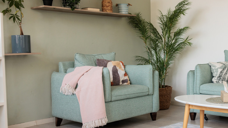
When it comes to selecting a chic shade of white or ivory to support pistachio, the placement is more important than the tone. To create a timeless living space, go for warm white walls, colorless curtains, and a pistachio linen sofa as your centerpiece. For a less communal space, like your bedroom, you have more freedom with the wall color. Try painting your walls in a delicate pistachio shade and softening the space with ivory and white textiles.
Darker options that will make pistachio pop
If light and bright aren't your style, you can still curate a timeless home with darker colors. An earthy atmosphere will never go out of style, which is why pistachio and dark green make such a foolproof pair. Although monochromatic interiors may seem trendy, green will keep everything down to earth. Forest green can create a calming atmosphere that still makes a dramatic statement. Try prioritizing texture for additional visual variation. You can start small and try out this color scheme in a more compact area, like a guest bathroom or office.
Last but not least, terra-cotta is a beautiful warm tone to balance a light pistachio green. It bridges the gap between a color and a neutral. For an authentic, old-world-inspired look, try a genuine terra-cotta tiled floor with pistachio wallpaper above. There are several creative ways to use terra-cotta tiles in your home, and green furniture will always be a stylish, complementary choice. If new flooring isn't in your future, you can still add splashes of burnt orange throughout your space. Dark orange curtains, throws, and other textiles are an easy way to create contrast. In a kitchen or bathroom, you can also use copper fixtures as an easy way to bring in a touch of metallic orange.