The Internet Trends Going Out Of Style In 2025
The internet is an excellent resource for design, but it can also be our worst enemy when it comes to getting seduced by trends. While some design ideas are totally timeless, others can make your home look dated in the blink of an eye. Interior designers are constantly experimenting with trends and determining what is worth trying and what should be left in the past. We had the unique opportunity to interview industry experts and receive exclusive quotes. From designers to brand owners, each design pro has highlighted different internet trends that aren't going to stand the test of time.
There's nothing wrong with adding a trendy touch to your interior, but you want to make sure you really ruminate on the practicality of a trend before jumping in. Maksim Sauchanka, design and home improvement expert and owner and CEO of BMR Belmax Remodeling, explains, "The pattern I see with these microtrends is speed — they rise fast because they look good on a screen, but fall just as fast because they don't feel good in a space. My advice is if it photographs better than it lives, think twice." Sauchanka continues to give pertinent advice regarding choosing decor based on your personal taste rather than its virality on social media. This approach will result in a much more timeless interior. In addition to expert advice from Sauchanka, you'll find additional exclusive quotes from professionals such as Rachel Blindauer, Jo Rich, Anton Liakhov, Liv Conlon, and Ally-Catherine Trenary.
Jelly furniture was not built for longevity or versatility
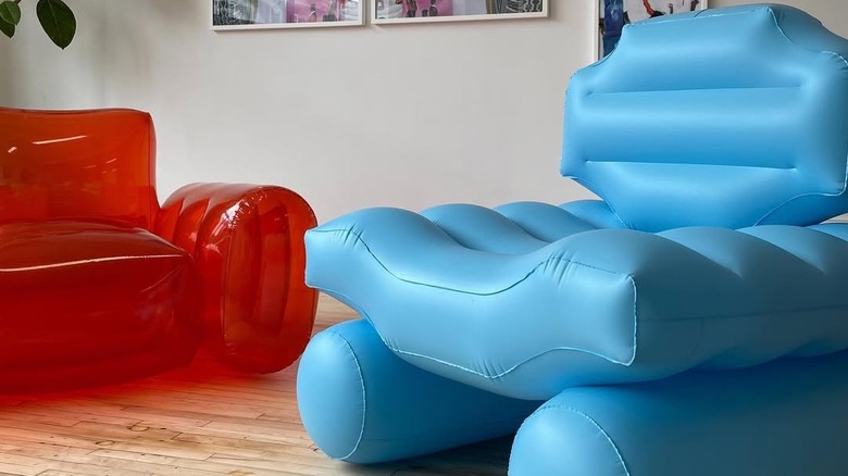
Although jelly furniture undoubtedly acts as a major conversation piece, it doesn't excel in functionality. Sauchanka warns against this fleeing trend and explains why it had such a brief 15 minutes of fame: "At the beginning of the year, I was flooded with client inspo boards filled with translucent, candy-colored 'jelly' chairs, tables, even shelving. It had a novelty factor — fun, nostalgic, very Gen Z TikTok — but that's also its downfall." He also criticizes the lack of practicality, arguing that jelly furniture was not designed with everyday use in mind. Once people started realizing how easily the surface scratches and collects dust, the trend immediately started to fade.
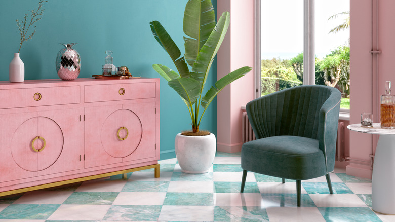
However, Sauchanka thinks there is still value in what the trend represents. He makes the following suggestion: "In my view, the better alternative is investing in sculptural furniture with softer silhouettes — think bouclé or velvet in unexpected shapes. These pieces still bring personality and a playful energy but integrate seamlessly into a wider design vision." Organic fluidity and curved designs arose as a major design trend last year and its favorability hasn't dimmed. Curved, asymmetrical furniture can give your home a contemporary feel without tipping over into the too-trendy category. For example, this Yoobech Modern Curved Sofa is a piece that has the same fluidity as jelly furniture, but with a much softer and more practical structure and fabric.
Lime green dominates rather than complements
Another trend that Sauchanka suggests staying away from is dousing everything in lime green. Not only is the color overwhelming, but it makes it hard to design a space that feels harmonious. Sauchanka says, "This one surprised me. For a hot second in February, I started seeing lime green — only lime green — used aggressively in single-accent pieces: rugs, lamps, even entire backsplash tiles." He credits the digital-inspired aesthetic as the source of this unexpected trend. Any shade that completely dominates a space is likely to date your space. Another issue with adding a neon color to your interior is the lack of perceivable intention. You don't want it to look like you flooded your home with a color just because it is trending.
Although the sun might be setting on lime green, other green shades are emerging as favorites that won't fade with time. Sauchanka expands, "If you love bold color, try layering multiple shades from the same family — olive, chartreuse, deep forest green. It creates complexity and mood instead of a shout." Benjamin Moore highlighted Rosepine as one of this year's top-trending colors. This shade is a softer variation of Sauchanka's suggestion of forest green, making it ideal if you're looking for a green hue to use liberally throughout a communal space. This is where a pro recommends bringing in trendy muted green paint tones.
TikTok trends combine too many clashing aesthetics
TikTok has highlighted the concept of interior aesthetics, which is the theory of curating your space around a specific theme. Although exploring aesthetics can be a great way to determine what styles resonate with your personality, it's also easy to get lost in the countless options. Interior and Product Designer Rachel Blindauer of Rachel Blindauer Interior Design + Furniture Design details this issue, "A gingham slipcover and a disco ball can't always coexist peacefully. Early 2025 saw viral mashups like 'cottagecore meets Y2K' and '70s disco meets prairie house.' They were fun — but deeply impractical." She describes the unsettling faux-pas as a form of "stylistic whiplash."
This advice doesn't mean you have to pick a single, exclusive aesthetic to explore within your space. However, there are more tasteful ways to blend several themes. Instead of mixing different styles in equal measure, try prioritizing one approach and adding hints of other vibes throughout. Blindhaur explains, "Let one aesthetic lead, then bring in tension through contrast — like a single contemporary art piece in a traditional room, or a bold light fixture in an otherwise restrained palette." The "rule of three" is another method that can help your space feel cohesive, even with pops of visual contrast. Try to find at least two other pieces that include the same colors or aesthetic details as your main statement piece — this will really help tie everything together.
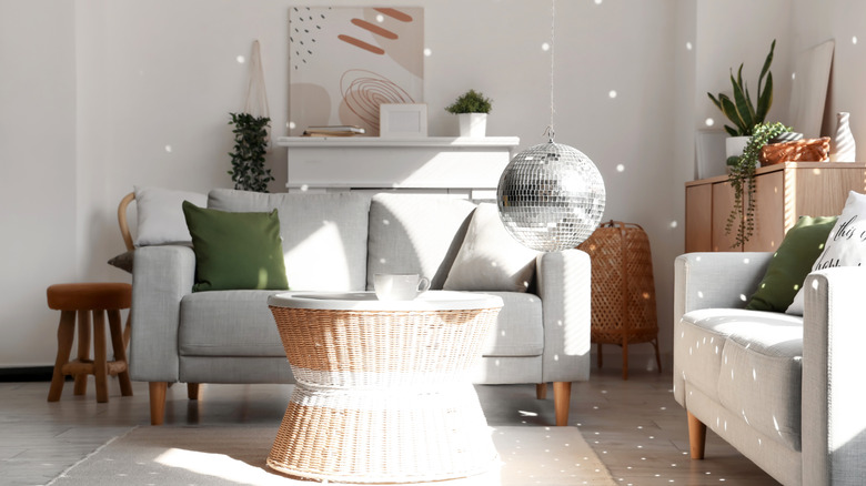
Bubble chandeliers can overwhelm contemporary spaces
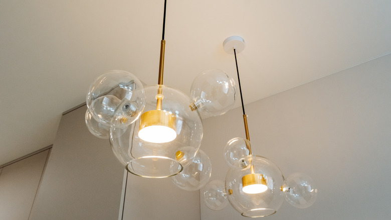
Bubblecore is the curvy decor trend that's embracing chic bulk. However, the bubbles might be about to pop. This bouncy overhead lighting trend is undeniably eye-catching — though, to a fault. Jo Rich, designer at Raydoor Sliding Walls & Doors, gives her thoughts on the questionably bold bubbles: "One trend that really caught fire this year was the bubble chandelier craze (oversized, tiered orbs suspended in foyers and dining rooms). I think they made a playful statement but many clients found the scale overwhelming and the style too whimsical for everyday living." There is a fine line between lighthearted decor and kitsch. What might look playful now can easily appear tacky later on.
There are plenty of ways to add trendy, whimsical accents to your home. Rich shares her stylish alternatives: "I recommended switching to a sculptural LED pendant in a streamlined profile. I found it delivered much more visual interest without dominating a space or making it feel dated." Although bubble chandeliers might be floating away, statement lighting is certainly here to stay. Sculptural pendant lights come in all shapes and sizes, from organic, asymmetrical pieces to sets of geometric shades. This Fivemengo Wabi Sabi Pendant Light is a modern, textural option that still looks more mature than a bubble chandelier.
Candy-colored cabinet knobs are already looking dated
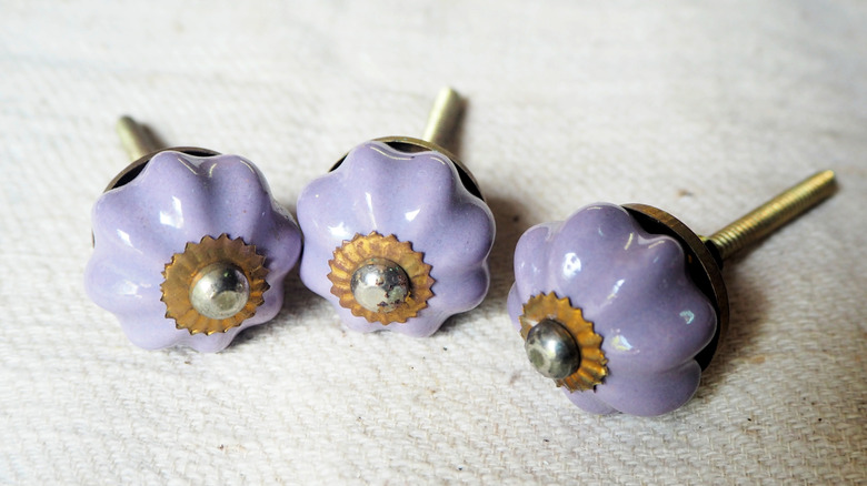
Playful pieces that lean juvenile are a recurring trend that people are starting to pass on. Rich points out a small decor piece that could start aging your kitchen: "Another big favorite has been the candy-colored ceramic cabinet knobs and pulls. This seemed to be fun for a really quick kitchen refresh, but based on current forums I read and customers, people are already sharing a feeling of being last month's novelty." Besides the aesthetic considerations, keep in mind that ceramic materials chip, and therefore the longevity of these knobs can be compromised. You should also ruminate on whether your decor will suit every season. It's easy to get caught up in the bright colors and patterns of spring and summer, but try to prioritize hardware and design elements that will look appropriate all year long.
Ceramic knobs are not suitable for every interior style. Sure, if you have a vintage home, ceramic knobs can complement the antique details, however, if your goal is to create a contemporary space, they can date your interior. Rich makes a suggestion: "I recommend choosing more classic finishes, like matte black or warm brass. It's simple and a timeless shape." If you are looking for a style that blends contemporary and classic aesthetics, try brushed metal finishes. You can also mix and match different metallic hardware throughout your kitchen to achieve visual variation that won't look overwhelming.
A mural-painted ceiling is pricey and polarizing
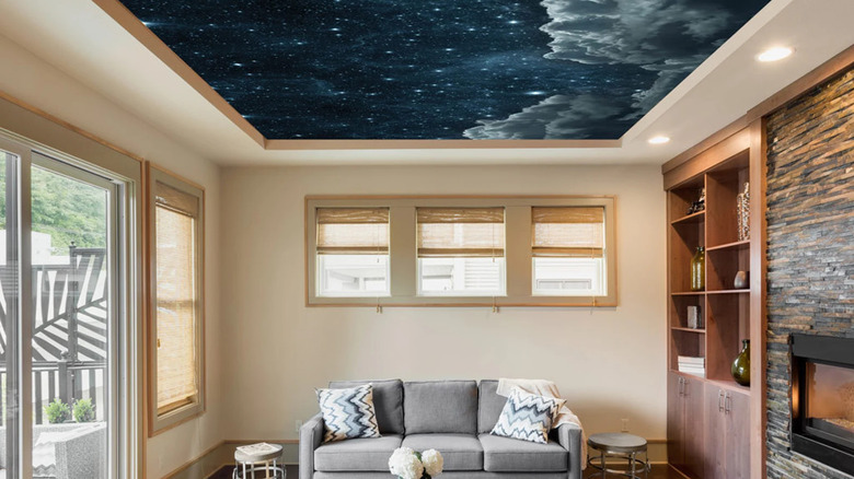
Painted ceilings have gone in and out of style for centuries. However, a true hand-painted mural can cost a pretty penny. If you're not sure whether you will want to keep your overhead mural indefinitely, it may not be worth the investment. Rich explains, "Another microtrend that has fizzled is the hand-painted ceiling mural. The early adopters loved the 'drama' but the permanence and higher installation cost have caused many to regret the commitment." This is another example of how a statement piece can backfire if it doesn't tie in with the rest of the room.
This doesn't mean that your ceiling shouldn't have any decorative elements. Rich offers a unique solution: "As an alternative, I would consider a subtle plaster or Venetian-style finish on the ceiling. It still allows you to introduce texture and depth but remains much easier to repaint or refresh down the road." Another low-cost option is to use wallpaper. Although it may not have the same effect as a hand-painted mural, it is a budget-friendly DIY option. However, make sure that the wallpaper doesn't compete with the rest of your space. A subtle pattern that adds visual texture, like Rich recommends, is preferable to a loud, distracting design.
A red statement piece clashes with everything else
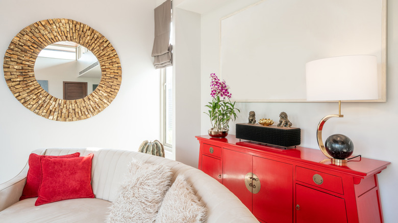
Everyone was obsessed with adding a splash of red ... until they weren't. Interior Designer and the Founder of Roomtery, Anton Liakhov, highlights the issue, "Early this year, everyone was carving out a crimson moment in their home — usually in the form of one bold chair, a single lacquered wall, or even cherry red lamps and accents. It felt bold and editorial. But it also felt forced." He also argues that bright red is nearly impossible to match with anything else in your home, unless you used it as your starting point. This viral TikTok home decor trend has been polarizing the internet, and a polarizing home doesn't typically stand the test of time. Although adding a splash of color can be refreshing, it's important for it to appear intentional and not the result of falling for a waning trend.
Red isn't going out of style altogether — it's just all about finding the right shade. Liakhov clarifies, "If you're craving a bold color moment that won't wear thin, I'd steer toward rust or oxblood. They're still rich, still dramatic, but warmer, moodier, and easier to ground with wood tones and neutrals. Red doesn't have to shout to make a statement." Adding a touch of orange isn't the only way to make red look more modern. Behr's 2025 Color of the Year is Rumors, described as a deep ruby red. It bridges the gap between warm and cool. The key is to select a dark, muted variation of red that will complement, rather than compete with, your existing decor.
Checkered beige textiles are lacking dimension and contrast
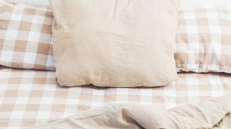
Another trend that Liakhov urges designers to stop playing with is checkerboard overload. Checkerboard patterns are often considered timeless, but certain variations are falling out of favor. He highlights one specific colorway that is fading fast: "Listen, I love a classic checkerboard. But this year saw an avalanche of beige-on-beige checkerboard patterns — on rugs, throws, towels, even walls. It was marketed as 'quiet luxury,' but in reality, it lacked contrast, dimension, and got boring fast." He notes that there is often nothing else in the space that visually anchors this overdone pattern, making it appear even less cohesive. Another reason why this trend is on its way out is due to the now-condemned "sad beige" aesthetic. While warm neutrals will never go out of style, all-beige-everything is definitely being left behind.
There are some ways to make the beige checkered pattern work. The focus should be on the texture, rather than the pattern itself. In fact, three-dimensional texture will distract from the pattern and help balance the busy design. Liakhov explains, "If you're drawn to a subtle pattern, I recommend breaking it up with textural contrast instead. A woven checker rug in jute and wool will feel much more alive than a printed version." Other Liakhov-approved options include tone-on-tone patterns and raised embroidery. In general, texture is a great way to give your space visual depth in an understated way. This Lahome Checkered Easy Jute Runner Rug is an excellent example of a touch of beige checkers done in an understated way.
Dopamine decor is overwhelming rather than joyful
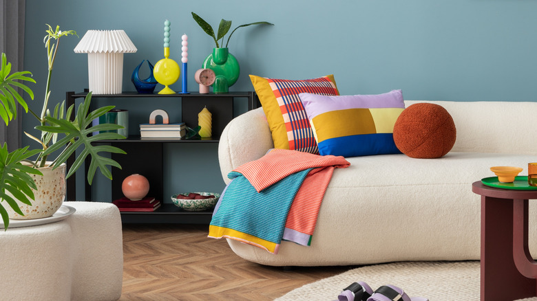
Bold decor has been growing in popularity, but have we reached the peak? Liv Conlon, CEO of award-winning ThePropertyStagers and StagerBoss, thinks it might be time to tone down the daring decor. She describes "dopamine decor" trend: "This was the trend using bright clashing colours, over-the-top pattern mixes, and ultra-playful accessories designed to spark instant joy. Think neon gallery walls, checkerboard rugs, and everything in mismatched brights." She goes on to say that Instagram-approved decor might not work in a real home environment. Although there's nothing wrong with adding pops of personality to your interior, your home should feel like a peaceful environment, rather than chaotic and overwhelming.
This year is experiencing a major shift towards earthy colors. While cool, low-contrast neutrals remain out of style, the oversaturated color schemes are getting increasingly more muted as the year progresses. Conlon shares her picks: "Instead, try mood-boosting neutrals — soft, warm palettes like buttermilk, terracotta and muted olive." She also suggests pairing these serene shades with natural textiles, including rattan and linen. This can create visual interest without taking over your entire space. Try bringing earthy tones to your home decor with a rich and gorgeous color combo.
Bouclé can be dirty and difficult to maintain
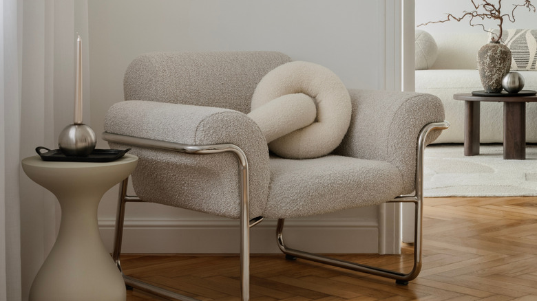
Everyone has seen a bouclé-filled interior by now. What used to be touted as effortlessly contemporary now looks like a fleeting trend. Ally-Catherine Trenary, founder at June St. George, points out the problem with this textural phenomenon: "While we adore cozy, comforting interiors, teddy bouclé has felt like a whirlwind trend that came in fast and strong, but then quickly lost its charm. The curly, looped yarn gave a cloud-like appearance that was incredibly inviting at first, but its rapid rise in popularity led to oversaturation. What once felt fresh and original began to feel predictable." Trenary also explains that bouclé is difficult to maintain, making it particularly impractical for those with a busy lifestyle. The looped fabric can get snagged easily, which means it might not be the best choice for households with pets and children. Also, you cannot machine wash most bouclé shams, throws, or other textiles.
There are other plush, cozy materials that can give off the same visual warmth as bouclé. Trenary lists rich velvets, woven linens, and soft cottons as more reliable alternatives. Beyond bouclé, these are the trendy natural materials you'll be seeing more of in homes everywhere. If you really love the look of bouclé, Trenary recommends incorporating accent pieces like throw pillows, rather than large-scale furniture pieces. She concludes with a statement that summarizes the rise and fall of internet trends: "And most importantly: if you truly love a material or trend, there's always a way to make it work. Your space should reflect you, not just what's currently trendy."