Fixer Upper's Joanna Gaines Shares The Perfect Paint Colors For Every Area Of Your House

We may receive a commission on purchases made from links.
When selecting the perfect paint colors for each room of your home, there is nobody better to turn to for advice than Joanna Gaines. Known for her modern takes on farmhouse chic and real-life home decor solutions, the busy mom of five really knows how to make a house into a home. In general, Gaines' advice about picking the perfect wall color leans toward just choosing hues that you love, without worrying about what everybody else is doing. "There really aren't any rules," she told House Beautiful. "Paint in whatever colors make you feel best in your home."
However, the HGTV star still has a few suggestions for those looking for guidance. The best part? They aren't too general, either. Instead of just suggesting a creamy white or moody gray to set the tone for your space, Gaines graciously name-drops the specific colors she likes to use. This way, you don't have to hunt down a Joanna-approved paint color. Instead, you can get it sent right to your door.
Use deeper shades of blue for relaxing sleeping spaces
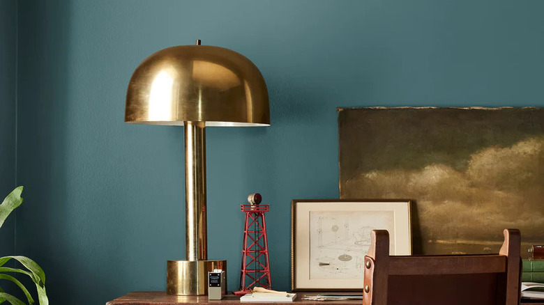
Shades of blue are often included among the best bedroom paint colors to create a peaceful environment, and Gaines' advice is no different. "Bedrooms are a great place to take a risk and use a little more color," she shared with Country Living. "I would love to see a client use Weekend in their bedroom. Like weekends, this color puts me at ease." Magnolia's Weekend is a rich shade of blue-green, said to be inspired by denim. Gaines described the hue as "the calming blue of retreat and relaxation."
To make it work in your own home, try painting all four walls of your bedroom for maximum impact, instead of just doing an accent wall behind the bed. This color is light enough that it shouldn't create a claustrophobic feeling when you're immersed in it. Then, to balance the richness of the hue, use light-colored bedding in a warm, creamy tone, like the Boll & Branch Signature Hemmed Sheet Set. Consider pairing the blue base with aged brass hardware to add a bit of contrast and polish that pops beautifully against blue tones. You can even add artwork with gold frames or vintage-style lighting to enhance the overall timeless vibe, like ARPEOTCY Vintage Gold Framed Wall Art or the Melunar Brass Table Lamp.
Grays work well for spa-like bathrooms
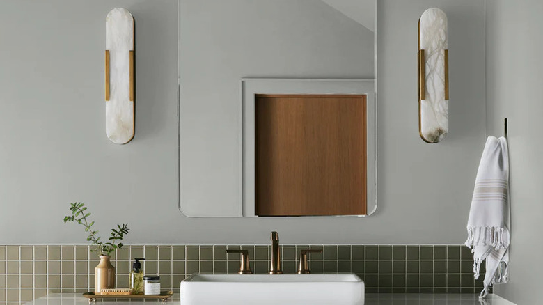
Gaines has the perfect color in mind to create a modern, chic bathroom: Gray! "In a bathroom, I like the idea of using something fresh and clean, like one of my favorite grays, 'Wedding Band,'" she told Country Living. Magnolia's Wedding Band is a light, silvery gray that is the color of her husband, Chip's, wedding ring, making it very special to her. Reviewers of the color report that it does just as promised, making their bathrooms feel calming and spa-like. Although others mention that in certain lights, it looks a touch more blue than silvery. So, you may want to order a peel-and-stick paint sample to test it in your space before taking the plunge.
Gaines has a painting trick that gives a space depth and dimension, coating the walls and trim in similar hues. So for a unique look when painting your walls in Wedding Band, try adding another shade of gray like Magnolia's Yarn to the mix for the trim. In a bathroom, this trick works especially well on baseboards, crown molding, and even built-in vanities. Finally, to lean into the spa-like atmosphere, add neutral storage options like the Iwell Tall Storage Cabinet or the MIULEE Waffle Bathroom Rugs, which come in a set of two.
Creamy whites work well in high-traffic spaces like kitchens
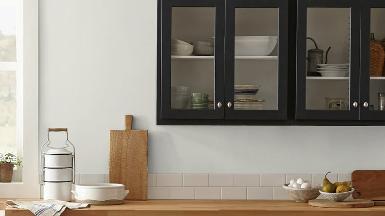
White kitchens will always be in style, making them a continued staple in the design community. Gaines agrees, as she told Country Living, "For high-traffic areas like kitchens and living rooms — and almost any space — I like to keep things simple and use a creamy, neutral white..." Her reasoning for white kitchen walls is that it sets the scene nicely for you to infuse your space with personality in other ways, really making it your own. "[These colors] create a bright, clean space and offer a versatile backdrop for décor," she told the outlet. One of her favorite whites for this purpose is Magnolia's Shiplap, named after her signature design choice.
You can certainly double-dip and paint things like cabinets and trim in a creamy white for an airy vibe. However, using darker colors on these items can help add more contrast if you're going for a bolder look. Shiplap is a perfect backdrop for more pronounced design choices, like a bold tile backsplash, a vivid cabinetry color, or even colorful textiles like the Loloi II Runner Rug.
Earthy greens are stunning on cabinetry and accent walls
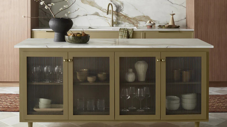
You can rarely go wrong with green. "Whether it's moody or a vintage green, there is so much emotional connection that can come from a green," Gaines told House Beautiful. Plus, you can find so many shades of the color out in nature, and it can fit perfectly almost anywhere in your home. She names Magnolia's Remote Trail as one of her current favorites. The color was also featured on "Fixer Upper: The Lakehouse", as Gaines used it on the kitchen cabinetry to fit the property's mid-century style."It took a while to find that perfect green," she told Homes & Gardens of the shade. "It's like that green that felt kind of vintage but still had that level of interest where you looked at it and you had to double-take, because it's like, 'Oh, that's an interesting shaded green.'"
To get a similar vibe, consider using Remote Trail as an accent color throughout your home on built-in cabinets and even wainscotting. Next, follow Gaines' lead by layering it with other shades of green by including plenty of houseplants and green accent pillows, like the Topfinel Olive Green Decorative Throw Pillow Covers. You can even consider painting smaller furniture, like an end table, in the shade. Or, pair the color with wood tones like walnut or teak in your furniture and flooring for a real mid-century vibe.
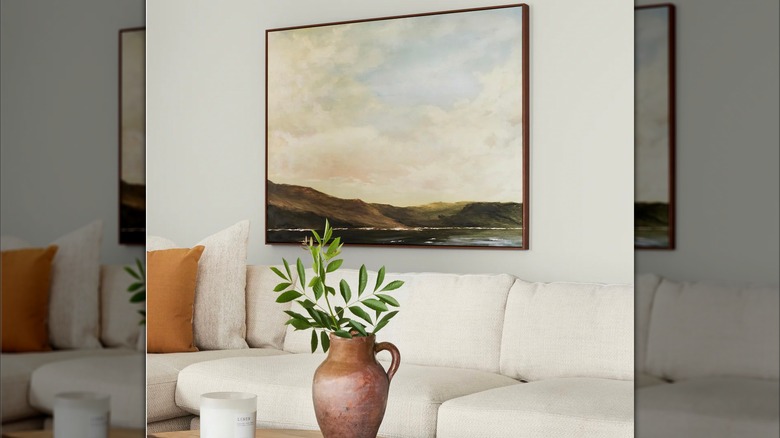
Try lighter blues for a cozier living room
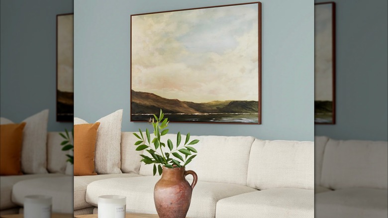
When you're trying to create a space that feels calm and comforting, lighter blues can be the perfect solution. Unlike navy, which is a once-trendy blue paint color that's dating your home, Joanna Gaines often leans on softer shades to bring serenity into a home. "Rainy Days is really the comfort of being home and taking in the quiet moments. I really feel like this color is one of those colors that just makes you want to sit on the couch, curl up, and read a good book," Gaines said of the color, per KILZ YouTube. Magnolia's Rainy Days is a pale blue with just a hint of gray, making it gentle enough to feel neutral, but still rich with character. It's a great option for anyone who wants to bring a calm feel to their living room or den without going full-on gray or beige.
It looks beautiful paired with creamy white trim and a lighter flooring choice, like oak. Anything too dark could create a harsh contrast and throw off the serenity of the space. To finish the look, incorporate soft textures like linen curtains and a cozy textured place to sit, like the Yaheetech Accent Barrel Chair. These layers will echo the softness of the paint and make the whole room feel even more inviting.
Dusty pinks can bring vintage charm to bedrooms and furniture
If you have an older home, or perhaps one with a unique architectural style, shades of pink can bring a touch of vintage charm to the space. For example, Gaines used Magnolia's Rosy Pink in the girl's bedroom in "Fixer Upper: The Castle." As a part of the color's description, she explains, "I wanted to honor the history of the castle with rich, unique colors that would complement its grand and traditional aesthetic, while still creating a timeless palette for any style of home." Yet this isn't the only shade of pink she loves when it comes to injecting character. Magnolia's Ella Rose is a lighter shade that is one of Gaines' favorite colors. "It's a true classic that never goes out of style," she said. Gaines has used the color to add charm when painting vintage furniture.
To add these pretty hues to your space, take a cue from Gaines and apply it to more than just walls to bring out architectural details. In the castle bedroom, she carried Rosy Pink from the walls onto the mantle, creating a seamless feel. These pinks both have the ability to match with a variety of neutrals from creamy white to chocolatey brown. This makes them perfect for continuing from the walls to the ceiling and trim to color drench a space. Or, paint a bookshelf, dresser, or headboard in the same pink as the wall for an immersive feel that's still light and cheerful.
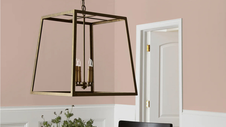
Neutrals work well for light-drenched living rooms
If you can't decide what paint color to use, you typically can't go wrong with a nice, neutral option. "I love a soft neutral color that warms up any space," Gaines told KILZ. "This light beige hue has a cool undertone that reflects any natural light pouring in, and helps create a blank canvas that feels open and inviting." Here she is discussing Magnolia's Blanched, a light, bright neutral she used in an airy living room.
Blanched has warm undertones, allowing it to soften the space and still pair effortlessly with a wide range of accent colors. Plus, the shade is versatile, so if your space leans modern or traditional, it will adapt. As far as accents, Blanched will pair beautifully with everything from aged brass fixtures to modern black window frames and even jute rugs. It also serves as an ideal foundation for dark wood pieces, like the MTFY's Round Coffee Table or DM Furniture's Faux Leather Accent Chair. However, with a color like Blanched on the walls, you could also go bold with something like a MAXYOYO Modern Accent Chair in a deep, hunter green or a rug with a wild pattern.
Bold reds can work well for exteriors, like front doors
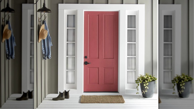
Gaines recognizes that while she loves to use neutral tones in her own home, and these colors are popular across design in general, sometimes bold hues have their roles too. In fact, Gaines thinks a red front door is a good idea. She explains to Real Simple, "I might shy away from reds and purples, but there is a time and place for any color. For example, I do think the right shade of red can add character to a front door and is great for curb appeal." One red hue from her Magnolia line that Gaines says is timeless is Vine Ripened Tomato.
The key when painting your door, exterior shutters, or even porch furniture is to use a shade that really contrasts with the rest of the home. That way, it stands out and immediately draws your eye to it. Unlike boring neutrals, this shade of red will really pop when paired with everything from white siding to dark brick. Add lush green foliage around the entry, and your porch couldn't look more idyllic. If you're adding potted plants to the area around the door, consider matching their containers to the facade. This way, the bold red door is still the main focal point, and colorful pots don't draw the eye away.