10 Accent Wall Colors To Turn Your Bedroom Into A Luxurious Oasis
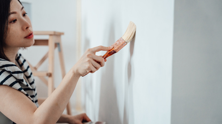
Adding an accent wall to your bedroom can serve all sorts of functions, from making a space more cozy to visually lengthening or widening the room. It can be a great way to make a boxy square or rectangular bedroom seem more interesting or create a focal point in the room when utilizing the space behind your bed. There are many ways to add interest to a wall, be it with paneling, wallpaper, or other architectural elements. Paint, however, can be one of the least expensive and takes only a few hours with big results. There are many beautiful options for accent wall shades that give a luxurious and sophisticated look to where you sleep, including classic neutrals and subtle shades of orange, blue, and green.
These colors are particularly eye-catching when combined with lighter walls around the rest of the room, or when paired with another similar shade for a color-drenched look. Most hues can easily be adapted to your aesthetic through other decor and accents. Use paint alone, combine it with a ragging paint technique, or create a woven strie paint effect to add texture. The accent wall would also look fabulous with wainscoting or picture rail molding.
Sage green
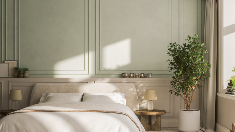
Soothing and soft green is a great color to bring freshness and an organic feel to any bedroom, where it can look either cool and contemporary or charming and vintage depending on other pieces and style choices in the room. For a crisp look, pair it with white walls, or for a more antique provincial style, pair it with ivory or soft cream walls, beddings, and draperies. Great minty fresh paint options include Benjamin Moore's Saybrook Sage or, for a deeper shade, Sherwin Williams' Taiga.
Navy blue
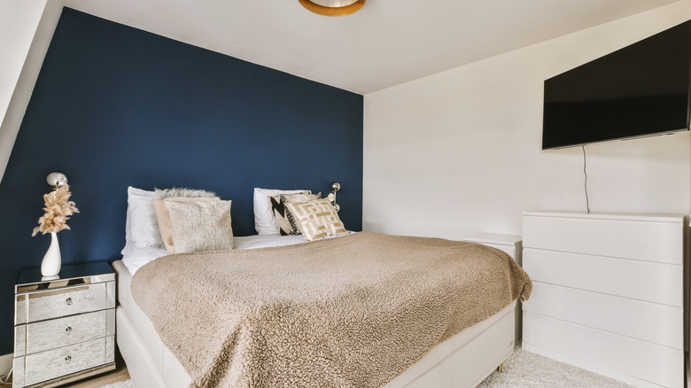
Navy is another color that has a lot of adaptability, occurring in more traditional interiors or contemporary spaces depending on how it's used. For a dark and dramatic look, use navy with brass accents or jewel tones in bedding and rugs. Or, go for a more nautical or preppy look with navy blue and crisp white. Navy can also be used as a neutral, with various warmer and cooler undertones to work with. Great options include Benjamin Moore's Deep Royal and Sherwin-Williams' more gray-based Sea Mariner.
Dark brown
Dark chocolate brown offers a lot of depth, no matter what you pair it with, be it soft pastels like aqua or sage or high-contrast creams and whites. You can also get a luxe look by painting dark brown with black accents. For a warmer deep brown, try Benjamin Moore's rich Coffeehouse Chocolate, or for cooler tones, opt for Sherwin-Williams' Bitter Chocolate.
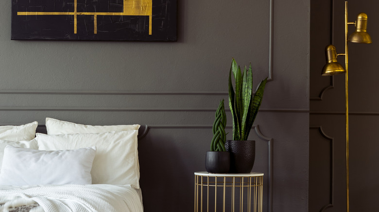
Gray
Gray has a vast array of shades from cooler slate grays to warmer-toned grays that almost come across as taupe. This makes finding one for an accent wall quite easy. Combine gray with your favorite shade of white, or layer it with lighter grays on the remaining walls or bedding for a monochrome look. Great shades include the warmer Worsted from Farrow & Ball or Benjamin Moore's Powell Gray.
Forest green
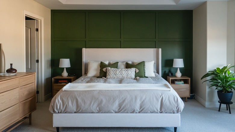
Dark green can read as romantic and dramatic or nature-inspired and soothing. Combine with white or ivory walls for a dose of color. Or layer various shades of lighter and darker green on the other walls. For a more masculine space, pair dark green and gray with touches of chocolate brown. For a shade that's more neutral, look to Farrow & Ball's Studio Green. For a more saturated green, try Benjamin Moore's Yukon Green.
Taupe
With a rich depth of shades available, taupe can be a great way to warm up a room considerably, particularly when paired with other warm neutral tones like cream, beige, and tan. It can also read as more neutral and cooler depending on what's around it in terms of textiles and accents. For a deeper, more saturated taupe shade, try Farrow & Ball's London Stone. Sherwin-Williams' Pussywillow is a great option for a cooler, more neutral shade.
Black
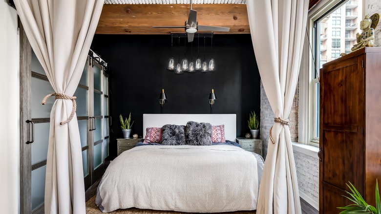
While often accused of making rooms too dark and shadowy, recent years have seen more and more homeowners choosing this chic color for everywhere, including luxe bedrooms. Pair it with high-contrast white or cream bedding or combine with other darker shades and wood tones for a dramatic look. It can read sleek and contemporary, or when paired with creams and warmer shades, look beautifully vintage. For a basic deep matte black, try Benjamin Moore's Black. For a slightly softer version, opt for Farrow & Ball's Pitch Black or Sherwin-Williams' Bohemian Black.
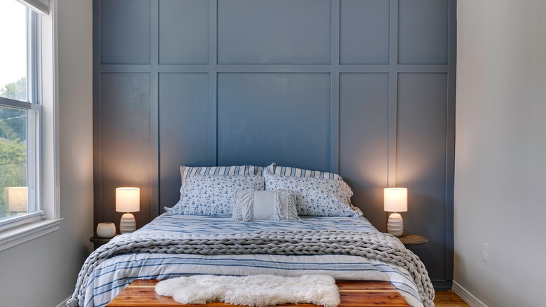
Dusty blue
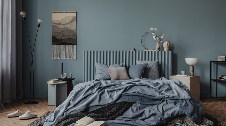
This variation of blue almost falls into gray territory, which makes it another soothing neutral that adds depth but still remains calming. This also means it combines well with other gray shades, both warm and cool, as well as other neutrals like white, cream, and ivory. It can be more masculine when paired with wood tones, or more vintage and retro alongside high-contrast lighter shades on the walls and bedding. Beautiful slate blues include Farrow & Ball's Kittiwake, or, for a more tropical feel, Benjamin Moore's St. John Blue.
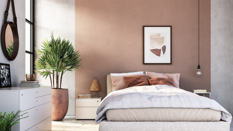
Soft orange
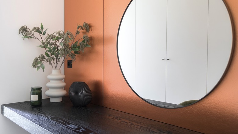
While choosing a brighter and sunny orange can be fun in some rooms, a softer orange shade can often help your bedroom feel calmer than a high-intensity one. Softer oranges have more subdued neutral undertones like brown or gray, leading to shades like Farrow & Ball's Orangery or Benjamin Moore's Orange Creamsicle, both sophisticated options that combine well with other neutral walls and bedding. If you want a little more depth and drama, opt for something like Benjamin Moore's Burnt Sienna.
Charcoal gray
A nice halfway point between matte black and lighter shades of gray, this offers the same dramatic depth and sophistication of black without being so dark. Pair it with other shades of gray for a monotone look or use bright white for a high-contrast effect. You can also layer this sage with deeper black for a moody and gothic-inspired space. Perfect options include Farrow & Ball's Hopper Head and Benjamin Moore's Flint.